-
 22 Dec
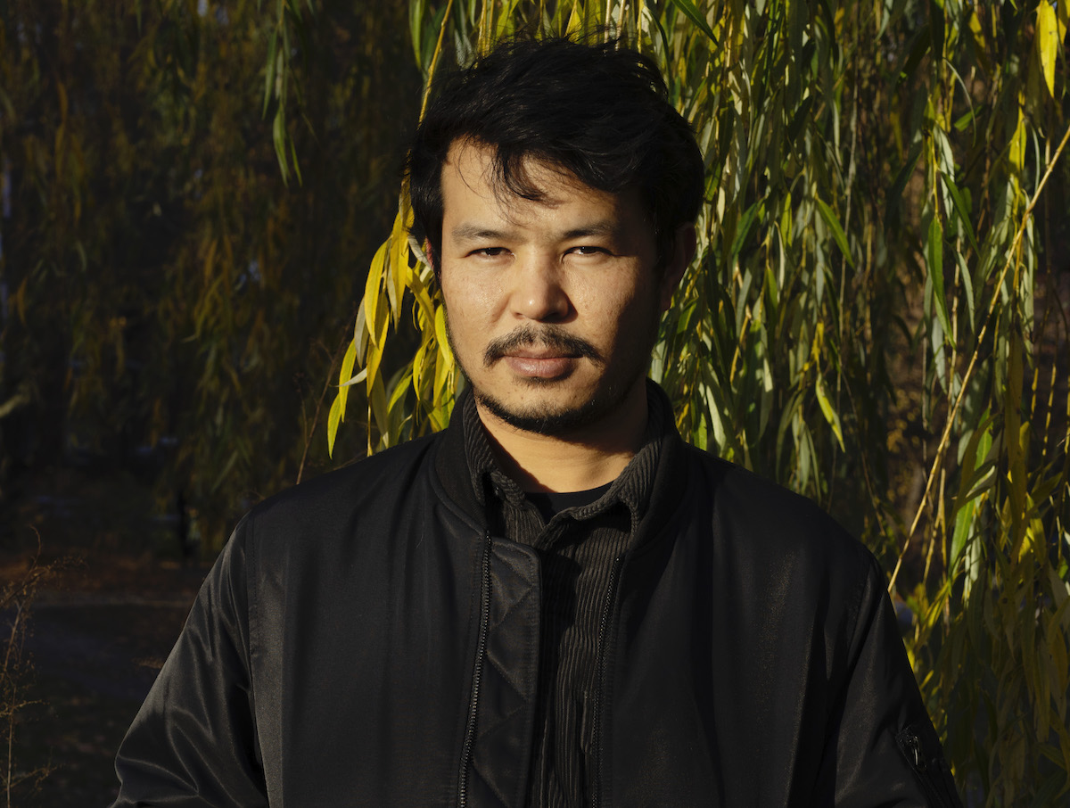
Aziz Hazara.
PHOTO MAKSIM BELOUSOV/COURTESY THE ARTIST AND PINCHUKARTCENTRE
Last December 8, renowned interdisciplinary artist Aziz Hazara took home the Future Generation Art Prize 2021, an award established by the Victor Pinchuk Foundation and given to artists under the age of 35. Besides the distinction, he was also given a total of $100,000 – $40,000 of which will be used to fund his practice.
An additional $20,000 was distributed among Special Prize winners Agata Ingarden from Poland, Mira Lee from South Korea, and Pedro Neves Marques from Portugal.
“Nobody can tell us better about this world than great, especially young, emerging artists,” said Victor Pinchuk, the founder of the PinchukArtCentre and the Future Generation Art Prize. “You are able to express the future of this world much better than politicians can. My belief is that contemporary art is one of the most revolutionary forces in the world. That is why I think your role is so important.”
He added, “You can influence and help us to change this world. We can survive only if we change this crazy world with its very dangerous and unpredictable future.”
Hazara was chosen by an international jury, which consisted of some of the art world’s most influential figures, including Lauren Cornell, the Director of the Graduate Program and Chief Curator at the Center for Curatorial Studies at Bard College; Elvira Dzangani Ose, the Director of the Museu d’Art Contemporani de Barcelona in Spain; and Eugene Tan, the Director of the National Gallery Singapore and the Singapore Art Museum.
Bow Echo, 2019
Image via experimenter.in
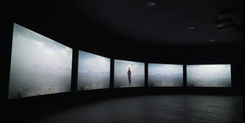
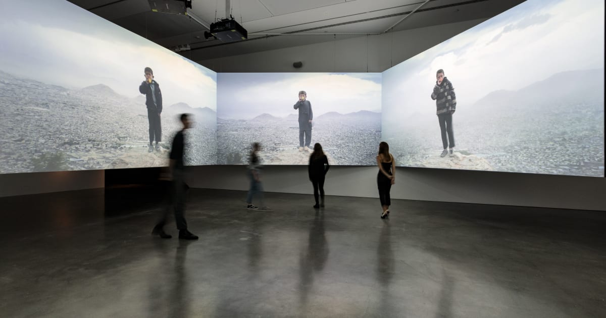
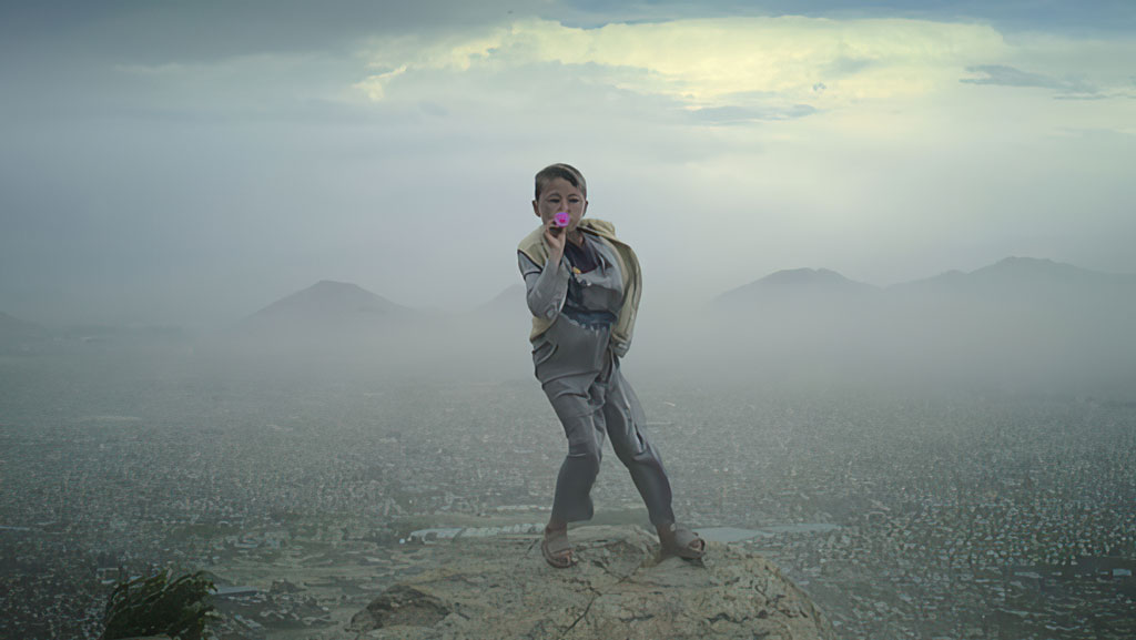
Based in Kabul, Afghanistan and Ghent, Belgium, Hazara is known for working across photography, video, sound, language programming, and text to explore power relations, geopolitics, and the panopticon. His work “Bow Echo” (2019) is a multimedia installation spread out across five screens, showing a young Afghan boy climbing mountaintops and playing a plastic bugle. It was previously shown at the 2020 Sydney Biennale.
“The piece holds many paradoxes in a simple scene: the playfulness of childhood, the limitlessness of grief, the conquest of land and territory, and the precarity of the future,” said the international jury in a statement. “In a sense, the piece identifies not only a future-facing tendency in art but a concern for future generations that was shared by many artists in this year’s Future Generation Prize.”
The panel added, “Touching on cinema, performance, and sound, ‘Bow Echo’ offers a striking time-based monument to resilience and hope for a geography that has, for many generations, remained under the pressure of various forms of failed governance. At the same time, the piece shows how artists continue to imagine complex independent ways of existence even amidst conflicts that seem never-ending.”
Aziz Hazara, Bow Echo (Video still), 2019, Duration: 4 min 6 , Five channel HD video, color, sound, Video produced by the Han Nefkens Foundation,
© Aziz Hazara, Courtesy the artist, Han Nefkens Foundation and Fundació Antoni Tàpies
Hazara has previously stated that “Bow Echo” is a response to the resistance of the local Afghan community – especially in Kabul, where he was born. While the city has been plagued by conflict since the U.S. military intervention began in 2001, its situation became even more precarious last August when the Taliban recaptured control. Given this, it isn’t unsurprising that the five-screen multimedia installation resonated with the international jury.
Established in 2009, the Future Generation Art Prize is organized by PinchukArtCentre, a private museum in Kiev, Ukraine. As one of the top awards in the art world, many regard it as predictive of emerging young talent on the verge of an incredible breakthrough.
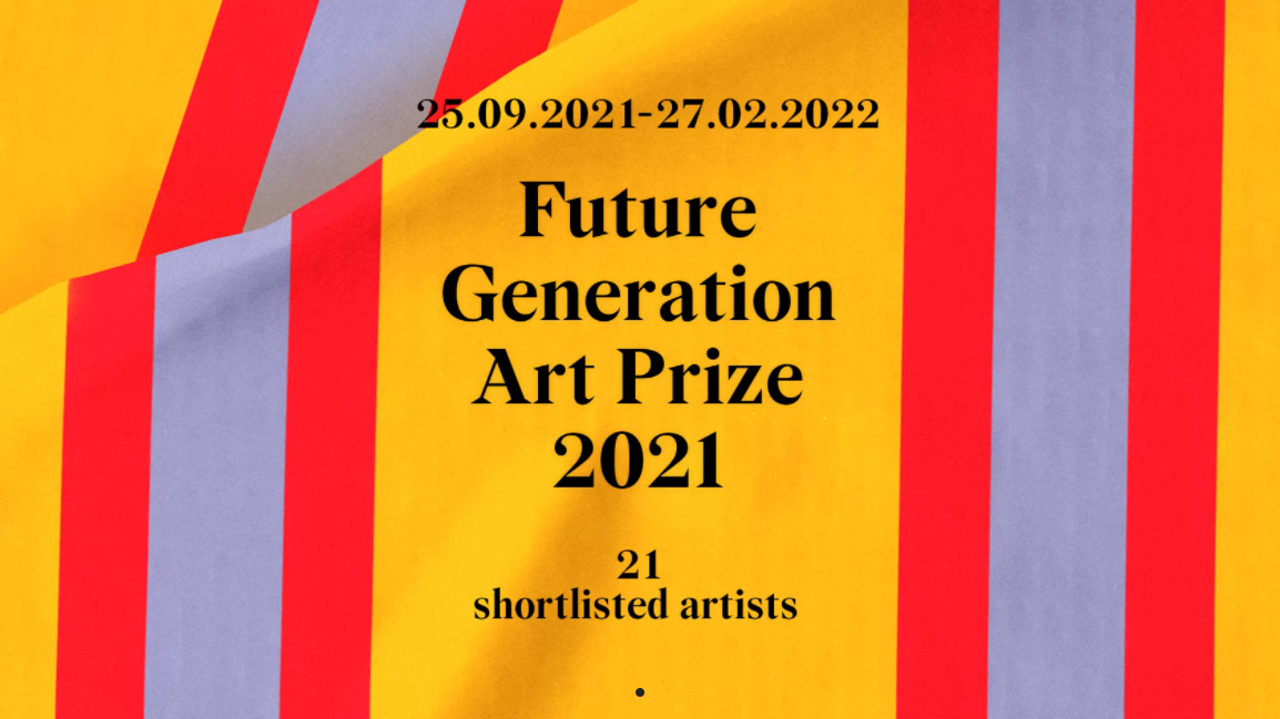
Image via new.pinchukartcentre.org/en
“This idea of the Future Generation Art Prize came to me in 2008 in the middle of the global financial crisis,” said Victor Pinchuk in his speech at the awards ceremony. “Maybe for you – young artists – it would be useful to know and understand that crisis is a fantastic source of inspiration. Nobody can tell us better about this world than great, especially young, emerging artists. You are able to express the future of this world much better than politicians can.”
The Future Generation Art Prize has previously been won by the British artist Lynette Yiadom-Boakye (2012), Carlos Motta of Colombia and Nástio Mosquito of Angola (2014), and the Lithuanian visual artist Emilija Škarnulztė (2019). An exhibition of the short-listed artists for this year’s award will be on show at the PinchukArtCentre until February 27, 2022.
-End-
-
 21 Dec
Image via Pexels
In art news today, there are recent developments at the Louvre Museum that we think are worth talking about. Firstly, renovations in the Salle des Bronzes gallery have been reversed after a long dispute between the Cy Twombly Foundation and the museum. We’ll explore the details on this page.
Secondly, the Louvre recently instated its first-ever female director! Laurence des Cars has been captain of the Louvre’s ship since September. In this post, we’ll discuss her plans for 2022.
At SOA Arts, we like to keep our fingers on the pulse of the art world. This way, we can continue to offer the sensational services you deserve.
Twombly Gallery Renovation Reversed
© Commons Wikimedia
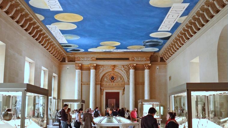
This month, the Cy Twombly Foundation and the Louvre finally reached an agreement regarding renovations in the Salle des Bronzes gallery. An installation by Cy Twombly has been featured in the gallery since 2010.
His foundation sued the Louvre earlier this year, claiming that recent renovations conflicted with the artist’s original vision.
The Original Design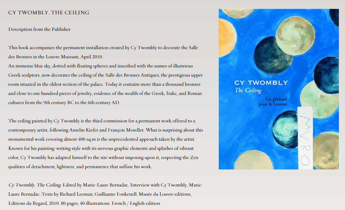
Screenshot via http://www.cytwombly.org/
In 2021, the American artist, Cy Twombly, completed an installation called ‘The Ceiling’ in the Salle des Bronzes gallery. A light blue sky with playful yellow circles adorned the ceiling of the room.
Salient to this discussion is the color of the walls and the rest of the gallery. When Twombly first installed his work, the rest of the room was neutral in color. Simple, understated colors accompanied the blue sky that he had painted.
The Changes and Why They Mattered
Earlier this year, changes to the design of the Salle des Bronzes interior sparked controversy. The walls of the space had been repainted to a burnt-red color. The floor had also been swapped out for parquet.The artist’s foundation argued that these changes undermined Twombly’s original vision. Initially, the Louvre rejected these appeals, which sparked a lawsuit.
The Result
After a long process of discussions and disagreements, the two institutions have finally reached an agreement. The Louvre has agreed to reverse the changes made to the gallery space, and in return, the Twombly foundation have dropped their lawsuit.
The Louvre’s First Female Director – Laurence des Cars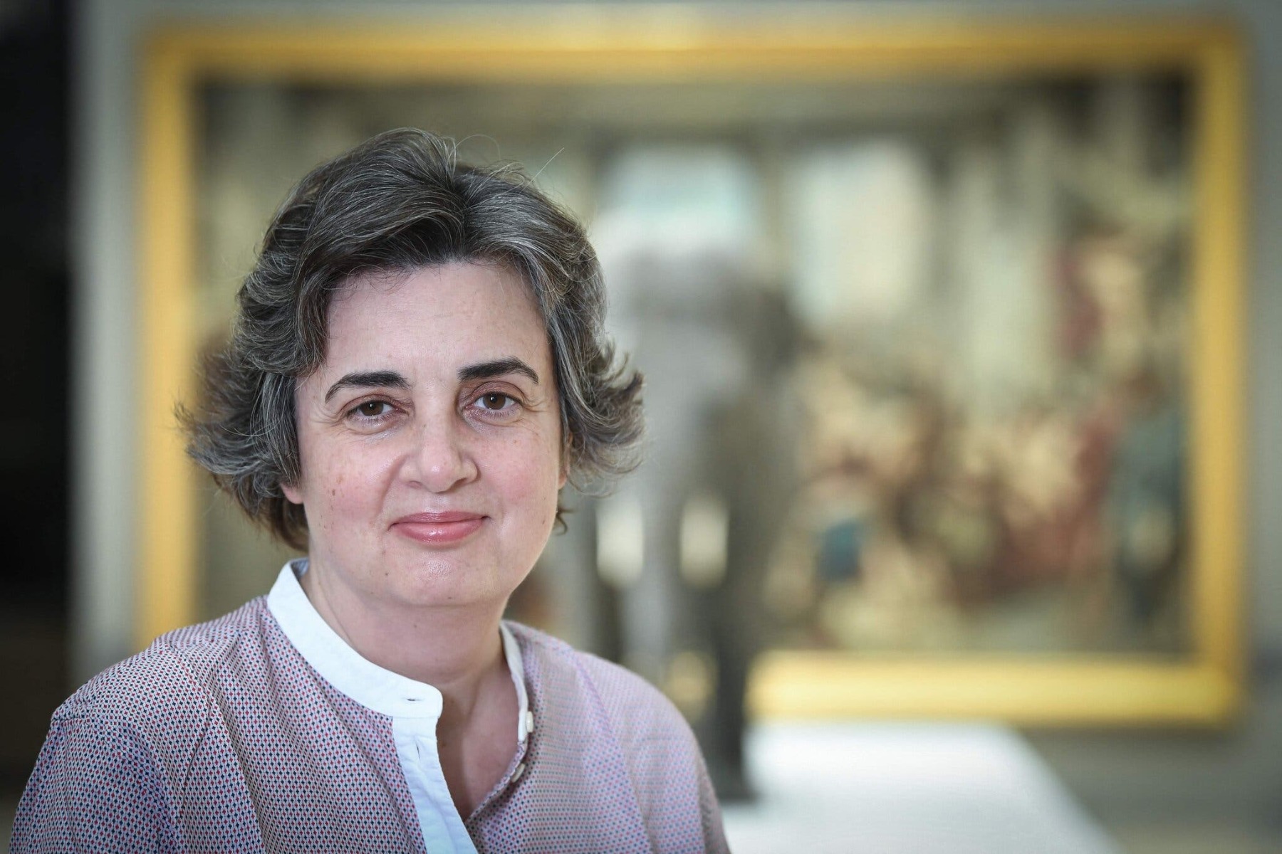
Laurence des Cars, at the Musée d’Orsay in Paris, in March.Credit...Alain Jocard/Agence France-Presse — Getty Images
In September 2021, the Louvre welcomed its first-ever female director, Laurence des Cars. This is a landmark decision for the institution; there has never been a female director at the Louvre since its conception in 1793.
Full of hope for the future, des Cars has outlined a few plans for 2022 and beyond.
Exhibitions With Other French Museums
Collaborations between art galleries in France are surprisingly rare. The new director of the Louvre says she’d like to change this fact. In particular, she’d like to work with institutions like the Orsay with collections from after the mid-19th century.
Increased International Partnerships
Sadly, civil unrest and looting in some parts of the world mean that precious art can become lost. Des Cars hope to alleviate some of this problem through increased international partnerships. Partnering with institutions in countries like Sudan, for instance, may help to offer vital support for artworks in dire need of protection.More Evening Hours
Hoping to attract younger visitors, the new director announced plans to extend the Louvre’s operational hours further into the evening. Des Cars says she wants as many people as possible to “have the pleasure of getting lost in the Louvre”.These changes would, of course, take current developments with COVID-19 into account.
SOA Arts – Where to Buy Art Prints and More
Looking for art prints, curated pieces, or special commissions? SOA Arts is the answer! We’re a fully equipped Chinese art factory that has everything you need to transform your interiors. Get in touch today!-End-
-
 17 Dec
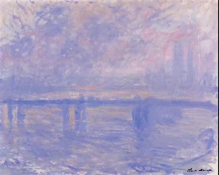
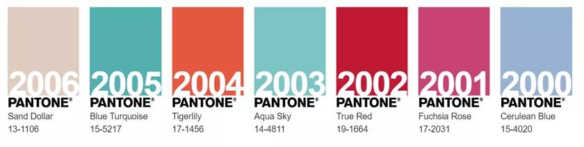
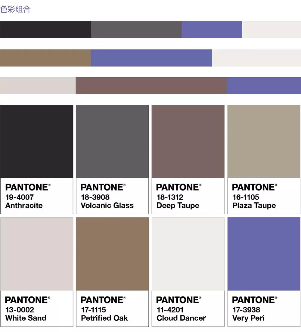
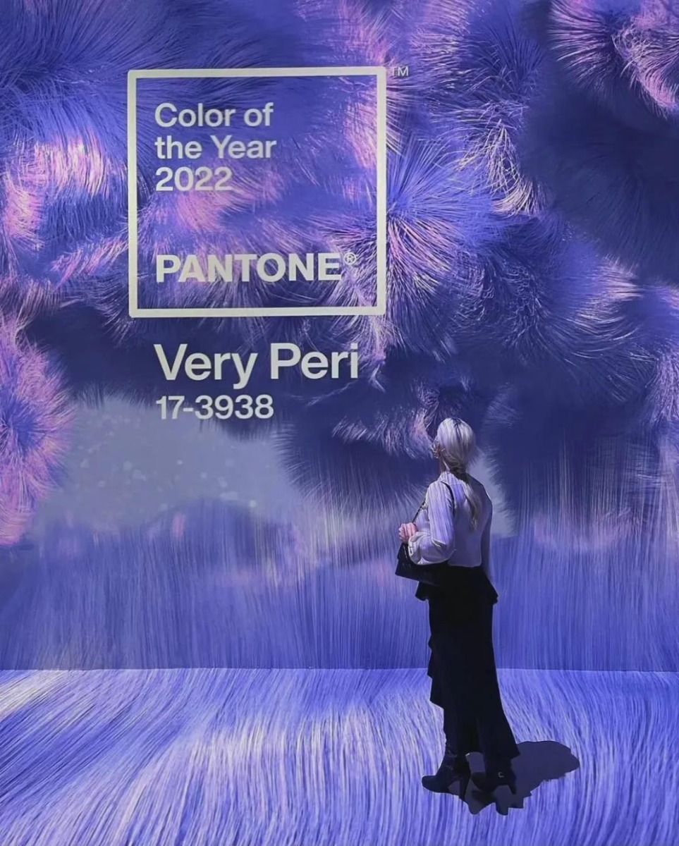
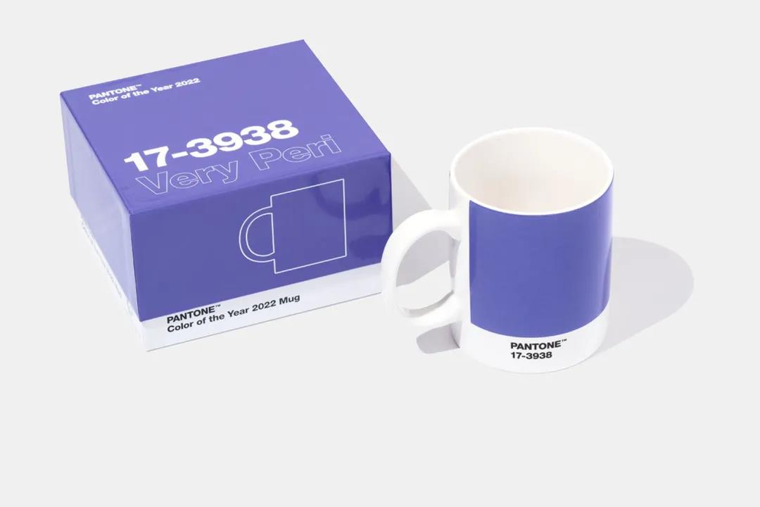
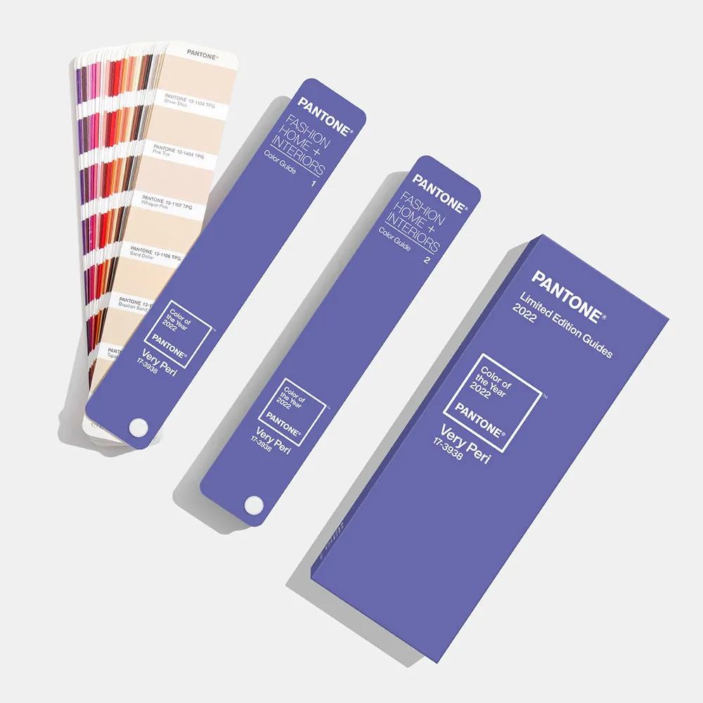
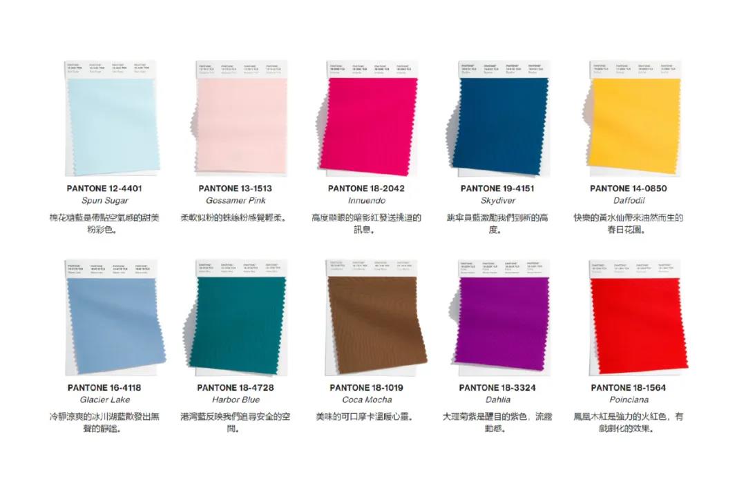
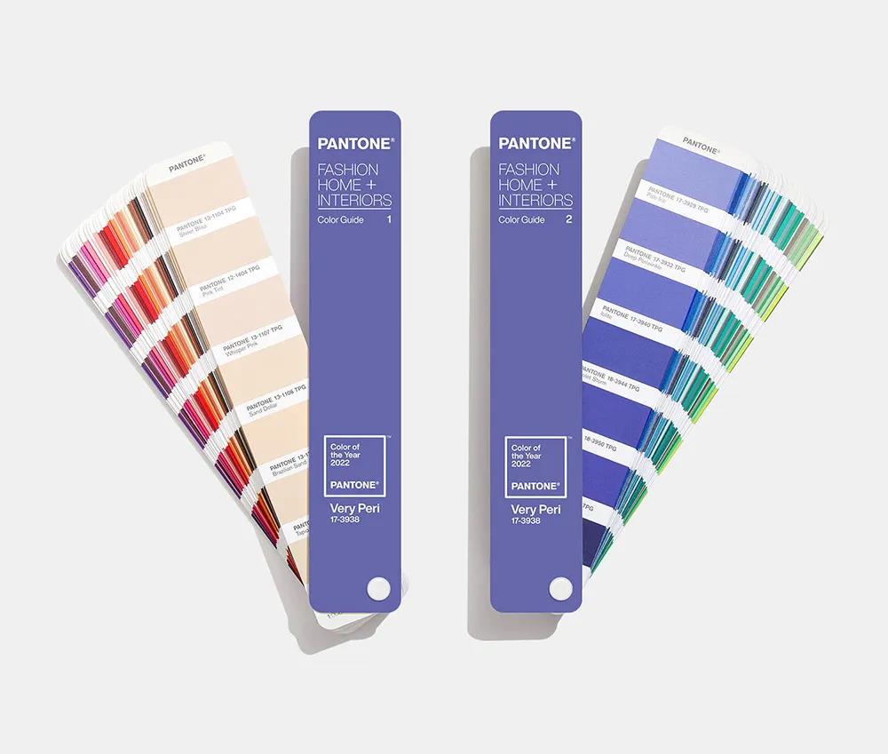
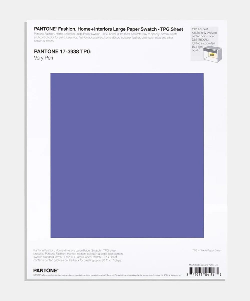
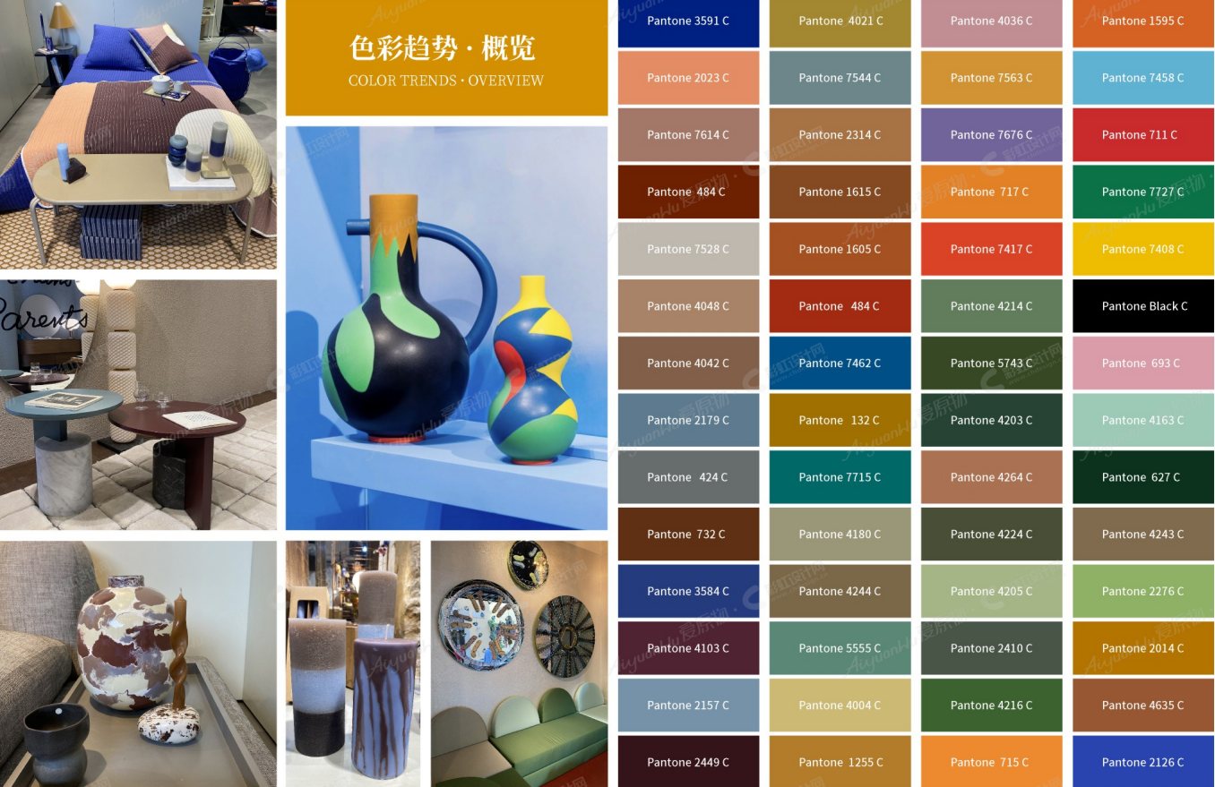
On Dec. 9, 2021, Pantone released its color of the year for 2022: Very Peri (Pantone17-3938).
Pantone has chosen blue as its color of the Year five times in the past 20 years.
What, then, shall we expect from Very Peri?Take a look!
01
Pantone's Color of the Year, What's New?
Pantone, of course, has always preferred blue.
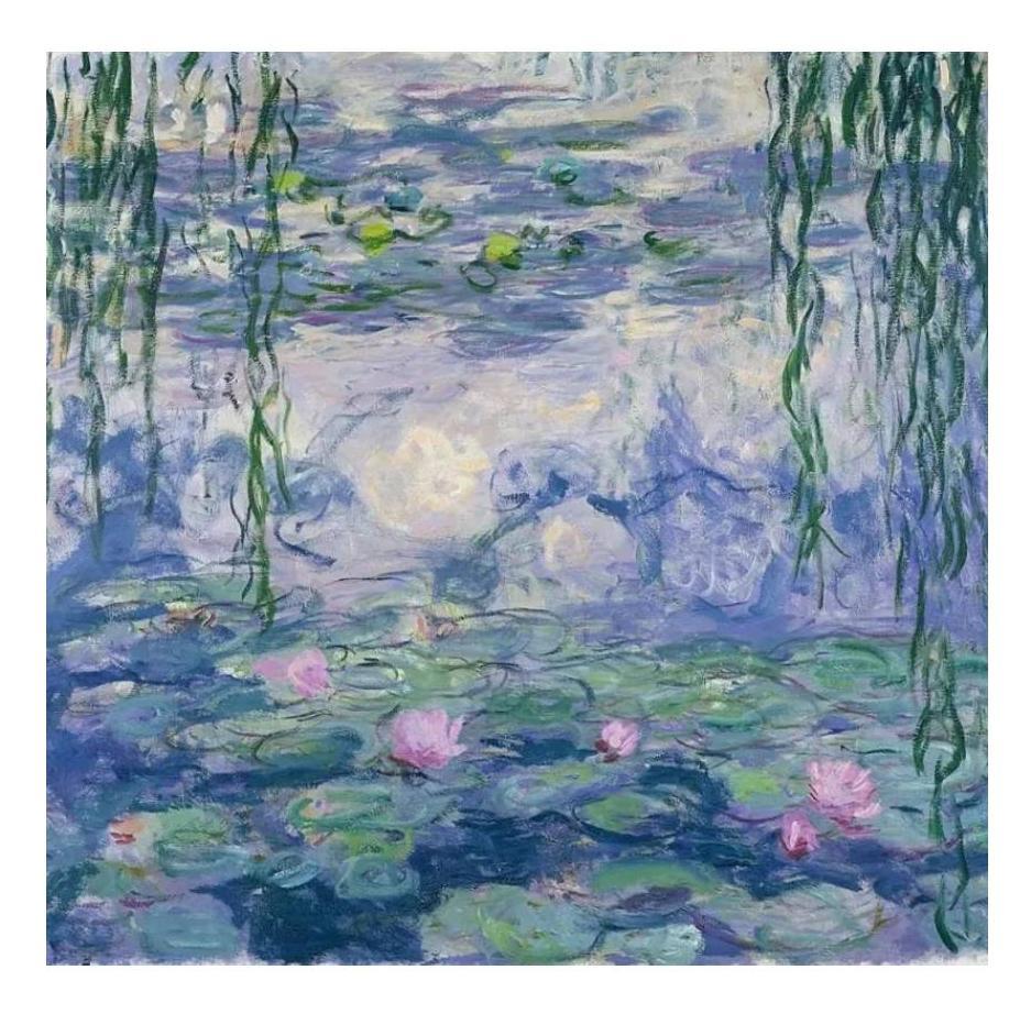
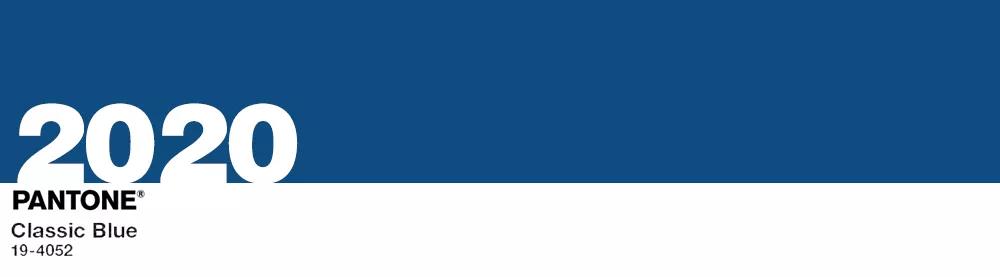
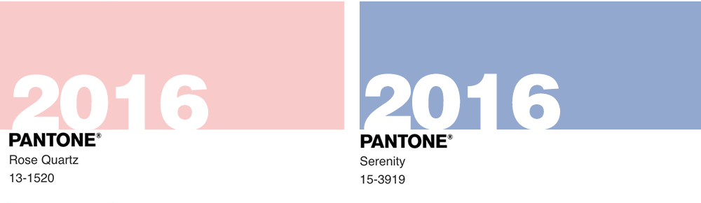
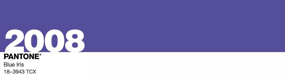
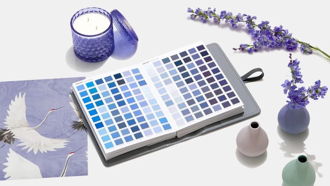
In the past five blue-based annual representative colors, Turquoise Blue is clear, Blue Iris is rich, Serenity is gentle, Classic Blue is deep, Cerulean Blue is peaceful, which have their own features.
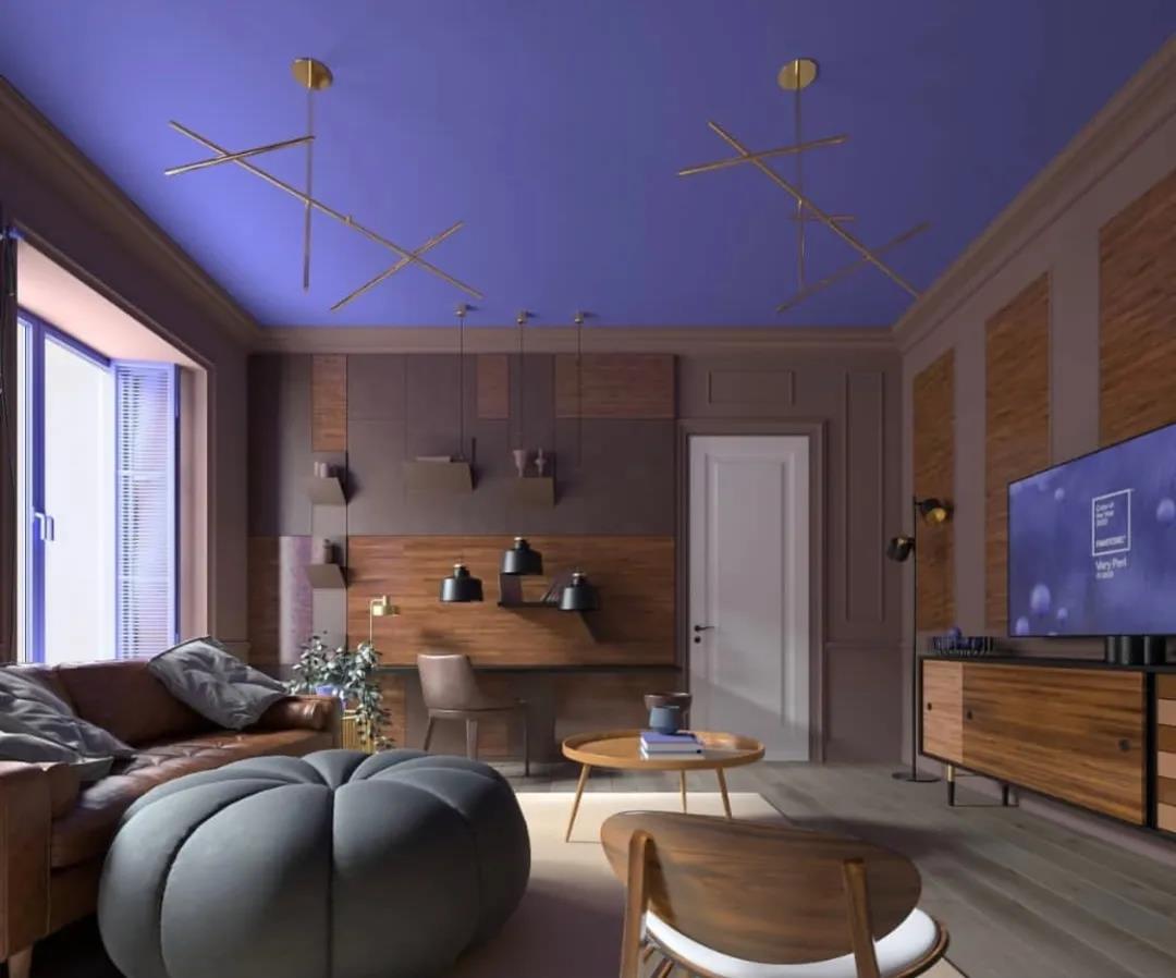
The color of 2022, Very Peri, was not chosen from the Pantone color library but a new hue whipped up by the company for the first time.
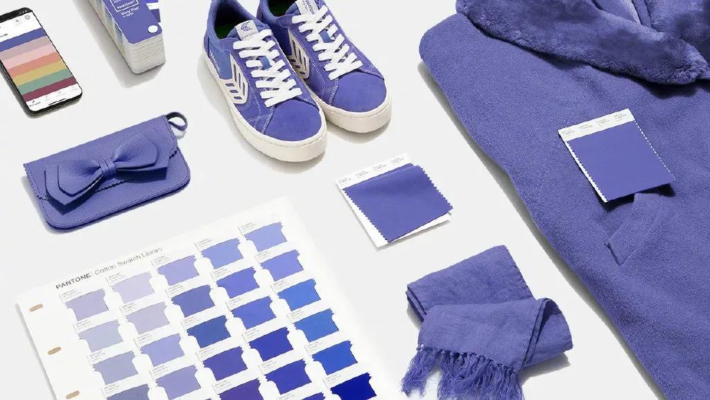
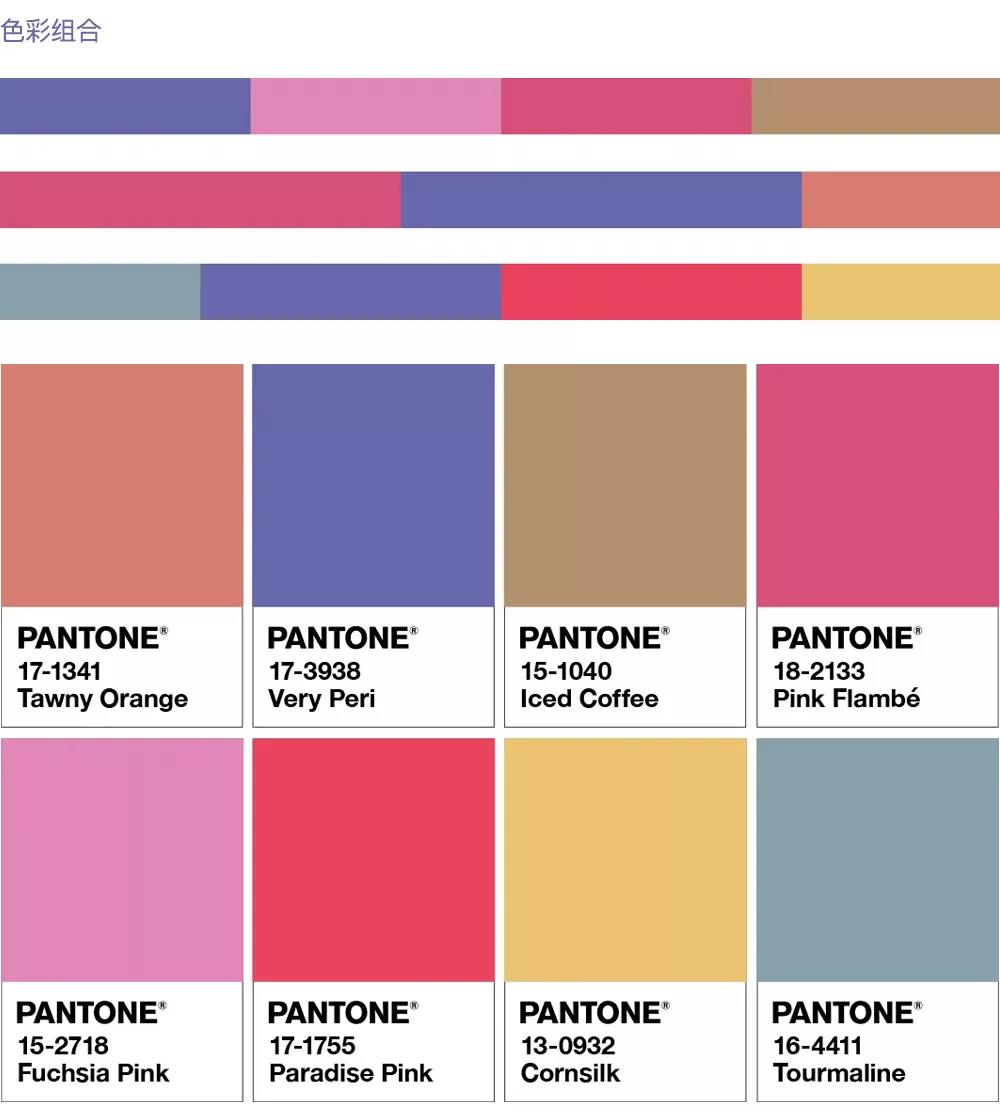
According to Pantone, Very Peri imbues dreamy purple and energy red with a serene blue tone, projecting a warm, cheerful and energetic attitude. Pantone has kindly come up with a color scheme for your reference.
BALANCING ACT
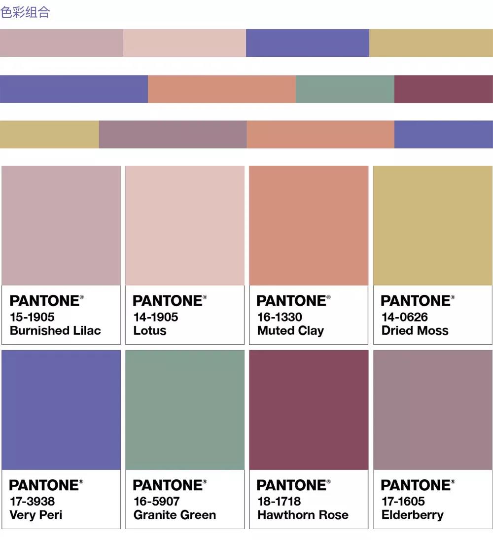
WELLSPRING
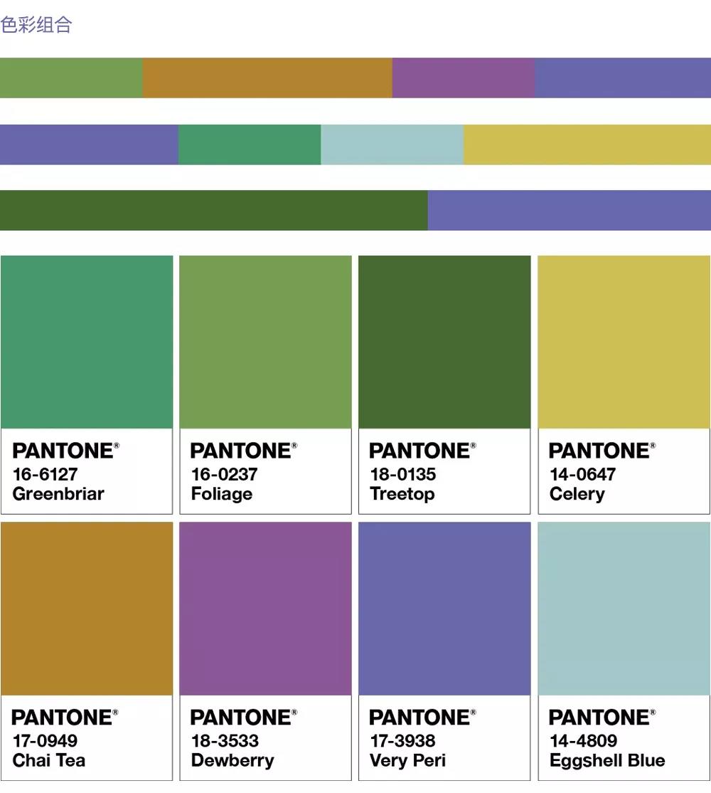
THE STAR OF THE SHOW
AMUSEMENTS
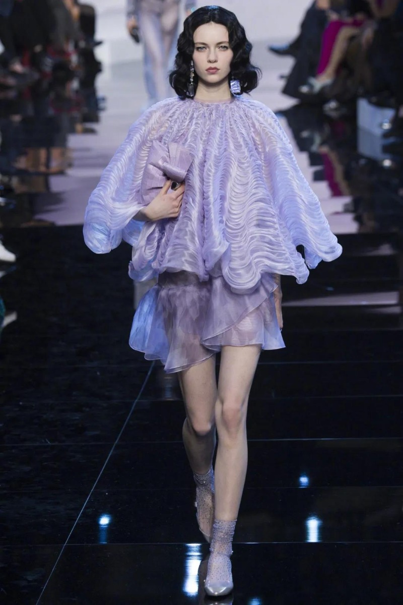
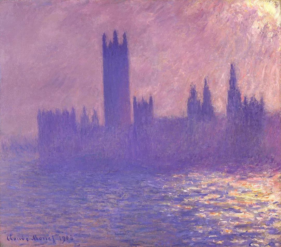
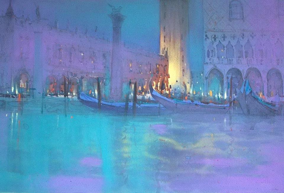
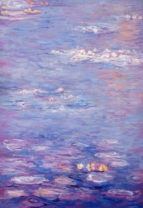
When I first saw Very Peri, the sight of "Monet's special color" came to my mind. Monet used this rich layer of blue and purple to present dense fog and winter snow.
Do you think Very Peri represents what you're looking forward to in 2022?
So why did Pantone make Very Peri the color of the year for 2022?
"We live in a time of radical change," Pantone wrote when it unveiled the logo. He also mentioned creation and change many times in his article.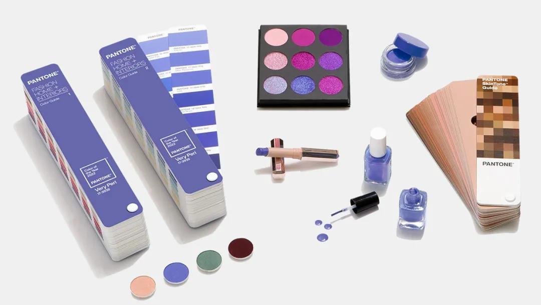
According to Pantone, Very Peri symbolizes the global spirit of this moment and the transformation we are experiencing.
Our physical and digital lives are converging in a fresh way and will adapt to living with ever more complex rules.The craze for video games, metaverse concepts, and NTF art will gradually become a part of our daily lives. Their rise is not a flash in the pan but a human vision of life.
Pantone has created new colors also benefited from the digitalization of design, allowing designers to convey their concepts more accurately, expanding the limitations of the past reality.
Very Peri (PANTONE 17-3938 ) shows the diversity of modern life and how the color trends of the digital world are mirrored in the physical world and vice versa.
From its outlook for 2022, it's not hard to see how Pantone has high hopes for Very Peri. Indeed, the combination of purple and red gives blue a softer glow, technological and futuristic feel, appropriately illustrating Pantone's vision of a virtual and digital future for human life.
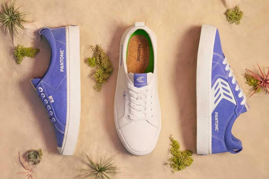
From shiny metals, gorgeous sheen and high-tech materials to handmade looks and natural fibers, Very Peri can be applied in a wide range of scenarios.
Telling a good story for a product is an essential skill for a modern company. Can Very Peri bear the weight of the zeitgeist delivered by Pantone? The world will be watching.
02
How Does Pantone Choose the Color of the Year?
When got this far, everyone could have a question, how does Pantone choose the color of the year? In terms of the selection process, the investigation and selection cycle of Pantone's annual representative color lasts for nine months, which requires thorough consideration and trend analysis.
To pick a representative color, experts at the Pantone Color Institute search for new elements that influence color change each year.
These new elements cover a wide range of fields, such as film, artistic creation, fashion design, popular tourist attractions, people's recreational life, and even social and economic conditions.
New technologies, materials, textures, and processing effects that affect color will also become critical points of choice. Color, as a basic element of our lives, has been commercially standardized for only 60 years.
Since there was no unified standard for color printing, Party A and Party B had a different understanding of color matching, often failing to meet customer requirements.
As Professor Albers wrote in The Interactive Science of Color, "If someone said 'red' to 50 people on the spot, 50 shades of red would appear in their minds. To be sure, all colors are different."
Thus, a precise universal definition of color became a revolution in waiting. In 1963, Pantone developed a revolutionary color system. The system realizes the accurate blending of color.
For more than 50 years, Pantone has extended its color matching system to various industries, including digital technology, textiles, plastics, construction, and interior decoration and coatings.
Pantone became one of the most authoritative color systems globally, and designers, artists, and manufacturers around the world began to use the "Pantone Standard."
Since 2000, Pantone will roll out the annual representative color every December, and its color of year release has become the industry's spotlight.
In addition to the color of the Year, Pantone also releases a fashion color report, in which color experts select a theme and then choose a color around that theme. The fashion color trend report unveiled every season for the clothing industry includes 10 popular colors and 5 key classic colors.
Such color prediction will bring a new round of shock to the color design in both fashion and industry, which have a vast and extensive influence on manufacturing and consumption.
03
Color Forecasts Will Control Our Choice?
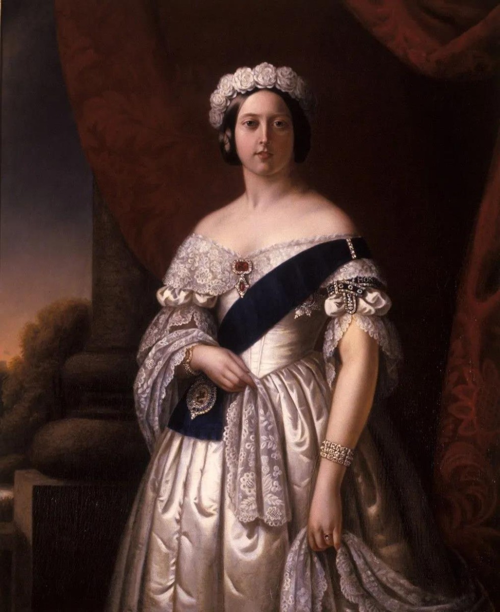
Since Queen Victoria was stunned in a velvet-lavender wedding dress, it sparked the trend for composite colors.
Complex colors followed, and dyeing houses and manufacturers worldwide began to set up color trend forecasting institutions, but their influence was limited to the fashion industry during this period.
It wasn't until the end of the 20th century that the colorful translucent shells of the iMac exploded the color industry in industrial design.
People are beginning to realize that color may determine the success or failure of a product in the market.Pantone has quantified color, stripped it of mystery and confusion, coded it into standardized products, and made selling color a huge business.
As the business of color forecasting has grown, the track has become increasingly crowded. Besides Pantone, Japan Fashion Color Association(JAFCA), Sico(Canada) and WGSN(UK), all offer expert trend reports for designers.
With the development of the Internet, the ways of predicting color trends are diversified. Tumblr, Pinterest and other design websites also start to predict color trends in their own ways.
Color forecasting helps designers understand and integrate trend information and understand market preferences in preparation for next season's products.
Reading this, you might think that color prediction is controlling our fashion choices.
In fact, the report issued by the color forecasting agency is only a trend. It can not determine the development of fashion, as a reference, will not be accepted wholly by designers and manufacturers.
While they may indirectly influence our choices, they are more likely to perform screening and analysis than the ultimate determiners of trends.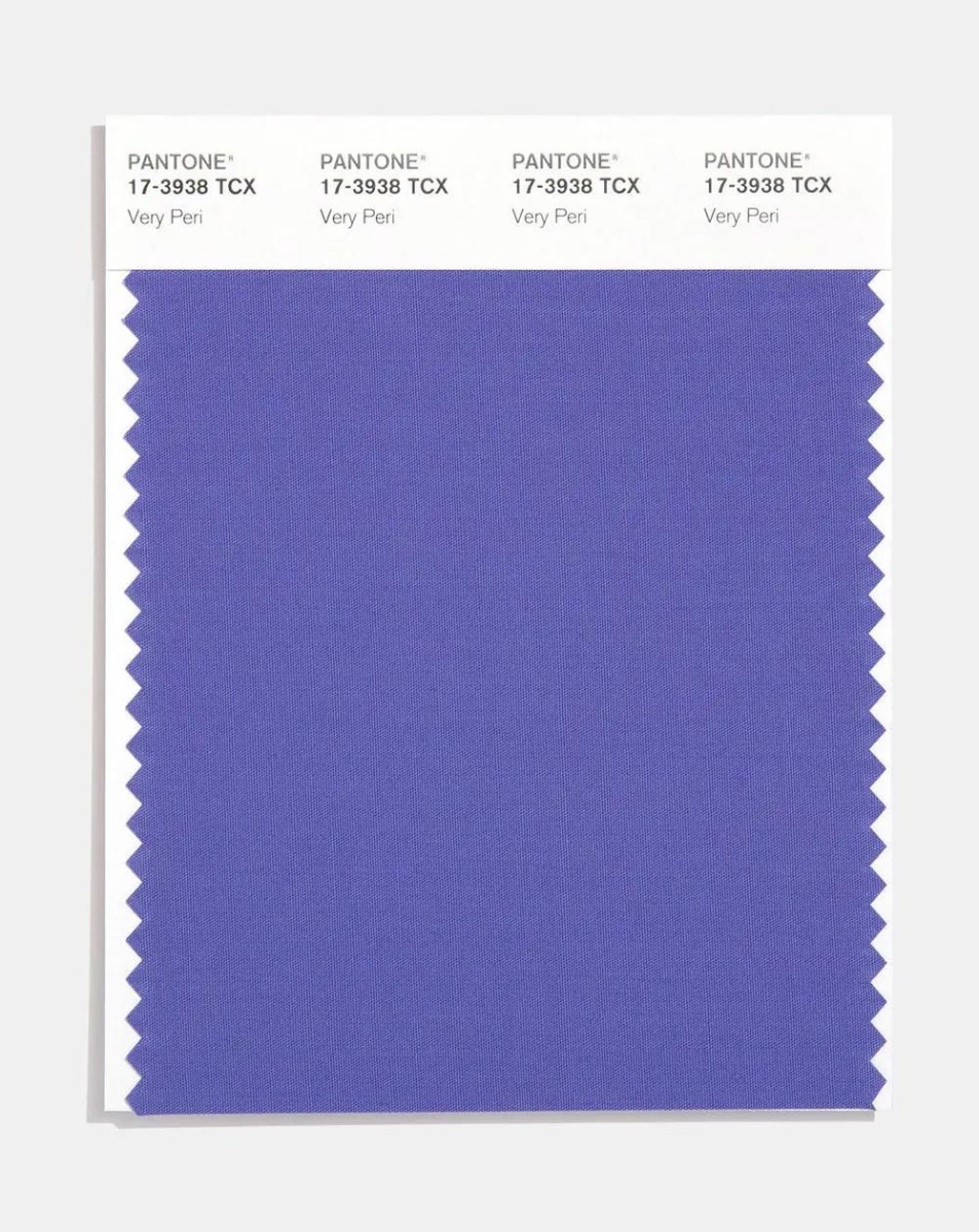
The factors that influence trends are diverse and complex, and the development of the Internet and social media has welcomed more people to create new trends.
The fashion industry and consumers are more closely linked and interact. We are all part of the movement.
Color, the visual wisdom of human beings, brings us collective resonance at different levels, leading the tide of life.
To some extent, color defines our state of life. Perhaps, as Pantone put it, color embodies the spirit of the times, as well as the complex social past.
All images via google.
-End-
-
 15 Dec
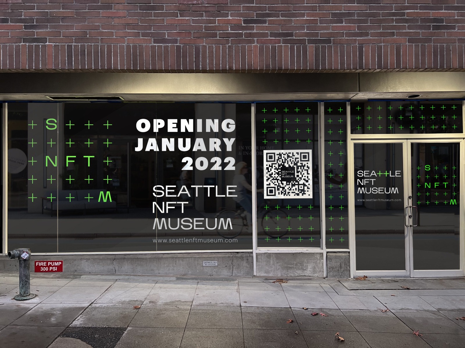
The Seattle NFT Museum on First Avenue in Seattle’s Belltown neighborhood. Image via seattlenftmuseum
The world is currently being dominated by non-fungible tokens (NFTs), a term that refers to digital tokens associated with physical assets that can be sold, bought, and traded. Countless artists have benefitted from this emerging technology, earning thousands of dollars without having to share their profits with museums, galleries, and other middlemen.
“Many digital artists, fed up after years of creating content that generates visits and engagement on Big Tech platforms like Facebook and Instagram while getting almost nothing in return, have lunged headlong into the craze,” said TIME Magazine. “These artists of all kinds – authors, musicians, filmmakers – envision a future in which NFTs transform both their creative process and how the world values art, now that it’s possible to truly ‘own’ and sell digital art for the first time.”
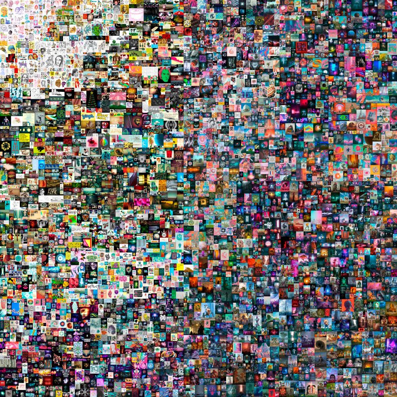 Beeple, Everydays: The First 5000 Days. Sold for: $69.3 million Beeple/Christie’s
Despite the hype surrounding NFTs, they remain misunderstood, especially by those in the art world. This is why tech entrepreneurs Jennifer Wong and Peter Hamilton are hoping that a physical museum will pave the way for a much greater appreciation for the phenomenon.
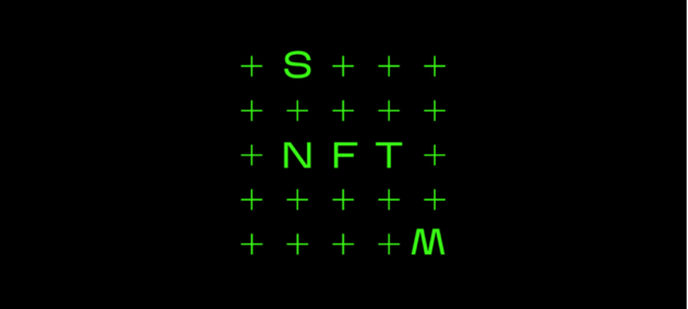
Located at 2125 First Avenue in the city’s Belltown neighborhood, the Seattle NFT Museum (SNFTM) will be the first-ever physical space dedicated to the emerging platform. Apart from serving as a gathering place for collectors and enthusiasts, it will also showcase a number of local artists, such as Larva Labs, Tyler Hobbs, Blake Kathryn, and Neon Saltwater.
 Pak, METANOIA. Not listed for sale. Pak/Sotheby's
“The community has this incredible energy and influence that they wield, but there’s something that’s missing, and that’s the physical experience and physical interaction that comes from looking at art together,” said Hamilton in an interview.
“We chose to open a museum versus a gallery because we do care about the museum aspect of it,” Wong added. “We want it to be educational for those who only know the acronym NFT to the deep-level enthusiasts.”

Jennifer Wong and Peter Hamilton, founders of Seattle NFT Museum.
While the main goal of the museum is to make NFTs more accessible to the public, both Hamilton and Wong also aim to bridge the gap between the virtual and the physical. Because of this, QR codes will be scattered throughout the entire building, sending visitors to online portals where they can interact more with the artists.
Frames created by mobile technology company Samsung will also enable curators and artists to choose how a digital piece will be presented to the public.
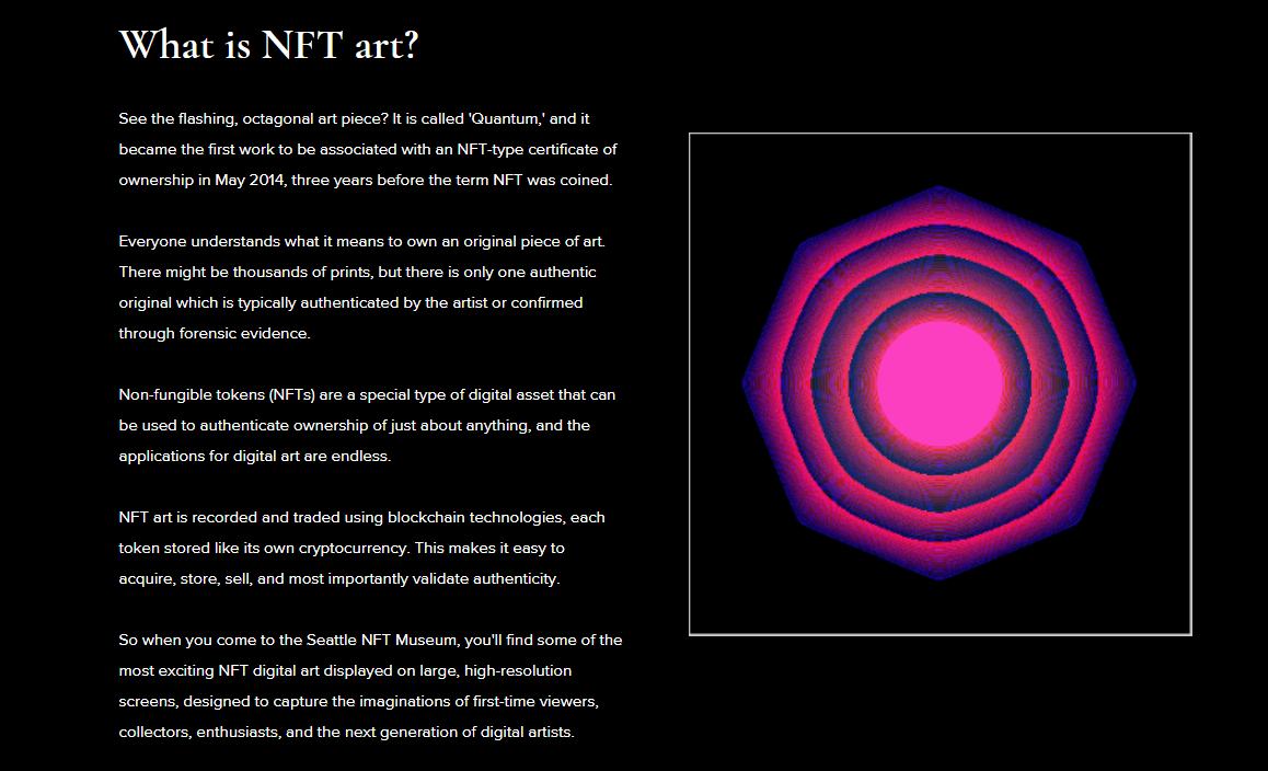
Image via seattlenftmuseum
The Seattle NFT Museum is a huge contrast to Phosphene, an online portal launched in May 2021 by tech veteran Art Min, in partnership with Kirsten Anderson, the owner of the Roq La Rue Gallery. This online platform curates NFT pieces from “mid-career and impact-oriented artists and musicians.”

Screenshot via Phosphene
“The fidelity and size of displays make space for inspiration that smartphone scrolling can’t provide,” explained Wong. “As powerful as online communities have become, there is little substitute for looking at art, standing next to another person. We need both worlds, and we know there will be so many opportunities to bridge the metaverse with physical experiences in the future.”
To prepare for the launch, Wong is working with local artists to curate pieces for the opening show. Meanwhile, Hamilton is handling their Discord server, where they keep in touch with collector organizations across the country. Both may regard the Seattle NFT Museum as a “fun passion project,” but its huge potential has pushed them to be on the lookout for people to fill out roles in administration, IT, curation, and community management.
Screenshot via Superchief Gallery NFT
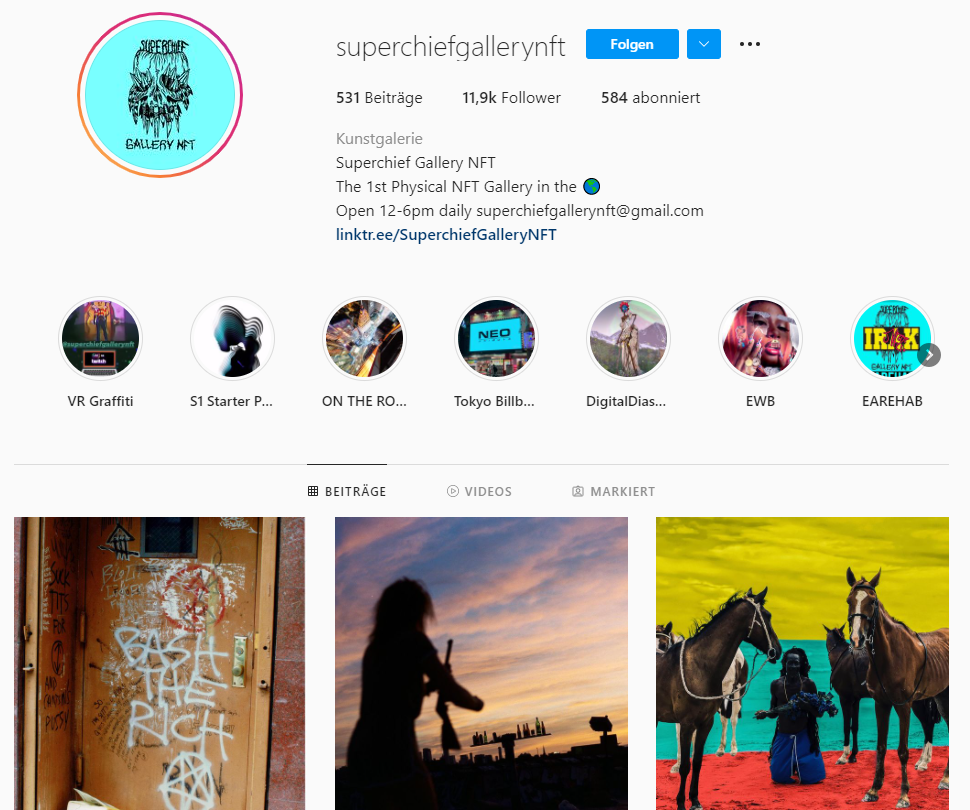
Creating a physical space for digital art isn’t something new. In March 2021, the Superchief NFT Gallery was opened in New York, and similar ones have popped up in Australia and Europe. However, the Seattle NFT Museum will be the first of its kind in the city.
While there are other physical galleries dedicated to NFTs, the Seattle NFT Museum will be the first of its kind in the city.
“The imagination of NFT artists and creators is thrilling,” said Wong. “We wanted to create a space to serve the NFT community while helping put Seattle on the map as a hub for NFT and Blockchain innovation.”

(SNFTM Image)
She added, “We’re not experts and we’re here to learn as much as anyone. That is why we are counting on the feedback and support of NFT enthusiasts to continue growing the vision.”
Set to open its doors on January 14, 2022, the Seattle NFT Museum will feature more than 30 high-fidelity digital screens in both portrait and landscape orientations. Each installation will be linked to its metadata, while visitors can access the artist’s story and explanation through a QR code.
For more information on the Seattle NFT Museum, check out their official website. Those interested in visiting may also start purchasing tickets, which cost $125.
-End-
-
 14 Dec
About Artist
Maurizio Cattelan
Museums League, Maurizio Cattelan, 2018, Museums League
Born in Italy in 1960, Maurizio Cattelan is a renowned artist in the contemporary art scene. He now resides in New York City, where he continues to do solo and group shows. He’s known for controversial works of art as he targets institutions in a playful manner. Cattelan never played by the rules and, in fact, pokes fun at the rules. His work is engaging enough to question the art industry, and we never quite know what he’s going to do next.
About Art Exhibition
The Last Judgment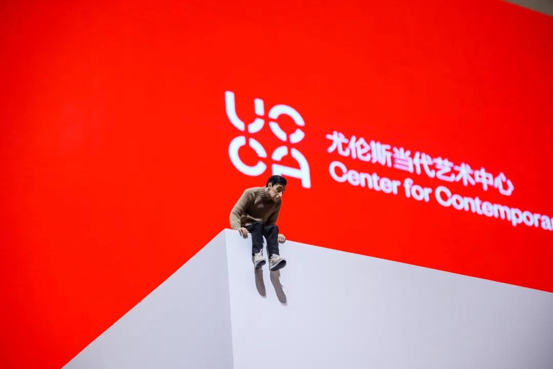
Maurizio Cattelan, Mini Me (1999), 45×20×23cm, Resin, Rubber, Artificial hair, paint, Clothing. Image courtesy UCCA Center for Contemporary Art.
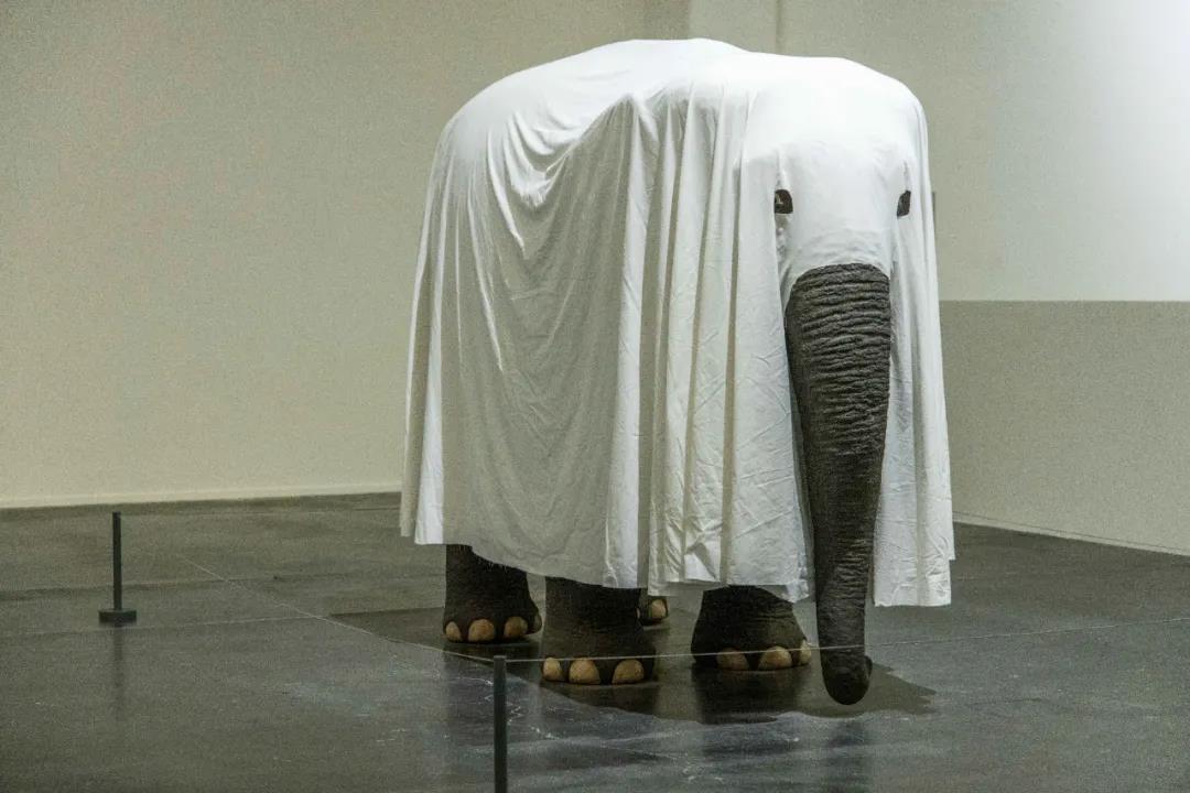
In November 2021, a solo exhibition, The Last Judgment, was set to hit the scene at the UCCA Center for Contemporary Art in Beijing, China. The show features work spanning the past few decades of Cattelan’s career. It tackles themes of death, acceptable social norms, and art history. The curation will run from November until February 20, 2022.
Maurizio Cattelan, Not Afraid of Love (2000), 205×312×137cm, Polyester Styrene, Resin, Pigment, Fabric. Image courtesy UCCA Center for Contemporary Art.
The Last Judgment makes viewers look at the big picture of what Cattelan’s been doing for decades - Being playful and teasing society, art, and looking at life with a holistic philosophy. The exhibition is curated by Francesco Bonami and organized by Liu Kaiyun, Edward Guan, Shi Yao, Anna Yang, and Yvonne Lin.
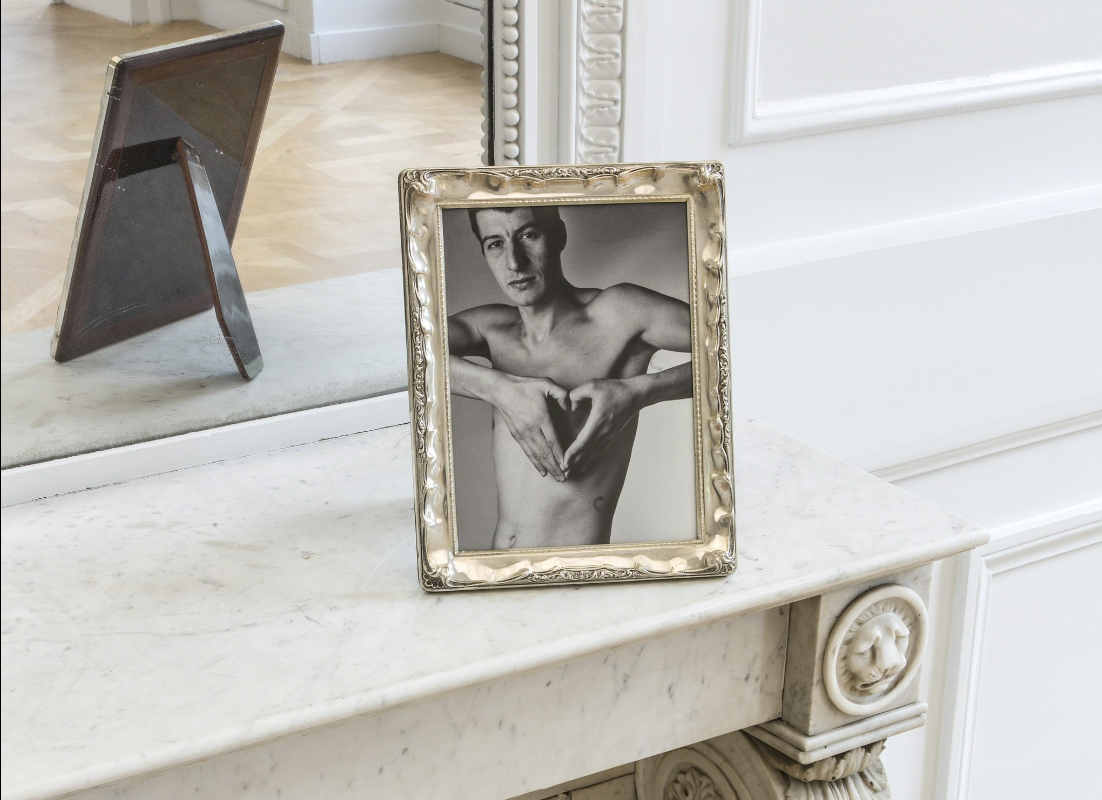
Maurizio Cattelan, Lessico Familiare (1989), screenshot via artsy.net
The exhibition includes 29 artworks that anything from installations to sculptures. Early in his career, Cattelan created Lessico Familiare (1989), featured in The Last Judgment. As one of his first creations, Cattelan utilizes black and white photography to capture a self-portrait making a heart-shaped symbol with his hands. Comedian (2019) is also featured, and this one is simplistic and silly with a banana duct-taped to a wall.
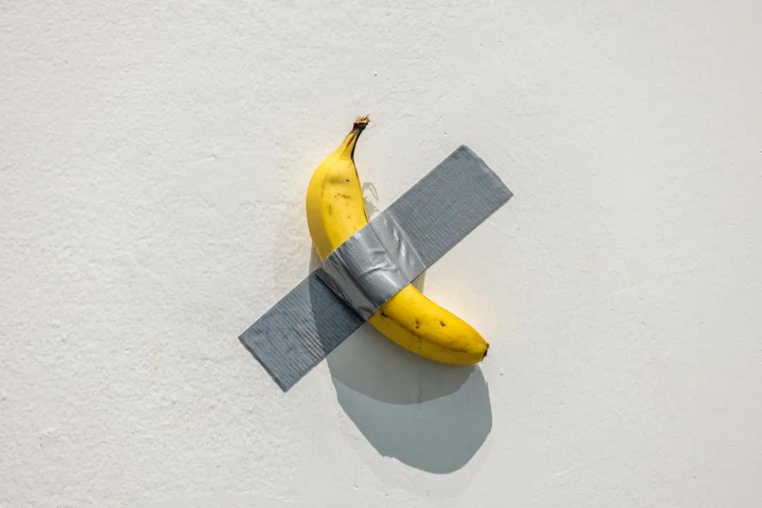
Maurizio Cattelan, Comedian (2019), Banana, Duct tape Size variable, Image courtesy UCCA Center for Contemporary Art.
Cattelan’s work also frequently references pop culture and art history. Untitled (2001) showcases a burglar scene from the classic Italian movie Big Deal on Madonna Street. Untitled (1998) playfully targets the art industry production system as it pushes for commercialization. A mascot dressed as Picasso entertains observers rather than looking at art for what it really is.
Maurizio Cattelan, Untitled 2001, 150×60×40cm Platinum Silicone, natural hair, fiberglass, clothing. Image courtesy UCCA Center for Contemporary Art.

Maurizio Cattelan, Untitled 1998, Ph Caroline Minjolle, Beyeler 2019
The Last Judgment is a dynamic art exhibition with plenty of experimental forms. One of Cattelan’s newer projects, Zhang San (2021), features a sculpture. It’s outfitted as a homeless man in Beijing. The figure is lying on the ground wrapped in a blanket with pigeons resting on their resting body and a shopping cart is loaded with garbage bags and extra clothes nearby.
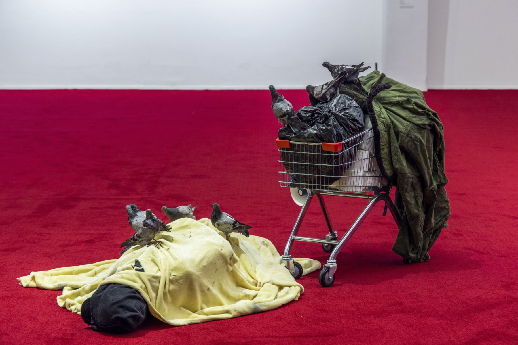
Maurizio Cattelan, Zhang San (2021), Image courtesy UCCA Center for Contemporary Art.
About His Artwork
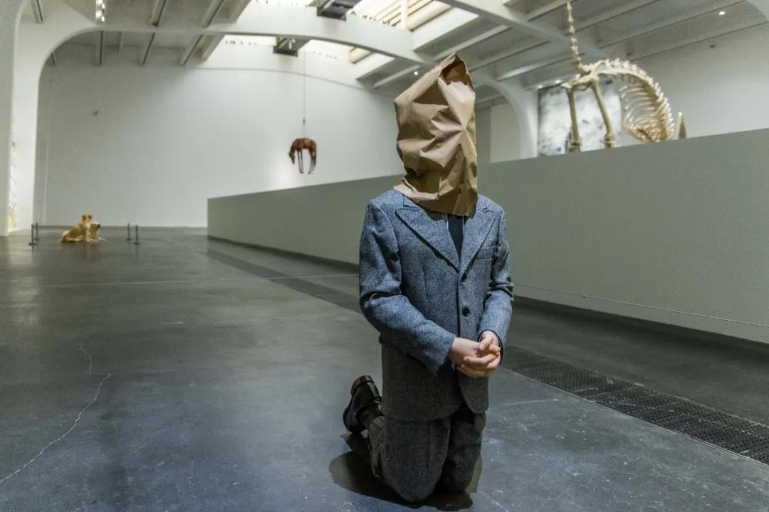
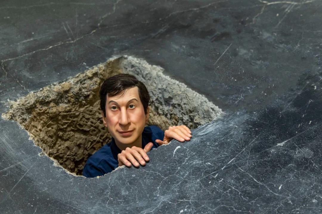
Maurizio Cattelan, No (2021), 101×41×43cm, Silicone rubber, natural hair, clothes, boots, paper bag. Image courtesy UCCA Center for Contemporary Art.
No (2021) is another new project where a figure kneeling on the ground with a paper bag shows that humans really don’t know anything about the definition of fate. While visitors may have some fun with Cattelan’s silly nature, they can also expect daunting and more solemn pieces from his newer art.
Maurizio Cattelan, Untitled(2001), 60×85.5×47cm, Stainless Steel, Wood, electric motors, lights, bells, mechanical components. Image courtesy UCCA Center for Contemporary Art.
During a press conference at the exhibition, curator Francesco Bonami summed up the legacy of Cattelan rather well. Bonami mentioned that Cattelan is, of course, an artist but also a prankster, a communicator, and a provocateur. “He does not care about discussing gender, race, nationality, but combines its complexity including fear, happiness, desire, failure, and success to pay attention to each individual”, Bonami stated.
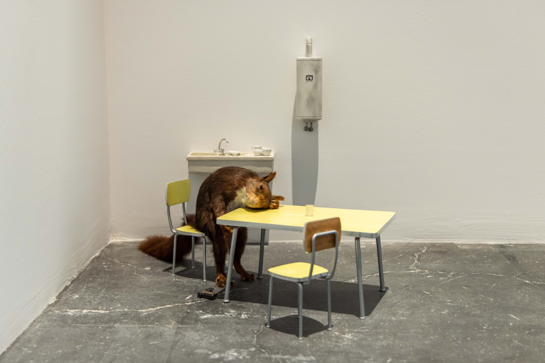
Maurizio Cattelan, Bidibidobidiboo (1996), Squirrel specimen, ceramic, fumei mesa, wood, paint, steel, Image courtesy UCCA Center for Contemporary Art.
Both existing fans of Maurizio Cattelan and new people just discovering his work are in for a treat in the Beijing area. The exhibition is based on Cattelan’s life and his experience as an artist. With 29 works of art, both new and old, the exhibit sums up the provocative philosophy of Cattelan over decades.
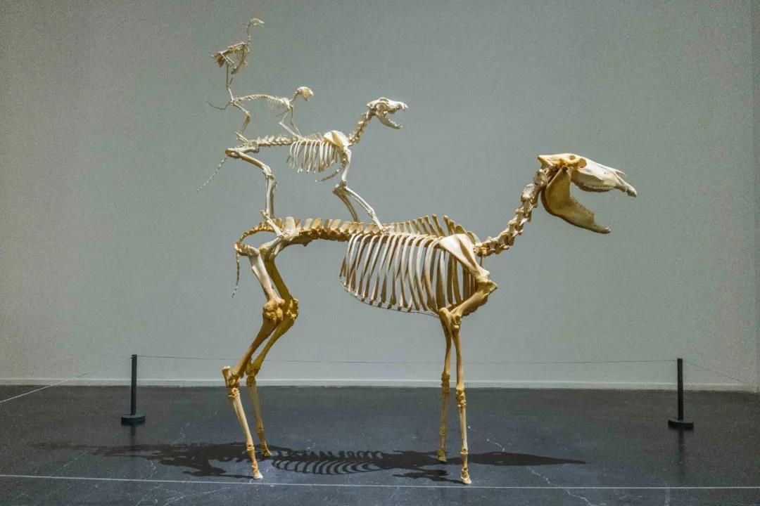
Maurizio Cattelan, Eternal Love (1997), 186×120×60cm Donkey skeleton, Dog skeleton, Cat skeleton, Rooster skeleton. Image courtesy UCCA Center for Contemporary Art.
The Italian-born artist is always known for causing stirrups in the world of art. Over the last three decades, Maurizio Cattelan challenged the way that we view art and institutions. He reminds us to question the rules in place and think for ourselves. After all, our creative freedom is one of the most powerful tools that any artist can have.
-End-
-

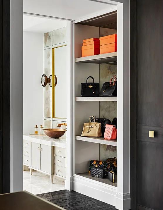
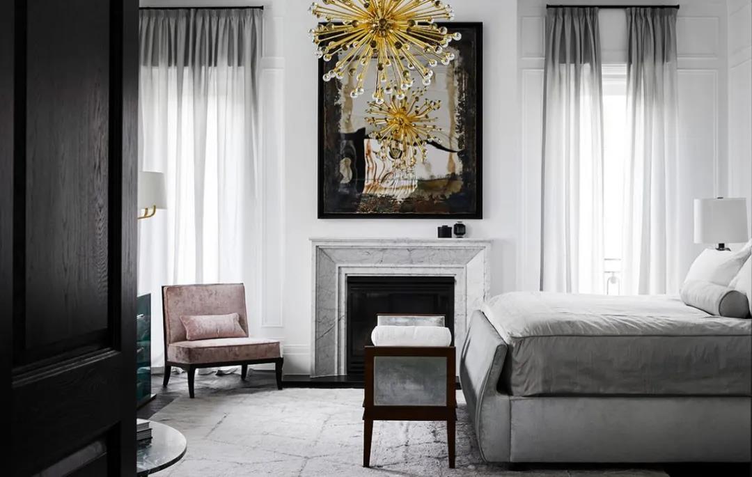
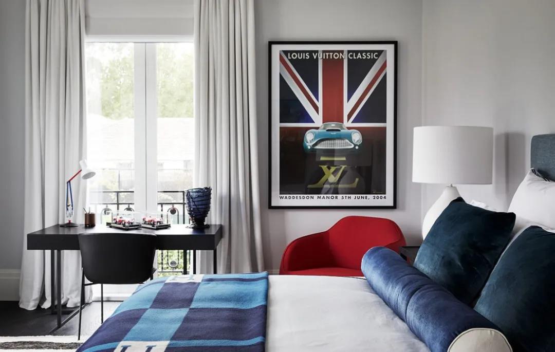
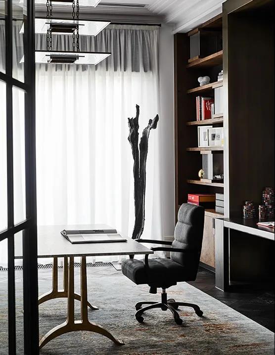
Dylan Farrell Design
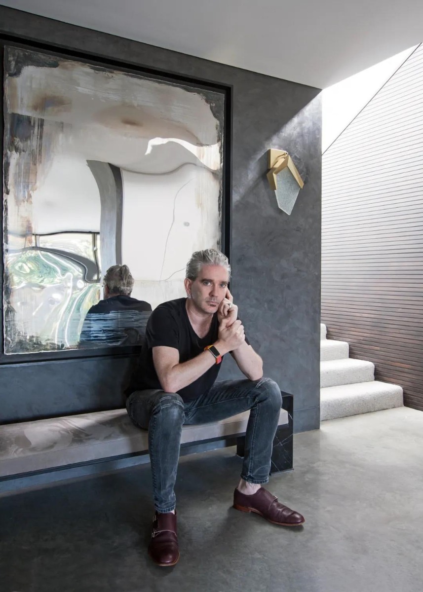
Dylan Farrell Design is a professional studio dedicated to interior design, furniture design and architecture, located in Paddington, Sydney, Australia, founded by Dylan Farrell in 2016. The studio's goal is to create a one-of-a-kind style for each client, always believing that each client has a unique creative "fingerprint", and this personality has embodied the expression of innovation and imagination in each completed project.
-01-
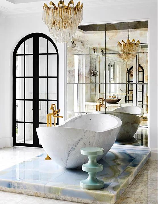
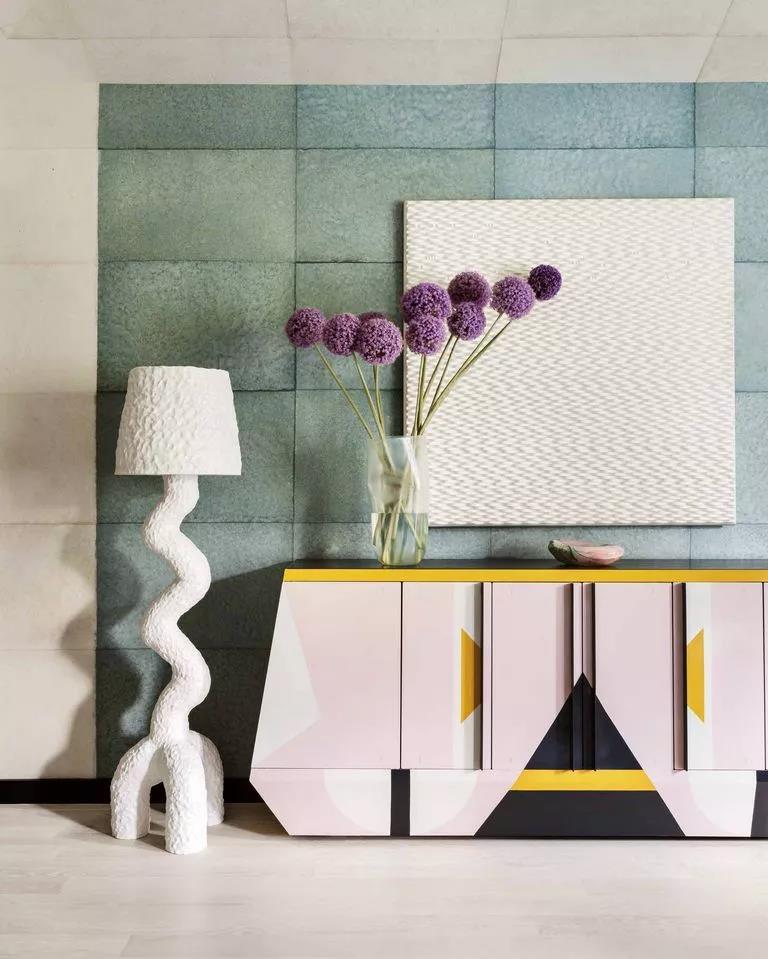
JUNIPER HOUSE"I believe that design style is like enjoying food, I don't want to eat pasta every day, I don't want to go without vegetables, and while I'm a vegetarian, I'm not going to give up meat entirely." - Dylan Farrell
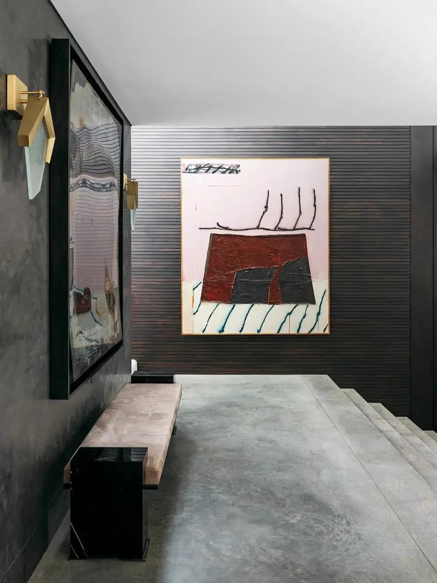
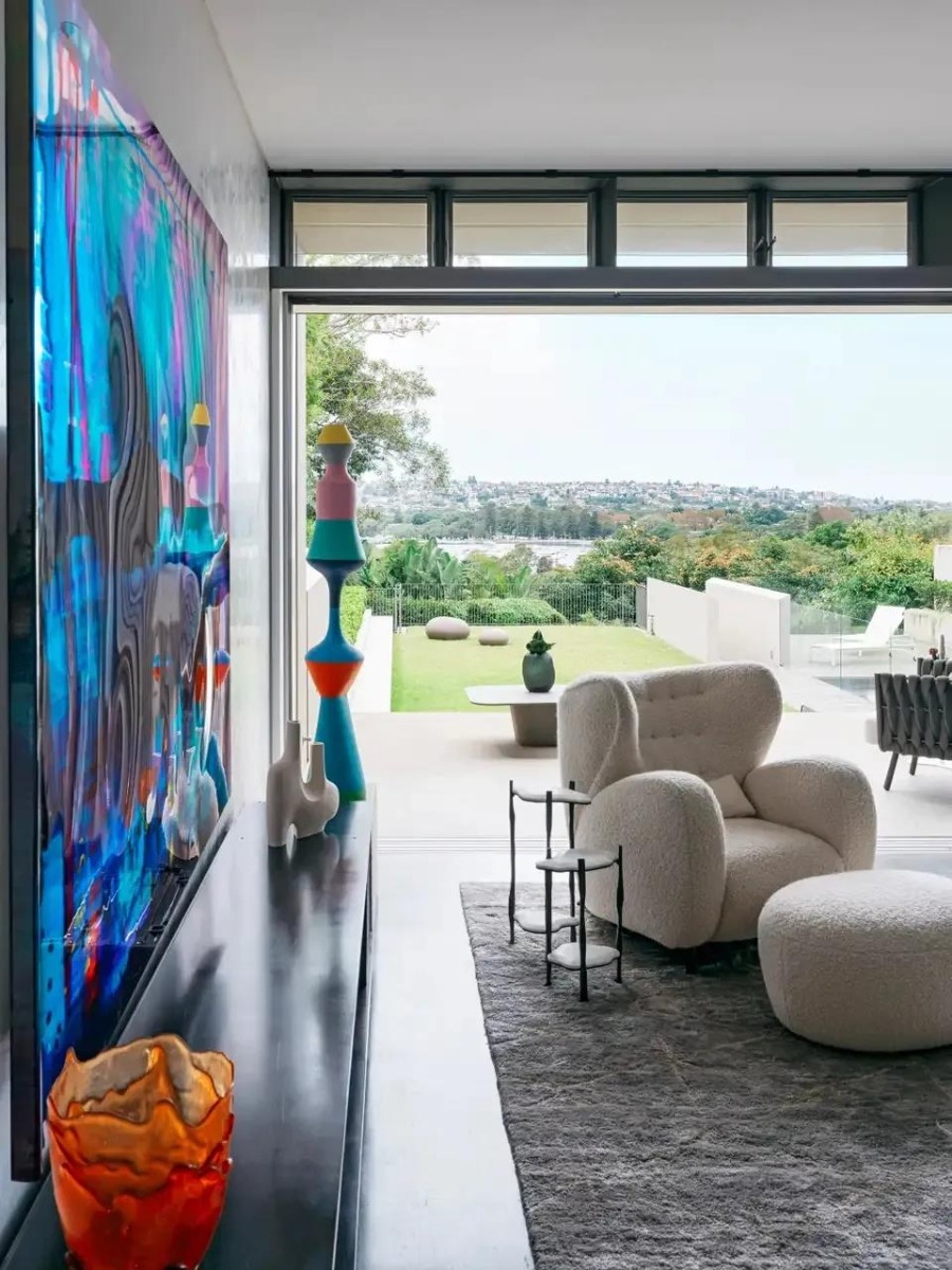
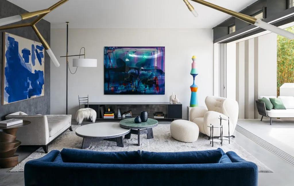
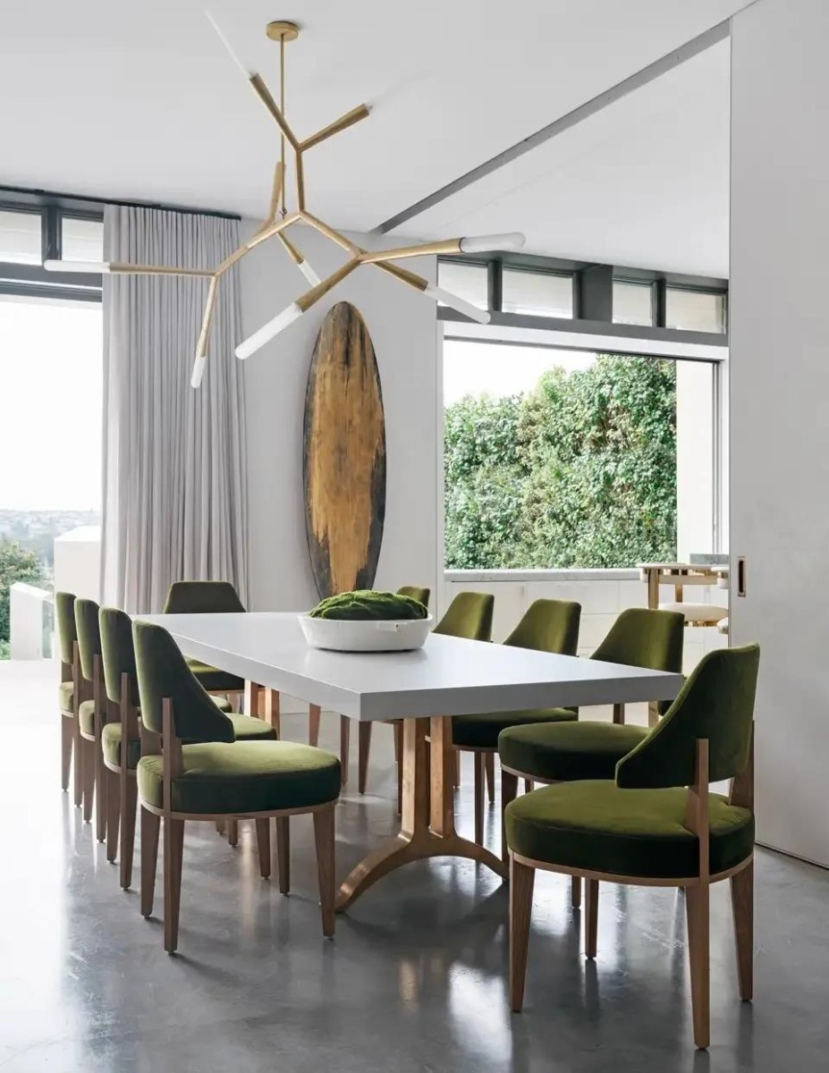
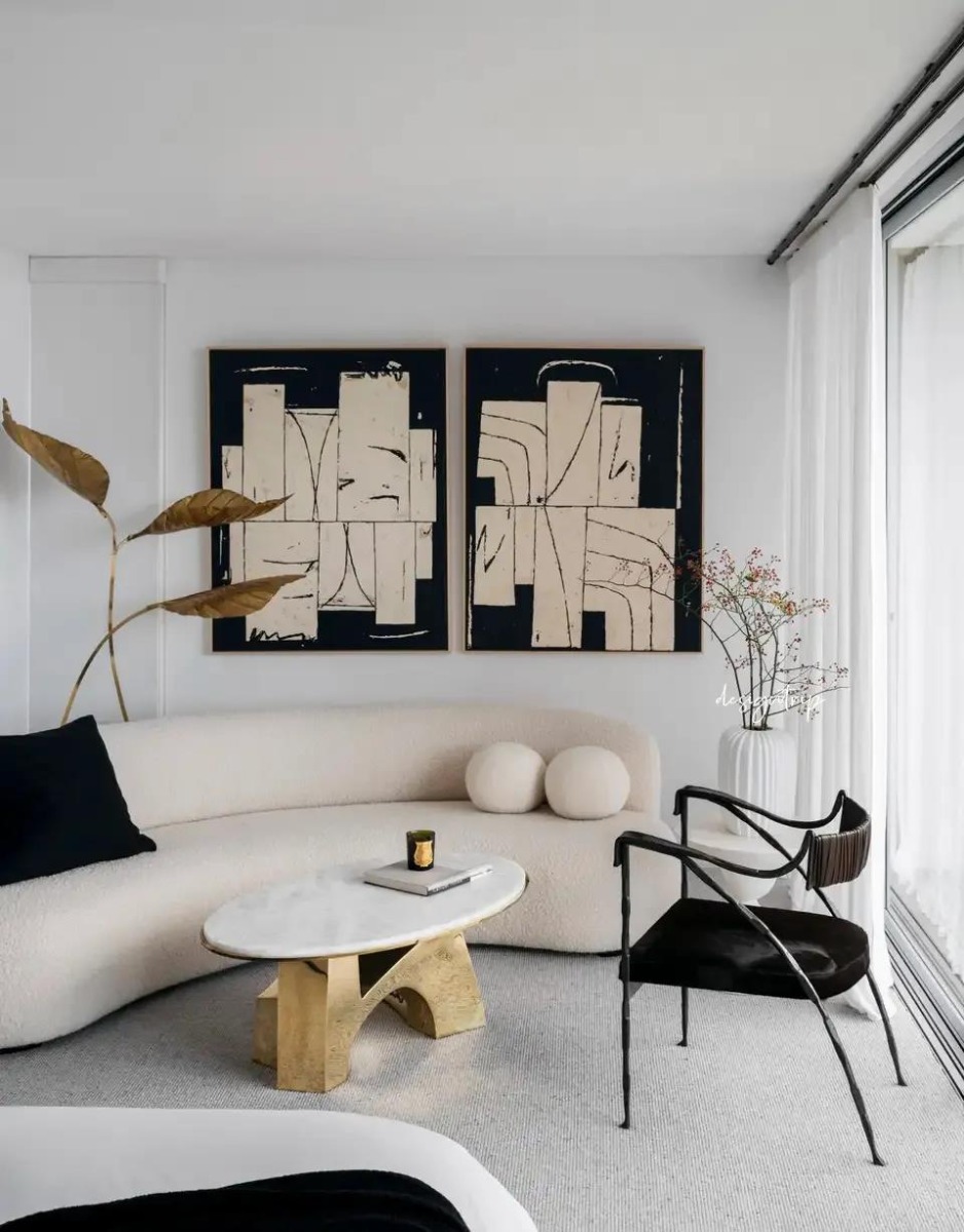
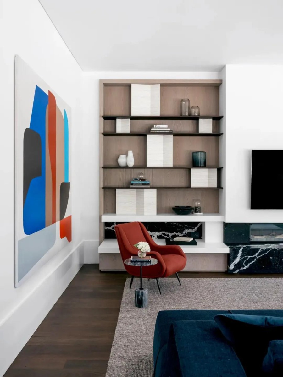
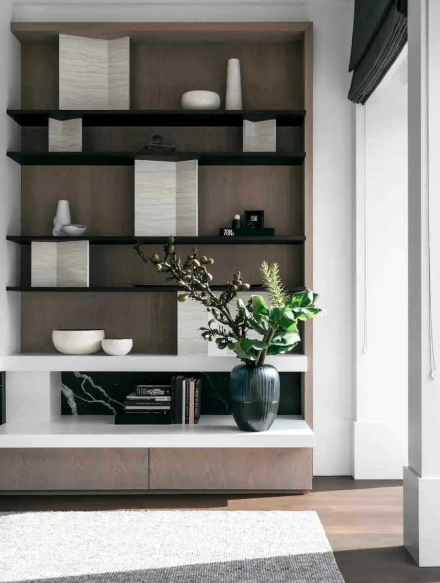
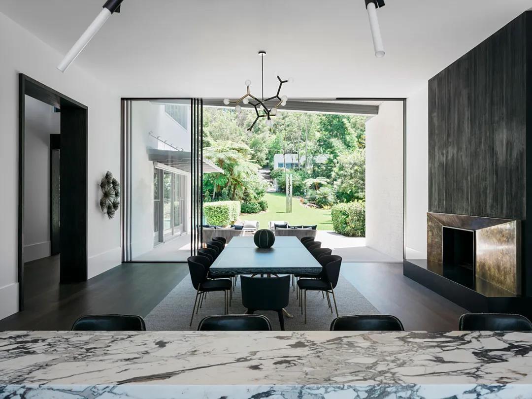
Juniper House is a seven-bedroom Australian House located on Sydney's waterfront with exquisite views of nature. The interior decoration of the house has been cleverly stripped and reshaped by Dylan Farrell, arousing rich and bold color resonance, and finally presenting a brand-new look of a home by feat of the perceptual inspiration of ecological nature.
The sculpture in the sitting room is showy but not incongruous, instead, forming a delightful contrast with a hanging picture in nave blue. The handmade orange artwork shows soft but touching power like water through its textures and curves. Warm natural light pours into the house, which makes the texture of the plush seats stand out. Through the bright French windows, the sight of the panoramic view of the charming landscape, and you can feel the dramatic changes that water and sky are of one hue.
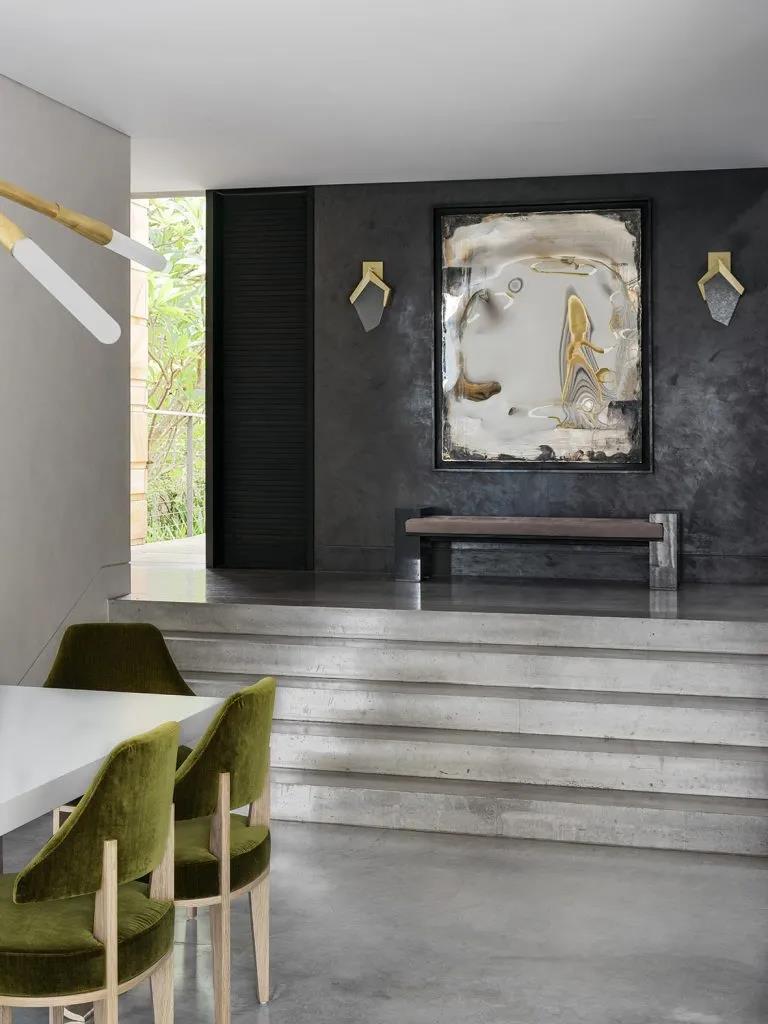
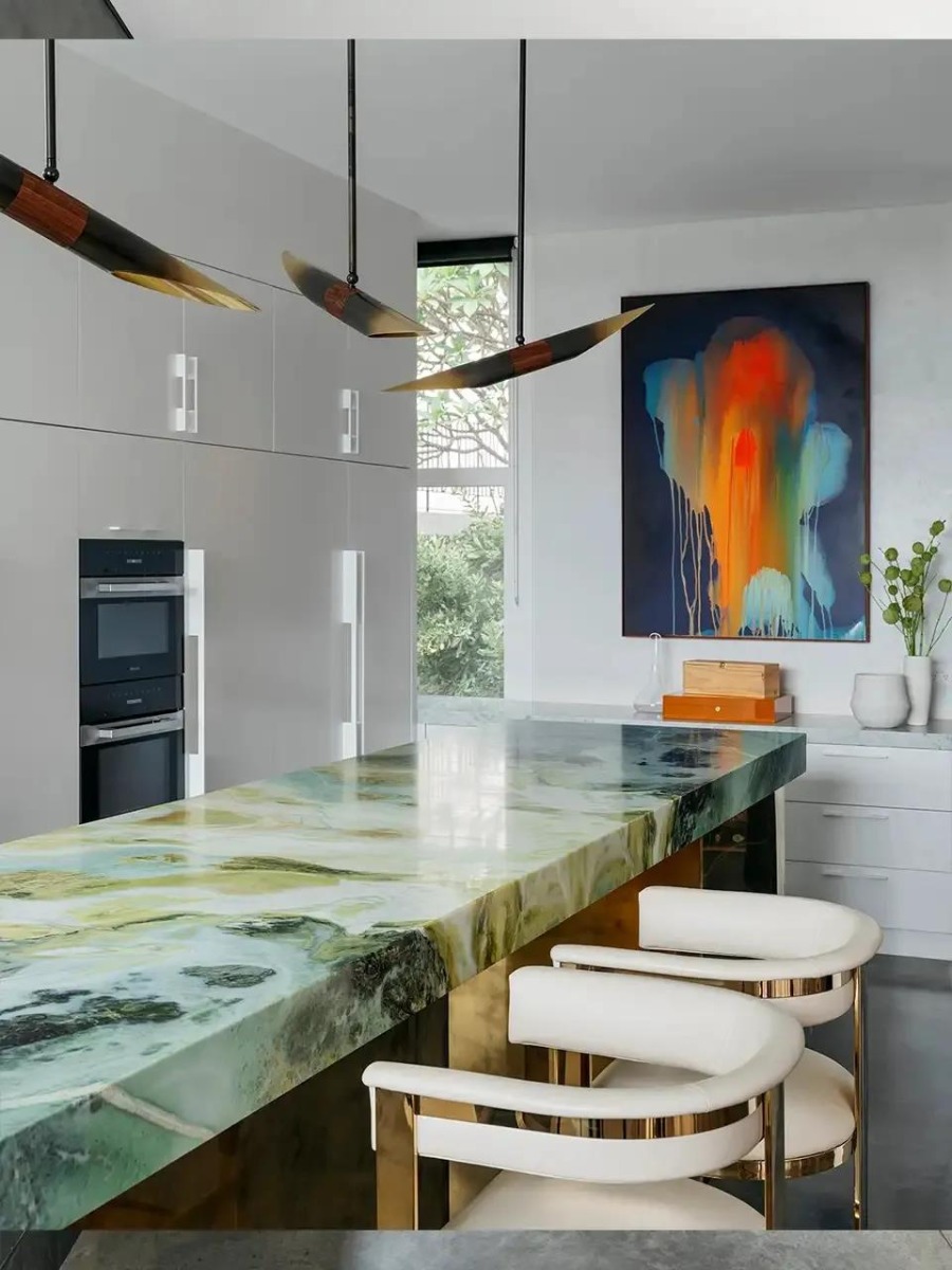
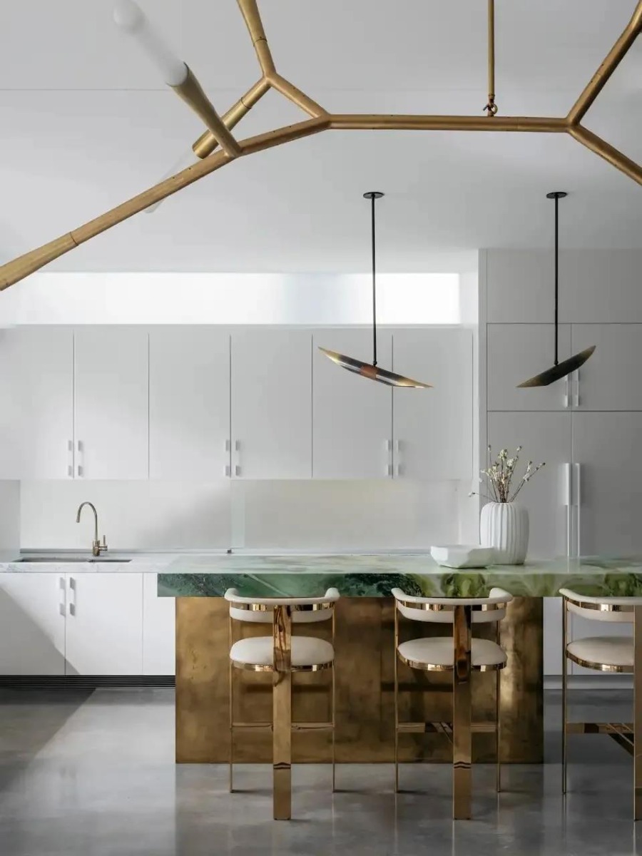
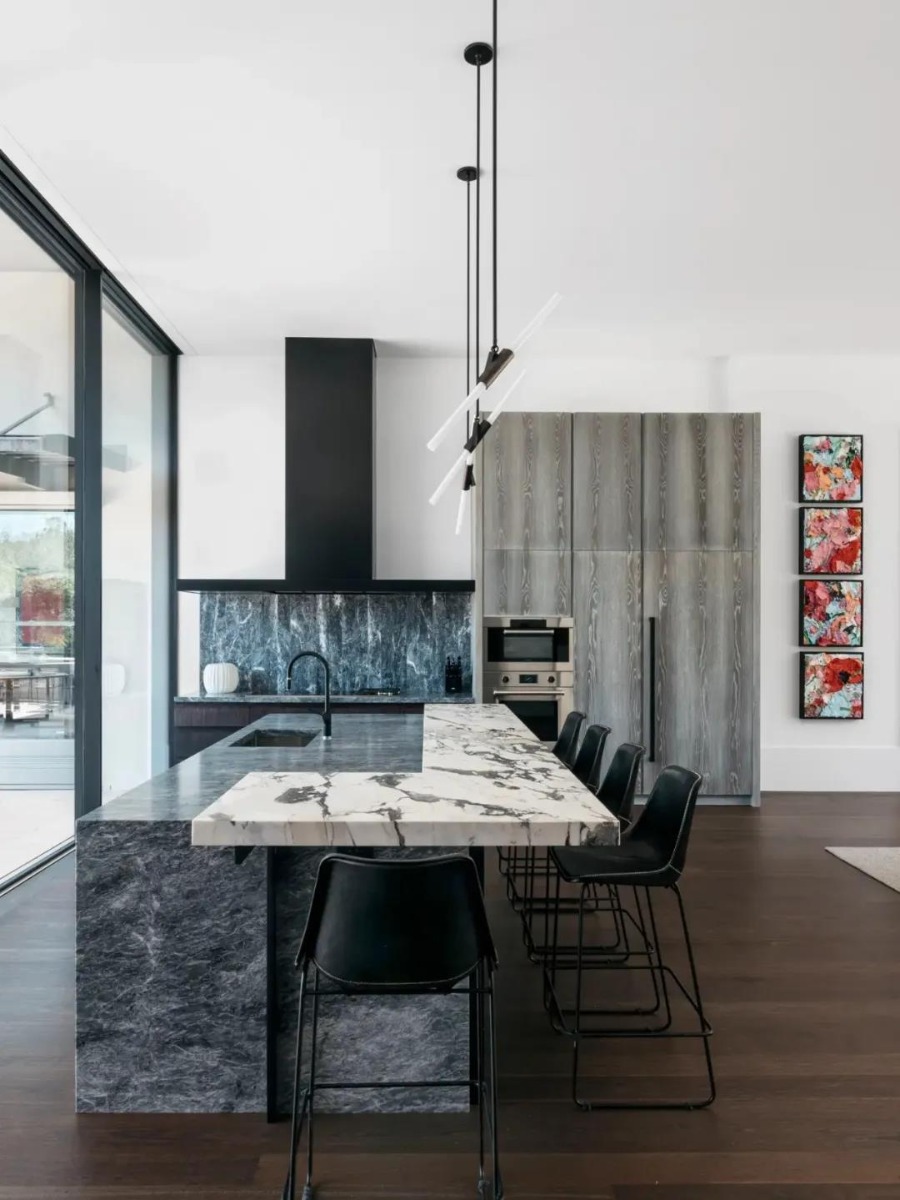
The main color of the dining area and kitchen is light green, which is full of natural atmosphere. The designers use artworks with different characteristics in the room to add playful elements to the space. The wall decoration paintings in the dining room are matched with hand-chiseled and burned brass, which provide a perfect foil for the marble table on the side.
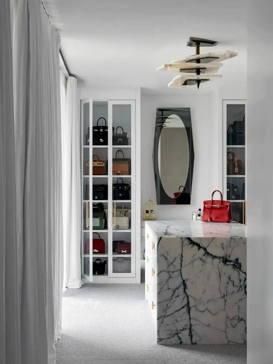
Elegant white curtains join the bedroom and cloakroom together. People who stay there will be intoxicated in the space that enriches visual translucency and enjoy the cozy and leisurely atmosphere. In Juniper House, Dylan Farrell can make people feel that the area is full of vitality, can stimulate people's endless imagination and enthusiasm for life. His works are diverting and vivid, expressing captivating visual poetry and rustic personality.
-02-
CONTEMPORARY PERCH
"Our work has a contemporary sense of consciousness and classical binding, while we pay great attention to line proportion, textural detail, spatial rhythm and the interaction of light and air. The close connection of all elements makes our design full of elegance and attitude." - Dylan Farrell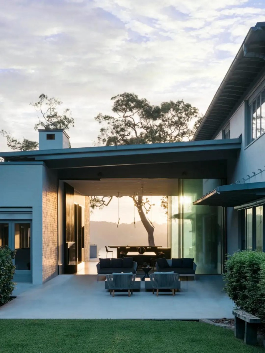
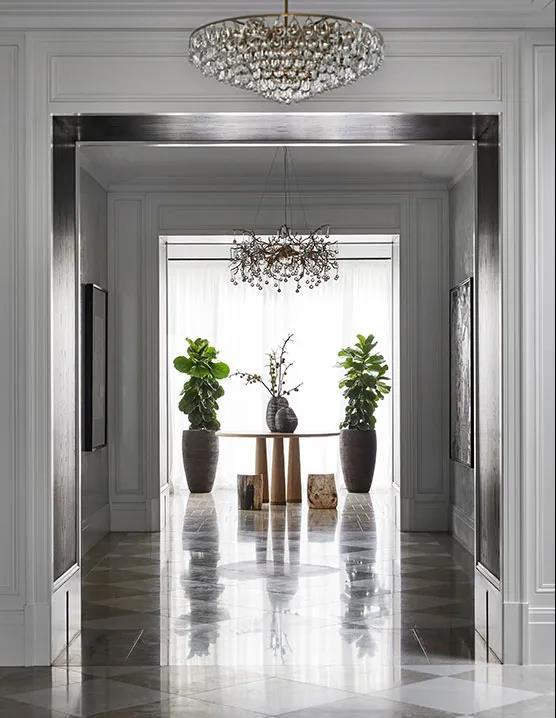
Contemporary Perch stands at a compelling Perch. This beautiful beach house boasts lush gardens and unique harbor views overlooking Sydney's waterfront with stunning views of the rising and setting tides. Dylan Farrell Design has infused the sentiments of nature and the city to create this charming poetic villa.
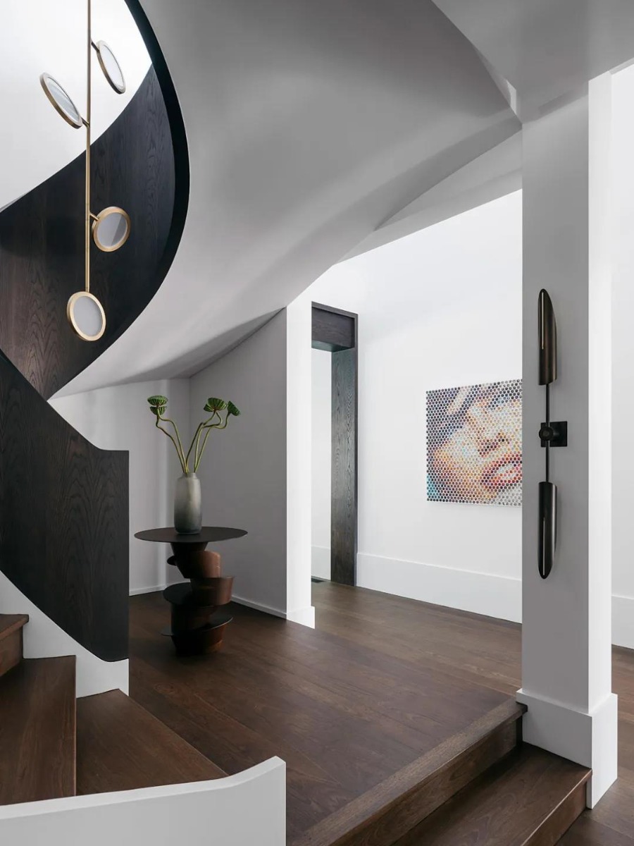
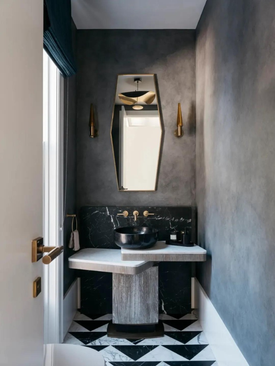
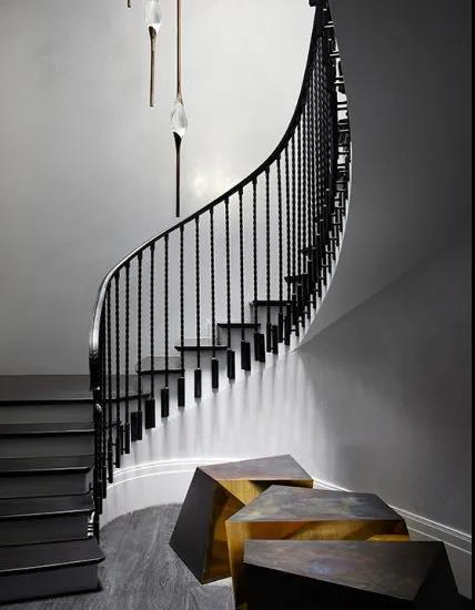
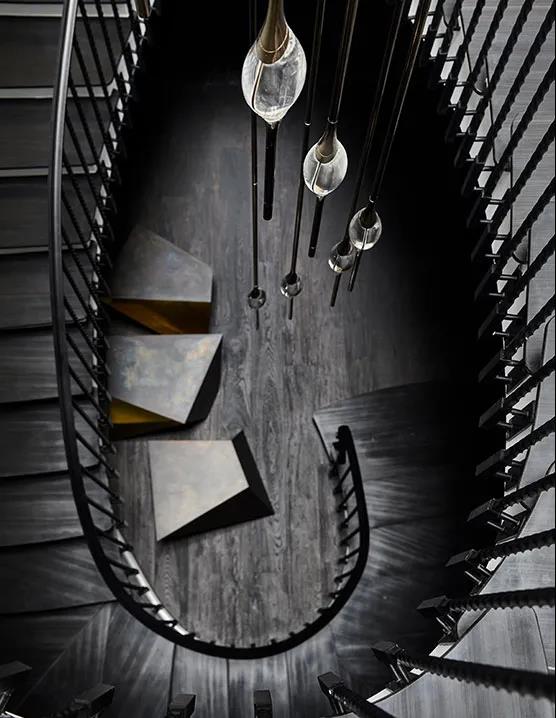
Clean and advanced building lines and the spiral staircase drive a close dialogue between the artworks, revealing their characteristic materiality and drama by sharing the same dark and light.

When entering the villa, the tranquility, comfortable feeling and rich artistic atmosphere come to you. The walnut floor and white wall also show the modern minimalist atmosphere and style.
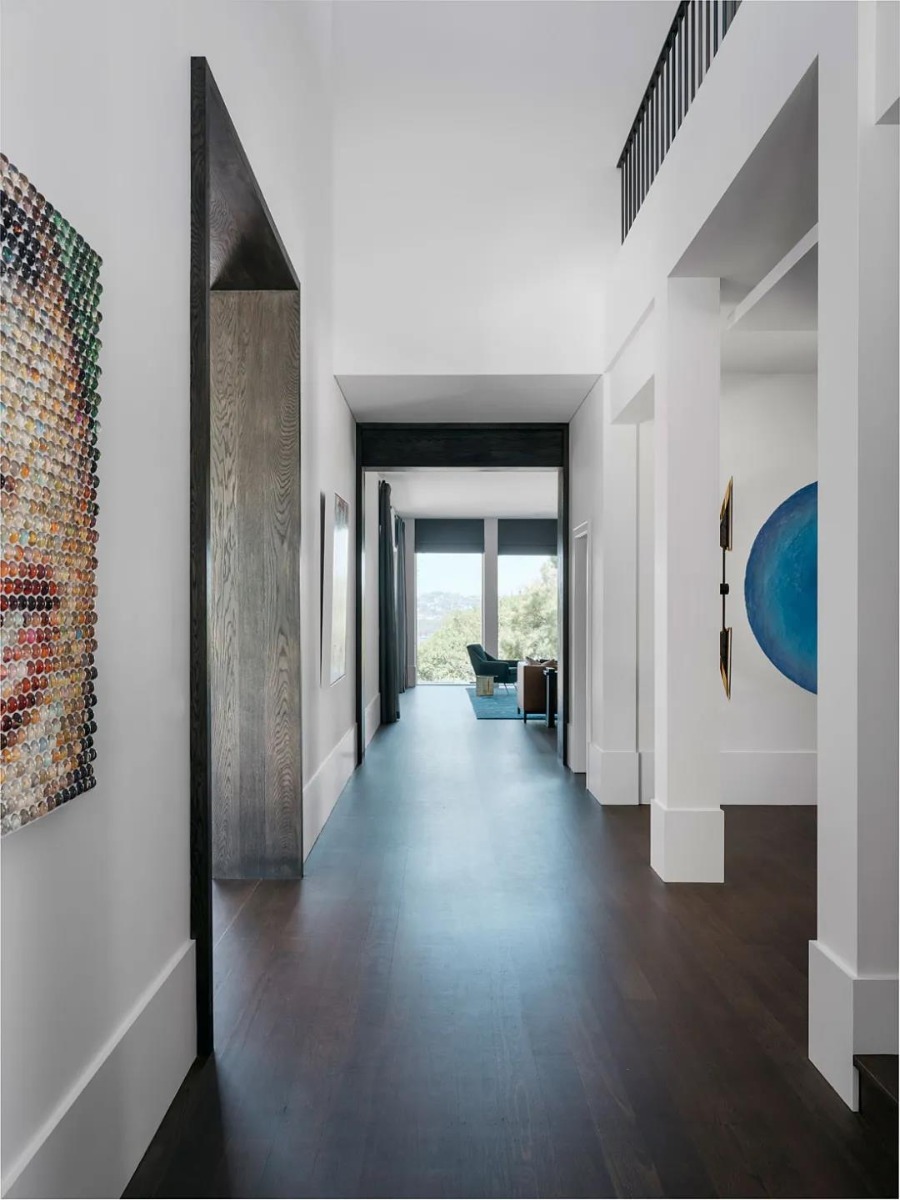
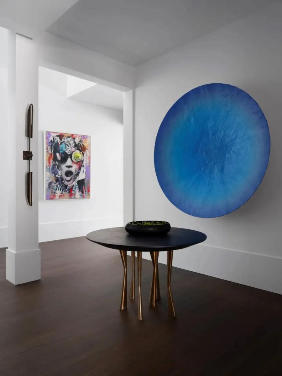
Saturated colors and bold textures are written against a white background, linking the space to the whimsical landscape beyond the building's walls. A series of crystal glass doors offer expansive views of the landscape, which include vast landscape that flows towards mountain streams and the coast.
The selection of tonal and furniture conforms to the harmonious scenery of indoor and outdoor, and all the furnishings in the house give consideration to both functionality and artistry. Every artistic style here is released freely in the space.

The kitchen and dining room are located in the same room, and the neutral and calm colors give people a comfortable and cozy feeling. The stone table has exquisite texture, and the concise color matching shows the minimalist tone in the space. The whole area is immersed in a delicate and quite aesthetic atmosphere.
A close dialogue between the dining room and the natural landscape is established through the transparent and bright floor-to-ceiling windows, while the lacquered fireplace walls, which recall the presence of wood in the soil, clash deliciously with the handmade polished and dappled brass fireplace doors.
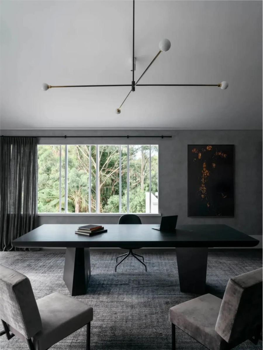
The low saturation space of the study makes the senior feeling from the inside, showing a deep and majestic charm of spirit, combined with the pleasant seascape outside the window, to create a natural aesthetic sense without modification.
The bedroom ceiling is carved in a microwave shape, and the homeowner to appreciate the building's raw beauty on a majestic and intimate level from the curved top. Dylan Farrell Design creates a perfect residence with art, beauty and life through a minimalist and restrained approach. The overall effect is clearly layered, expressing the studio's yearning for a beautiful poetic life and unique insights.
-03-
ALCHEMY HOUSEThe aim is not to impose a single style on the client. It's about making design more intuitive, more dynamic, and more personal." - Dylan Farrell
Alchemy House is a new Australian family home reminiscent of stately, turn-of-the-century Victorian houses, but with a stylistic twist. Dylan Farrell Design combines the neo-classical details of Paris and the eclecticism of contemporary New York with the glamour of Hollywood's golden age through a high-class approach to create a dramatic light luxurious and elegant mansion.
Bold colors and dramatic curves are the key components of this staircase, macro and subtle, illusory and realistic details are having meticulous expression below the harmony of designers.
The designers created an elegant and comfortable atmosphere between the lines and finishes of the corridor, finding a delicate balance in the open space. Abstract thinking is used in the design to create a sophisticated, stylish and layered interior space through the subtle combination of classical and modern.
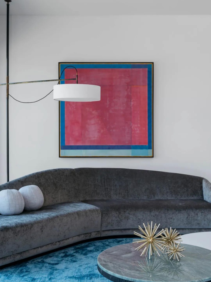
The living room is full of saturated color and artistic inspiration, metal chandeliers and irregular tea table legs with high-quality retro texture, colorful suede sofa and elephant paintings add dreamy and elegant color to the space.
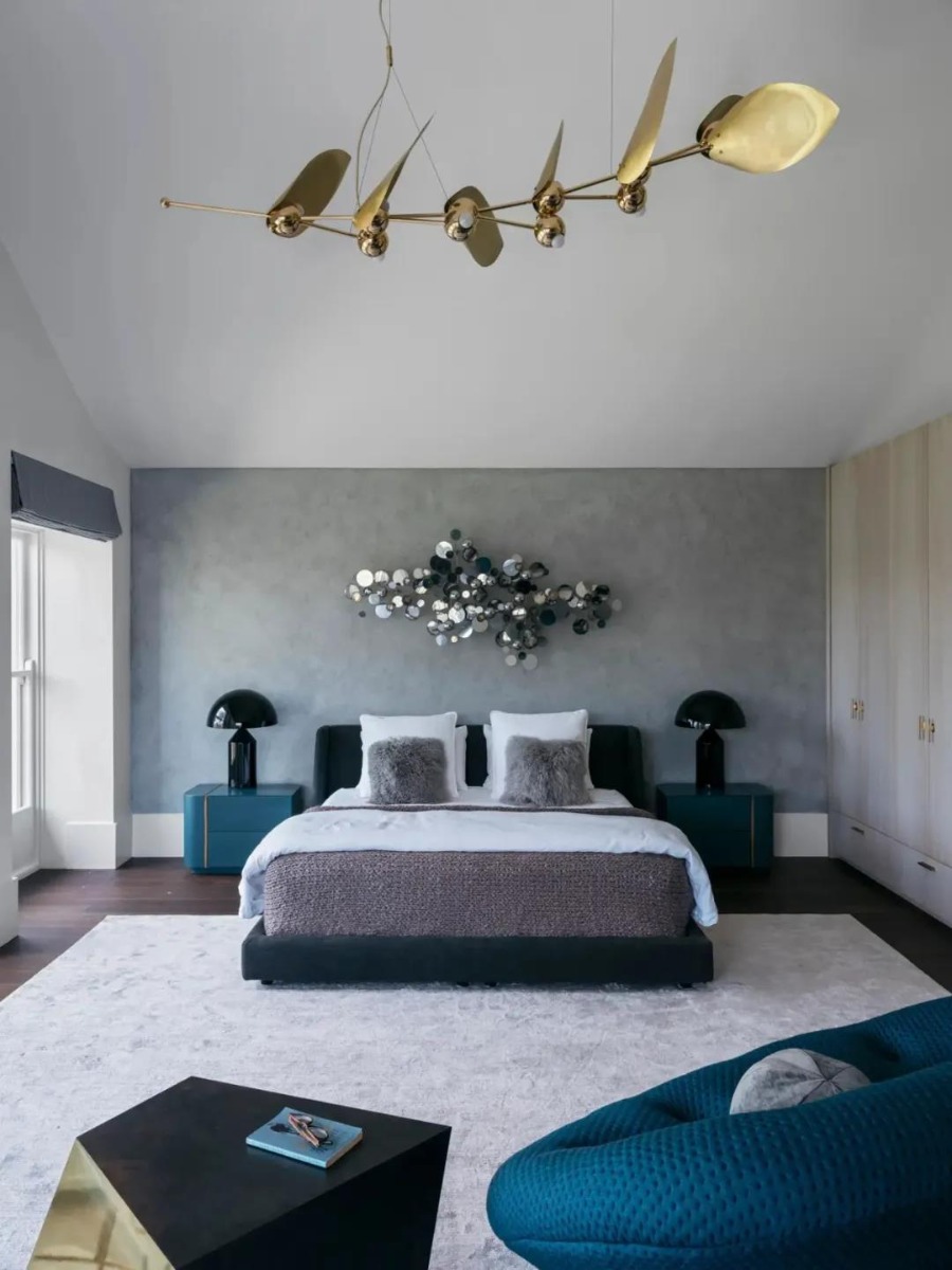
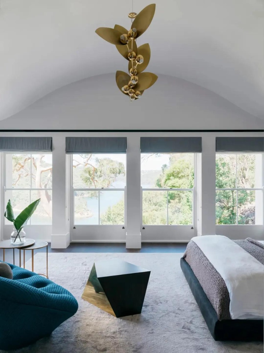
The master bedroom has a spacious layout, and the large picture window absorbs natural scenery. The fireplace restoring ancient ways highlights the classic, beautiful charm. The boundary with a clear streamline feeling appears elegant and has style, noble and luxuriant simple sense is sent by inside.
The design of the second bedroom presents a modern and dazzle living vibe. Comfortable living space and work reading area are also set in the bedroom. The room is full of dignity, and the unique space texture gives residents a unique living experience.
The study's design is full of detail. Neuter match color and solemn display show the lasting appeal that gives calm and composed again, and bright light neutralized the spirit charm of dark elegant, diffuse the breath of comfortable and leisurely come.
In this dramatic mansion, Dylan Farrell explores the interest of life and the meaning of living, using classical, contemporary, cultural and architectural languages to create a sense of art and timelessness through the dual communication of material and consciousness.
Dylan Farrell believes that a home is inclusive, and good design also needs to be inclusive. It should not be limited to a certain style. In modern life, everyone has his own unique personality, and eclecticism is the theme of contemporary life.
All images via Dylan Farrell Design
-End-
-
Image via Unsplash
At SOA Arts, we not only sell artwork for interior design spaces, but we want to help inspire you to create as well.
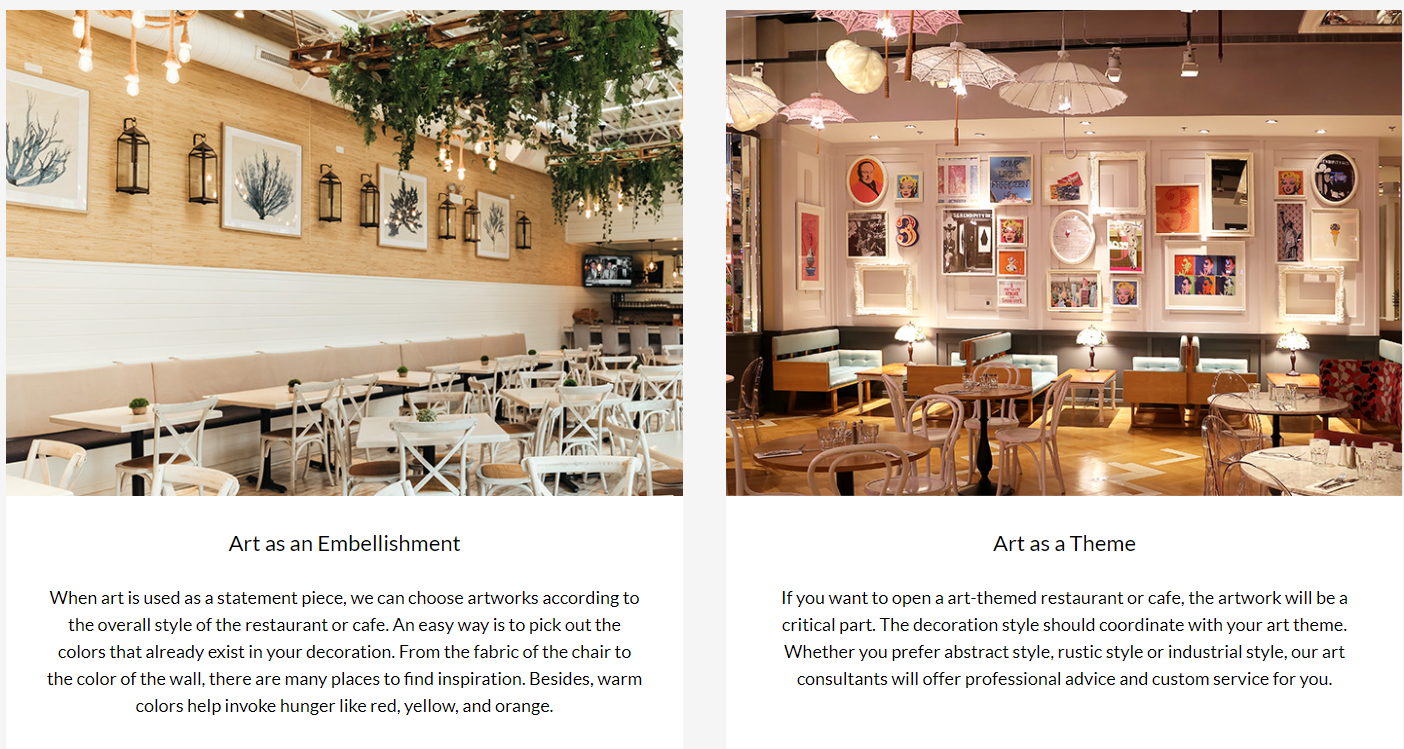
The interior design world is vast and there are many spaces to design. It can be challenging to start from scratch, and taking inspiration from others is a great way to craft your own ideas. From hotels to home offices and everything in between, there are designers who created immaculate spaces. Let’s look at 5 interior designers and their work in different areas.
01
Interior Design Ideas for Hotels
Peter Pichler
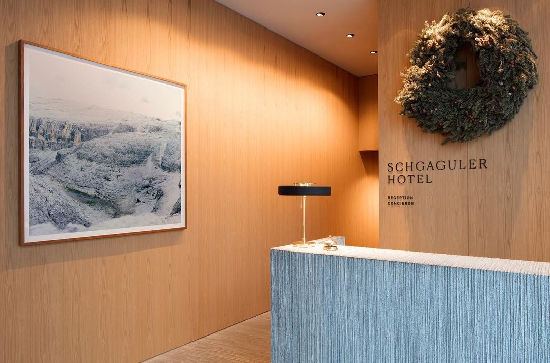
Instagram imge:Schgaguler Hotel
Located in Southern Italy, the 42-room Hotel Schgagular is a minimalist’s dream. With sleek, modern and urban accents and a grayscale backdrop, anyone can feel relaxed here. This is designer Peter Pichler’s first hotel, and the entire design gives a calming sensation to visitors. Everything is designed simply with sustainability in mind. Minimalism is great for hotels to not cause any distraction to visitors and immerse themselves in relaxation and calm color schemes.02
Interior Design Ideas for Restaurant
Karen Herold
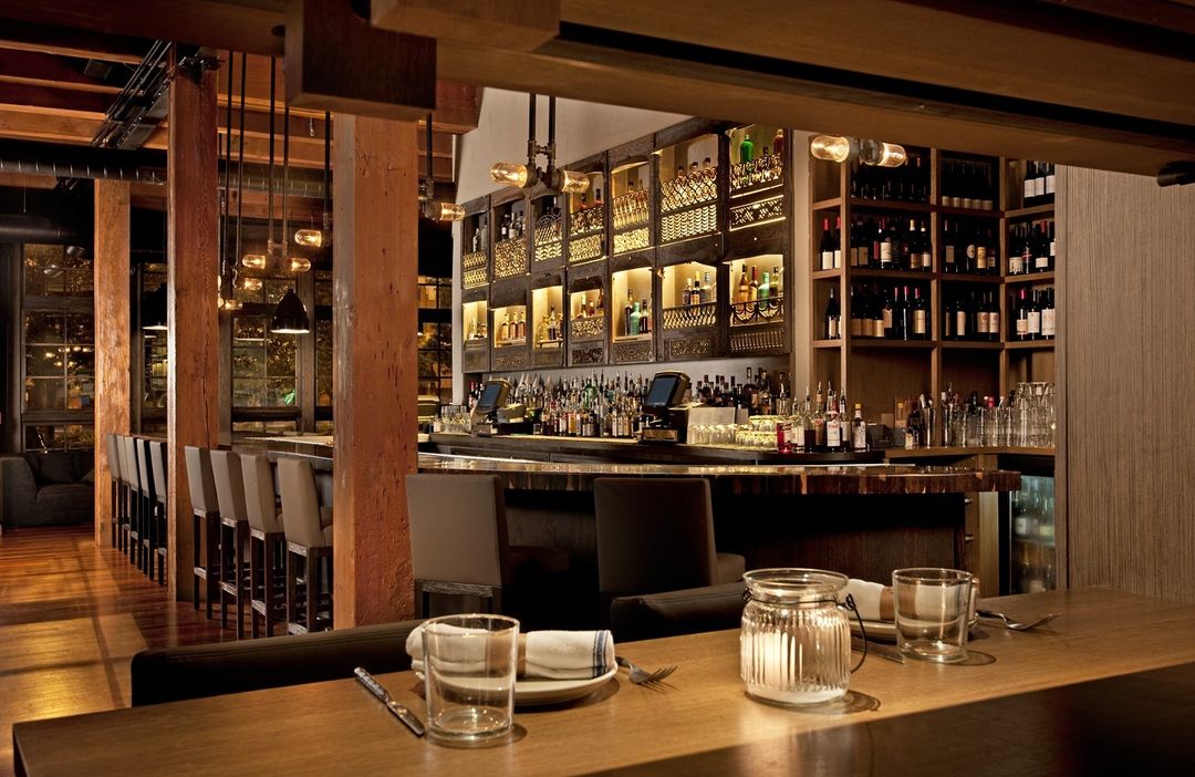
Instagram image: Girl & The Goat
Even if the food is fantastic, the style and décor of a restaurant can make or break the experience. In 2010, Girl & The Goat, one of Chicago’s hottest restaurants opened. Not only is it known for the food created by Top Chef winner Stephanie Izard, the space is known for having incredible ambiance. Izard told the Chicago Tribune the area was “rustic with a bit of badass,” which is all thanks to Karen Herold. In an interview with the Eater, Herold states that her philosophy is “that a dining room should feel like an extension of the chef and her cooking style.”
She currently owns her own firm, Studio K and has worked on some of Chicago’s most stylish restaurants, such as Maple & Ash. The spaces have a modern and classy feel with rustic features making them the perfect setting for a night out in Chicago.
03
Interior Design Ideas for House/Villa
David Jameson
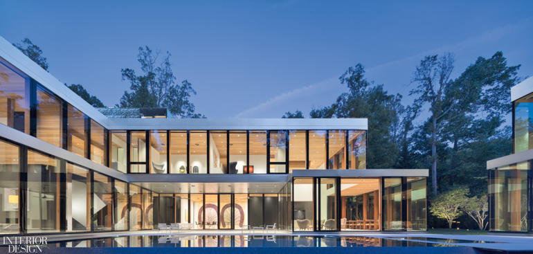
Image via interiordesign.net
Architect David Jameson created the “Vapor House” in Bethesda Maryland. He got the idea after a tree fell on his home. This design goes to show that sometimes recreating the memory isn’t as important as making a new one. Jameson used his memories to create a beautiful modern home that can be an inspiration to other designers. The house has floor-to-ceiling windows and stainless steel on the outside. Everything on the house is custom and has a modern but nostalgic feel.
04
Interior Design Ideas for Home Office
Jessie Carrier and Mara Miller
Image via carrier and company
Jessie Carrier and Mara Miller are not just one designer but a duo. They are husband and wife and work together to create beautiful interior designs. They specialize in home décor and have been known to create incredible office spaces. With more people working from home today, you’ve got to get creative with your home office space. These two are all about repurposing things you already have to make a space feel new, such as turning a dining room into a home office.
05
Interior Design Ideas for Exhibition
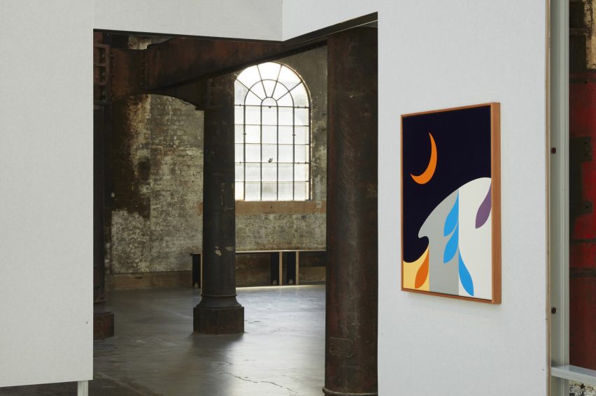
Image via dezeen
Exhibition spaces can be challenging to create. You are starting from scratch, typically in an empty warehouse or other vacant space and have to use your vision to get you there. In Australia, architecture studio Youssofzay + Hart has created an exhibition space using repurposed materials from hardware stores, going back to using repurposing as a design technique. An exhibition space needs to be equipped to hold several artists, so it comes top to keep the room neutral while also stylish.
The hardware store pieces are used to separate areas into neutral-looking rooms that artists can fill with their work. It matters for the space not to be too distracting to take away from the art itself. This setup is great inspiration for other designers who need to create an exhibition space.
Conclusion
To sum it up, there are many interior designers doing incredible things with spaces in and out of the home. If you’re stumped, you can always look to other designers for inspiration for your own designs. A key theme seen in modern interior design is repurposing other items into a new design, such as for a home office. You may be turning a dining room into an office, but if you look at the room creatively, you just may find you have all the tools you need right there.
At SOA Arts, we provide artwork to aid interior designers in their projects. You can check out the rest of our website for inspiration for your next design project in any space. If you have further questions, please feel free to contact us through our website, as well.
-End-
-

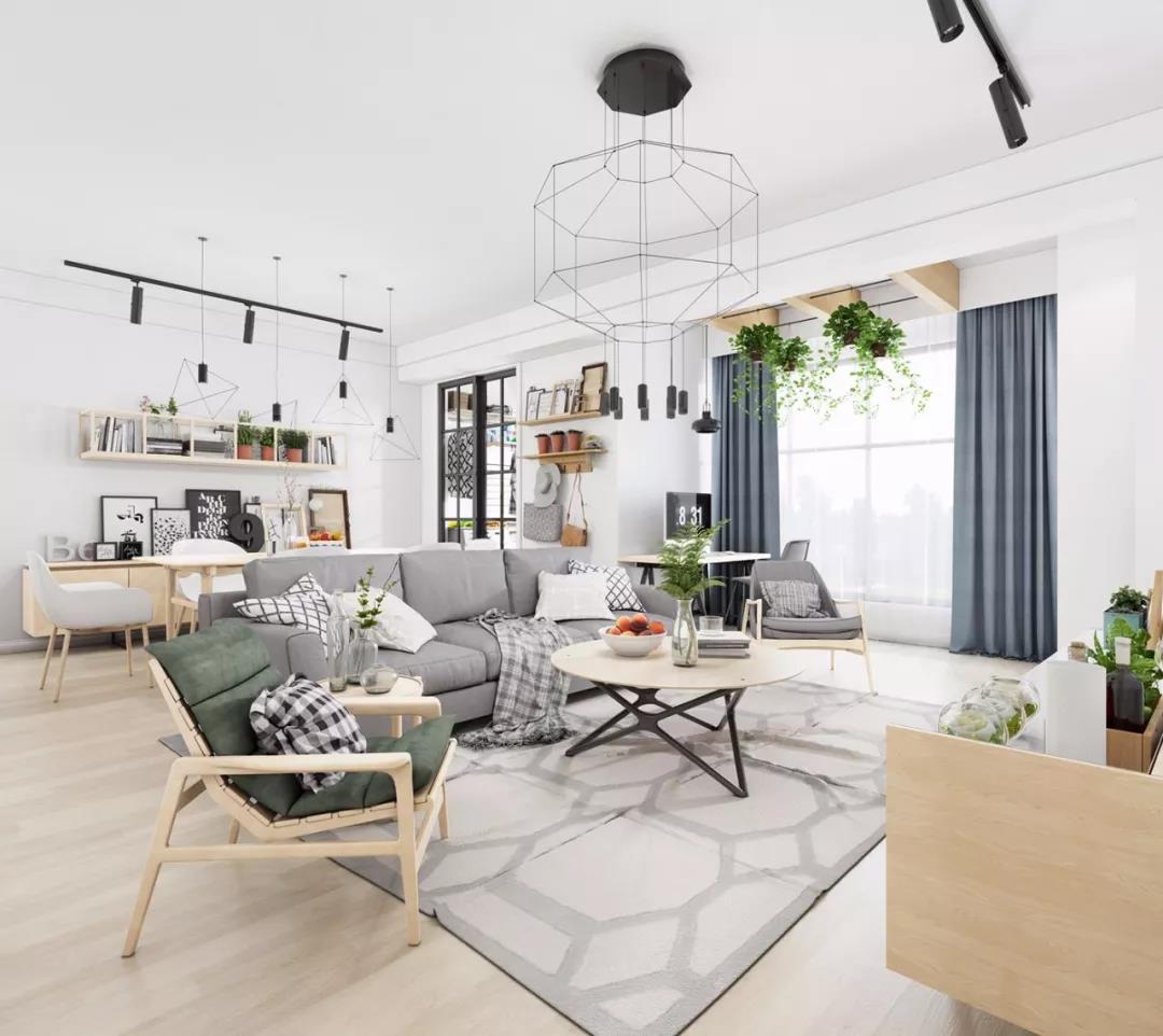
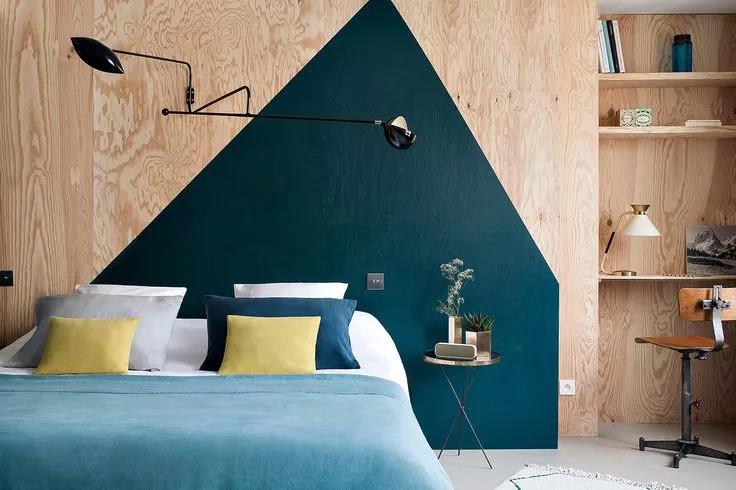
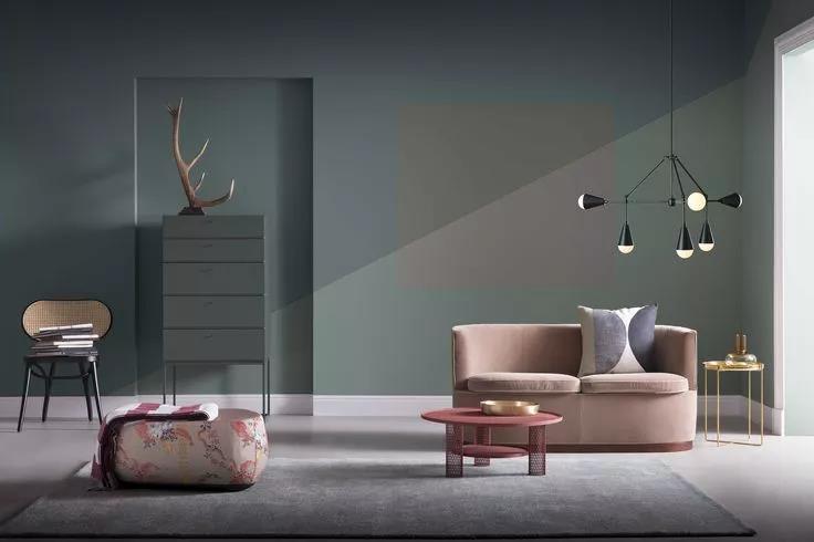
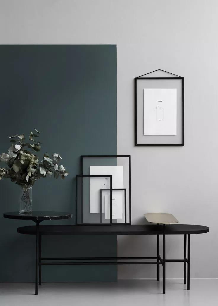
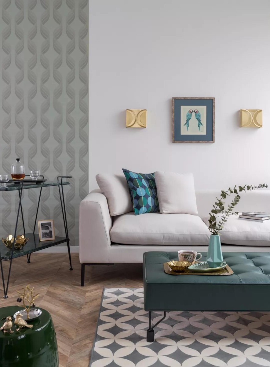
On this page, we’ll explore interior design ideas for living room spaces and much more. We’ll be harnessing the power of geometric shapes to create rooms with impact. We’ve curated a list of simple, attractive ideas that you can use in your own spaces.
Finding interior design ideas for home spaces can be tricky if you don’t know where to start. The suggestions below are designed to spark your creativity and get you thinking like a true designer! Read on to learn more.
Interior Design Ideas 2021
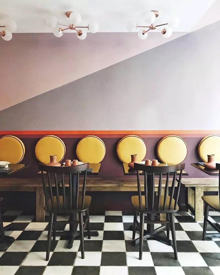
London restaurant Little Kolkata designed by Meddhi Larouci.
Geometric elements in clothing, architecture, visual, interior and other design fields play an unmatchable role. It can extend space and condense corners. Lines, triangles, circles, squares, polygons, and irregularities form a mysterious and interesting world.We recommend using these ideas as ‘jumping off’ points. If you think something else might work better for your home, don’t hesitate to give it a go! Right, let’s get into it!
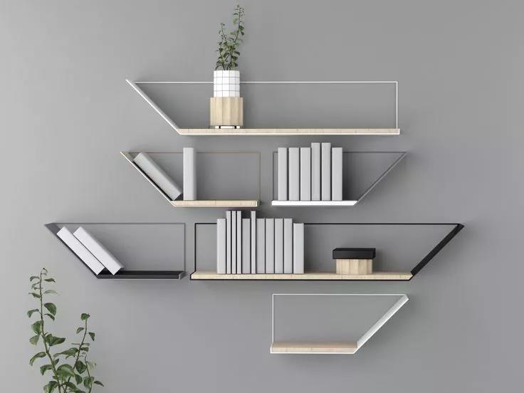
01
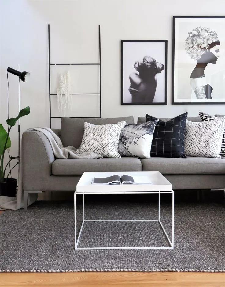
Geometric Patterns in Furniture
Designer Kelly Wellesley uses a corner bookcase in her West Hollywood home.
The shapes, lines, and patterns you feature in your interiors can have a huge impact on how they feel. Check out the image above. Notice the linework in both the lamp and lower cupboard. They immediately catch the eye and create a striking image.
The use of repeating, rectangular tiles on the wall behind is also worth noting. Pay attention to how they match the square artwork that’s hanging in the room. Interior design ideas for living room spaces don’t get much better than this!
02Striking Geometric Modern Artworks
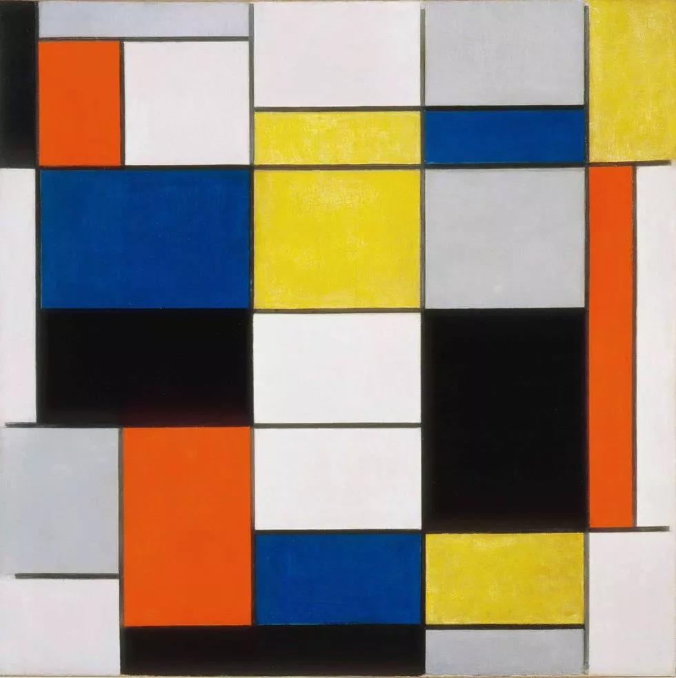
DE STIJL, 1917 Style school
A movement that began in the Netherlands as a reaction to the Art Deco boom, based on geometric shapes and primary colors.
If you’re using geometric shapes as a theme in your interior design, the modern art era is packed full to the brim with fantastic pieces that could compliment your other choices. Take the image above, for example.
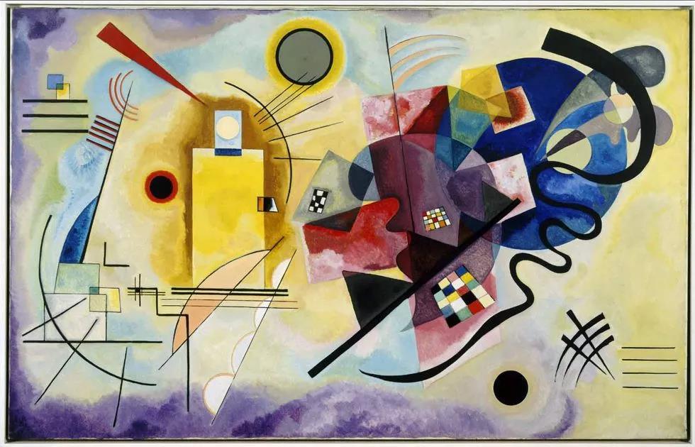
These bold, tessellating shapes will look right at home among the rest of your geometric paradise. If you’ve got the budget, you could search for an original near you. Looking for prints or specially commissioned work? We may be able to help.
03
Harmony in Disharmony with Geometric Decor
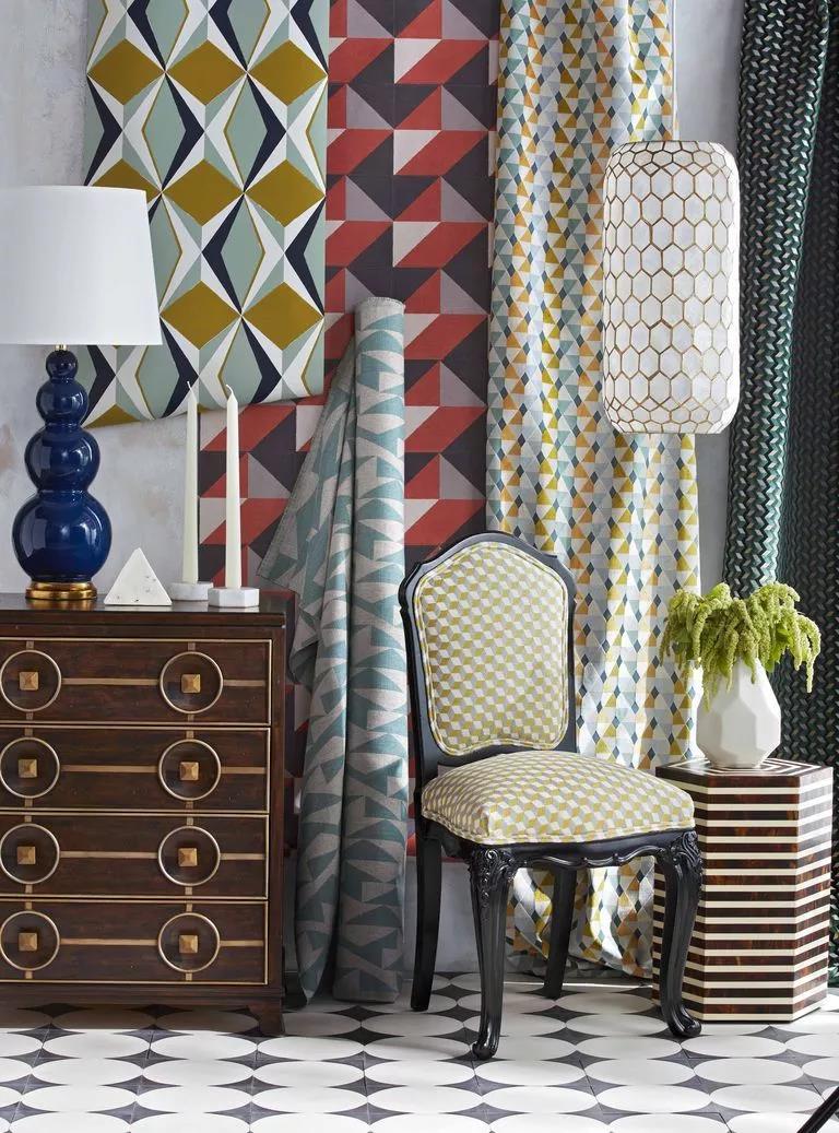
From Tony textiles to floor tiles with delicate surfaces, today's modern geodesign brings bold graphic styles.
Wallpaper: Pierre Frey, Arte. Fabrics: Madeaux, Romo, osbourne & little, Cowtan&Tout.
Capiz shell pendant from Serena&Lily; Hexagonal table from Worlds Away.
When first starting out in the world of interior design, most people learn to keep things simple. The lesson is often to avoid clashing patterns and colors wherever possible. However, when your theme is geometric shapes, you may have more room to experiment.
Take the image above, for instance. When viewed in isolation, the patterns, colors, and shapes in this room could be considered as ‘clashing’. However, their use of bold geometry and repeated shapes mean that the whole room simply sings!
They’re unified by their bold use of repeated shapes.
04Geometric Shapes and Patterns in Background Wall
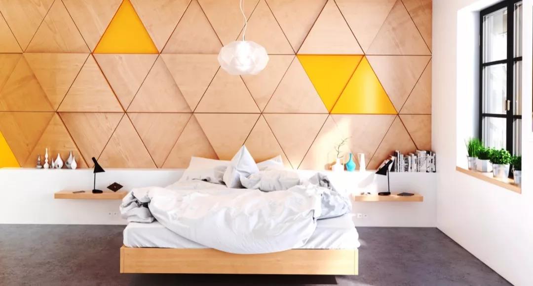
Different geometric shapes and forms are used on the wall with bold colors so that the whole space is full of style. Combining polygon color blocks of different shades can create a naked-eye 3D three-dimensional effect.
The background wall with geometric elements not only stretches the space, but also embellishes the corners. The extension and repetition of the geometry make the corners so extraordinary.
05
Geometric Decorative Items
Of geometrical shape hang a picture, craft places piece, and small bookshelf is a treasured trick to adorn space. It can be echoed with other Furniture full of lines through lines.
06
Geometric Luminaires
The geometric lamps and lanterns with lines are the ace that builds a dimensional atmosphere. Angular new-style lights and lanterns such as the diamond pendant lamp that hangs upside down, polygon iron art pendant lamp, combination musical instrument pendant lamp and so on, can add eye-feast vision to the space.
07
Carpet with Geometric Shapes and Forms
Carpet is the thing that can reflect chic most in household space, the geometrical element that has tension extremely is united in wedlock integral match color, let dimensional appearance level up.
08Framing Techniques with Geometric Shapes and Forms
The geometric carpet echoes designer Katie Ridder's wall art image in a room.
No matter what approach you’re taking with your interior design ideas in 2021, some of the classic techniques can serve you well. Pay attention to the image above. Note how the stunning wardrobe has been framed by the prints that are hanging along its perimeter.
This immediately draws the viewer’s eye to the statement piece of furniture in the room. Another brilliant touch is the complementary shapes that can be found in both the green carpet and the repeating artwork prints.
Sourcing wholesale art is one of our specialties at SOA Arts. We can help designers, business owners, and individual collectors find the pieces they’re looking for. Check us out.
Final Thoughts
While suggestion pages like this one can certainly be helpful, it’s important to remember that they’re just one piece of the interior design puzzle. Don’t forget to trust your gut too when working.Does it excite you and feel like the right decision? It’s probably worth exploring further. The more avenues you explore, the better your instincts will become. Practice makes perfect after all!
Whenever you’re feeling stuck, SOA Arts are ready and waiting to help. For all your interior design, wholesale art, and art print needs, please don’t hesitate to get in touch.
All images via Google.
-End-
-
 04 Dec
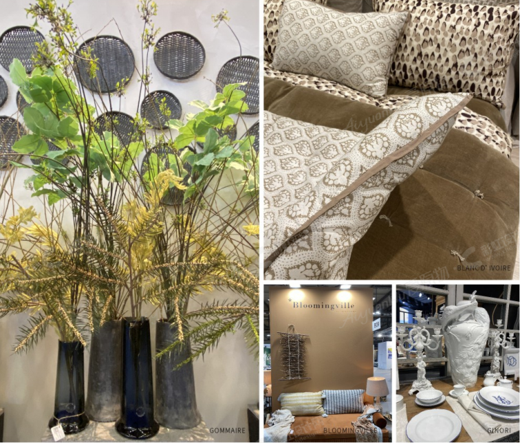
HOMI is a renowned exhibition dedicated to decorative objects, accessories, decorations, tableware, textiles, essences, and perfumes that characterize contemporary living spaces and the latest living scenarios.
HOMI is the home, updated, synonymous with style, and telling of the latest lifestyle trends. Twice a year, it takes place in Milan (Italy) the home of design.
More than a lounge, Maison&Objet is the center of attention of every professional. Design, fashion, home, decoration objects, arts. The fair explores every decorative universe and style: to renew ideas or change them, inspire them, and create your own universe. Natural decoration, creation, design reference, a mosaic of trends, new talents, and new concepts. Maison & Objet offers another look, another atmosphere: an offer of high added value!
MAISON&OBJET Paris was strongly characterized by three thematic areas.
The first is MAISON, which is the house and its wide range of interior decorations, organized in different worlds.The second is OBJET, which focuses on the product: a helpful concept store for retailers is organized every year.
Finally, there are INFLUENCES. As the name suggests, the format focuses on market trends, and the original display form was created to facilitate communication and the discovery of new products.
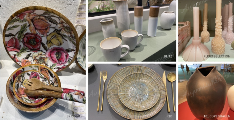
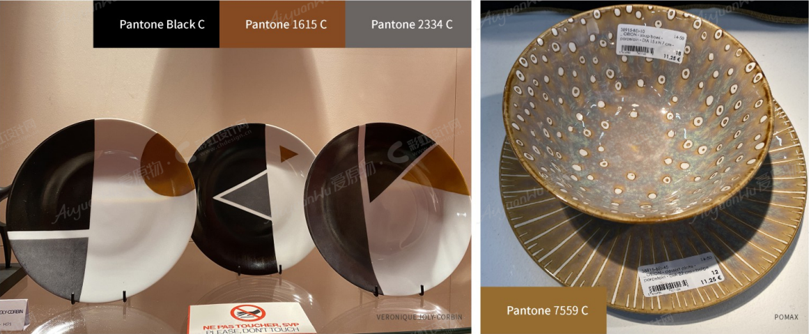
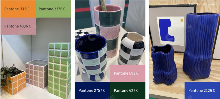
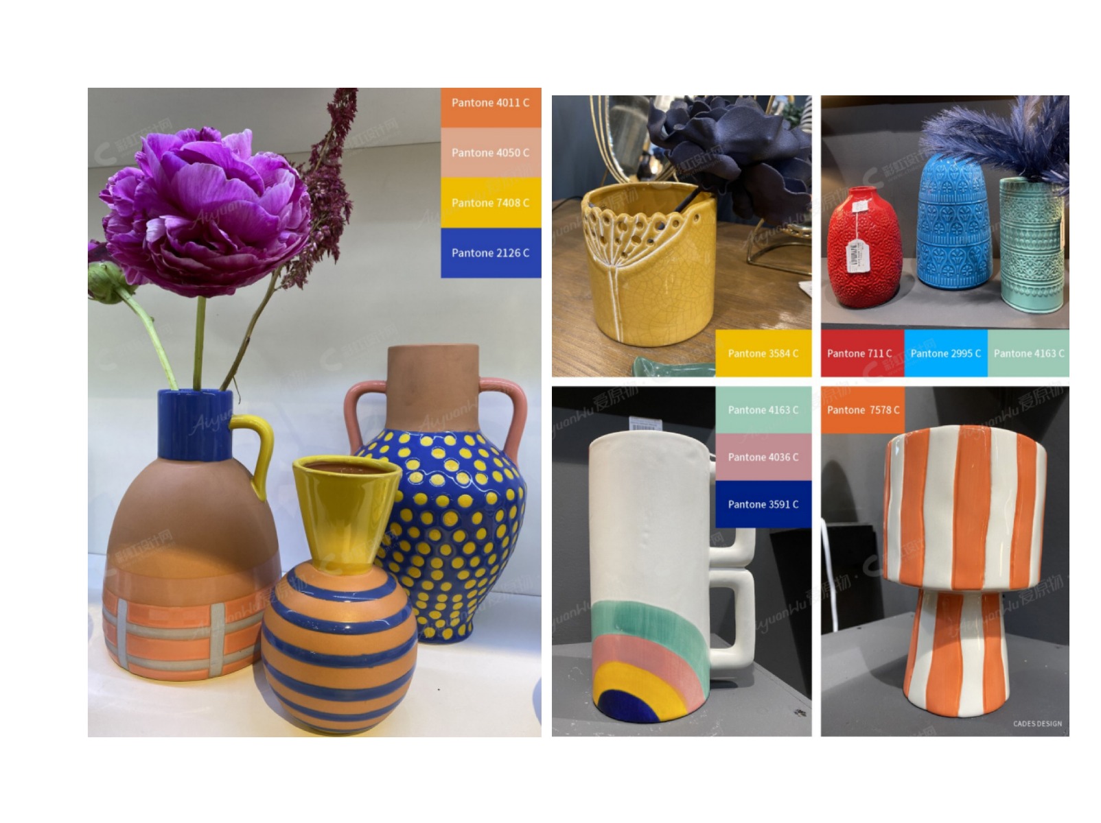
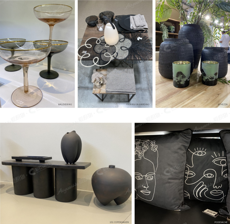
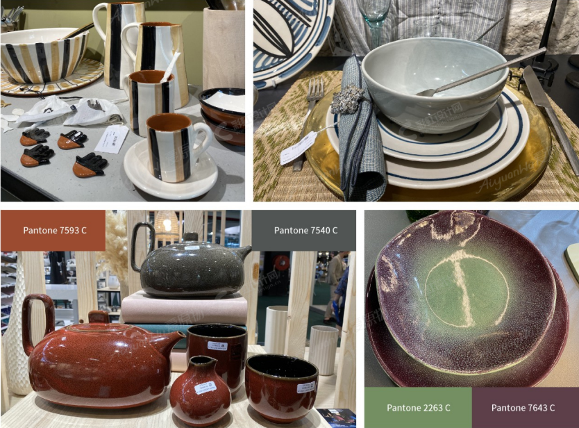
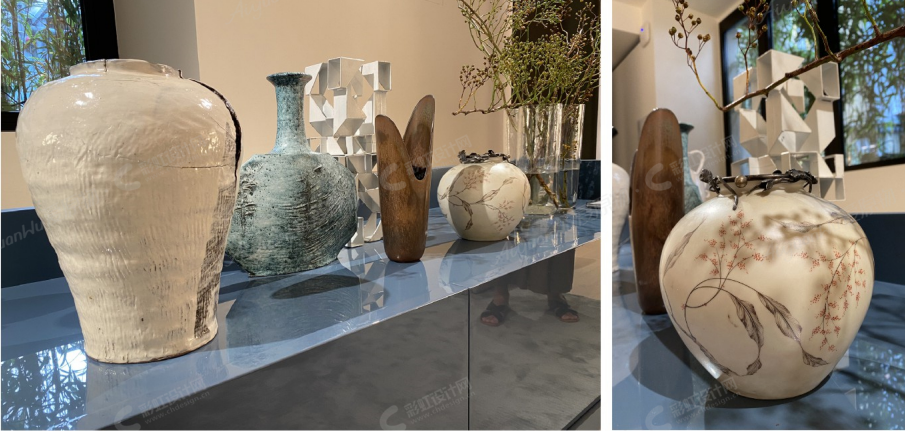
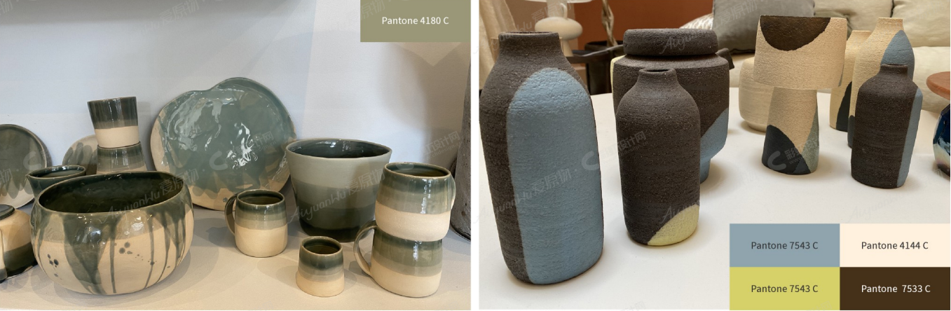
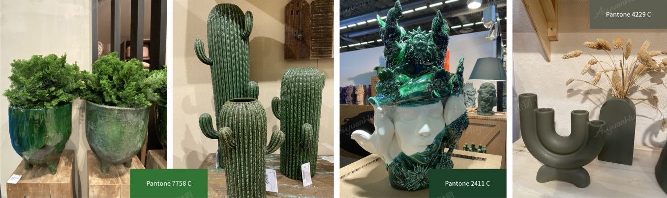
01 Regeneration for Ceramic.
Following the theme of the (re) generation.
Different reflections and creations of a generation determined to change and overturn the codes as much as possible are highlighted.
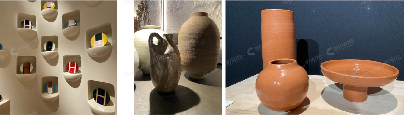
Ceramic jars that reproduce a classic style, the effect of the finishes that imitate the used effect, but written contemporary messages that fit with modern kitchens and all ages of customers.
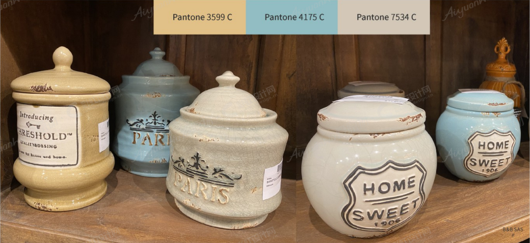
Pastel colors that underlie the idea of past times, simulating vintage products from the granny kitchen.
Hybrid collection: magical paintings for an original and colorful table. The iridescent colored motifs boldly mix traditional decorative elements inspired on one side by the West and on the other by the East.
The contrast of the motifs is accompanied by the contrast of shapes.
The union between past and present, between East and West: an exuberant mix between tradition and modernity!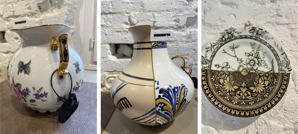
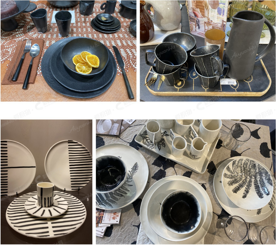
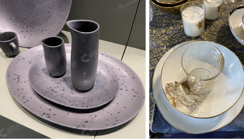
Bone China PORCELAIN
Handcrafted pieces in stoneware with a unique multi-colored glaze. The aesthetics of a decorated dinner table setting are empowered by the cozy harmony of calm colors. Shapes strongly show the handmade identity and are decorated not in a cold industrial way.
Plates with unconventional borders, irregular geometries, more natural effect: at first sight, they give an impression of something made by hand from a pottery artisan. Irregularity is a plus, not a defect: naturality and humanity.
Bowls: suitable for all the places of the home, kitchen, living room, bathroom, etc.
In fact, they could contain plants, biscuits, or bread, or be used for serving soups, maybe without nothing, just to create a decorative corner between books on shelves, or placed on the bedside table as an occasion for putting inside jewels and watches before seeping.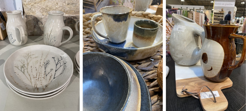
FLEXIBILITY with SIMPLICITY.
ARTWORKS translated for DAILY LIFE.
Each handcrafted vase challenges the balance between soft and cohesive forms, playing with human silhouettes in contrast to the architectural components of the building.
The ideal pieces for an artistic and authentic aura at home.
ECLECTIC SURFACES.
The collection is inspired by the European avant-garde movement created after the Second World War and expresses the spontaneity of the gesture, the work on the material, and the collective creation.This vase challenges the balance between soft and playful shapes.
02 Earth Tone for Ceramic
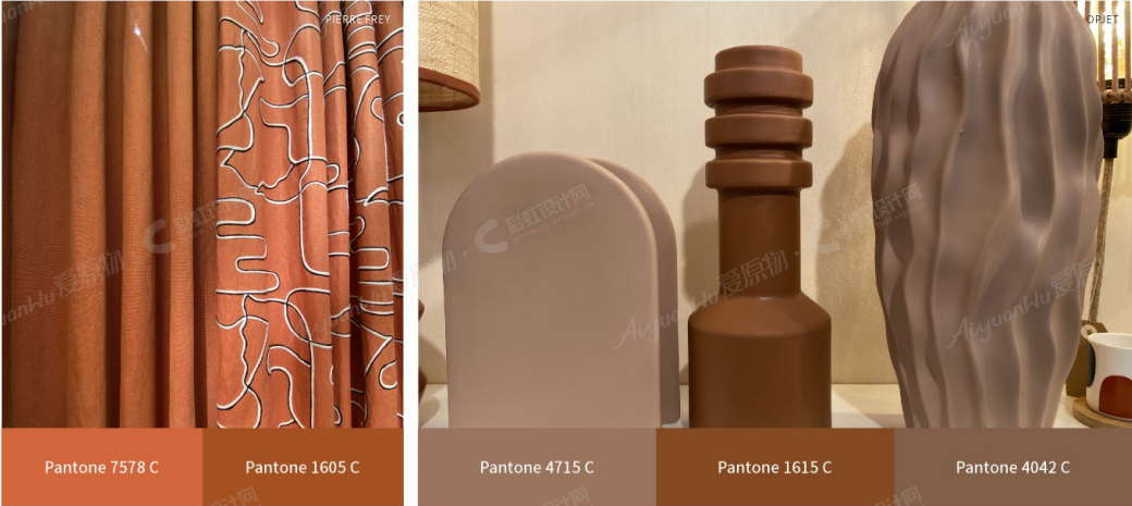
FROM NATURETONATURE
From the colors of the earth and the materials themselves, everything is tinged with its shades in a warm embrace, a welcoming, reassuring nest. Hues of browns and terracotta were rediscovered in the research of a wild nature in the genuine world for a basic living. Earth is our nutrient for us to live a healthy life in a calm and healthy ambiance.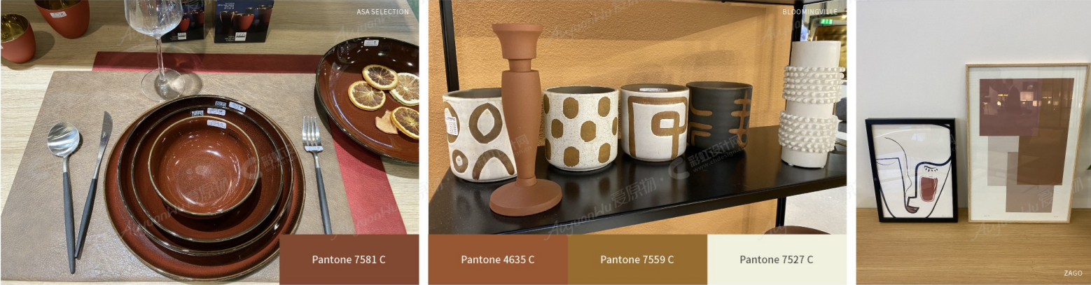
Key elements: Organic Shapes/Simplicity/PurenessOf Lines/ Few Colors Combination/ Sustainable Materials/OneColor
Brown and terracotta pigments create an incredibly grounding and stabilising decorating scheme. They help us reconnect with nature, bringing us back down to earth when we're craving stability.
Terracotta is taking over the interior design with its rich, earthy, red, and brown tones that are easy to incorporate into wardrobes and interior features.
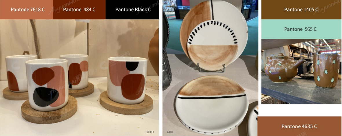
From scorched earth to pink terracotta to hazelnut.Bringing nature indoors: the earthy shades, "the earth palette", perfectly meet this need.
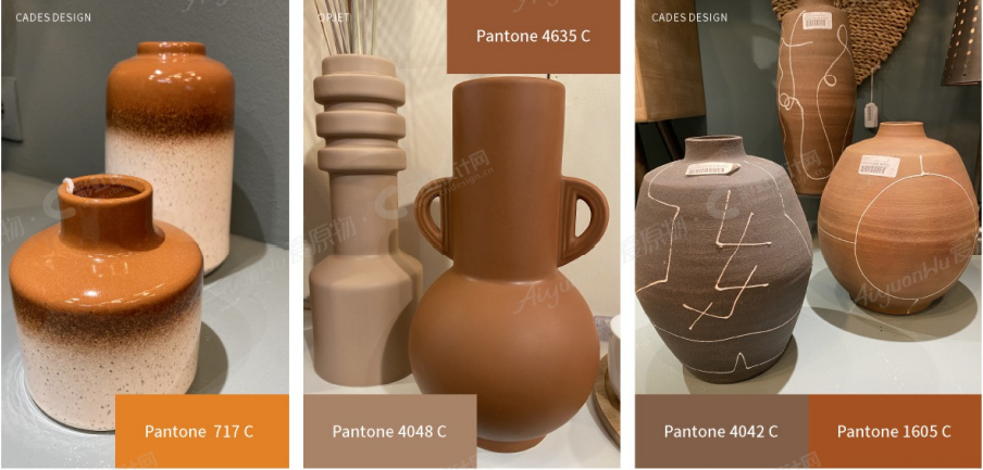
This trend describes the growing concerns related to sustainability, the desire to reconnect with wilderness, the search for authenticity, and even the expression of more sobriety in consumption.
KEY ELEMENTS: organic shapes / one color
03 Colorful Matching for Ceramic
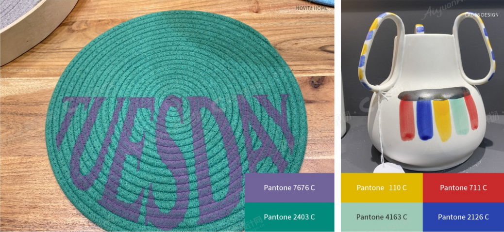
SPRAYINGJOY
After these months of stressful and frightening waits, the need of joy and return to life with reborn enthusiasm is really.
We notice new confidence in colors: colorful wallpaper, patterns, textiles, as ceramic products and glassware, decorative items emerge with strong frequency.
Surreal splashes of color: ironic and bold colors for a FEEL-GOOD home and for the shared places.
Hues in pastels for more dreaming and playful return to childhood intimacy, a romantic touch easy to combine with earth or grey tones, to the whites or the darkest elements.
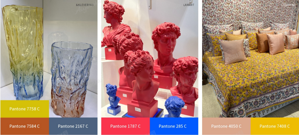
One of the color trends I've seen dominating designs in these just finished fairs are saturated, juicy colors paired with much paler hues in the background to make the intense colors pop. After a challenging year like this one, people are craving positivity, so designers are giving us the cheerful, vivacious corals, magentas, and oranges we need right now. These deliciously juicy and rich colors have a rejuvenating and uplifting effect. They are warm, but not hot. Refreshing, not brash.
And the combination of pale pinks and creamy tones creates an intriguing contrast that just works.
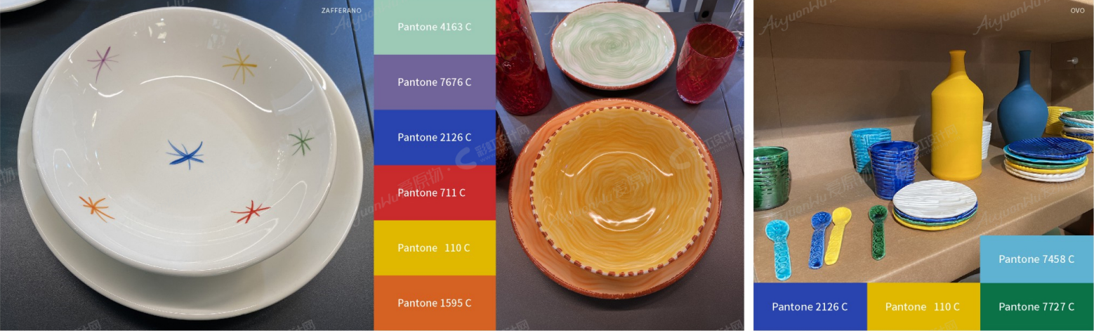
In some designs, the pale background is as important as the focal color, grounding it and making pop.
These designs make a statement by coloring objects in colors they normally aren't. The goal here is to be playful and create escapist landscapes where people can find a few moments of solace away from the challenging reality.
Use colors in unexpected, even surreal ways to create dream-like images.
Bold proposals
The color matches represent a message of strength and hopefulness that is both enduring and uplifting.
A color palette for the bold and determined that makes us want to bring about positive change, even placed on a table or on the shelves, even as a gift as a message of a return to joy.
KEY ELEMENTS
Think harmony, not dissonance.
Soft colors or bold, strong and pop.
Smooth surfaces or textured with decorations that enrich the monochrome object.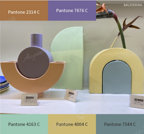
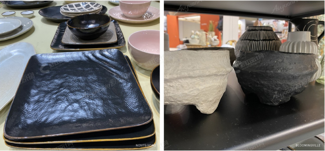
04 Eternal Black for Ceramic
DARK ATTITUDE
Black is still one of the trends of this period and is supposed to remain. Even if here in Italy and Europe in general, black in our imagination is matched to negative feelings, to darkness, to sadness, black is without any doubt one of the most elegant colors, for fashion but for interior design as well.
Black and dark tones are relevant, from cabinets to sinks, paint, and countertops, ranging from living rooms, bathroom accessories, bedroom or freestanding kitchens, etc...
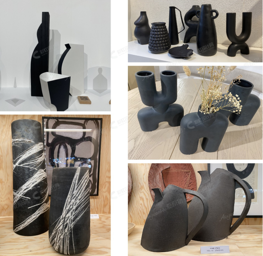
Advice: Remember to include contrasting colors (a pattern, a detail or with a bold border), natural and light hues or strongly colorful, according to the researched effect.
Black is chic, elegant, and (barely) never goes out of style. It looks great as a small-scale accent or as a large focal point in the room, and so on the tables.
TOTAL BLACK or repetitive forms and graphics contrasting with bright creme hues.
Obsessive motifs, quite hypnotic, or minimal touches of color.
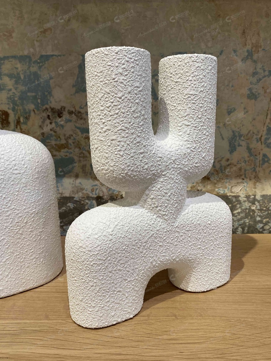
Black consent to pay attention to shapes and volumes: is growing the attitude of a view of vases sculptures or statement objects.
Vases that are a result of exploration of new organic, biomorphic shapes inspired by the movement of natural elements, of the material itself, of the gestures needed in the realization process.
Everything is changing, and the big ceramics show it with their unexpected presence.
KEY ELEMENTS
Textured and satin/ matte finishes
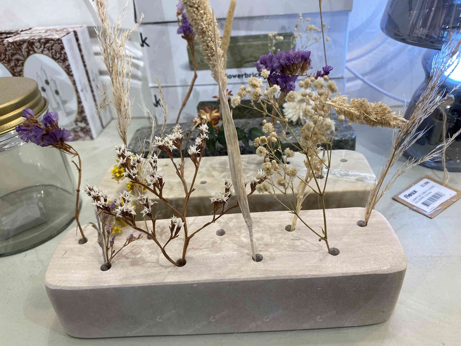
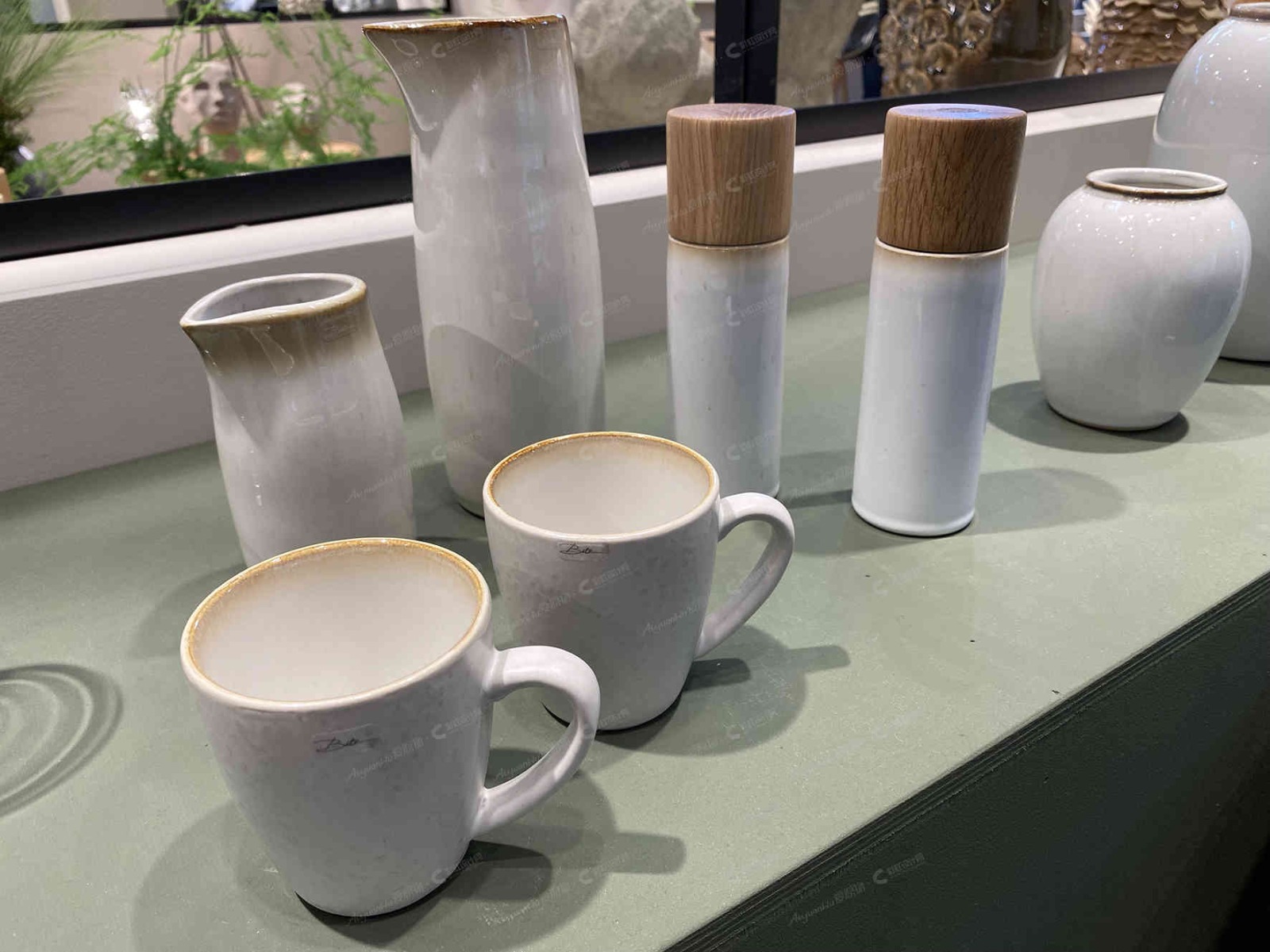
05 New Lightness for Ceramic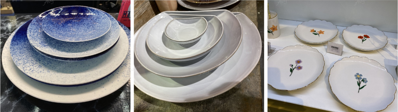
Products that boast very delicate, light, and organic shapes. Products that have soft colors, a lot of white, and are even see-through. The idea of reflecting light, not taking up a lot of visual space, and giving a relaxing, calming feel dominates this trend.
Sometimes just a little decor, a thin golden border underlines the sensation of levity, a thinner thickness lets the users feel delicacy as the idea of preciosity, just in touching and lifting up the products.
06 SUSTAINABLE. GREEN HOME for CERAMIC
CASE STUDY
TERA vases for indoor or outdoor living
Material: 100% recyclable - recycled plastic
An evident example of how precious and trendy could be a product even if made reusing waste materials.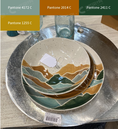
RECYCLE | RETHINK | REBORN: to give plastic a second life.
KEY ELEMENTS
ETHICAL APPROACH - DESIGN
INNOVATION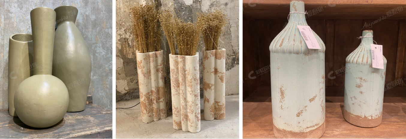
I know I'm often repeating myself in recent months, but the ever-growing trend with an evident presence on the market is precisely the one that relates to the concept of nature and sustainability.
A macro trend that blends into every other trend, ethically necessary and inevitable by now.
This need to redesign and review spaces and objects of everyday life is expressed in the global return to the human and primordial aspect.
The creation of a mindful home is becoming increasingly important.
Bringing the experience of nature into products with greater attention to detail, carefully selected materials, and authentic functions that whet the appetites for natural living.
Mindful and thoughtful home.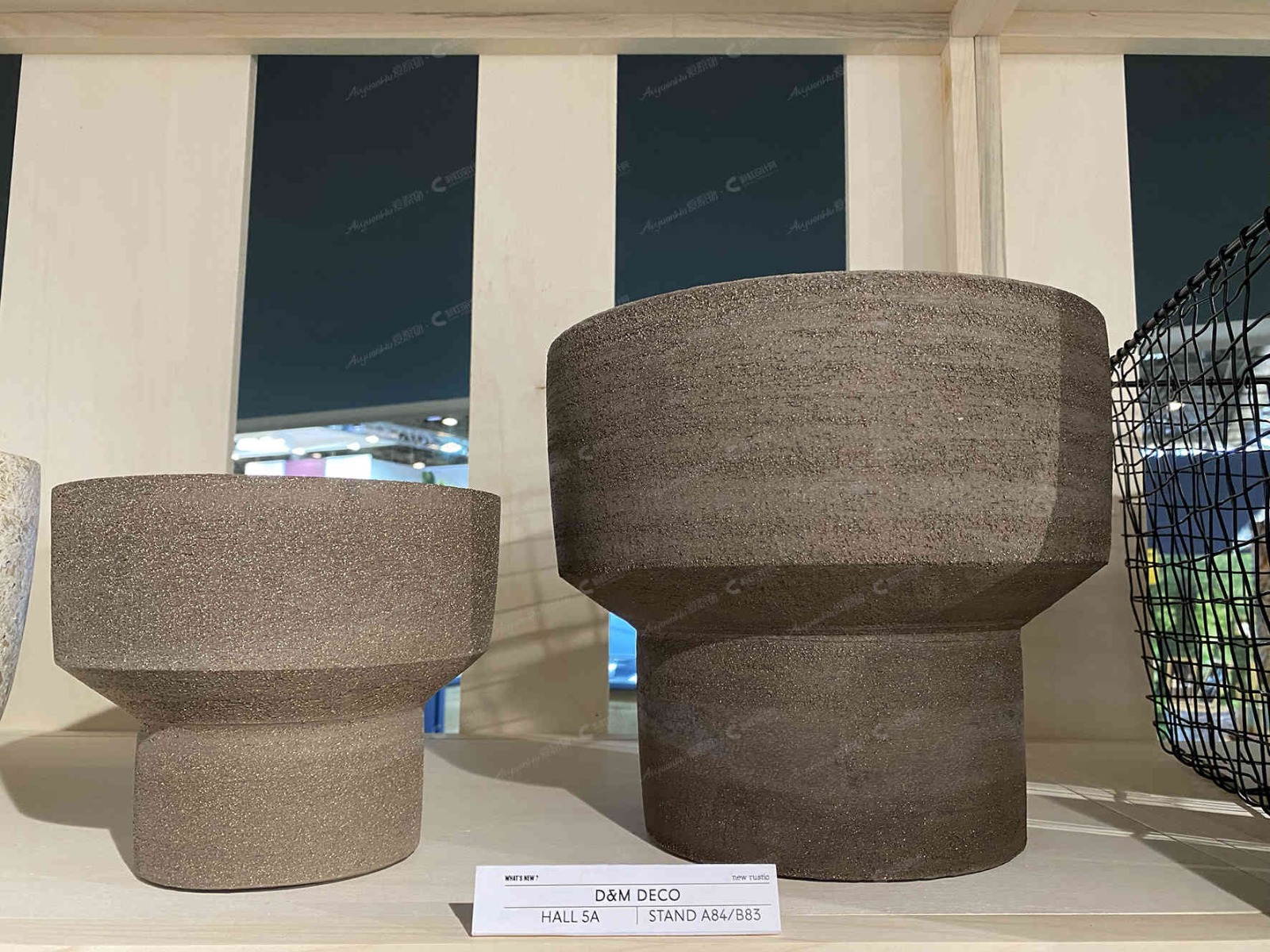
MASS TRENDCeramic translates well the experience of nature into the home. Ceramic tableware (material from the earth) combines the idea of healthy food that has to be present and contained.
This design theme feels completely natural. The colors and the alternative - often sustainably produced - materials literally bring natural spaces to life.
Customers carefully curate what they allow to move in with them today. They pay more detailed attention to the little things.
STATEMENT: We opt for authenticity rather than high gloss design.
ADVICE
Recycled ceramics and porcelain and products made using sustainable production methods: everything is communicated by the brand because it is a note of added value and preciousness.It's communicated through communication channels (adv, website, leaflets) and more than often on the same product and related packaging.
The colors, the final glazes are certified for naturalness and absence of toxicity.
The materials and finishes simulate a vintage, used look, as if of natural corrosion and deterioration due to use and exposure to atmospheric agents. In some cases, they look like a continuum of the ground.
Products that go well with indoor and outdoor environments.07 Line Decor for Ceramic
Line drawings made with a skillful lightness of touch, most of the time consisting of a single sweeping stroke or a few delicate lines, are currently to be seen everywhere in interior design.
Line art: the perfect curve.
I am convinced that this trend line can show its true potential even more strongly with values of awareness, creativity and freedom.HIGH POTENTIAL trend
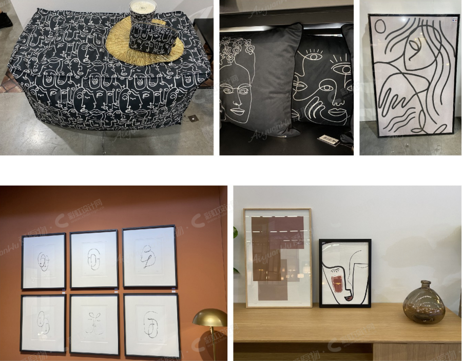
Just a few lines are needed to create a complete picture. Line art radiates optimism. The cultivated stylistic elements of line art fit perfectly with our present time.
08 Leisure Live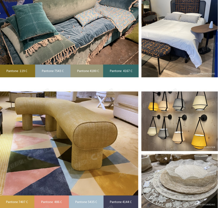
Leisure means well-being.
A need for a calming atmosphere to suit the "TO BE HOME" theme. Small, essential objects, benches and cushions, cozy soft materials--minimally furnish a meditation room.A selection of textile lamps that warm up the ambiance or a little corner.
This approach highlights the return to life through a selection of soft elements with organic shapes.
The theme, which had started even before the pandemic, is in total resonance with what we're experiencing. Furniture more and more presents the internal nature of the home, its pleasant character.
The soft and calm atmosphere given thanks to unique objects, chosen in research of good combination between organic shapes, good materials, warm colors.The home nowadays has to be more cocooning, a place where experience the good of life, alone, in a family or even when we have to stay in and work.
HIGH- POTENTIAL TREND
Products today need to have a deeper meaning, thus having a sustainable purpose and nod to general well-being.
Colors don't fight with our eyes: dark earth tones, pale pinks, mostly desaturated greens and blues.
09 Green Color for Ceramic
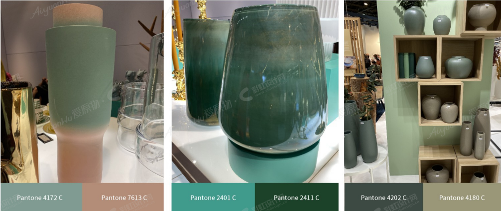
The green color is, without a doubt, a symbol of a new beginning. This color aims to revive, restore and renew.
Today we look at these hues not only as a color but as an ideal element of reconnection with nature and the wishes of the great outdoors.
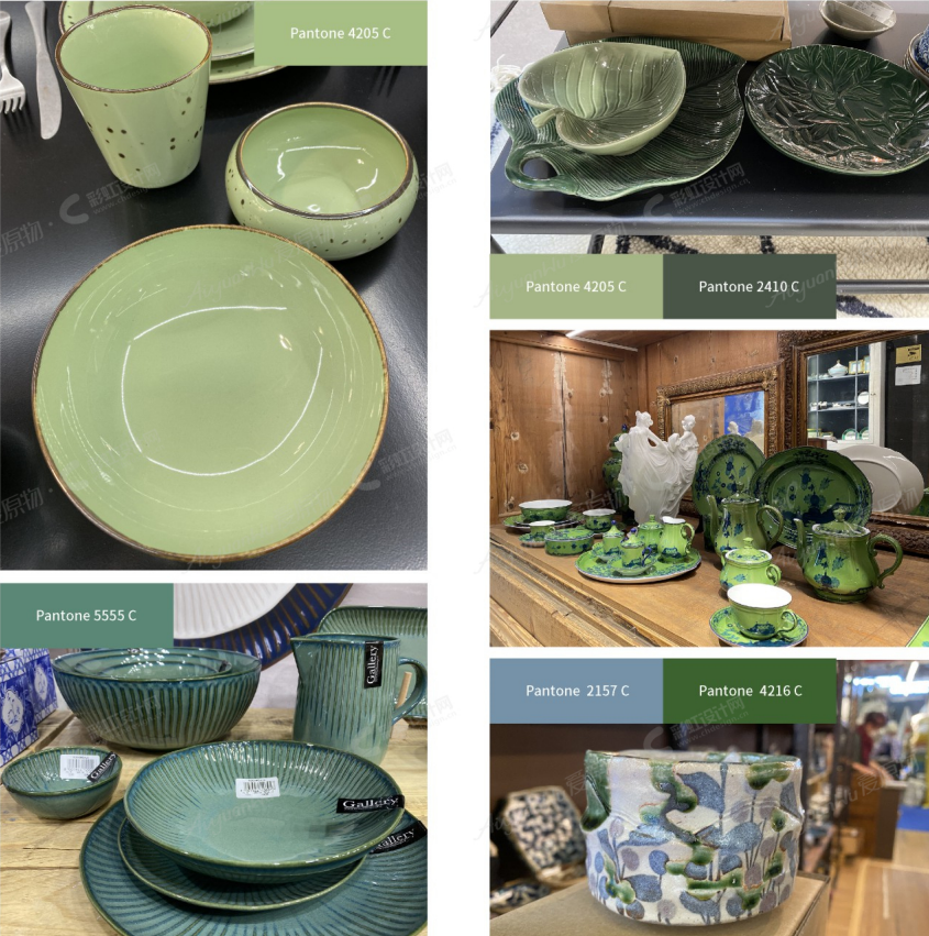
STILL GROWING and with the HIGH POTENTIAL trend.
New declinations of greens: from muted mints, soft sage, pistachio, to earthier olive green.
PURPOSE: a fresh and renewed start after a worrying year.
KEY ELEMENTS
This is the reason because it can reach all range of customers and never tire them.
10 New Romantic for Ceramic
The new romance comes to the interior design trend.
Translucent colored florals with a romantic touch are key to this trend.
Faded vintage rose prints and ice-cool colors give a fresh new look, even on a plate.
KEY ELEMENTSYou can select smaller elements of the romantic interior design trend or make a complete collection.
The trend will work with the existing decor, so customers will love this emerging and growing trend. Expected to become a MASS trend.
11 WALL DECOR Trends
PRODUCTTREND
WALL DECOR & INTERIOR ARTS
Brilliant and original, the Neon Art line allows you to personalize the walls with luminous messages. The game can count on multiple solutions, thanks to the availability of choice between collections of shaped applique in the shape of letters of the alphabet, quotes, graphics suitable for any indoor environment.
HIGH POTENTIAL trendBaden creates decorative items for the home: all products are handmade. The unique coloring gives the articles their recognition value.
MATERIALS: felt wool, wood, metal
Modern African Collection was inspired by the great tradition of African masks and the inherent lack of realism.
A handmade decorative wooden mask inspired by colors, patterns, and grids, ideal on an office wall, living room or in the kids' room.
MATERIALS: Made from a combination of different materials such as Veneer, MDE, Formica, Perspex, Plastic, and Felt and are all colored with quality Molotow" Premium colors.
SHAPE TREND
EXTRA CURVES
Items that have curves.
The era of razor-edged design is giving way to soft lines and feminine curves.
Maybe it's a desire to surround ourselves with more elemental shapes and forms in a world increasingly disconnected from nature.
The preponderance of softer lines and rounded edges in everything from furniture to architecture is a hard fact right now. It's also a welcome one after years of ultra-sleek lighting, industrial-style interiors and macho super -buildings.
Here the smaller products generously appropriate this style.
HIGH-POTENTIAL trend
All screenshots via AIYUANWU.
-End-
-
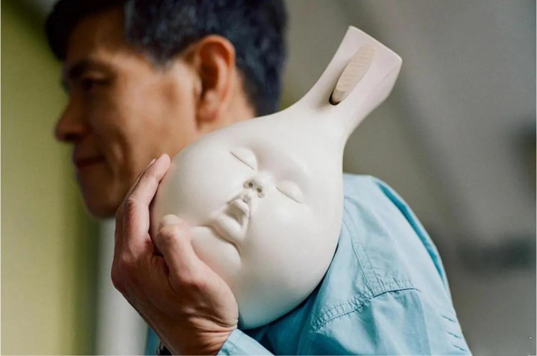
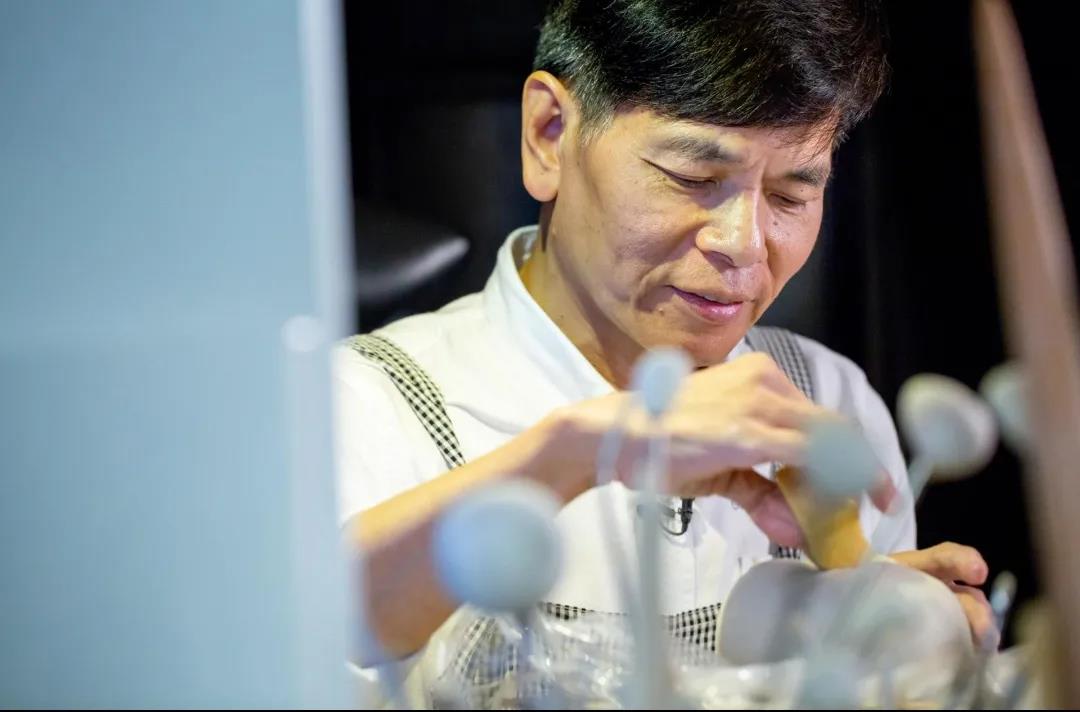
Born in Hong Kong in 1960, Johnson Tsang specializes in modern and contemporary art. He’s always been fond of ceramics and sculptures, playing with the idea of texture and human emotions. He wasn’t an artist early in his life though. Tsang had to take care of himself growing up without much parenting. His mother left when he was just a few years old. His father was in and out of drug usage. Tsang jumped around odd jobs until he decided to train as a police officer.
During his early time as an officer, Tsan visited the Hong Kong Arts Center where he found breathtaking inspiration to pursue art. “I entered a world that truly belonged to me”, he said. He began to shape works of art with his hands as he applied issues with society and human emotion.
A Dish of Future
This work done in 2006 expresses the untold truth of society here on Earth. Two hands with a fork and knife in each hand digging into a dish you’ve never seen before. On the plate is a meal that looks like the Earth with a fetus inside.The tragic message is that humans are rapidly depleting our planet for our own good from each generation. Humans leave the next generation with a whole new set of issues to deal with instead of setting them up for success. It’s tragic, yet a genius perspective to the future made in a dish.
Still in One Piece III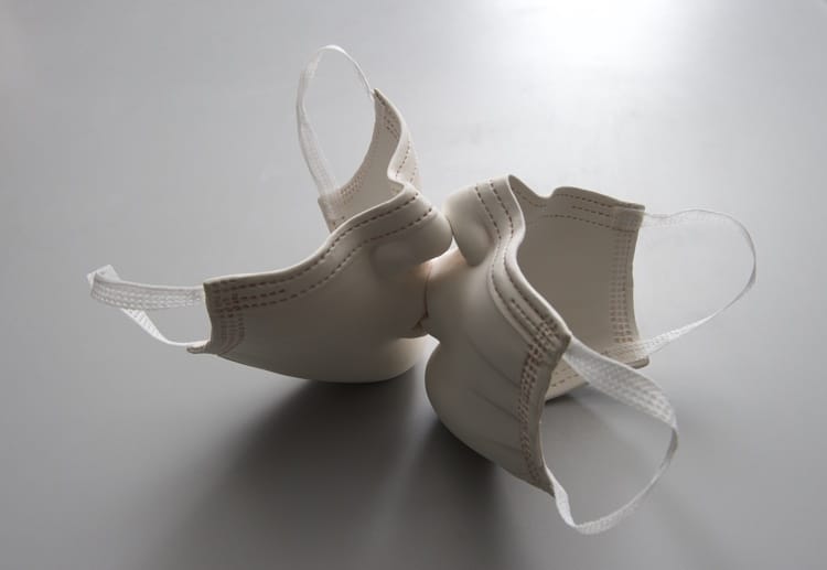
This piece is a perfect expression of how Tsang reflects on the obstacles of society. A symbol for the COVID-19 pandemic has been the masks that billions of people use today to prevent spreading. Tsang created a delicate sculpture where two masks are shaped into faces. The intertwined face masks are locked in a kiss with noses and lips that look like humans.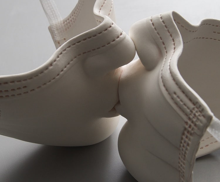
It represents how people feel today. Distancing and isolation were emphasized during the pandemic, but humans still crave love and affection. As a kiss represents love, the masks separate us even if it is in our best interest to prevent the virus from spreading.
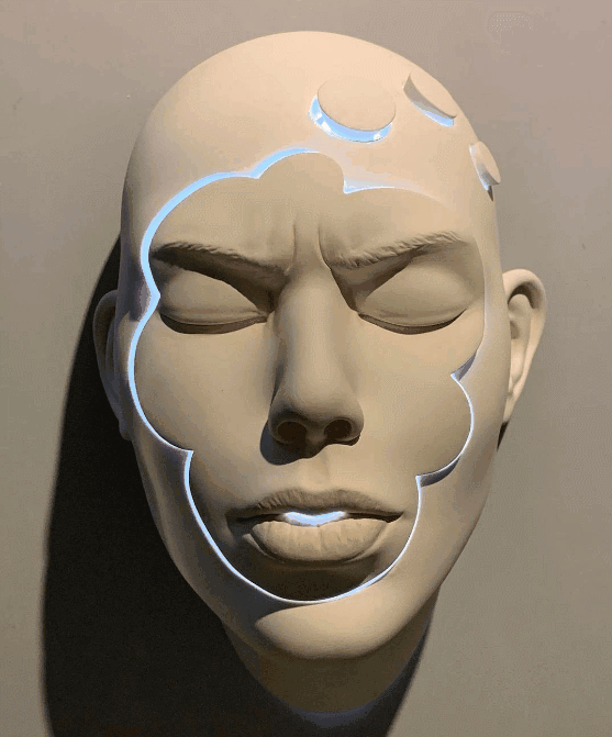
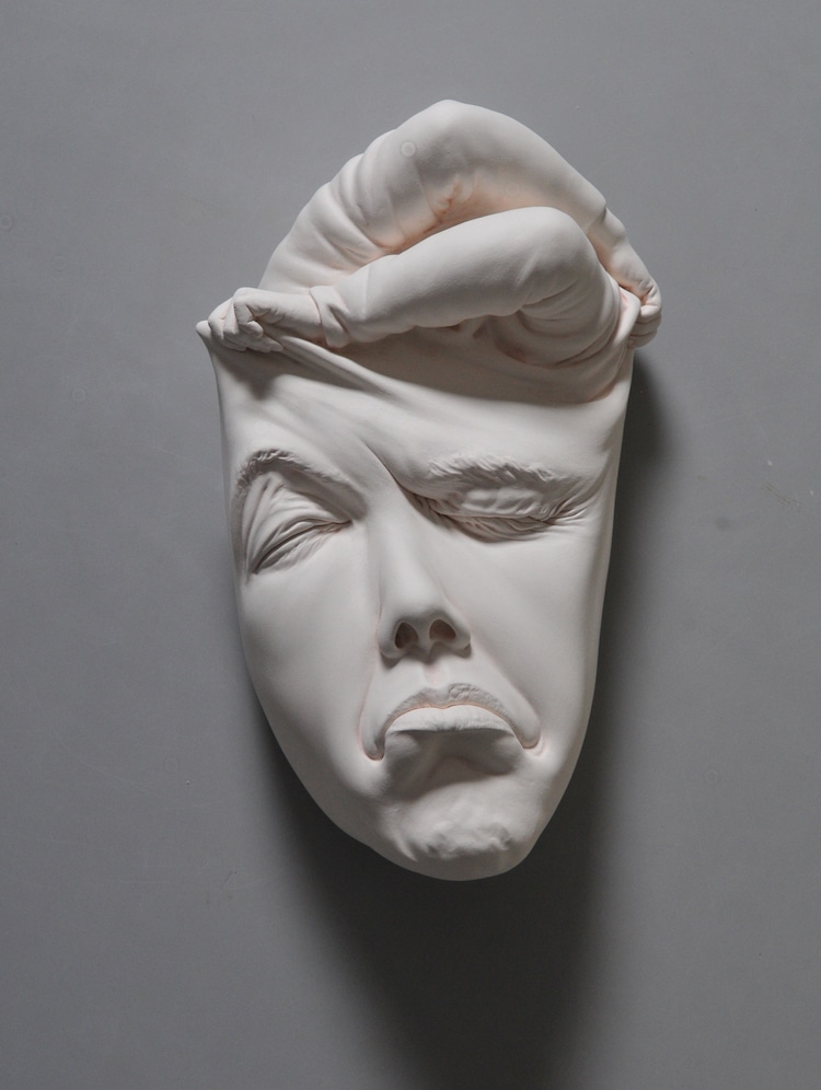
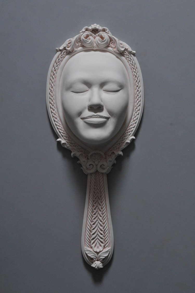
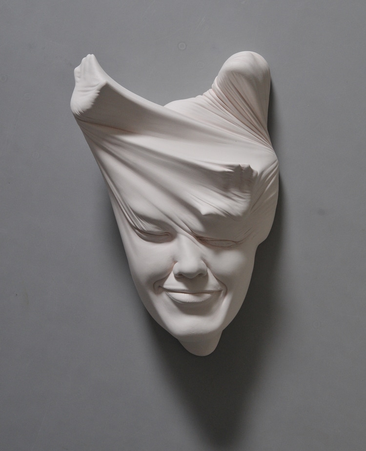
Lucid Dream II Series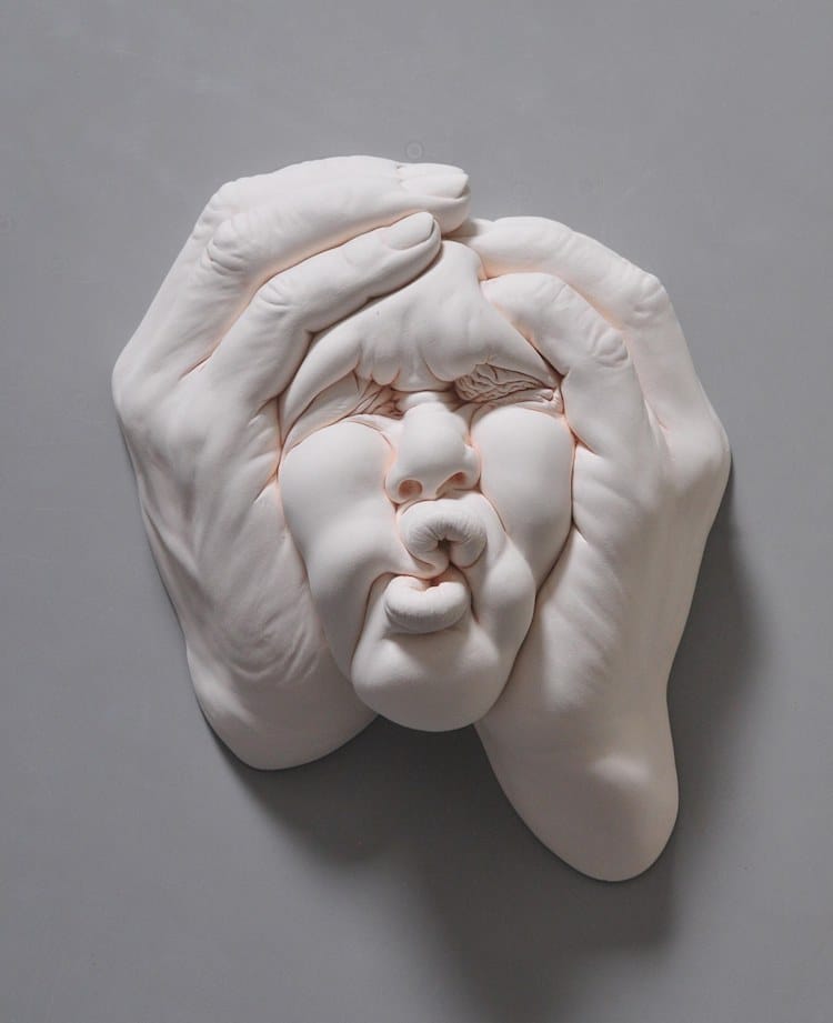
Lucid Dream II_Work in Progress
Tsang is best known for his face-shaped sculptures that display an array of emotions. In the Lucid Dream II Series, Tsang uses clay to create multiple human faces that appear twisted, contorted, and literally bend the mind. He focuses on human subconsciousness and experiments like people have never seen before.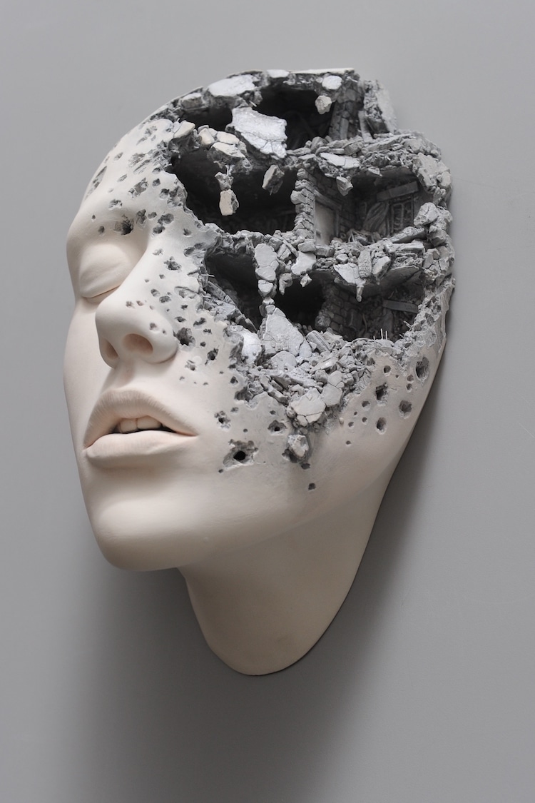
Lucid Dream II_Here and There
Lucid Dream II_Here and There (Detail)
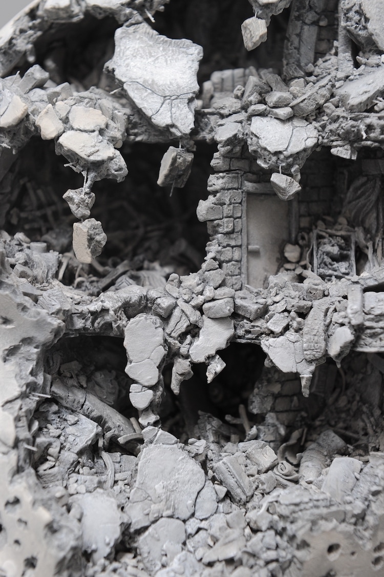
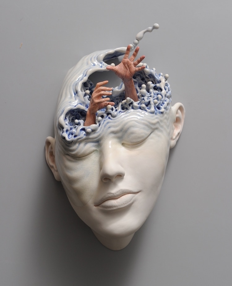
Here and There, for example, features a human face with the eyes closed in a resting expression. Half of the face is human, while the other half appears as a crumbling building. The face is three-dimensional with gaping holes and debris. It looks like the building is going through major demolition. Just as people appear to be in peace, they may be torn down on the inside with nobody knowing.
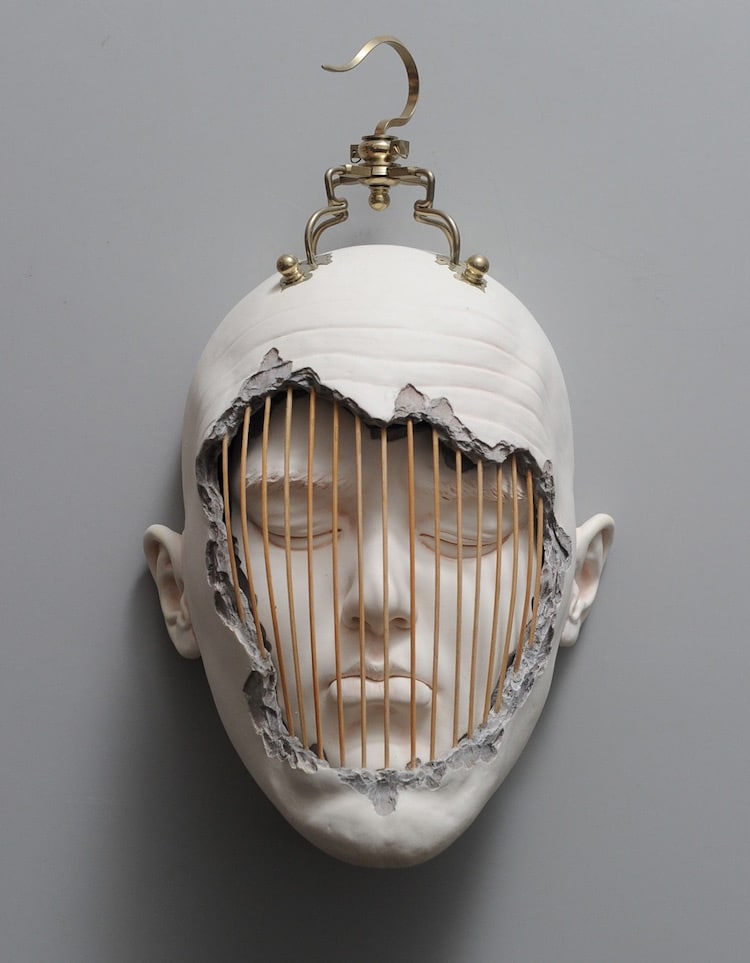
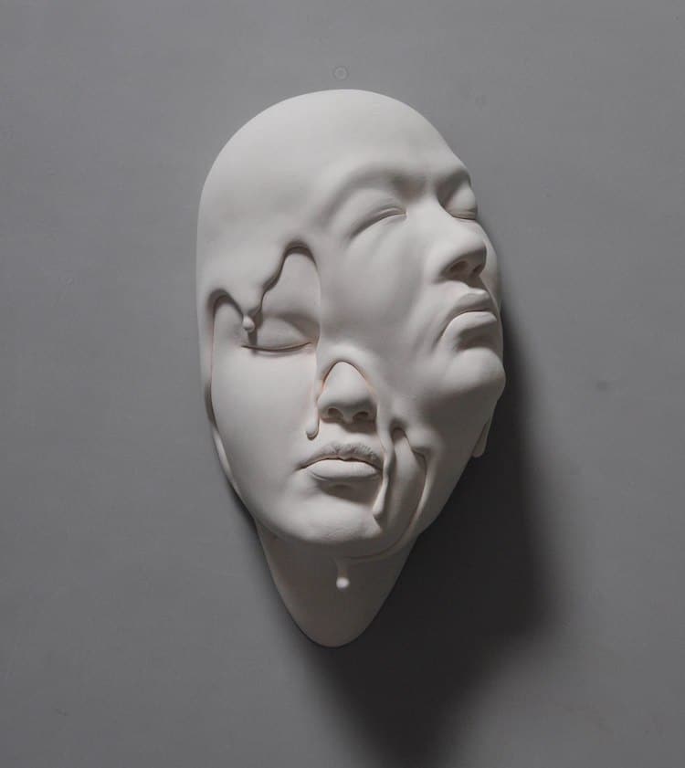
Lawful Custody is another instance where Tsang combines realistic facial sculptures with his surrealist imagination. This sculpture looks like a broken shell with a human face on the inside. The face is at a similar resting position like Here and There is. The face is behind bars and could represent a number of powerful messages here. Is it a clever way of showing that people are limited by their own subconscious? Or could it be the fact that people lock away their genuine emotions?
Lucid Dream II_Lawful Custody
Lucid Dream II_Just Listen
Lucid Dream II – Extrication
Lucid Dream II_Falling in Love
Lucid Dream II_Mirror Mirror
Lucid Dream II_Remembrance
Lucid Dream II – Under the Skin
All images via Johnson Tsang.
-End-
Toggle Nav