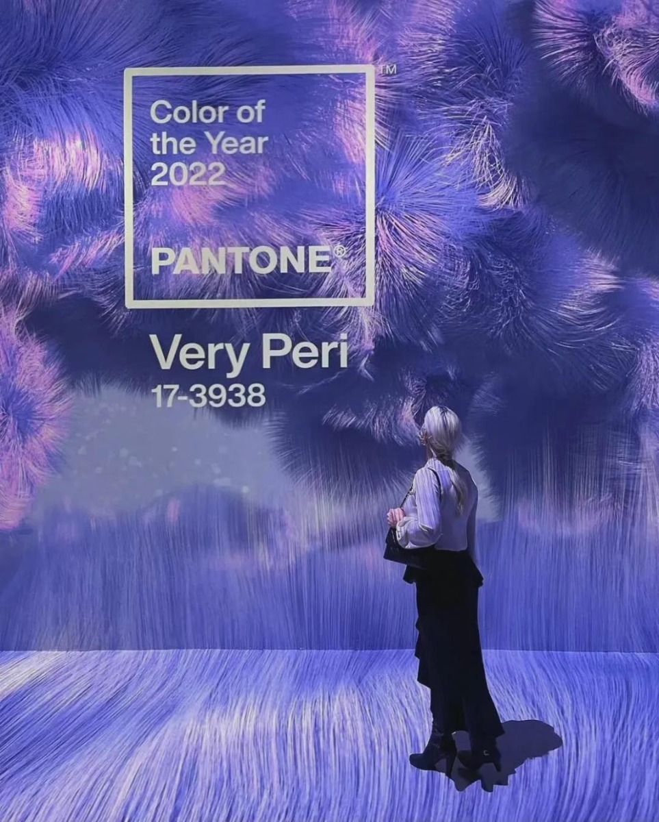
Pantone's Color of the Year for 2022: Very Peri, What's New?


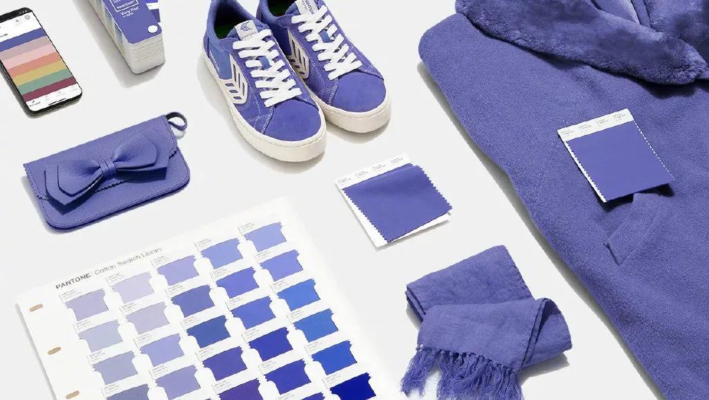
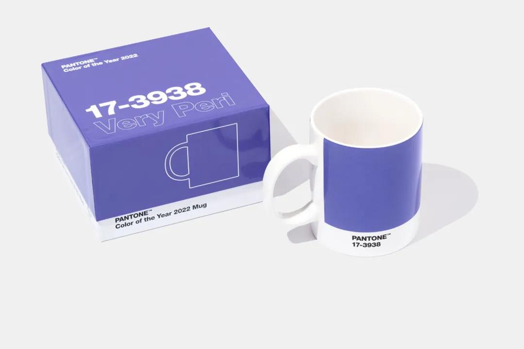
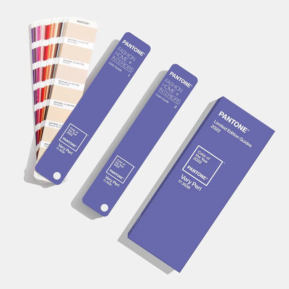
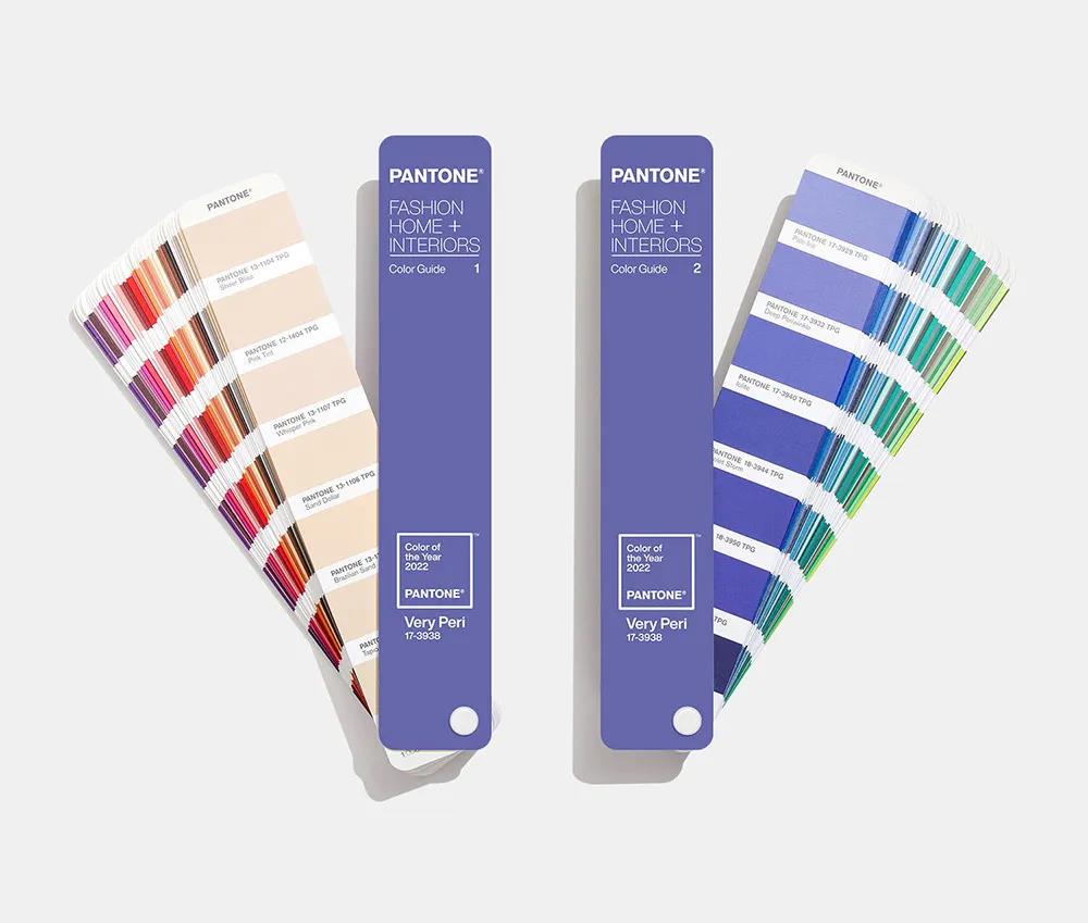
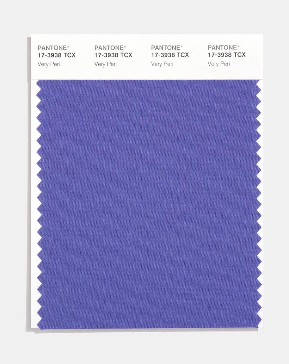
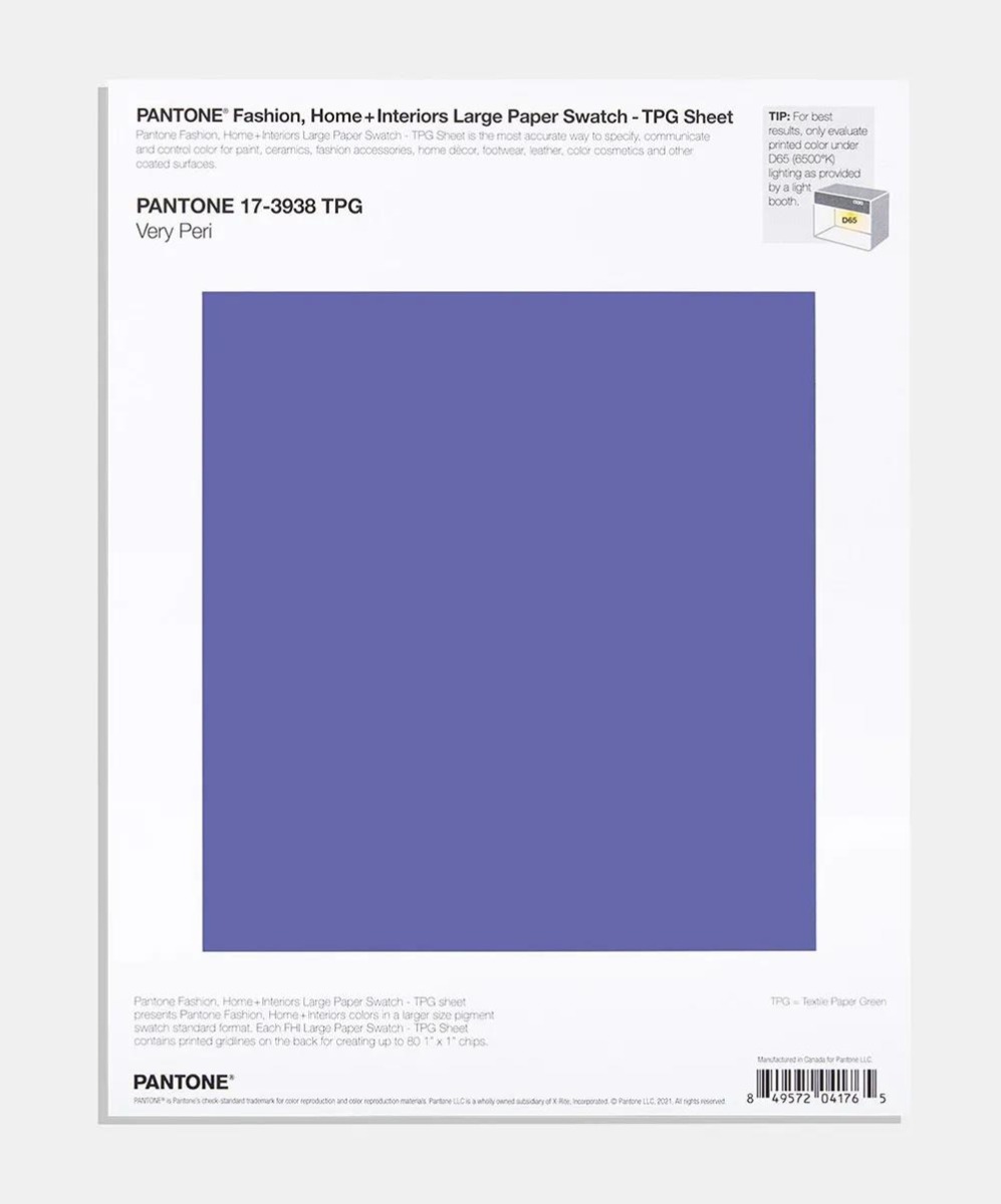
On Dec. 9, 2021, Pantone released its color of the year for 2022: Very Peri (Pantone17-3938).
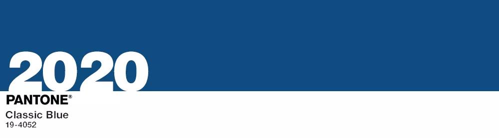
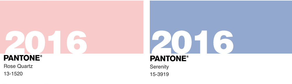
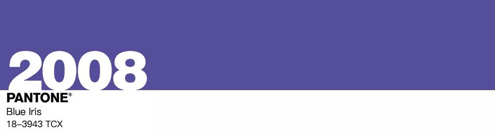
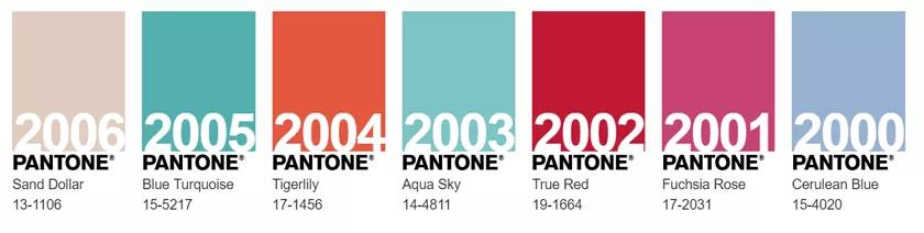
Pantone has chosen blue as its color of the Year five times in the past 20 years.
What, then, shall we expect from Very Peri?
Take a look!
01
Pantone's Color of the Year, What's New?
Pantone, of course, has always preferred blue.
In the past five blue-based annual representative colors, Turquoise Blue is clear, Blue Iris is rich, Serenity is gentle, Classic Blue is deep, Cerulean Blue is peaceful, which have their own features.
The color of 2022, Very Peri, was not chosen from the Pantone color library but a new hue whipped up by the company for the first time.
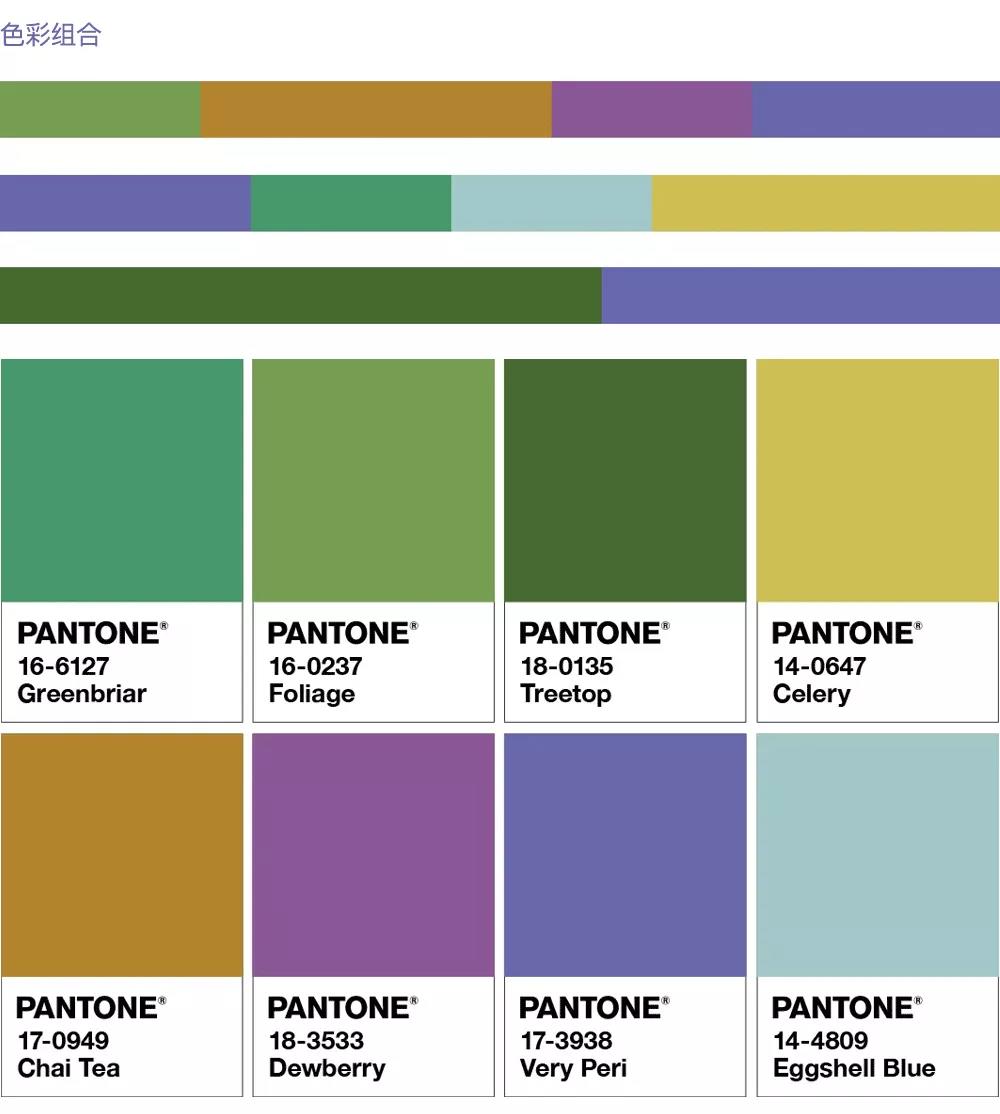
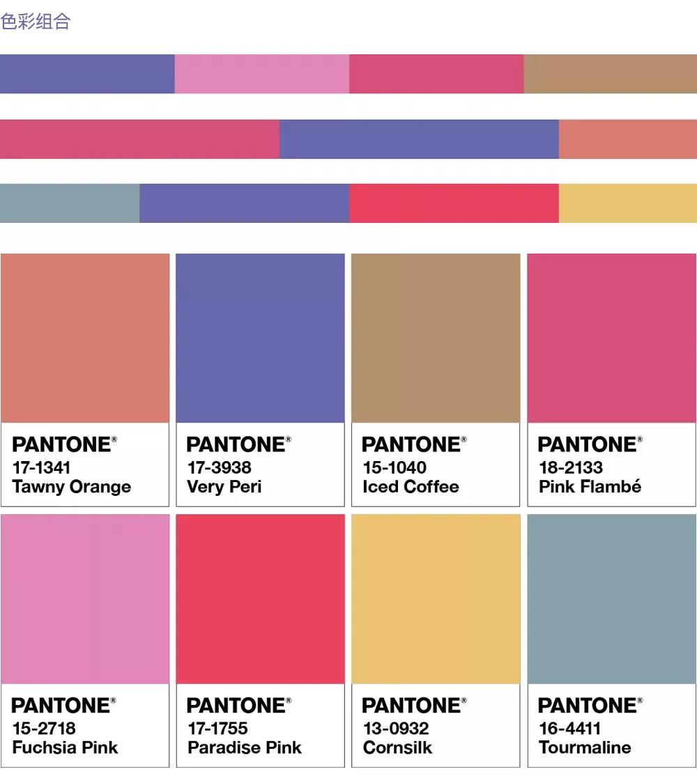
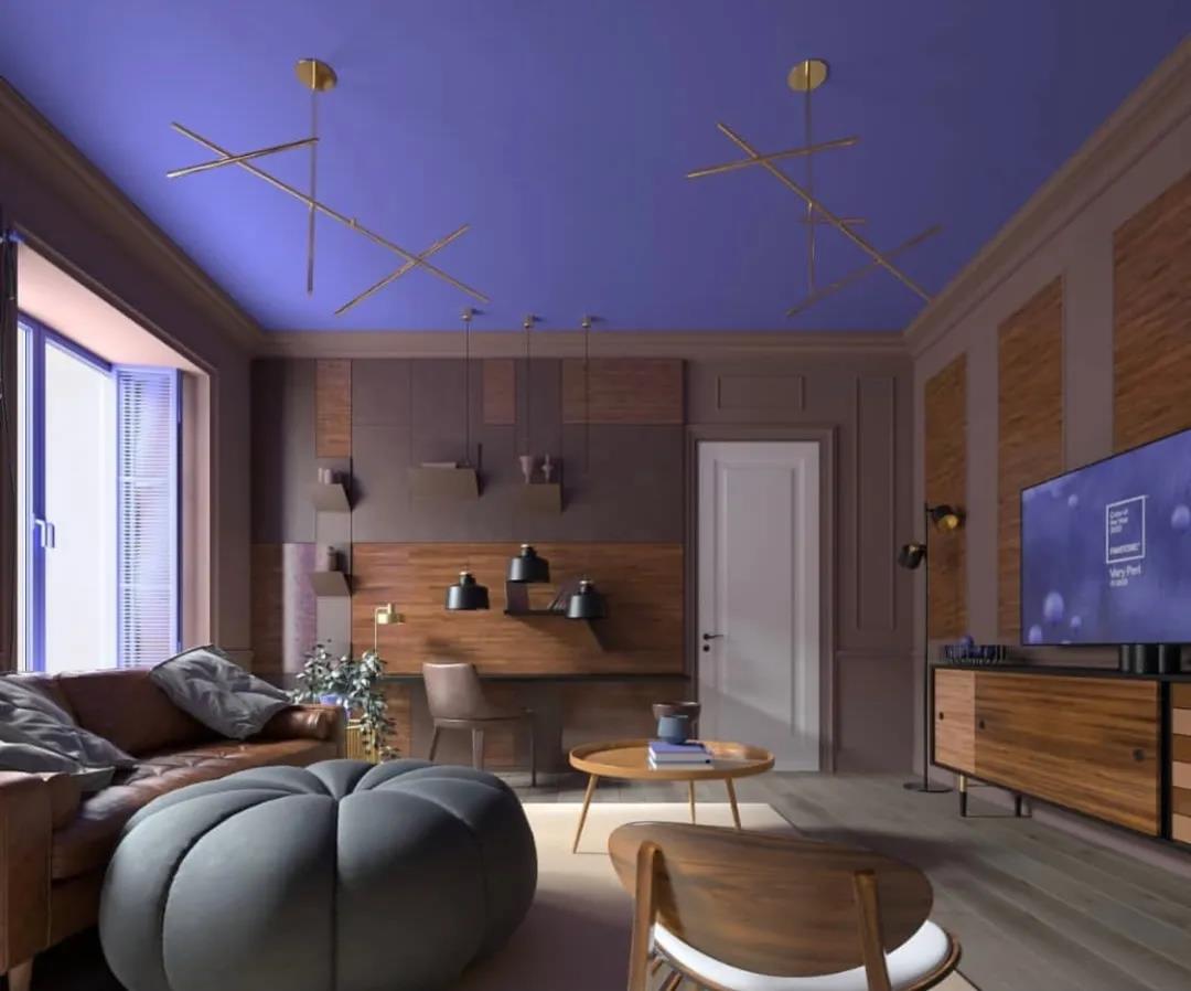
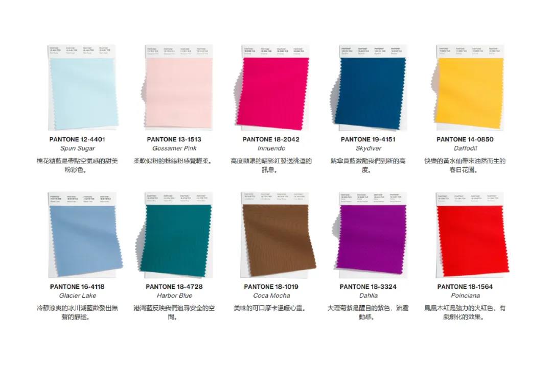
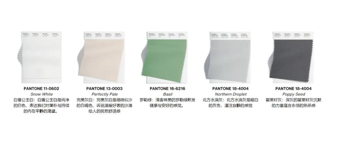
According to Pantone, Very Peri imbues dreamy purple and energy red with a serene blue tone, projecting a warm, cheerful and energetic attitude. Pantone has kindly come up with a color scheme for your reference.
BALANCING ACT
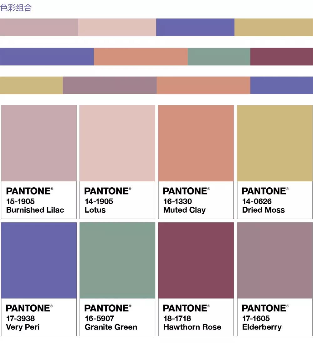
WELLSPRING
THE STAR OF THE SHOW
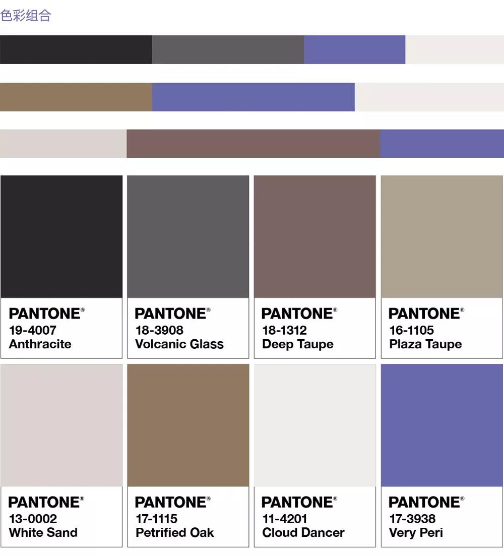
AMUSEMENTS
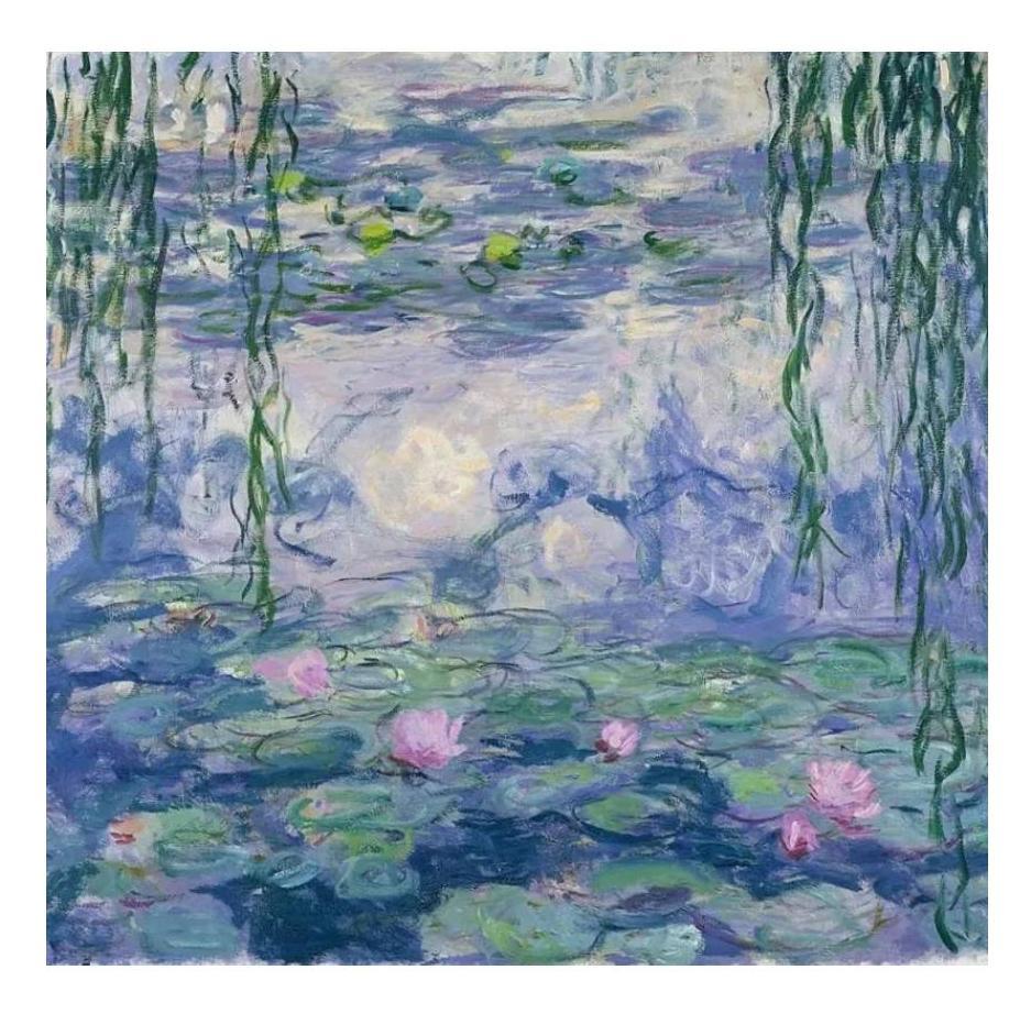
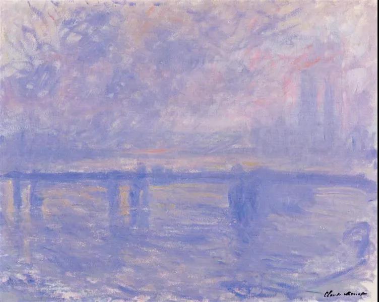
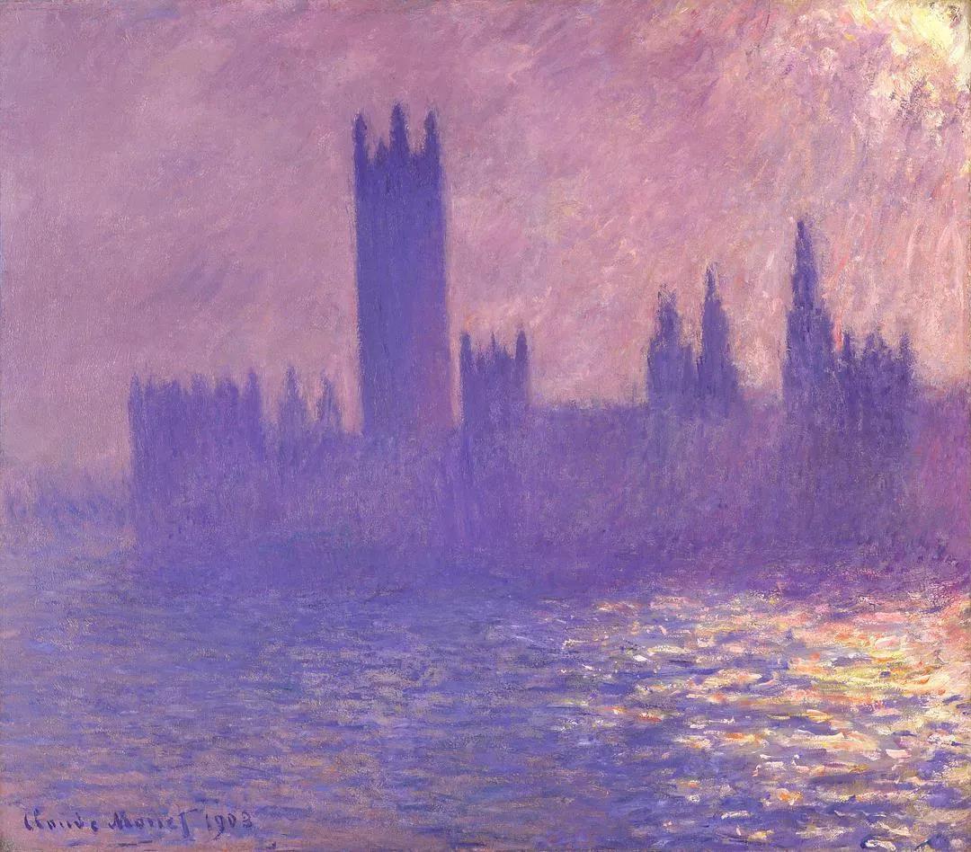
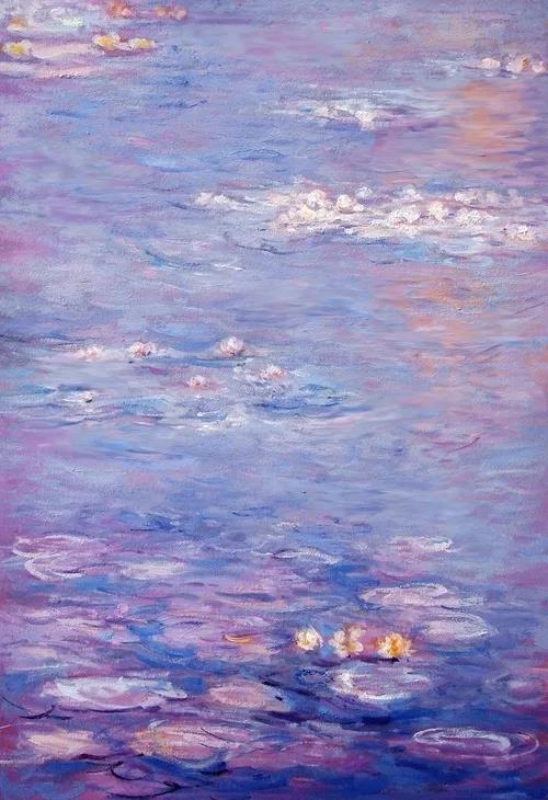
When I first saw Very Peri, the sight of "Monet's special color" came to my mind. Monet used this rich layer of blue and purple to present dense fog and winter snow.
Do you think Very Peri represents what you're looking forward to in 2022?
So why did Pantone make Very Peri the color of the year for 2022?
"We live in a time of radical change," Pantone wrote when it unveiled the logo. He also mentioned creation and change many times in his article.
According to Pantone, Very Peri symbolizes the global spirit of this moment and the transformation we are experiencing.
Our physical and digital lives are converging in a fresh way and will adapt to living with ever more complex rules.
The craze for video games, metaverse concepts, and NTF art will gradually become a part of our daily lives. Their rise is not a flash in the pan but a human vision of life.
Pantone has created new colors also benefited from the digitalization of design, allowing designers to convey their concepts more accurately, expanding the limitations of the past reality.
Very Peri (PANTONE 17-3938 ) shows the diversity of modern life and how the color trends of the digital world are mirrored in the physical world and vice versa.
From its outlook for 2022, it's not hard to see how Pantone has high hopes for Very Peri. Indeed, the combination of purple and red gives blue a softer glow, technological and futuristic feel, appropriately illustrating Pantone's vision of a virtual and digital future for human life.
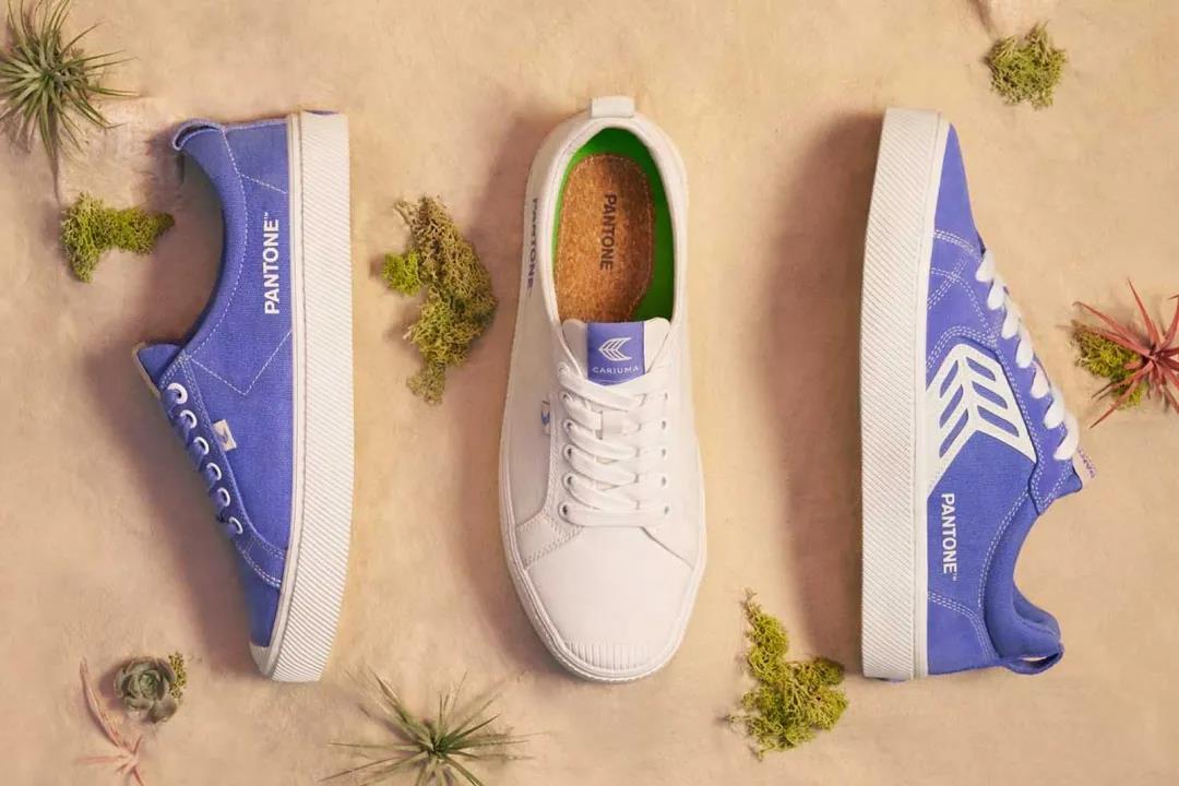
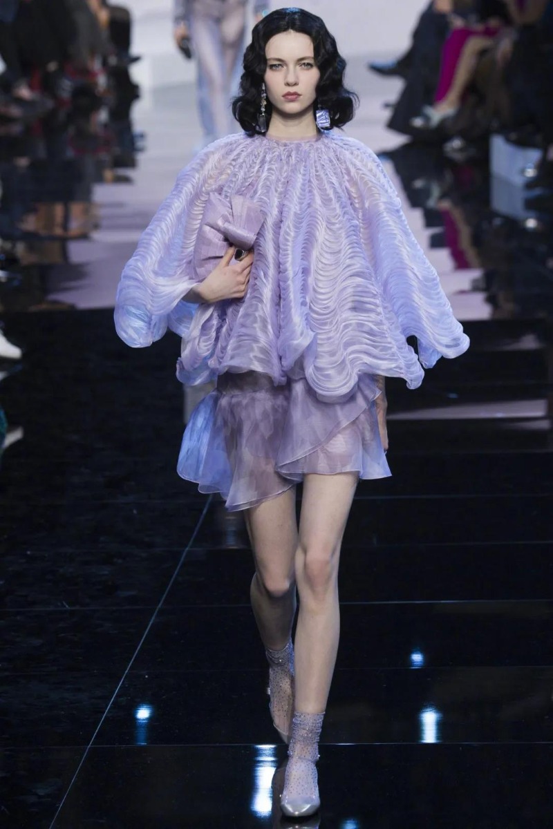
From shiny metals, gorgeous sheen and high-tech materials to handmade looks and natural fibers, Very Peri can be applied in a wide range of scenarios.
Telling a good story for a product is an essential skill for a modern company. Can Very Peri bear the weight of the zeitgeist delivered by Pantone? The world will be watching.
02
How Does Pantone Choose the Color of the Year?
When got this far, everyone could have a question, how does Pantone choose the color of the year? In terms of the selection process, the investigation and selection cycle of Pantone's annual representative color lasts for nine months, which requires thorough consideration and trend analysis.
To pick a representative color, experts at the Pantone Color Institute search for new elements that influence color change each year.
These new elements cover a wide range of fields, such as film, artistic creation, fashion design, popular tourist attractions, people's recreational life, and even social and economic conditions.
New technologies, materials, textures, and processing effects that affect color will also become critical points of choice. Color, as a basic element of our lives, has been commercially standardized for only 60 years.
Since there was no unified standard for color printing, Party A and Party B had a different understanding of color matching, often failing to meet customer requirements.
As Professor Albers wrote in The Interactive Science of Color, "If someone said 'red' to 50 people on the spot, 50 shades of red would appear in their minds. To be sure, all colors are different."
Thus, a precise universal definition of color became a revolution in waiting. In 1963, Pantone developed a revolutionary color system. The system realizes the accurate blending of color.
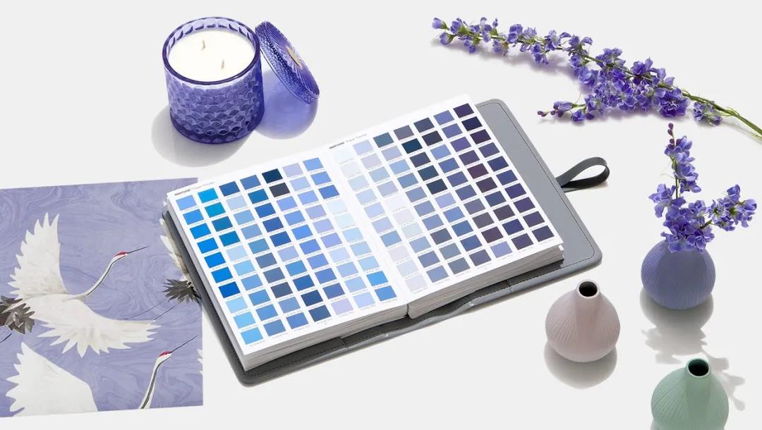
For more than 50 years, Pantone has extended its color matching system to various industries, including digital technology, textiles, plastics, construction, and interior decoration and coatings.
Pantone became one of the most authoritative color systems globally, and designers, artists, and manufacturers around the world began to use the "Pantone Standard."
Since 2000, Pantone will roll out the annual representative color every December, and its color of year release has become the industry's spotlight.
In addition to the color of the Year, Pantone also releases a fashion color report, in which color experts select a theme and then choose a color around that theme. The fashion color trend report unveiled every season for the clothing industry includes 10 popular colors and 5 key classic colors.
Such color prediction will bring a new round of shock to the color design in both fashion and industry, which have a vast and extensive influence on manufacturing and consumption.
03
Color Forecasts Will Control Our Choice?
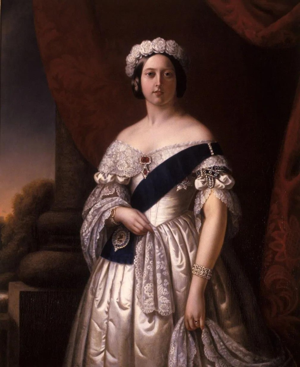
Since Queen Victoria was stunned in a velvet-lavender wedding dress, it sparked the trend for composite colors.
Complex colors followed, and dyeing houses and manufacturers worldwide began to set up color trend forecasting institutions, but their influence was limited to the fashion industry during this period.
It wasn't until the end of the 20th century that the colorful translucent shells of the iMac exploded the color industry in industrial design.
People are beginning to realize that color may determine the success or failure of a product in the market.
Pantone has quantified color, stripped it of mystery and confusion, coded it into standardized products, and made selling color a huge business.
As the business of color forecasting has grown, the track has become increasingly crowded. Besides Pantone, Japan Fashion Color Association(JAFCA), Sico(Canada) and WGSN(UK), all offer expert trend reports for designers.
With the development of the Internet, the ways of predicting color trends are diversified. Tumblr, Pinterest and other design websites also start to predict color trends in their own ways.
Color forecasting helps designers understand and integrate trend information and understand market preferences in preparation for next season's products.
Reading this, you might think that color prediction is controlling our fashion choices.
In fact, the report issued by the color forecasting agency is only a trend. It can not determine the development of fashion, as a reference, will not be accepted wholly by designers and manufacturers.
While they may indirectly influence our choices, they are more likely to perform screening and analysis than the ultimate determiners of trends.
The factors that influence trends are diverse and complex, and the development of the Internet and social media has welcomed more people to create new trends.
The fashion industry and consumers are more closely linked and interact. We are all part of the movement.
Color, the visual wisdom of human beings, brings us collective resonance at different levels, leading the tide of life.
To some extent, color defines our state of life. Perhaps, as Pantone put it, color embodies the spirit of the times, as well as the complex social past.
All images via google.
-End-