Monthly Archives: May 2021
-
 29 May
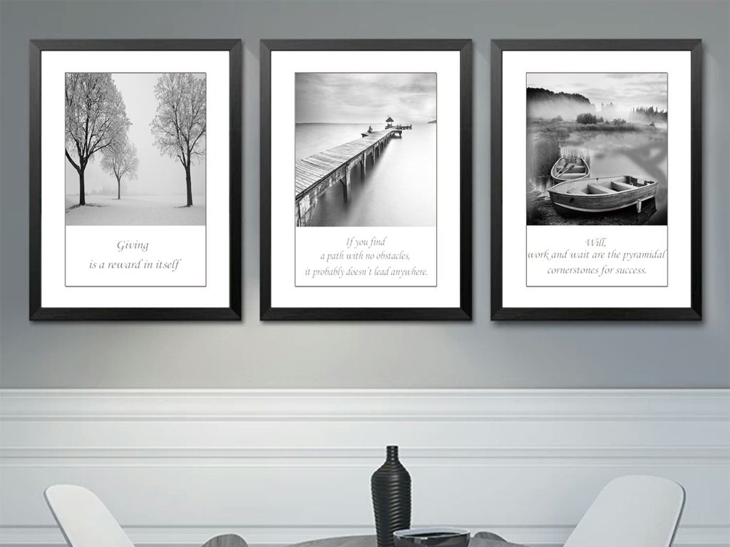
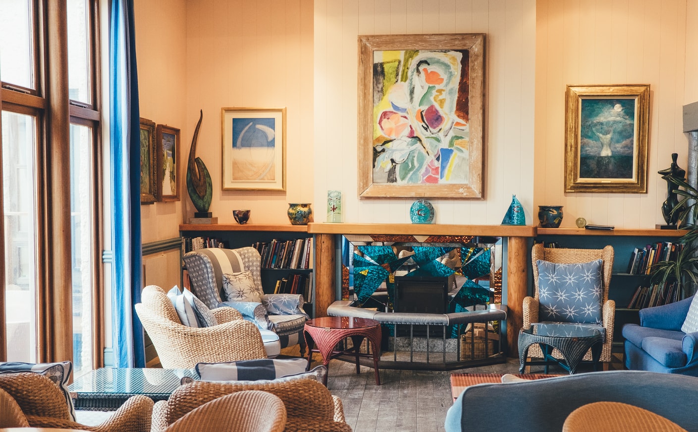
How much do you know about the picture mounting?
MOUNTING 0F CONTEMPORARY ARTWORKS
ONE | ABOUT THE MOUNTING
-Three-part for Painting, Seven-part for Mounting
Anyone who has bought art knows the truth of three-part for painting, seven-part for mounting. Picture mounts are beneficial for a variety of reasons. They can not only provide decoration for the artwork but better improve its visual appeal. More importantly, it is also an important way to protect the artwork, which helps avoid as much as possible damage and influence from the external environment that can cause to the artworks.
Everyone knows the importance of mounting, but can you distinguish between effective mounting and ineffective mounting?
TWO | Ineffective Mounting v.s. Effective Mounting
Just imagine, even if you framed and protected your favorite piece of art, it starts browning and discolored after a few years. One hand is due to the aging of the material itself, on the other hand, the pollution from the outside, including the way of picture mounting.
The form and material used in mounting will affect the work itself from the inside. If the appropriate mounting form and material are not selected, it will cause greater damage to the arts. And if using acid mounting materials to protect the work, acid erosion will accelerate the aging process of the artwork, which is ineffective mounting. Thus, "effective mounting" shows its important role.
01.The Principle of Mounting Reversible
Effective mounting must follow the principle of reversible protective mounting, which means without permission from the customer, the decorator is never allowed to cut, paste or fold the works. After the work is mounted, it can return to the original state.
02. Acid-free Mounting
If the work you want to mount is of high value and significance, you should choose the best mounting form according to the suggestions given by the decorator. Acid-free mounting is one of the most effective ways to reduce the damage to the works.
Now we're going to talk about acid-free mounting.
THREE | What is Acid-free Mounting?
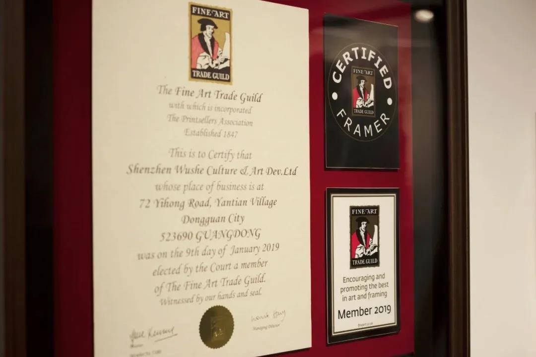
The Fine Art Trade Guild (FATG) was founded in London, the UK in 1910. It is the authoritative certification body of the art printing, mounting, and framing industry in the contemporary world, and the maker standards of global mounting.
GRADE MOUNTING OF ARTWORKS
The FATG sets industry standards for art and mounting industry practitioners, classifying mounting forms into the following five levels:
Different levels of framing technology also meet individual needs.
01. MUSEUM LEVEL
- A top-level mounting
- Improving the highest aesthetic value of the artworks
- Keeping arts for up to 35 years
- The mounting process is entirely reversible
- Suitable for the arts of high-value and historical value
02. PROTECTION LEVEL
- Second only to museum-level mounting
- Enhancing the visual appeal of the artworks
- Protecting works for up to 20 years
- Acid-free protective materials
- The mounting process is reversible
- Suitable for emotional value things or original works, or limited edition works
03. COMMEND LEVEL
- Medium-level mounting form
- Against air pollution for about 5 years
- Not necessarily reversible
- Suitable for visual effects and sentimental value of replaceable things
04. ECONOMIC LEVEL
- The inferior mounting form
- The economical price with the good visual effect
- Short preservation time
- Suitable for normal, low-value alternative works without or with emotional attachment
05. The LOWEST LEVEL
- Low cost and efficient
- Low demand for overall appearance and quality
- Mainly for temporary display and have no commercial value
Next, let’s move on to acid-free mounting.
In some cases, such as mature museums, cultural relics protection, and art market, their artwork may be preserved using the acid-free level mounting for maintenance and framing. Acid-free mounting is also called museum-level or protection level mounting. So, what is acid-free mounting? Acid-free mounting means that the mounting process is effectively isolated with acid-free materials to prevent the penetration of active acid contents. Its material standard is pH 7.0-7.5. The material is not easily changed from the environment in special handling. Advantages: preservation resistance, environmental influence (such as UV light, moisture, humidity, air pollution, dust, and physical contact), can extend the life of the work, and a long time to maintain the original state, etc.
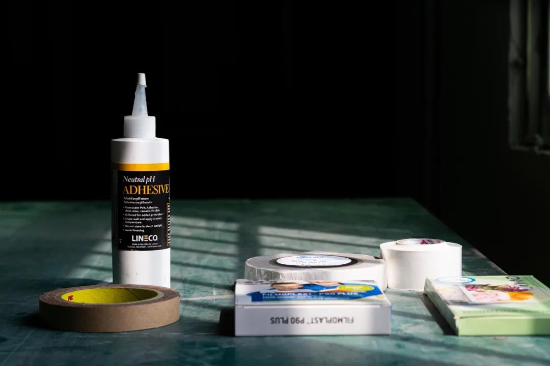
Except the works are on acid-free paper, the material used in picture mounting must also be acid-free and lignin-free.
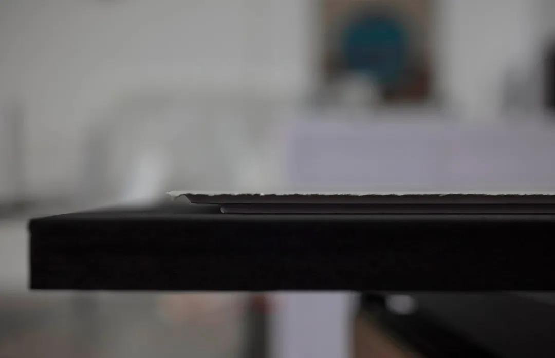
01 MOUNTING BOARDS
The first thing to mention is acid-free mounting boards. An acid-free board has many uses. It contains acidic chemicals that are covered up and meant to be exposed later. The mounting boards for mounting, non-lignin, avoid the acid coming into contact with the artwork and buffer with calcium carbonate (CaCO3), pH above 7, such as MUNKEN and COLOURMOUNT cards. It helps keep color over time and is better for long-term storage than ordinary boards.
02 TAPE
TAPE also needs to be acid-free. The structure of acid-free tape is generally composed of lignin-free acid-free paper + acid-free active adhesive. In addition to itself acid-free, it can isolate acid and avoid harm to artworks.
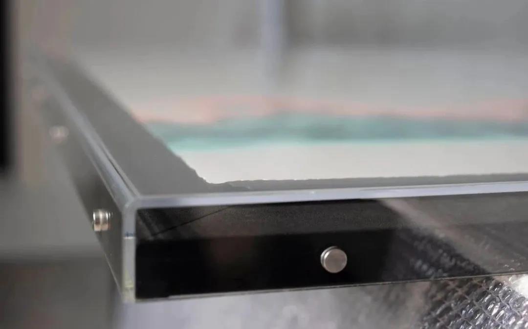
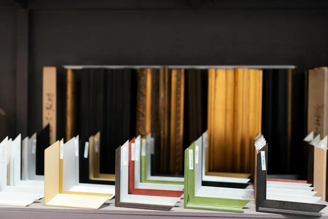
03 FRAME
The ordinary wooden frame itself is easily affected by humidity, temperature, acidity, air pollution, etc., acid from the wooden frame will infiltrate the board, so that it turns brown, and eventually ruins the works. Therefore, choosing the frame also needs to go through deacidification treatment, if using an acidic wood frame, it is necessary to use acidic tape for isolation.
FOUR | Technological Process
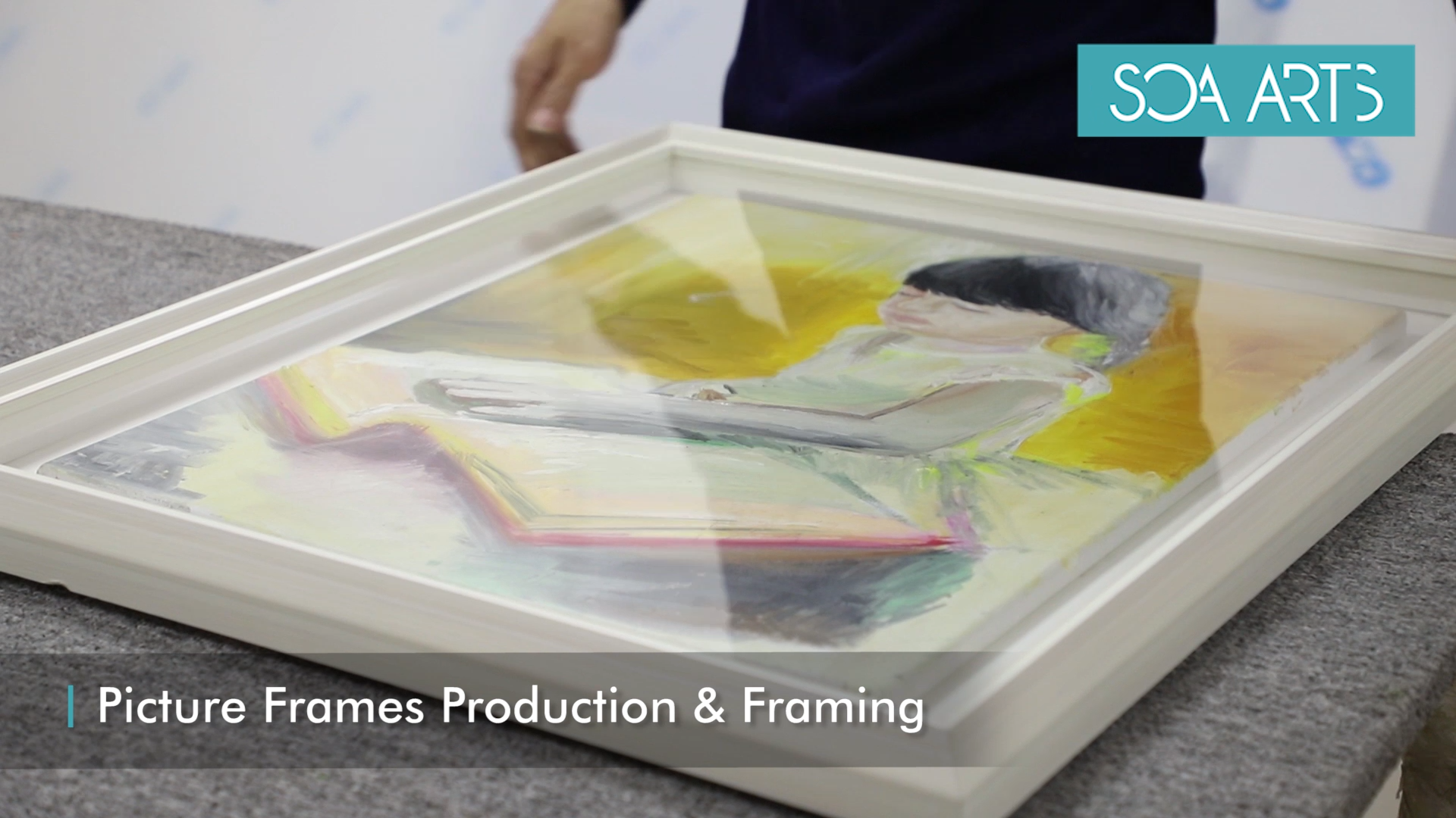
In the past eight years, SOA ARTS has become a representative of the typical art wholesaler with high quality and good taste in the client's mind.
SOA ARTS mounting process adopts a protective mounting level and follows the principle of reversible mounting for each work.
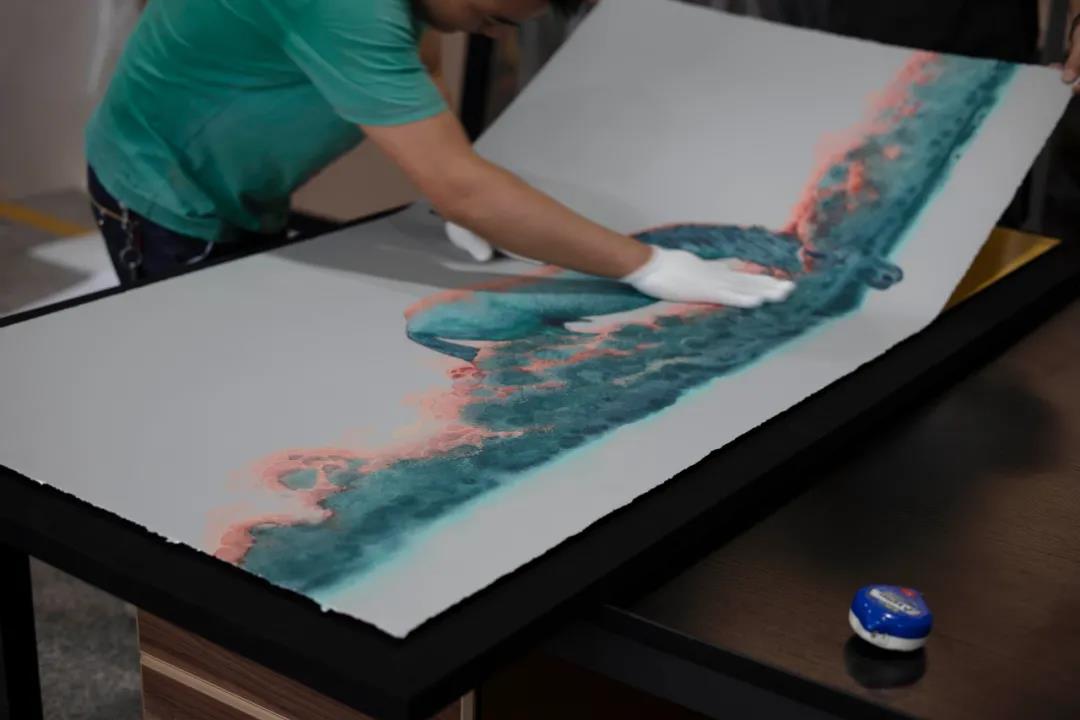
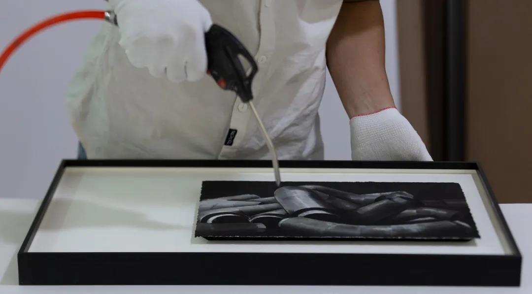
In the process of mounting for each is for the permanent spread of the work, must be strictly treated with meticulous attitude.
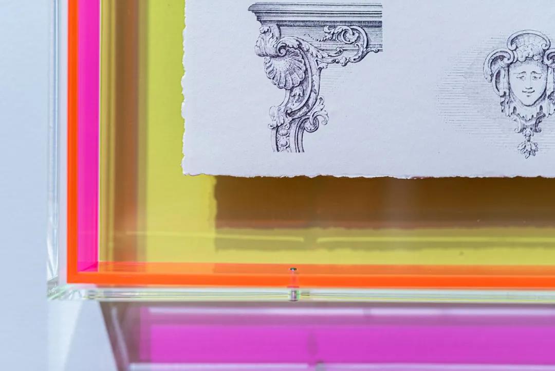
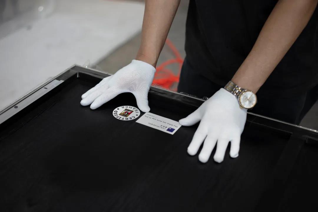
There can be no mistake at every step, and the decorator will be careful inspection of the work. The artwork is pasted in the protective level paper before the acrylic and backboard are pressed front and back to the arts to reduce oxidation and do not allow any dust. It is not only a responsibility to the customer but also a respect for the artwork.
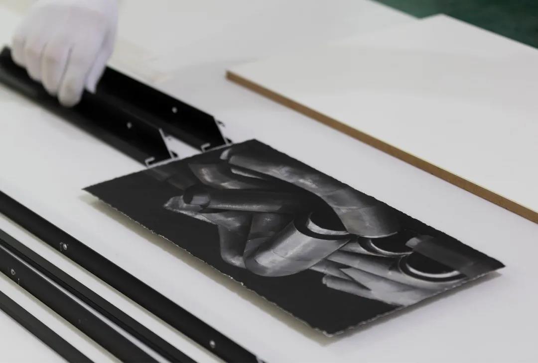
A decorator inspects a frame before it is mounted.
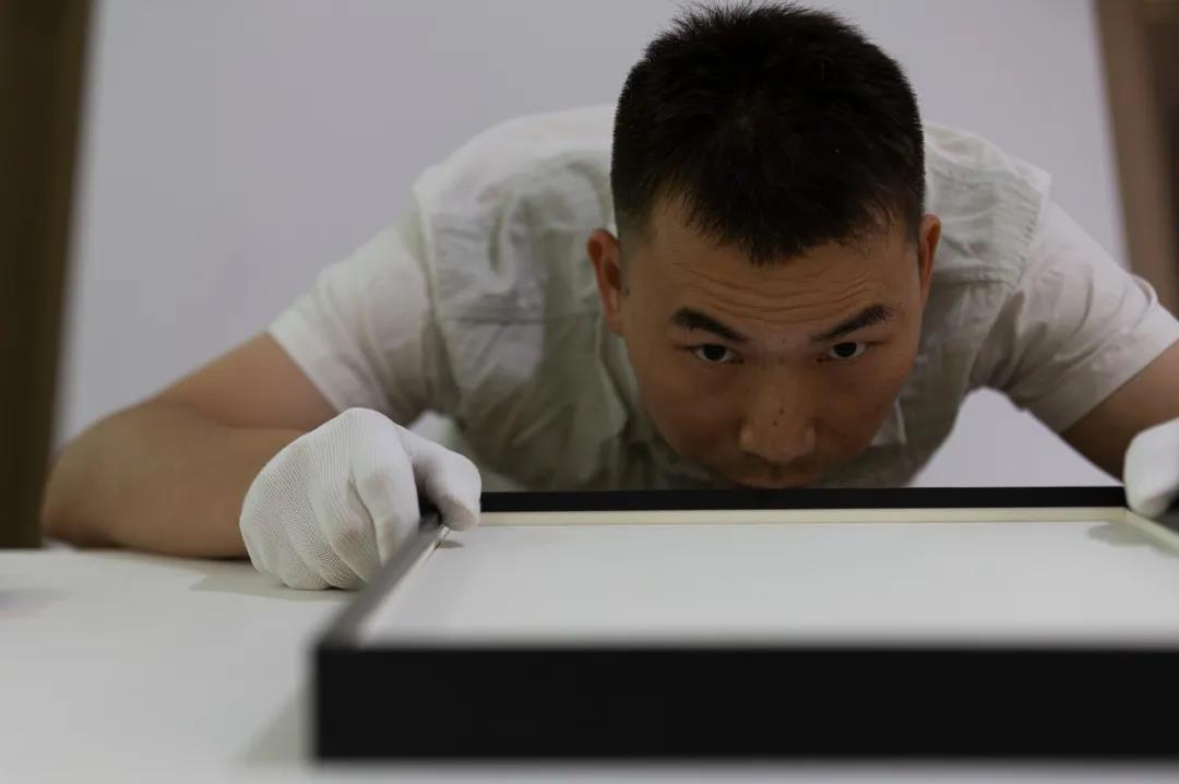
Positional adjustment
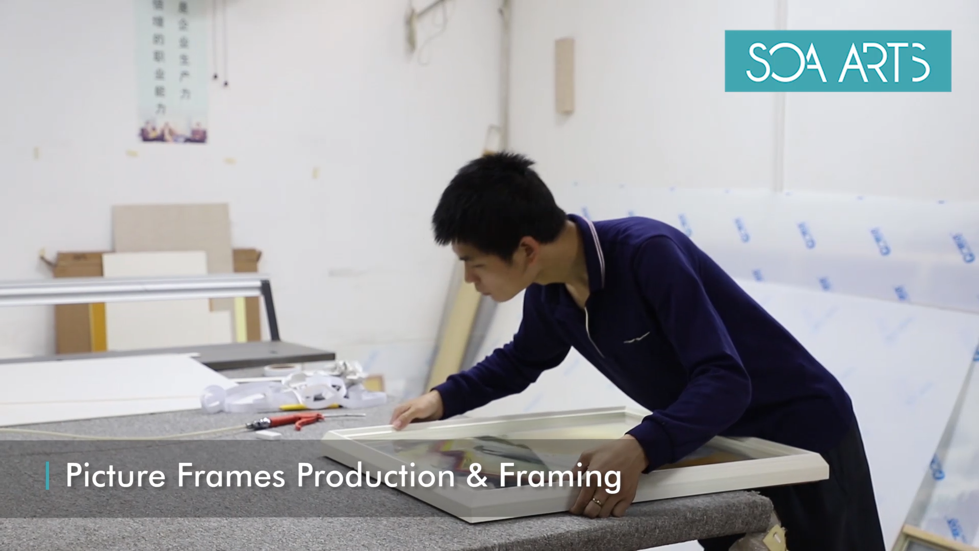
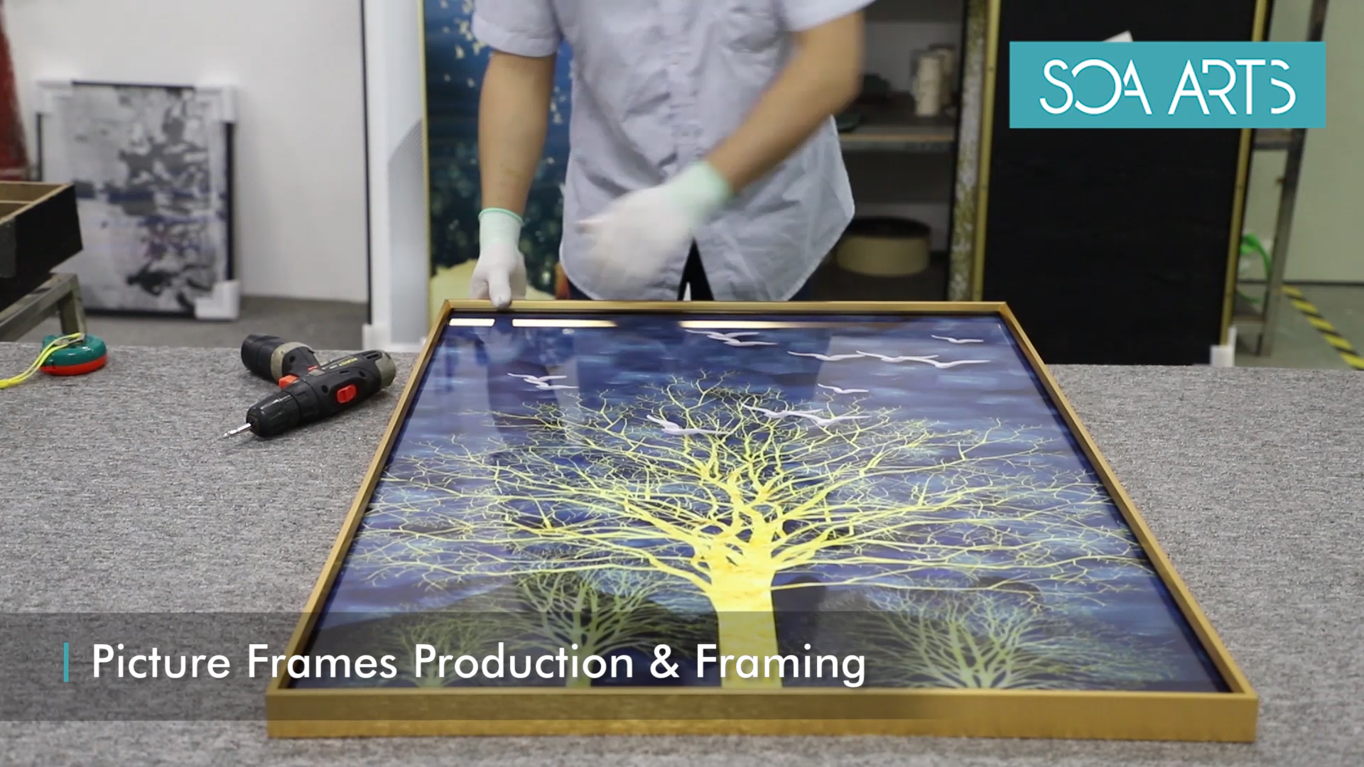
The decorator is framing.
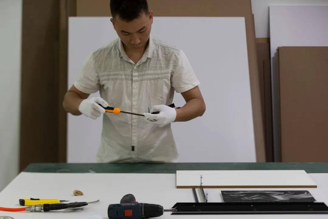
The decorator reinforced the frame.
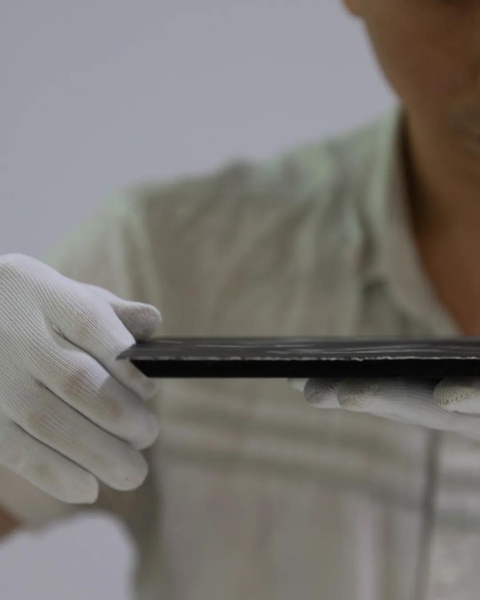
The decorator is going to sticker core.
The decorator is dusting.
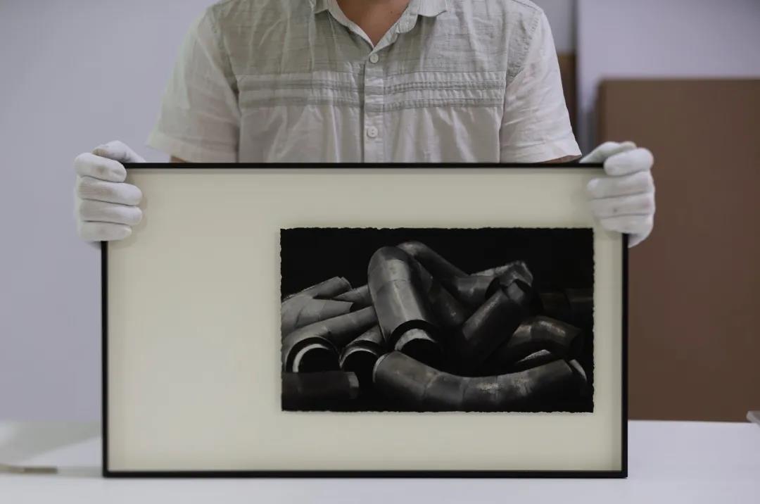
Mounting finished.
After finished, do you have any idea about acid-free mounting? Welcome to contact SOA ARTS for professional mounting solutions.
-
 21 May
For designers who don’t have basic knowledge in art or delicate design skills, when they see a harmonious color scheme of the home, the admiration for it is very high, but only stay in the feeling of “fantastic” and “very classy”. But there is no clue as to the color matching in their case.
So, how can you match colors like a master at will? What are the rules and points for color matching for your interior design?
Interior Space Color Matching Guide
Those master-level color matching secrets, there are no complicated colors to make people look very comfortable. It is so easy!
That is: Less is more.
ONE | IKEA Color Matching Rules
One key for IKEA color matching
A large area of light tones (low saturation color) + small area of high saturation color, it can serve as an overall ground by using these two colors and then match with a small area of bright color
Why? You may wonder, should IKEA color matching be popular? Fresh and bright is the secret for IKEA color matching.
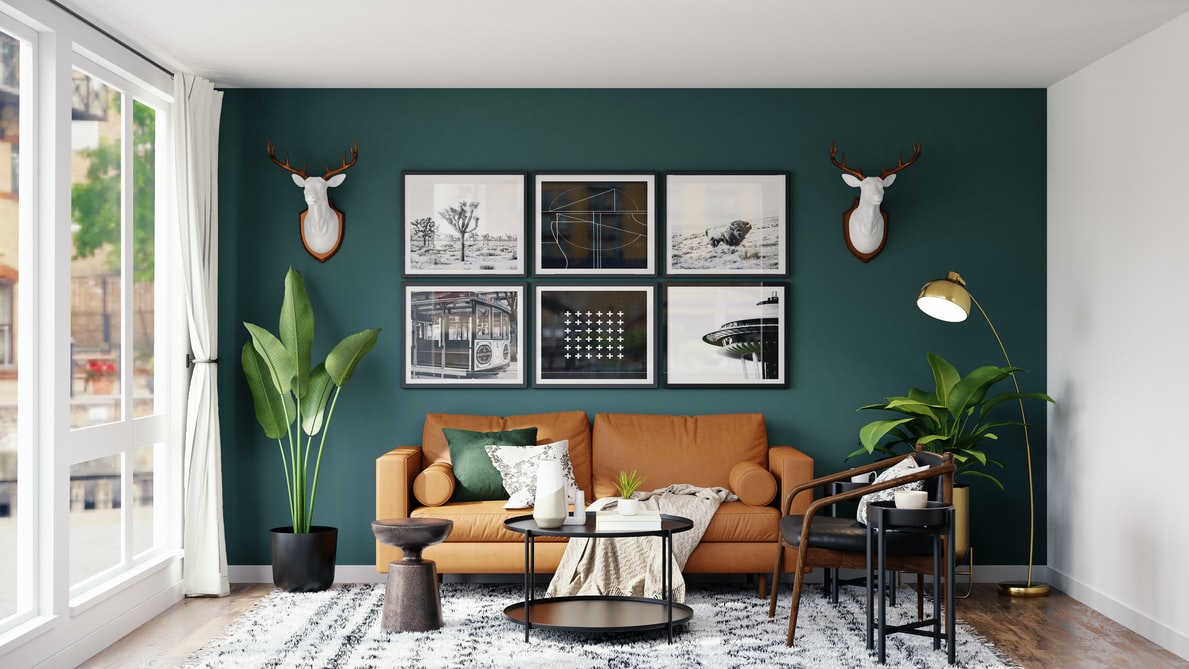
TWO | Choose an Emphasis Color and Repeat It
It is the most commonly used emphasis method in color match, and also very simple to do:
Black, white and gray base + an accent color
For example, adding colors to black, white and gray, and the large base is reconciled into light tones/bright tones, etc. + a key color...
The accent color is not a random choice of red and green, placed abruptly in the center of the room to catch the eye.
Black, white, and gray can be regarded as a “disappearing state” in the color system. Choosing black and white ash as a large base for wall color, ceiling, and large-area interior decoration is equivalent to creating a blank canvas. At this time, you can fill it with any color. It’s all okay.
Next, choose a color you like as the key one, and repeat, it will give people a sense of “fashionable and high-class”.
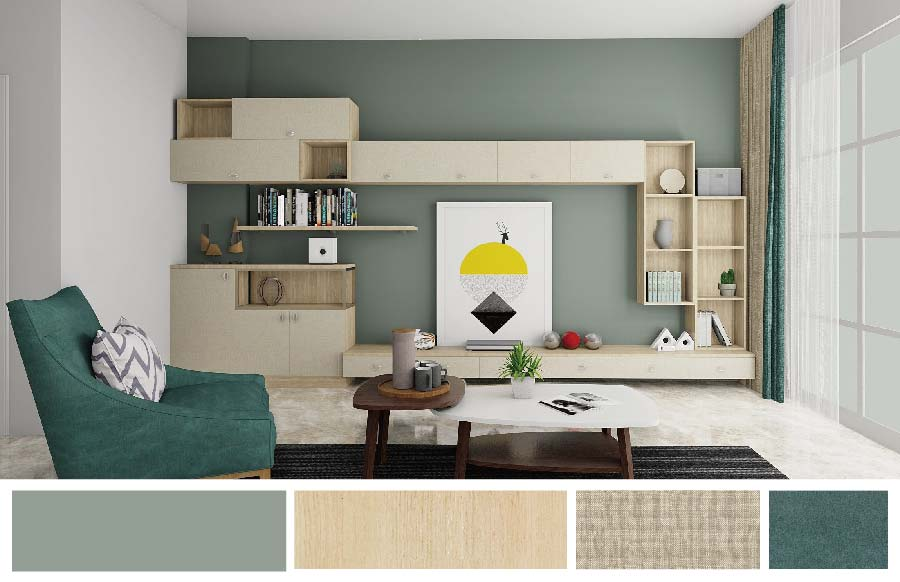
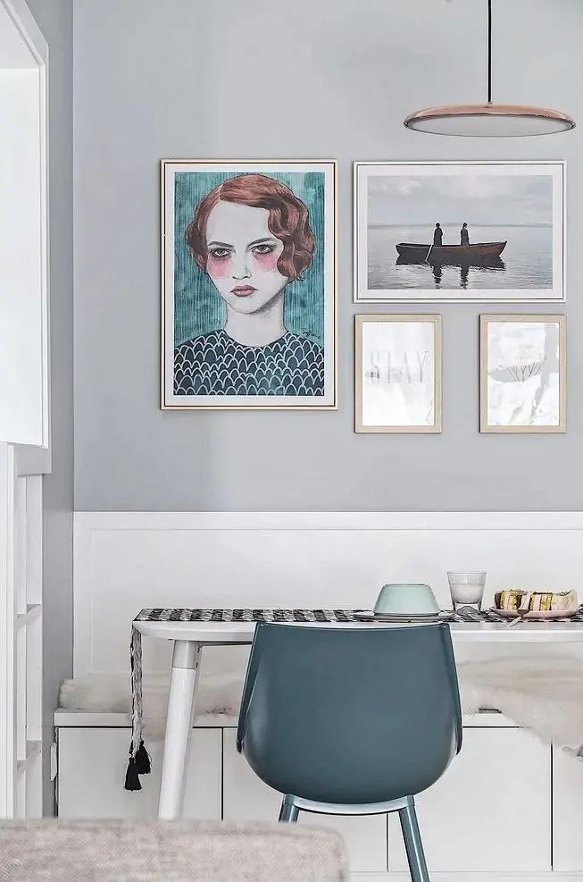
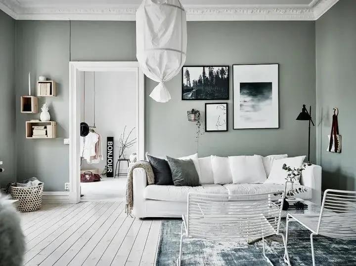
01 Black, White, and Gray + Wood
02 Black, White, and Gray + Blue
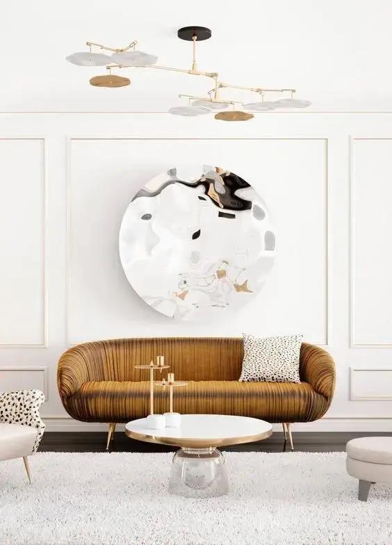
03 Black, White, and Gray + Golden
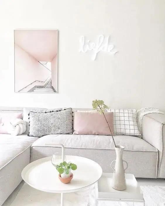
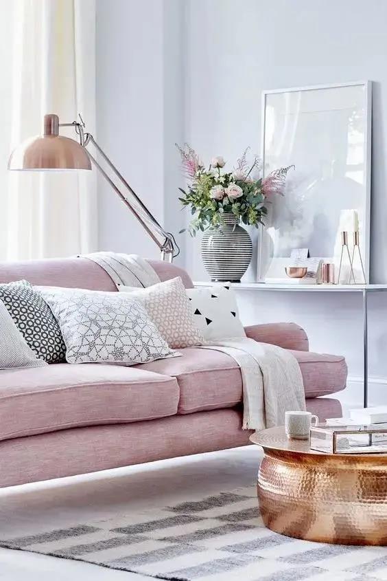
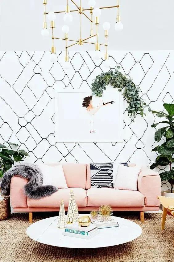
04 Black, White, and Gray + Pink
05 Black, White, and Gray + Yellow
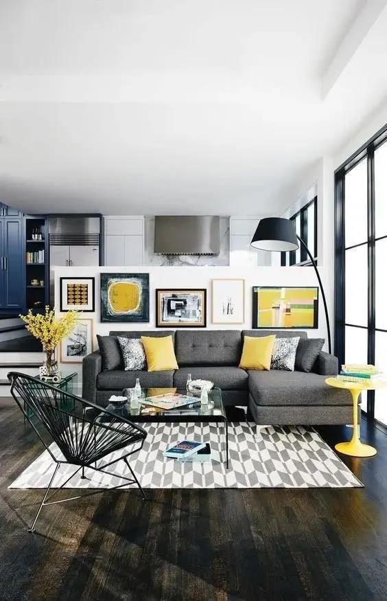
If you want to create a focal point in the space, make the color of a single item unique.
If you have brightly colored home decor, such as a golden-yellow sofa, it will be incompatible in a black, white, and gray environment. You can choose a black, white, and gray painting with gold to achieve the balance in the picture, and your sofa will become the finishing touch that makes the space easy to be naughty and lively.
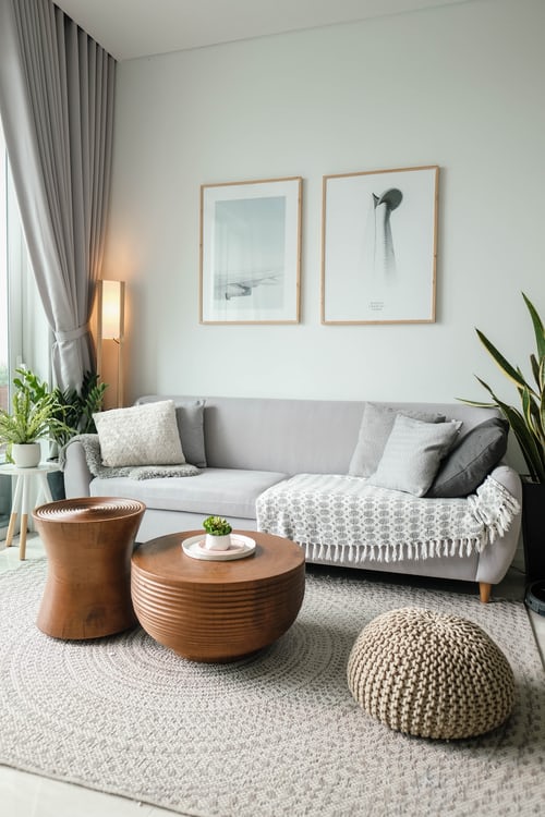
THREE | Superimposition of the Same Color System
Modern homeowners’ spaces are more individual, and they always want to add some colors to create a sense of freshness. Once the walls paint colors, the matching of furniture and decorative paintings will have higher requirements.
The best way is to stack the same color system:
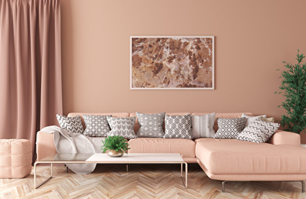
Choose home decor items and decorative paintings of the same color as the wall, which can be in various shades, but within the same color system.
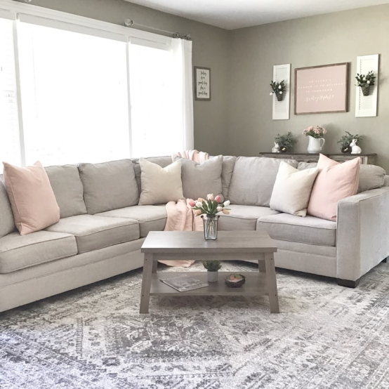
The gray-painted wall, with a slighter pillow and carpet, plus a western-style table, and the lighter color of the plant decoration painting, forming a layered warm color transition
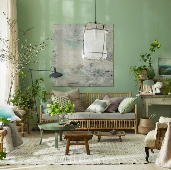
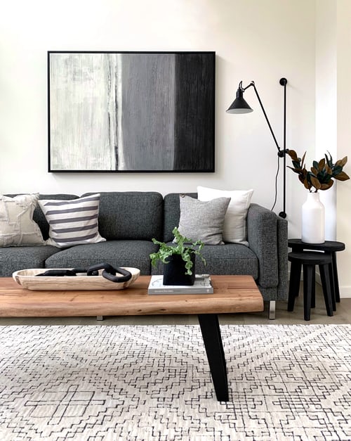
Verdancy color is also good. There is a feeling of spring in the air.
In recent years, the trending color olive green is very tonal when used in the home design.
The walls, framed paintings, pillows, and carpets all maintain the same color system. The framed arts can choose some black and white or dark green so that the overall atmosphere can be fresh and peaceful.
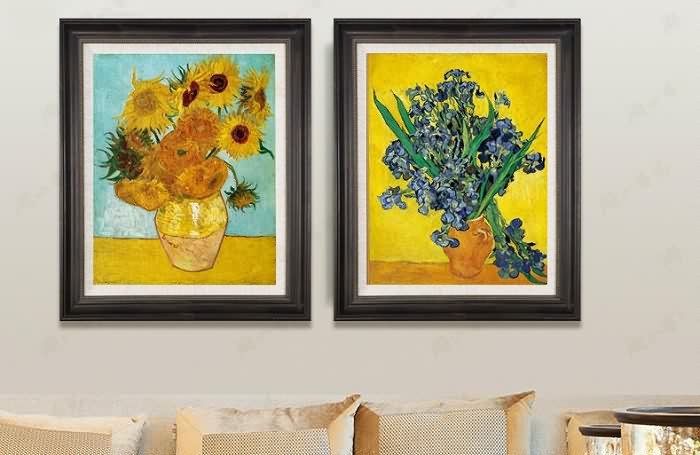
FOUR | Bold Contrast Color (Complementary Color)
It is the complementary color matching method in Vincent Van Gogh’s paintings.
Here are a few of the most commonly used and the most effective matches, which can be grasped easily without understanding the color principle.
01 Blue + Beige
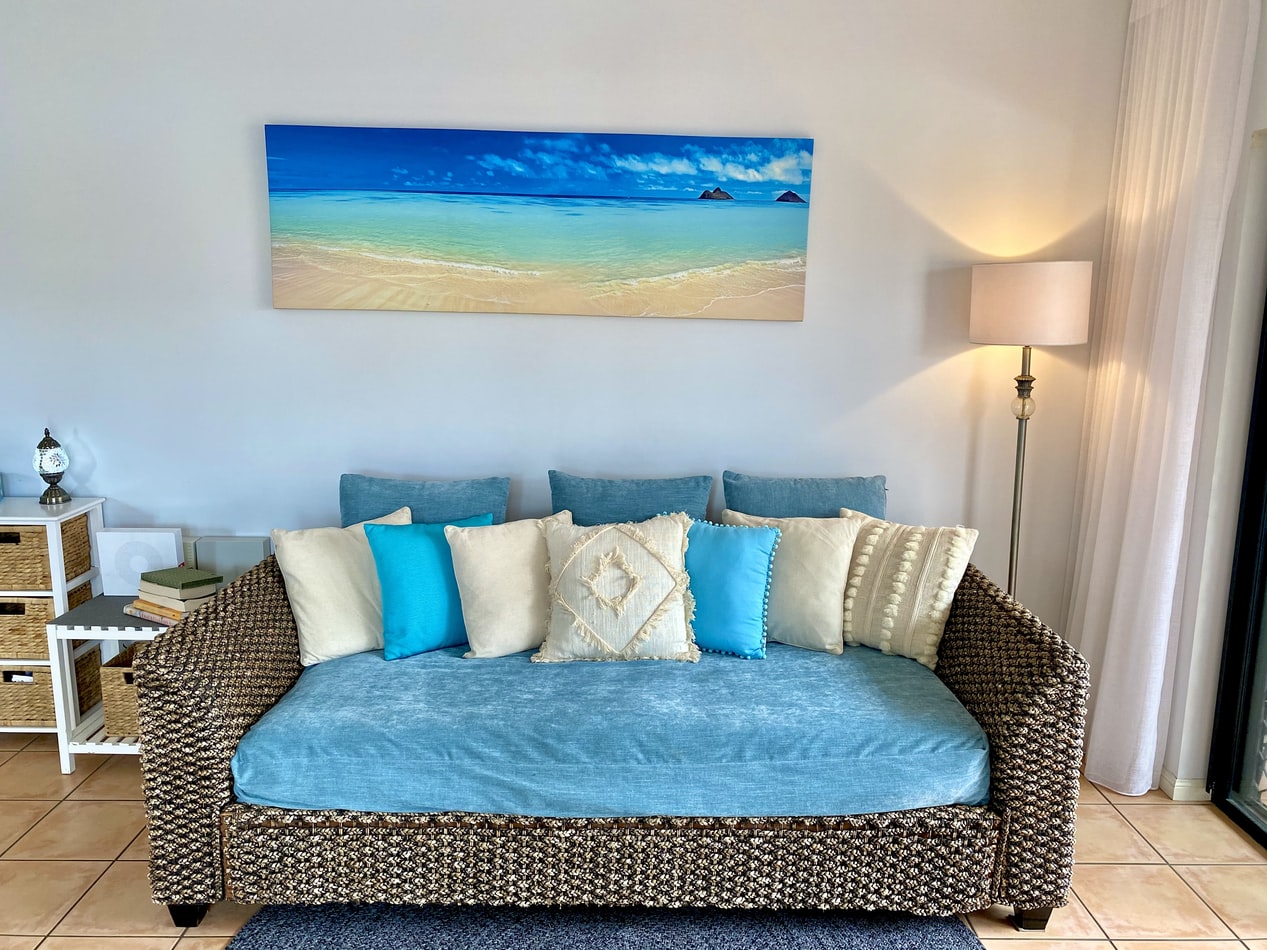
It can go with a perfect contrast effect.
Contrasting colors can’t be hit with high-purity colors, because it makes people into a sense of internecine destruction, and its impact is enough but not eye-pleasing.
The blue pillows are bright, but the beige colors in pillows and decorative paintings are very light. As soon as the fresh and soft aqua beige appears, with one thicker and one lighter, gaudy colors are immediately lowered, and the entire space is balanced.
02 Pink + Golden + White
The white framed paintings, the pink walls, and the golden home decor are perfect.
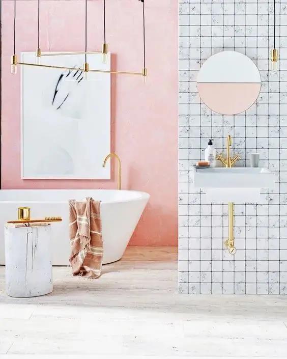
In a bathroom, the white decorative paintings blend well into the pink walls.
03 Green + Purple
I think they are built in pairs and collide with a modern and textured feeling.
In summary, only when color matching conforms to the compositional aesthetics can the relationship between the subject and the background be handled well, and the color can beautify the space.
What is your favorite decoration color in 2021?