How to Match Colors for Your Interior Design
For designers who don’t have basic knowledge in art or delicate design skills, when they see a harmonious color scheme of the home, the admiration for it is very high, but only stay in the feeling of “fantastic” and “very classy”. But there is no clue as to the color matching in their case.
So, how can you match colors like a master at will? What are the rules and points for color matching for your interior design?
Interior Space Color Matching Guide
Those master-level color matching secrets, there are no complicated colors to make people look very comfortable. It is so easy!
That is: Less is more.
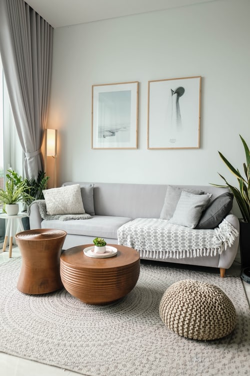
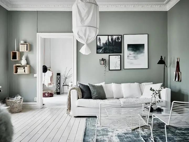
ONE | IKEA Color Matching Rules
One key for IKEA color matching
A large area of light tones (low saturation color) + small area of high saturation color, it can serve as an overall ground by using these two colors and then match with a small area of bright color
Why? You may wonder, should IKEA color matching be popular? Fresh and bright is the secret for IKEA color matching.
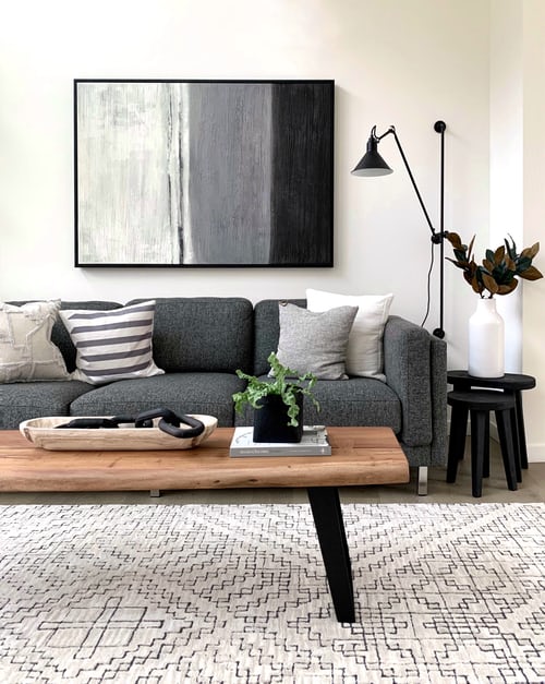
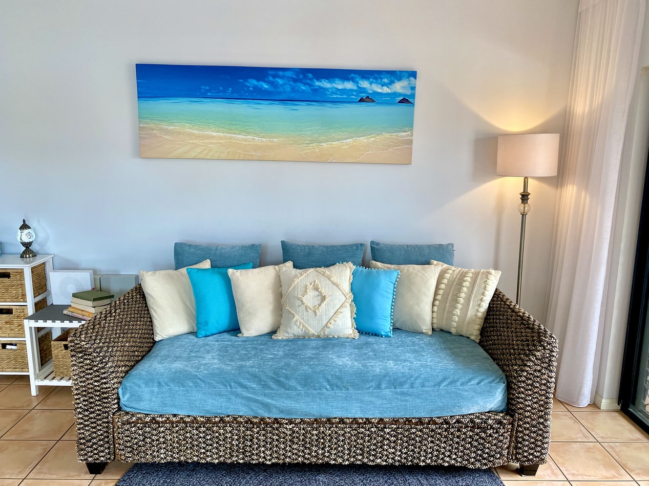
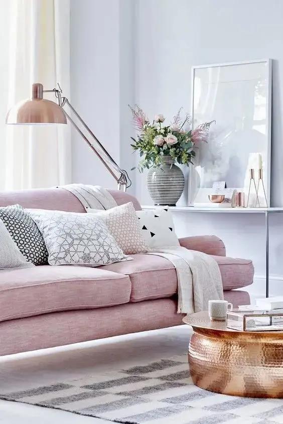
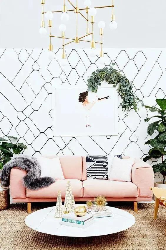
TWO | Choose an Emphasis Color and Repeat It
It is the most commonly used emphasis method in color match, and also very simple to do:
Black, white and gray base + an accent color
For example, adding colors to black, white and gray, and the large base is reconciled into light tones/bright tones, etc. + a key color...
The accent color is not a random choice of red and green, placed abruptly in the center of the room to catch the eye.
Black, white, and gray can be regarded as a “disappearing state” in the color system. Choosing black and white ash as a large base for wall color, ceiling, and large-area interior decoration is equivalent to creating a blank canvas. At this time, you can fill it with any color. It’s all okay.
Next, choose a color you like as the key one, and repeat, it will give people a sense of “fashionable and high-class”.
01 Black, White, and Gray + Wood
02 Black, White, and Gray + Blue
03 Black, White, and Gray + Golden
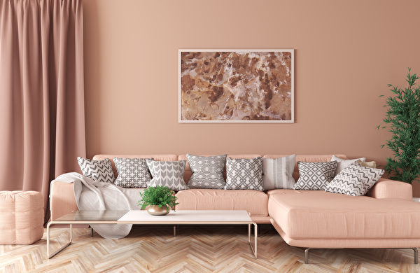
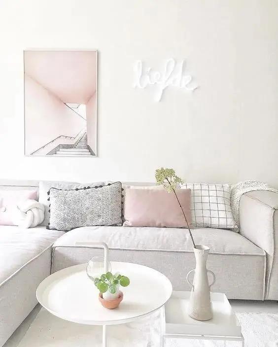
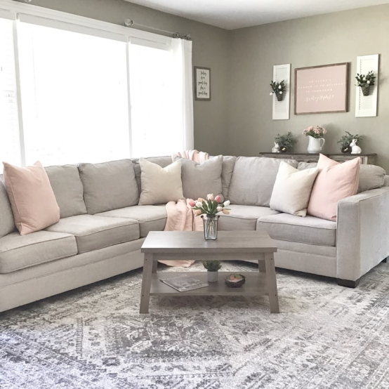
04 Black, White, and Gray + Pink
05 Black, White, and Gray + Yellow
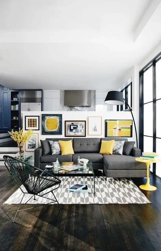
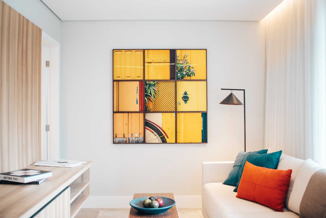
If you want to create a focal point in the space, make the color of a single item unique.
If you have brightly colored home decor, such as a golden-yellow sofa, it will be incompatible in a black, white, and gray environment. You can choose a black, white, and gray painting with gold to achieve the balance in the picture, and your sofa will become the finishing touch that makes the space easy to be naughty and lively.
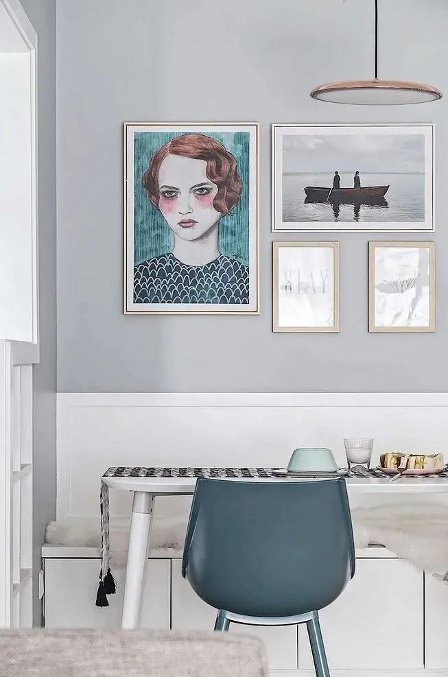
THREE | Superimposition of the Same Color System
Modern homeowners’ spaces are more individual, and they always want to add some colors to create a sense of freshness. Once the walls paint colors, the matching of furniture and decorative paintings will have higher requirements.
The best way is to stack the same color system:
Choose home decor items and decorative paintings of the same color as the wall, which can be in various shades, but within the same color system.
The gray-painted wall, with a slighter pillow and carpet, plus a western-style table, and the lighter color of the plant decoration painting, forming a layered warm color transition
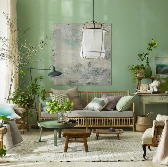
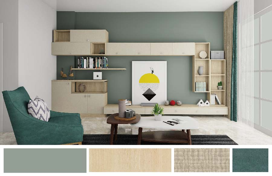
Verdancy color is also good. There is a feeling of spring in the air.
In recent years, the trending color olive green is very tonal when used in the home design.
The walls, framed paintings, pillows, and carpets all maintain the same color system. The framed arts can choose some black and white or dark green so that the overall atmosphere can be fresh and peaceful.
FOUR | Bold Contrast Color (Complementary Color)
It is the complementary color matching method in Vincent Van Gogh’s paintings.
Here are a few of the most commonly used and the most effective matches, which can be grasped easily without understanding the color principle.
01 Blue + Beige
It can go with a perfect contrast effect.
Contrasting colors can’t be hit with high-purity colors, because it makes people into a sense of internecine destruction, and its impact is enough but not eye-pleasing.
The blue pillows are bright, but the beige colors in pillows and decorative paintings are very light. As soon as the fresh and soft aqua beige appears, with one thicker and one lighter, gaudy colors are immediately lowered, and the entire space is balanced.
02 Pink + Golden + White
The white framed paintings, the pink walls, and the golden home decor are perfect.
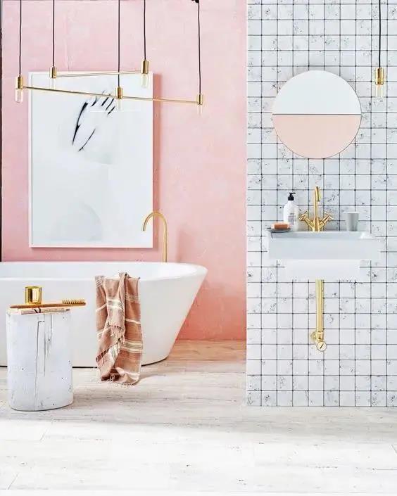
In a bathroom, the white decorative paintings blend well into the pink walls.
03 Green + Purple
I think they are built in pairs and collide with a modern and textured feeling.
In summary, only when color matching conforms to the compositional aesthetics can the relationship between the subject and the background be handled well, and the color can beautify the space.
What is your favorite decoration color in 2021?