5 Trendy Color Schemes in Interior Design Everyone Should Know

Color is a vital part of interior design but also the first feeling after people enter the space. Therefore, as a designer, it becomes a necessary ability to choose and match colors in interior design.
Color schemes are based on science, not feeling. Many of you in doing color matching for interior design and do not know why it should be matched like that, and just by your own feeling or copy from the website. It turns out to be indescribable for the result of the visual effect.
Therefore, to help you solve this problem, we will share 5 popular color matching in interior design.
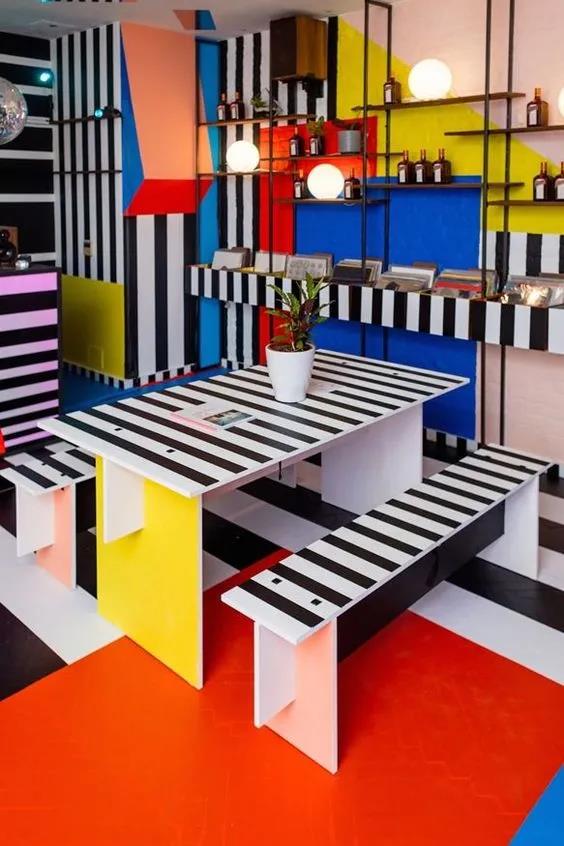
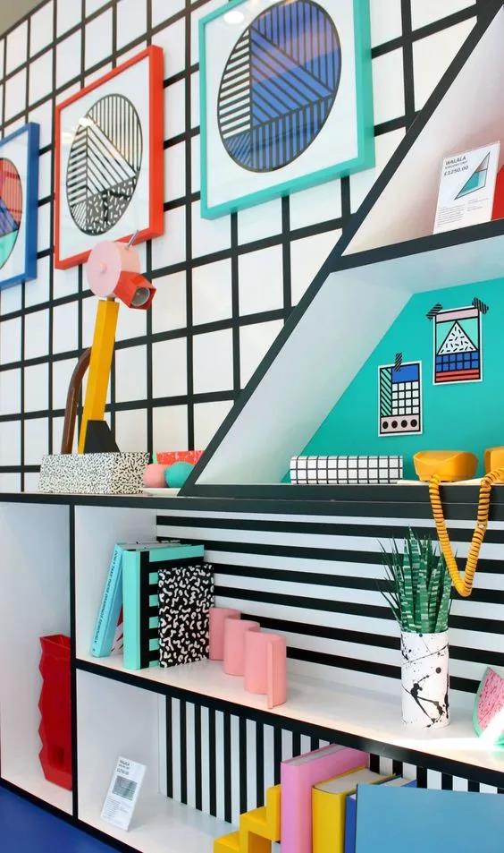
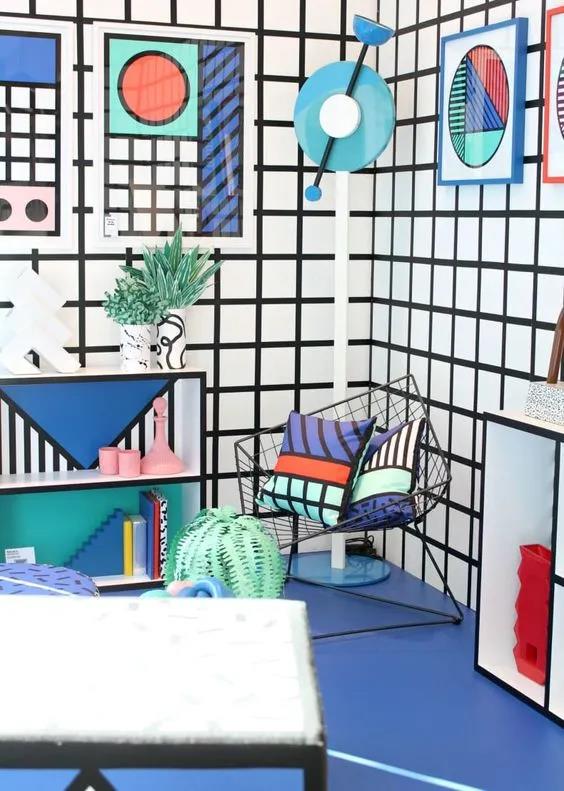
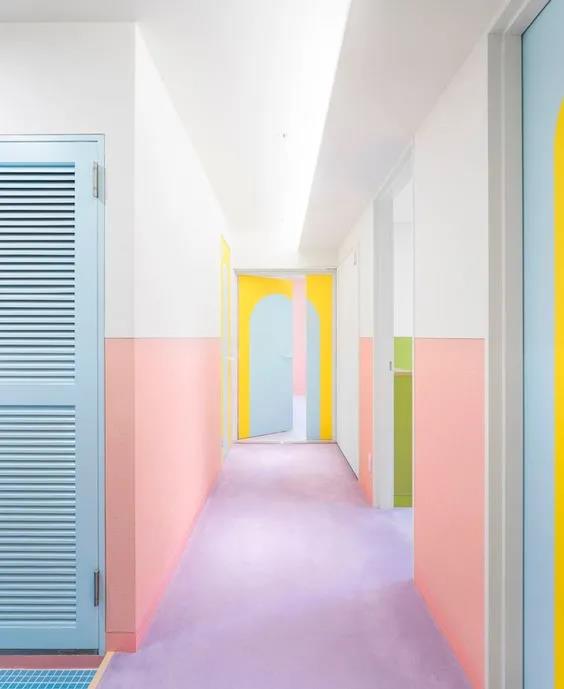
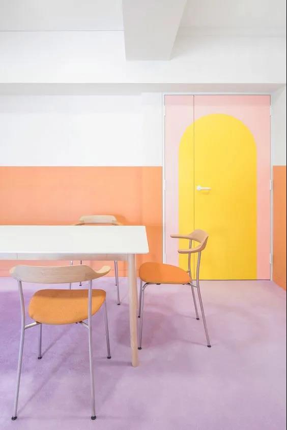
ONE. Memphis Color Scheme
Why do we call Memphis color so advanced? The secret lies in using bright, lively, high contrast hues. The personality in overall color tone is more evident after using a variety of complex, colorful surface patterns.
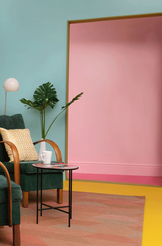
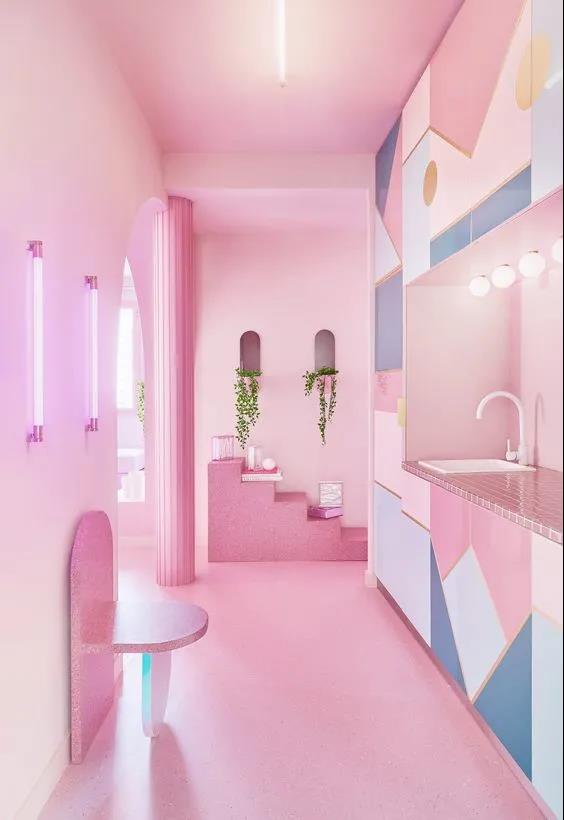
TWO. Macaron Color Scheme
As a dessert, the color of macaron can make us feel sweet, clean and dreamy. It also can be used in interior design to create a warm, girly, and fresh vibe.
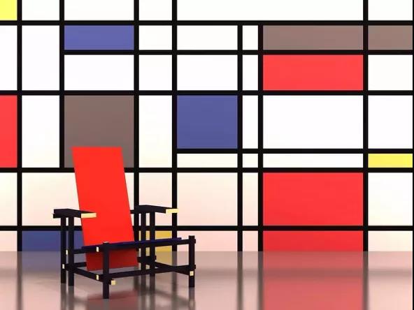
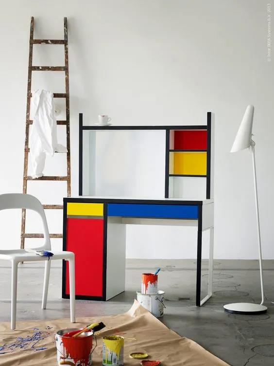
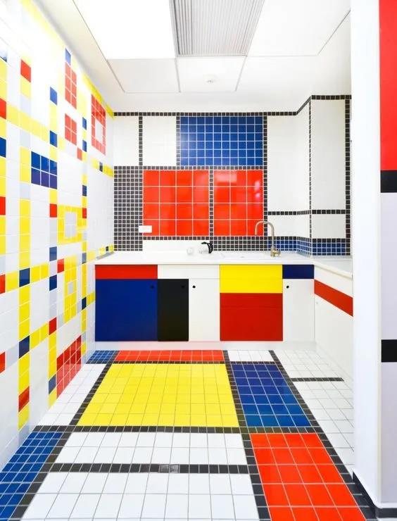
THREE. Mondrian's Color Scheme
The space is dominated by the highly saturated red, which has a relatively wide area and more vivid color, while the other colors with a little blue, yellow and white.
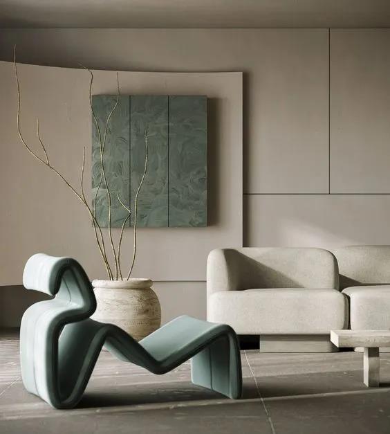
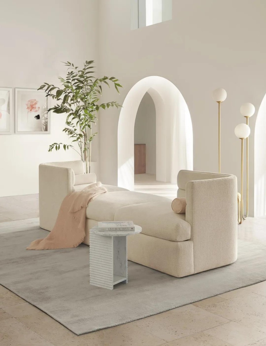
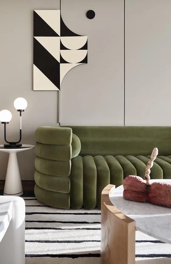
FOUR. Morandi Color Scheme
Morandi color is a low saturation color series, not as bright as other colors, as if covered with a layer of gray. But "gray" is not a simple color but the representative of a group of colors, so it will always be called "advanced gray".
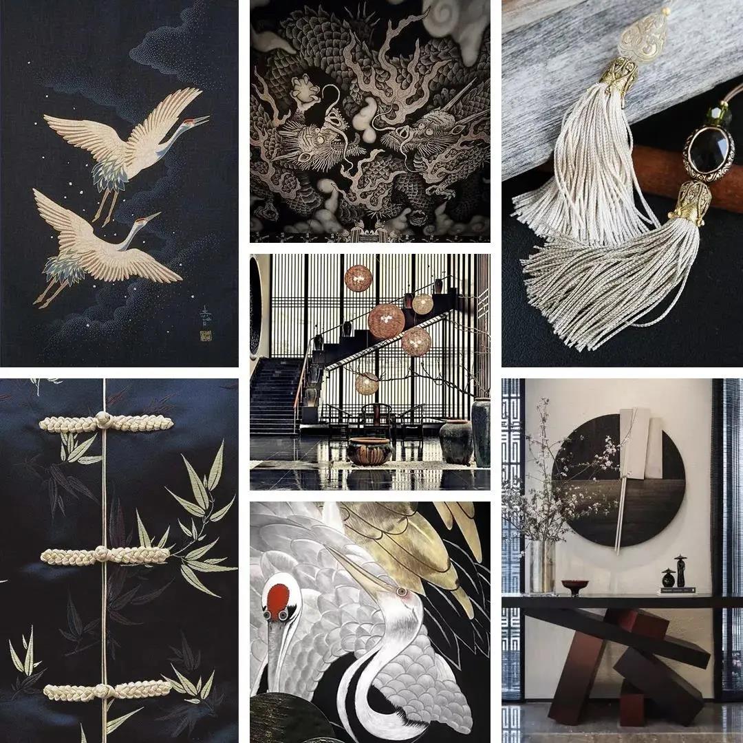
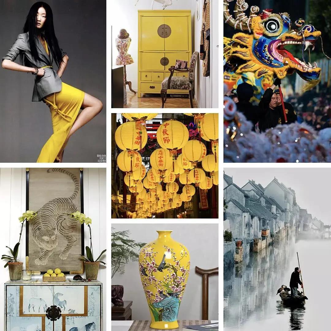
FIVE. Traditional Chinese Style Color Scheme
Speaking of color, Chinese people tend to have deep implicit feelings and vigorous waiting for release, not directly expressing the sense, but combining emotion with the scenery. The expression "depict three points, leave seven points" is Oriental unique amorous feelings.
Deep Black Color
It vividly conveyed Chinese architecture's exquisite tenon and mortise and restored the simple, quiet and neat beauty.
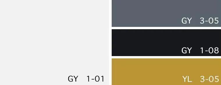
Color card: Bright white/Storm grey/Pure black/Honey
Chinese Red
Highlight cultural deposits have always been a good way for the Chinese style to output the world's most advanced taste performance with national characteristics. French romance adds more delicate elegance to Chinese red.
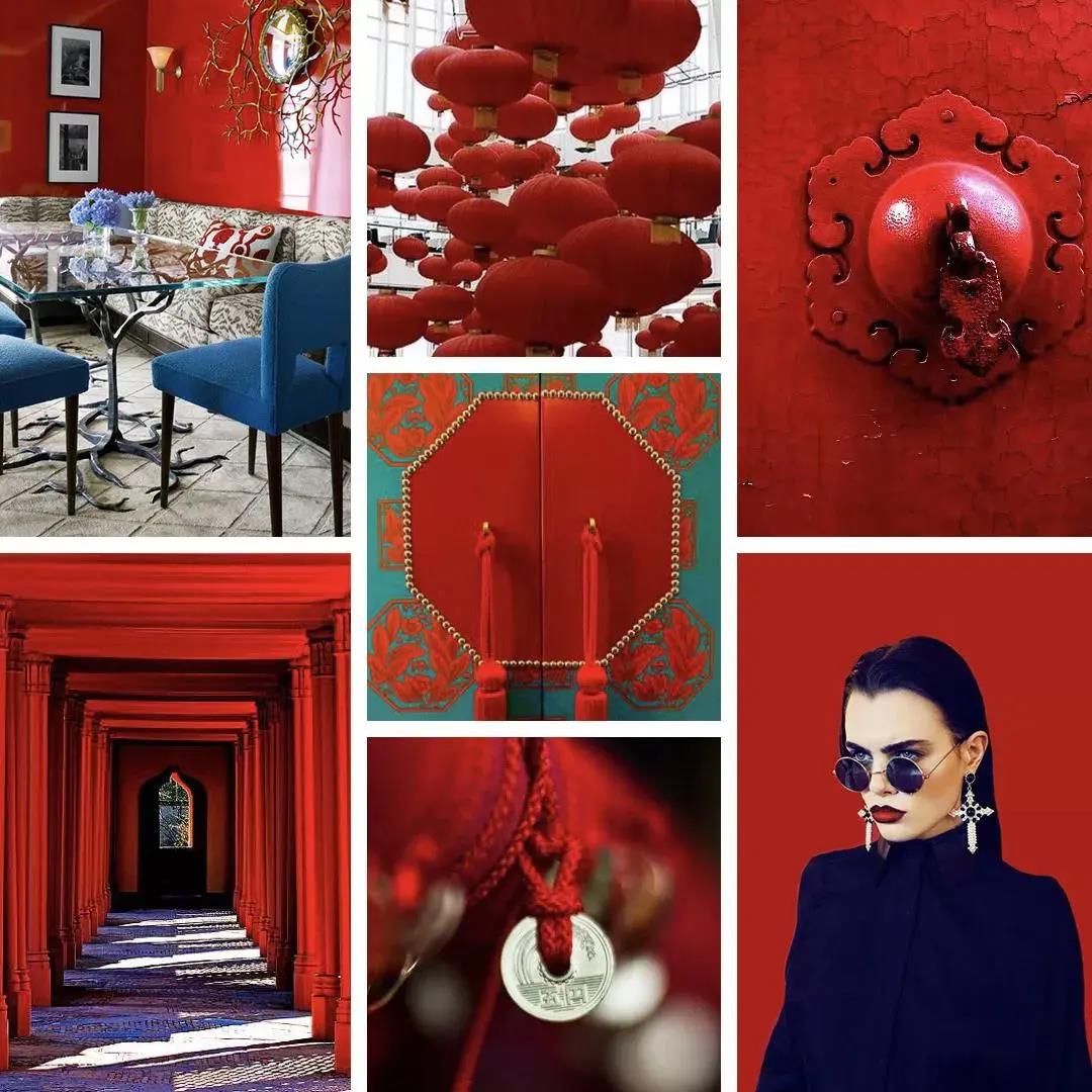
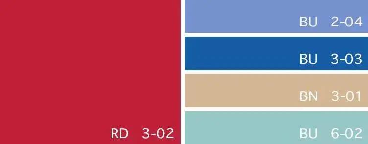
Color card: China red/Serenity blue/Victoria blue/Beige/Light turquoise
Songbird Green
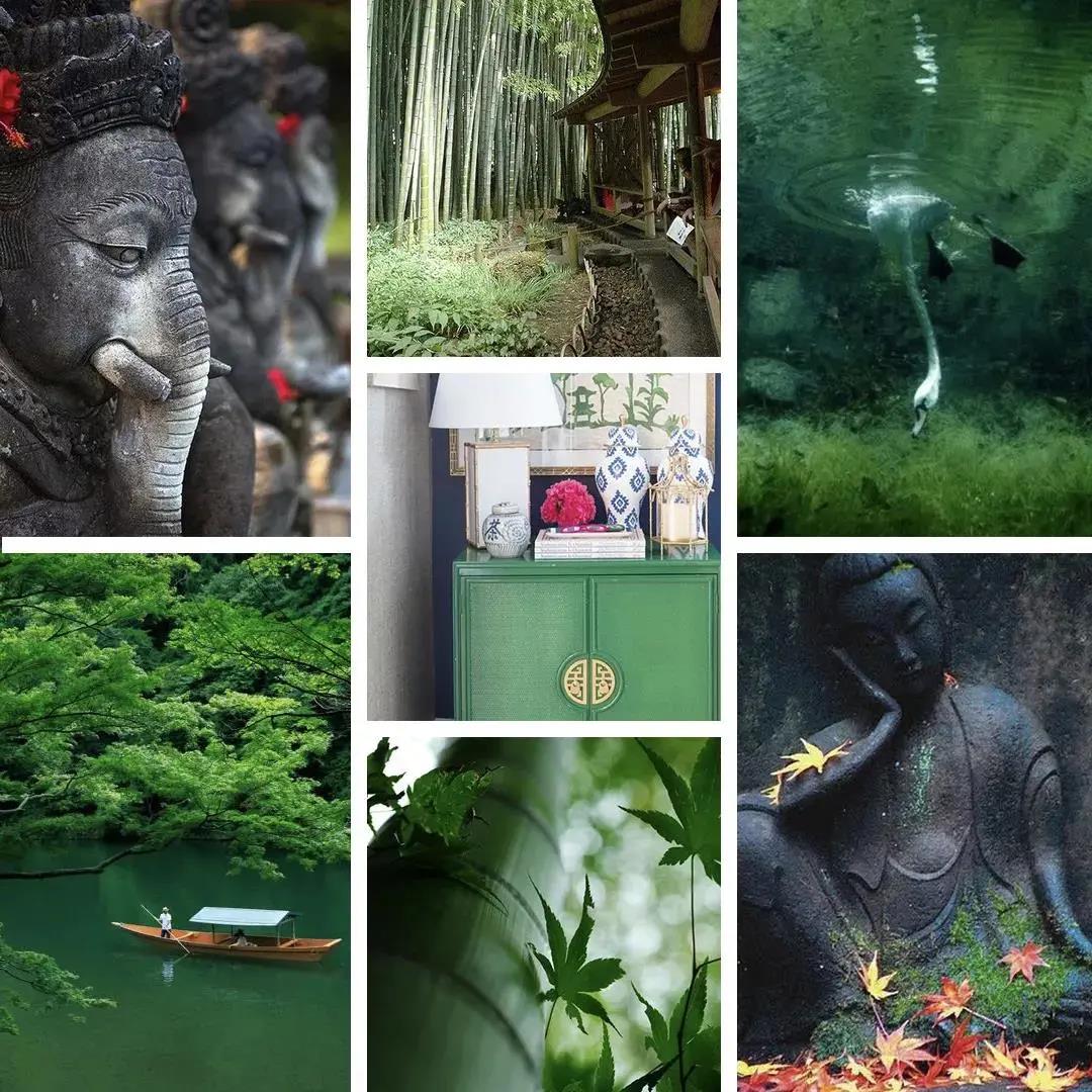
Color card: Dusk blue/Treetop green/Kelly green/Bluebird/Wheat
Coral
Bright and dynamic Hermes orange, gathering new Chinese style can also deduce the gorgeous color of Chinese style.
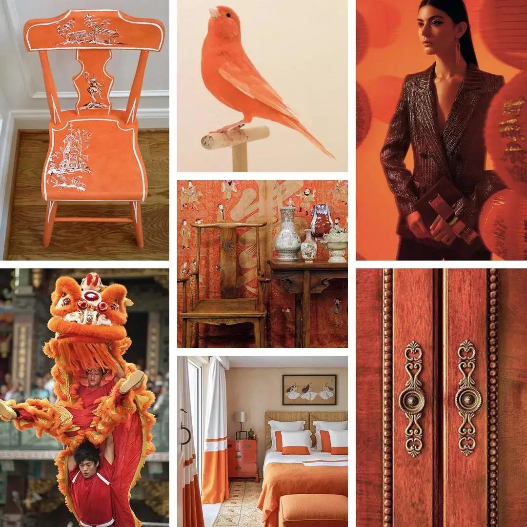
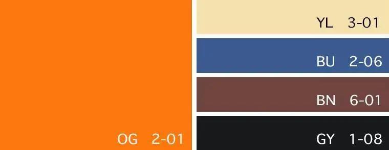
Color card: Hermes Orange/Sunshine/Delft blue/Sable/Pure black
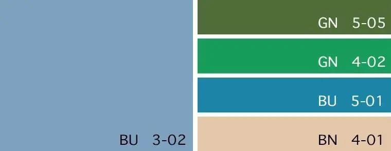
MACLURA AURANTICA
The fashion collision between senior grey and imperial yellow makes the new Chinese style modern and full of western-style publicity and individuality.
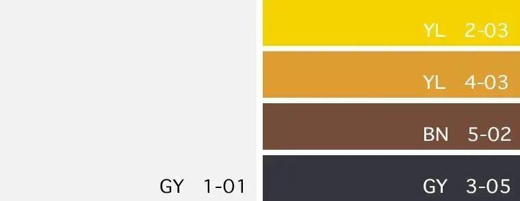
Color card: Bright white/Imperial yellow/Gold/Tortoiseshell/Phantom black
The above are 5 popular color schemes for interior design. If you have any questions about color matching and art recommendations for home, feel free to contact SOA Arts, and we will help you!