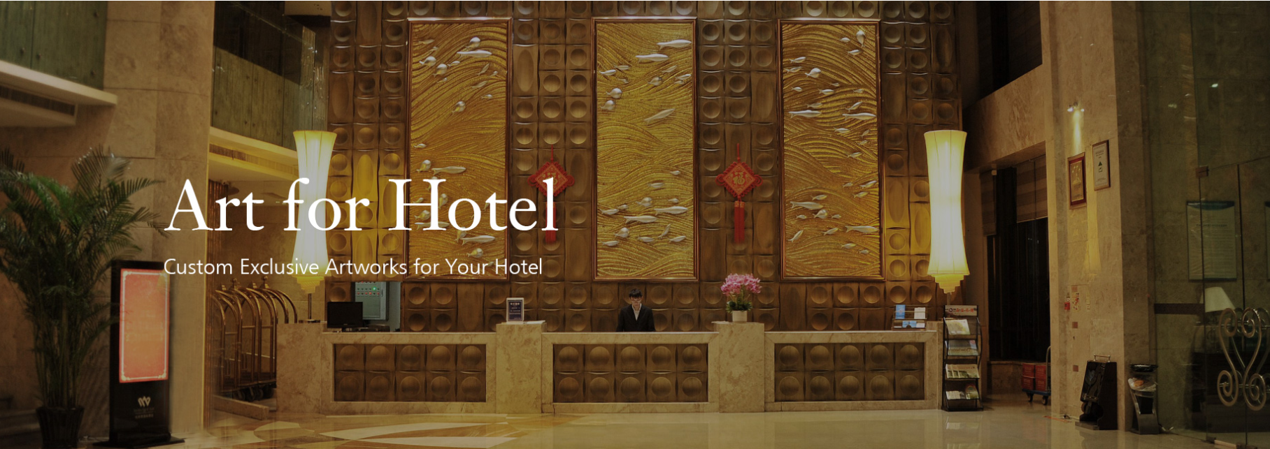
Interior Design Ideas
-

At SOA Arts, it’s our job to stay at the bleeding edge of hotel interior design and everything art-related. Over the years, we’ve come to know that well-sourced art can make or break a hotel’s atmosphere, reputation, and revenue.
If you run a hotel and are looking for inspiration, this post might just be for you.
This page is written as a celebration of contemporary art and its power to transform interiors. We’ll be exploring some of the most beautiful hotels in the world and the art collections they jealously guard.
For those lucky enough to have the money for a night’s stay at one of these locations, they’re well worth a visit.
ART AT THE GEORGE HOTEL
Screenshot via https://www.thegeorge.com/about/art-collection
Curator Stephen Gleeson has been working on this spectacular collection since the 1990s, and his dedication really shows. It successfully captures the distinctive flair of the hotel and is breathtaking to behold if you’re in New Zealand and can visit.
The vast majority of the collection is contemporary, from New Zealand, and undeniably innovative. It goes beyond improving the overall hotel interior design. It makes the George a destination, not just a place to stay the night.
For the curious, full-art tours can be arranged at the hotel for $50 per person.
ART AT THE CONRAD INDIANAPOLIS HOTEL
Screenshot via https://www.hilton.com/en/hotels/indcici-conrad-indianapolis/
Part hotel part art gallery, the Conrad will stay in the minds of its guests many months after they leave. The interior design of hotel lobby spaces, bedrooms, and corridors are all exquisite. What’s more, the hotel boasts a collection of art that’s full of uniquely curated selections known as the Collection Suites.Each suite is inspired by the “Pop, Modern, Surrealist and Contemporary” art movements and are well worth a visit if you’re in the area. Pieces from movement-defining artists such as Salvador Dalí, Pablo Picasso, and William John Kennedy are all ready and waiting. Even dedicated art galleries in the area struggle to compete with the Conrad!
ART AT THE CONRAD CENTENNIAL SINGAPORE HOTEL
Images via https://www.hilton.com/en/hotels/sincici-conrad-centennial-singapore/gallery/
The second ‘Conrad’ hotel on this list has more than 3,400 pieces to explore throughout the entire building. Glance at a surface in this hotel, and you’ll probably see something beautiful hanging there.
The hotel interior design employed here has an overarching east-Asian theme with elegance and sophistication dripping from every square inch. If you’re planning a trip to Singapore, this art hotel is unlikely to disappoint.
ART AT THE SILO HOTEL
Screenshot via https://www.theroyalportfolio.com/the-silo/experiences/at/art-at-the-silo-hotel/
The Silo won the best city hotel in Africa award for 2020, and for a good reason. Everything about this building is truly breathtaking. The architecture, interior design, and contemporary art all sing together in a triumph that is much greater than the sum of its parts.
It’s a fantastic example of how suitable artwork can transform the interior of a building into something magical.
The establishment is just above the Zeitz Museum of Contemporary Art, which houses the continent’s largest collection of groundbreaking African art. For those looking for luxury, intrigue, and ultimate comfort, the Silo complex will be simply perfect.
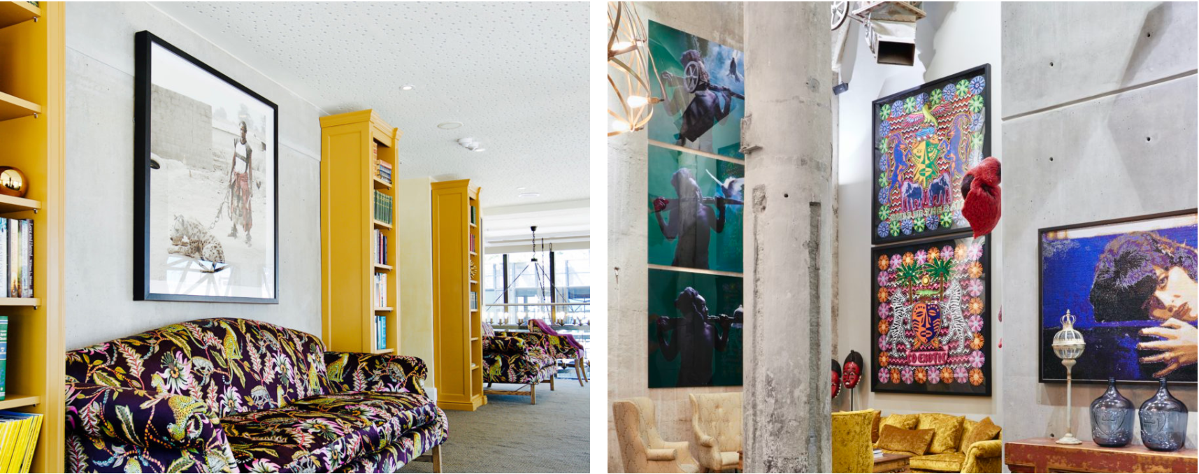
ART AT THE FIFE ARMS HOTEL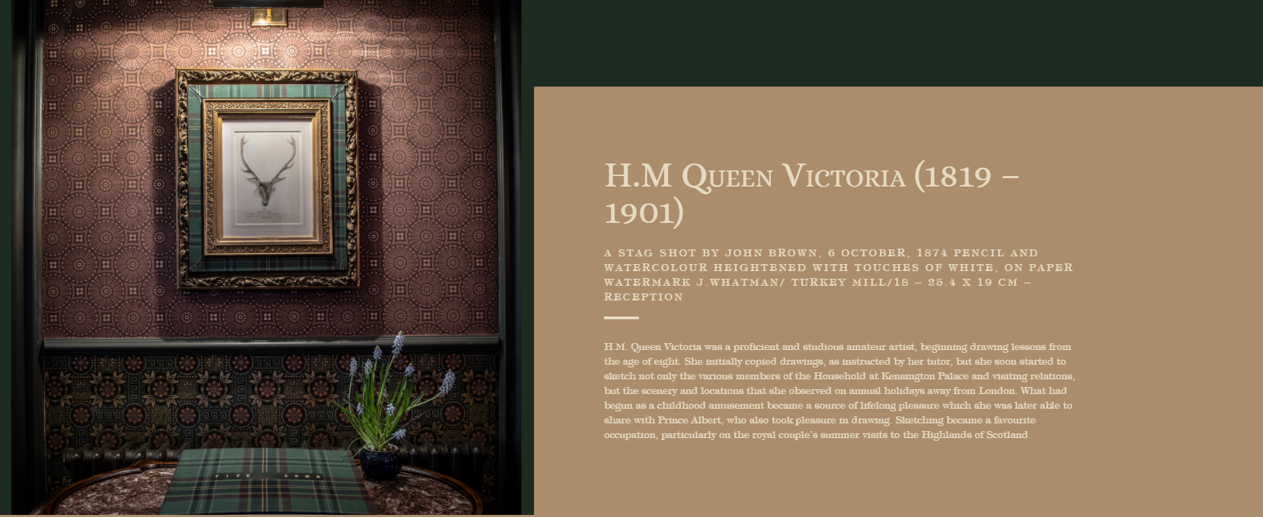
Screenshot via https://thefifearms.com/about-the-hotel/highlights-from-the-fife-arms-collection/
Located in Scotland, UK, the Fife Arms is a whiskey lover’s dream. The hotel offers regular whiskey tastings near the iconic Scottish countryside. While enjoying the local tipples, visitors can marvel at the establishment’s sizeable collection of beautiful artworks.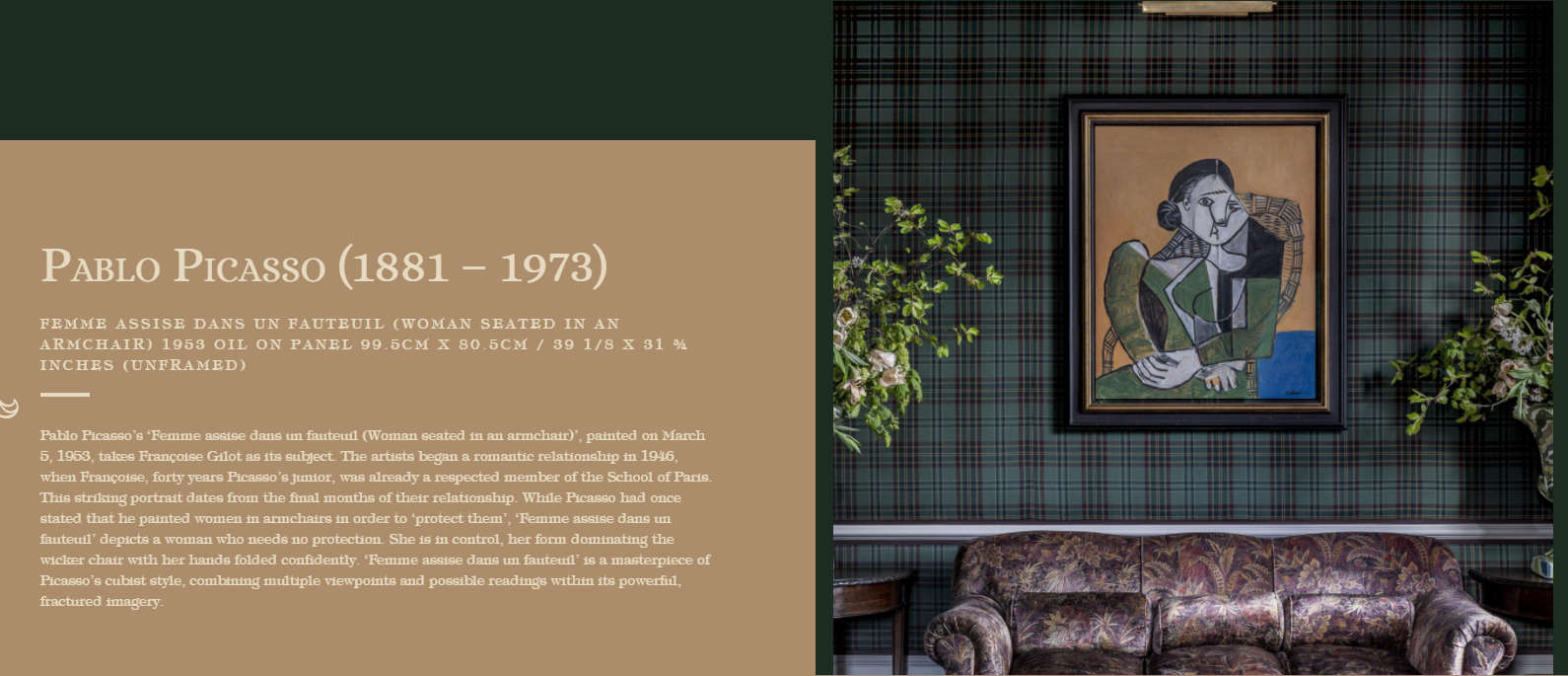
Screenshot via https://thefifearms.com/about-the-hotel/highlights-from-the-fife-arms-collection/
The pieces range from the 19th century through to the present day. They’re spread throughout the hotel and are a central part of its experience. Expect modern art, Victorian pieces, and much more. There’s even a rare Picasso painting from 1953!
If you’re a fan of cozy, eclectic interior design, the Fife Arms is right up your street.
SOA Arts – Your Source for Everything Art-Related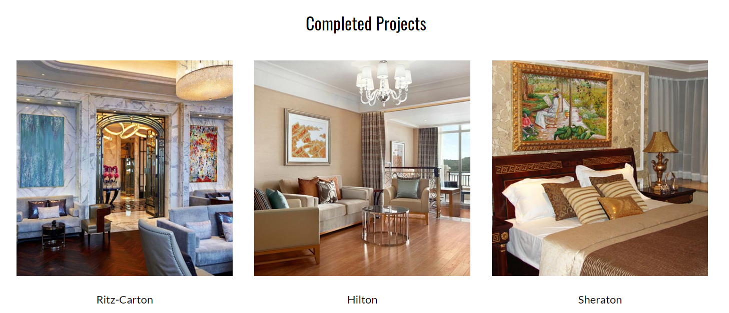
SOA Arts is a premium art factory located in Shenzhen, China. We’ve been supplying businesses around the world with specially curated, commissioned, and produced art for over a decade now.It’s our job to understand exactly what an interior needs to look its best. We offer a range of services and cover a broad spectrum of art types and genres. Unsure where to start? Looking for something specific? Get in touch today and we’ll be happy to help!
For all your art and design needs, think SOA Arts.
-End-
-
Screenshot via Cloud-up Design
Every homeowner wants their place to stand out, which is why they’re more than willing to invest in high-quality furniture and one-of-a-kind decor. Besides these, recent years have also seen people purchasing art pieces to make their spaces appear more creative and more comfortable.
Filling your walls with extraordinary art pieces is definitely a great option if you want your home to feel more like you. It enables you to express yourself, adding character and personality to the space. Doing so also adds an aesthetic feel, which is incredibly important for some people, especially those who spend the majority of their day indoors.

Screenshot via Cloud-up Design
As fantastic as wall art may seem to be, there are several challenges when purchasing them. For starters, many come with astronomical price tags, which is undoubtedly a huge barrier for the majority of consumers.
To add to that, the number of wall art options out there is practically limitless, making it difficult to choose one or just a few of them. This dilemma is made even harder if you share your space with someone. After all, no two individuals have the exact same tastes and preferences when it comes to art.
So what do you do when the process of picking wall art becomes too overwhelming to handle? Well, take a step back and consider a different perspective – a three-dimensional one, to be exact.
What is 3D Wall Art?
Screenshot via Cloud-up Design
The consumer market is abuzz with 3D Wall Art, which, as its name suggests, is essentially art that makes use of a wide variety of materials to literally bring the design to life. From butterflies that look as if they’re actually flying to beautiful floral paintings with genuine bouquets, these kinds of pieces will undoubtedly make your home stand out.If you want to start conversations without losing the aesthetic feel of your home, then 3D Wall Art is your best option.
Take a look at our top 3D Wall Art picks below:
Coral Trees Decorative Artwork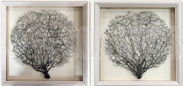
Size: 120 x 60c; 48 x 24 in
Medium: Mixed Media
Price: $158.40Made with a combination of wood, stone, ceramic, metal, steel, paper, and acrylic, this 3D Wall Art piece will be a stunning addition to your home. The blend of different materials perfectly encapsulates the silhouette of the tree, making it appear as if it was genuinely moving in the wind. The design is also extraordinary, thanks to its unique mix of elements from both land and sea.
White Porcelain Spoons Artwork
Size: 180 x 60 cm; 72 x 24 in
Medium: Mixed Media
Price: $237.70If you’re a foodie or a culinary enthusiast, then you’d definitely appreciate this fantastic 3D Wall Art piece. The White Porcelain Spoons Artwork uses a wide variety of materials to mimic a utensil found on every dining table across the globe. These are then arranged interestingly, falling into a pile as if diners simply discarded them after digging into a steaming bowl of soup. Starting a conversation with guests will be much easier with this art piece around!
Papercut Art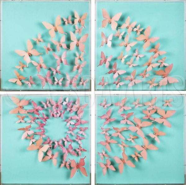
Size: 50 x 50 x 4 cm; 20 x 20 in
Medium: Mixed Media
Price: $300.00Butterflies are a go-to option for 3D Wall Art due to the phenomenal movement that they exhibit, and this particular one is no exception. This Papercut Art features a kaleidoscope of butterflies in varying shades of pink against an eye-catching shade of blue. The combination of these shades is incredibly calming, making this piece a wonderful addition to any home.
Flowering Tree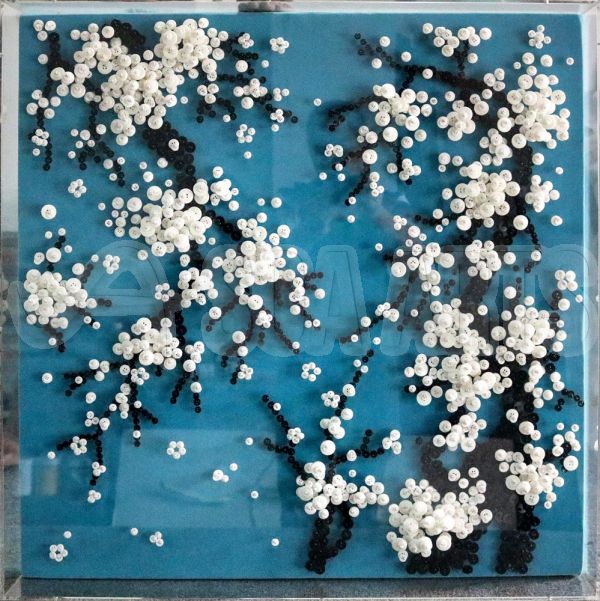
Size: 80 x 80 cm; 32 x 32 in
Medium: Mixed Media
Price: $140.80Without a doubt, this 3D Wall Art will appeal to many homeowners, thanks to its fascinating combination of beads, needles, and buttons, all of which give the design a one-of-a-kind texture. Its design may appear simple but upon closer inspection, there are a ton of subtle elements that add to the piece’s fascinating vibe. Additionally, the cool-toned color palette will suit all kinds of aesthetics, from minimalistic Scandinavian to kitschy boho.
Decorative Plates Artwork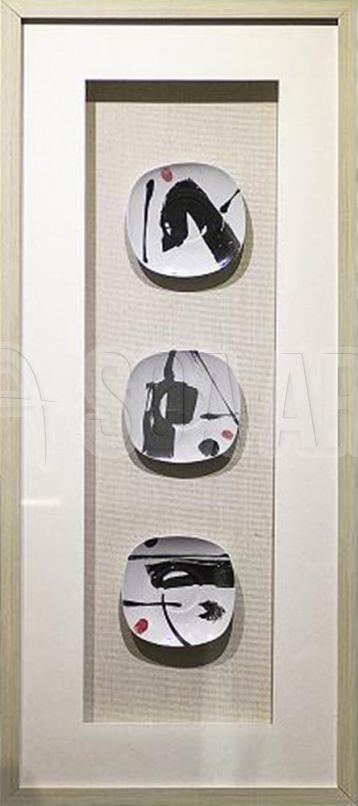
Size: 120 x 60 cm; 48x24 in
Medium: Mixed Media
Price: $158.40Homeowners who are fans of a more Japanese-esque style will love this 3D Wall Art piece. Titled “Decorative Plates,” it consists of a set of three dishes, with each featuring a different design. The swath of black paint, the vibrant dots of red, and the textured beige background are all reminiscent of the “Land of the Rising Sun,” making it perfect for spaces that aim to bring to life this beautiful aesthetic.
* * * * *
Which of these are you most excited to own? Do you plan on giving any of them as gifts for the upcoming holiday season? If you’re still hesitant about making the purchase, then check out SOA ARTS and our vast collection of 3D Wall Art pieces.
You’ll definitely find something there that will fit your tastes and preferences!
-End-
-
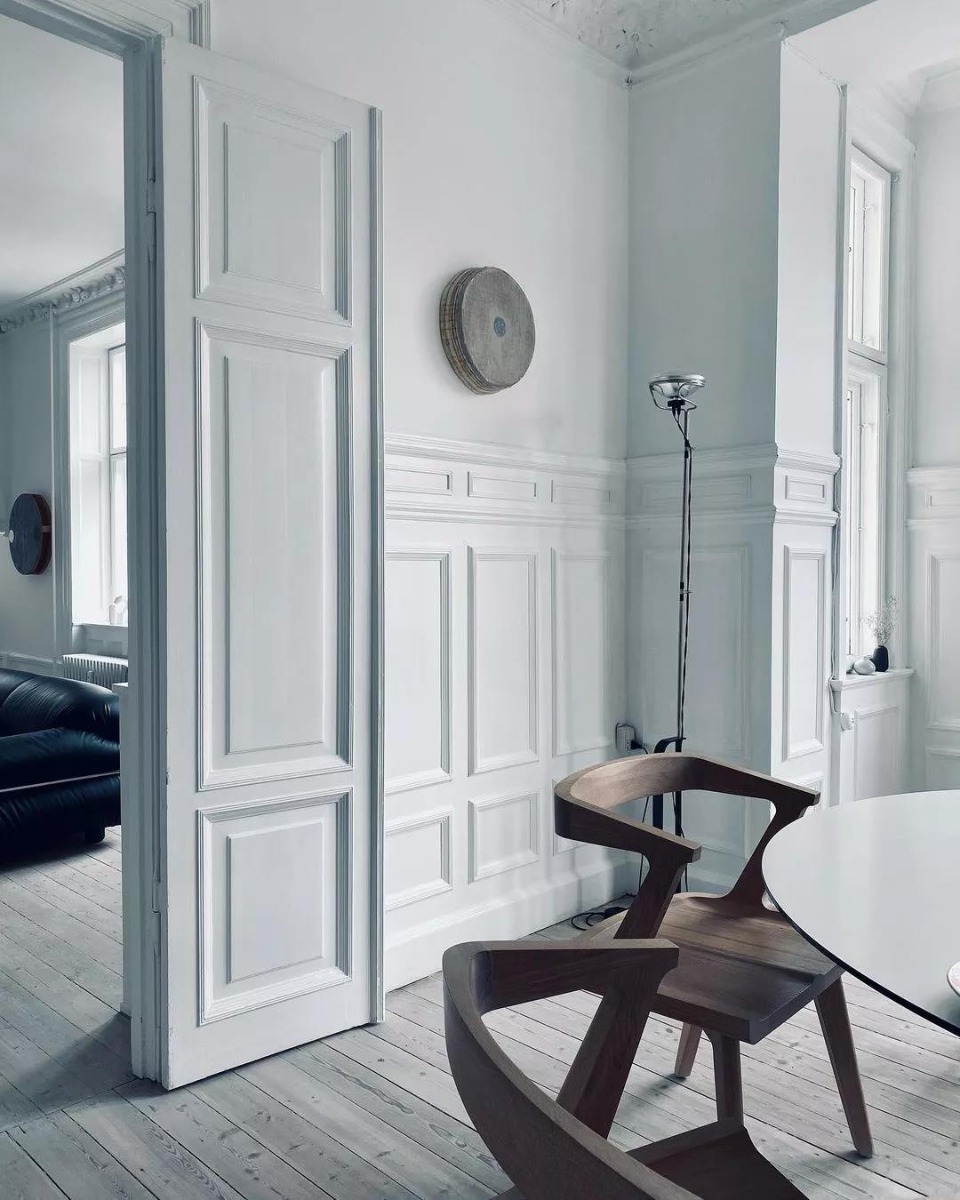
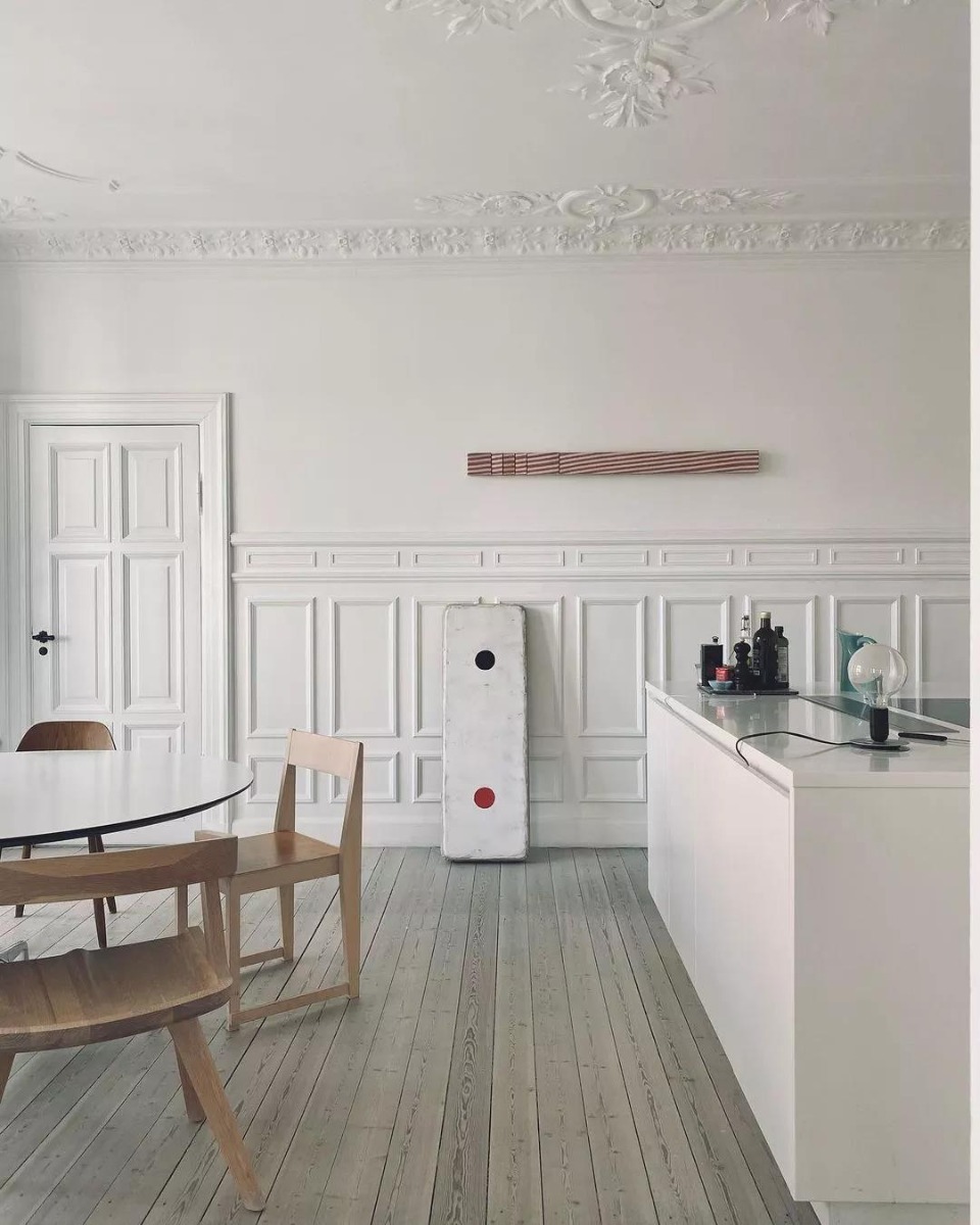
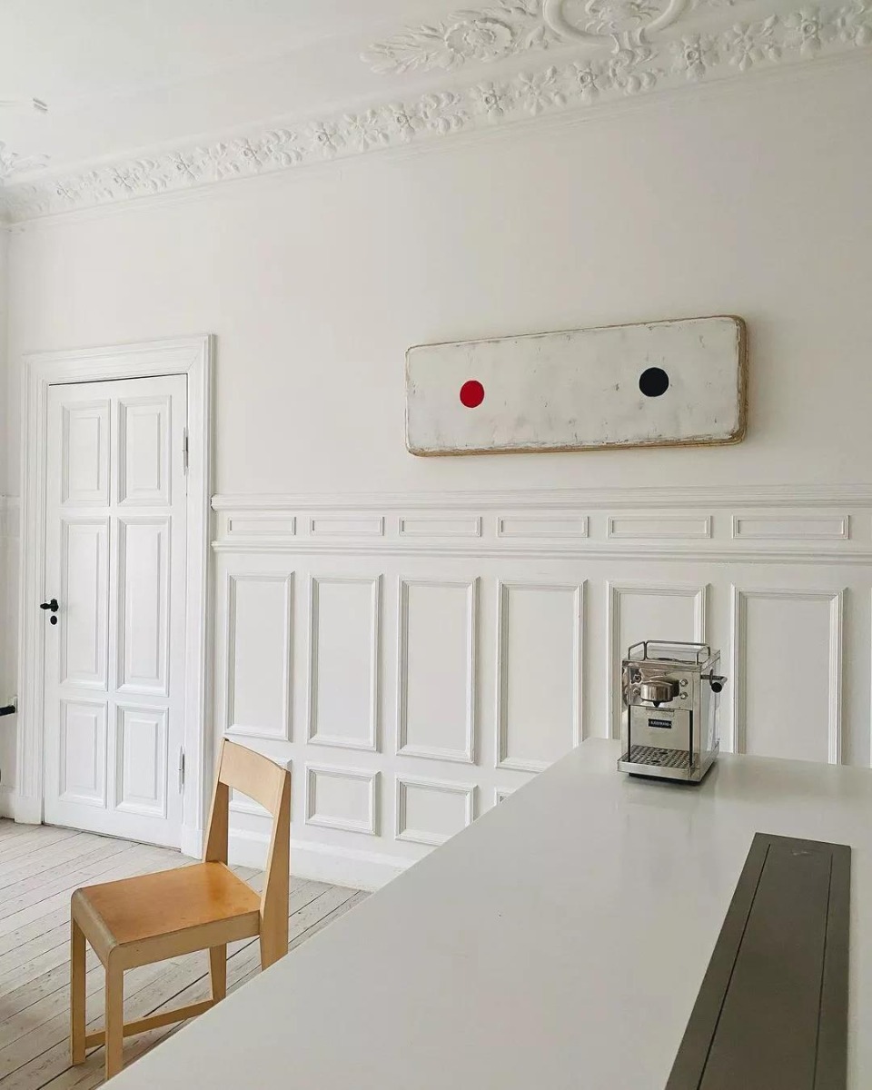
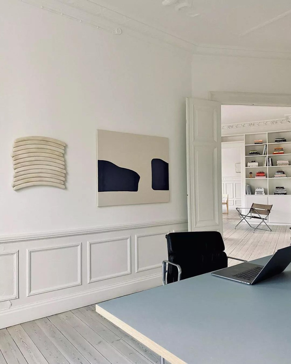
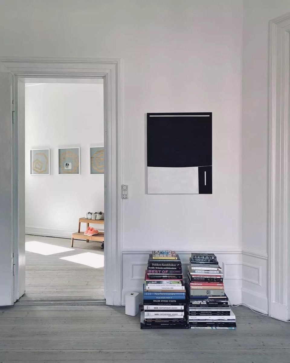
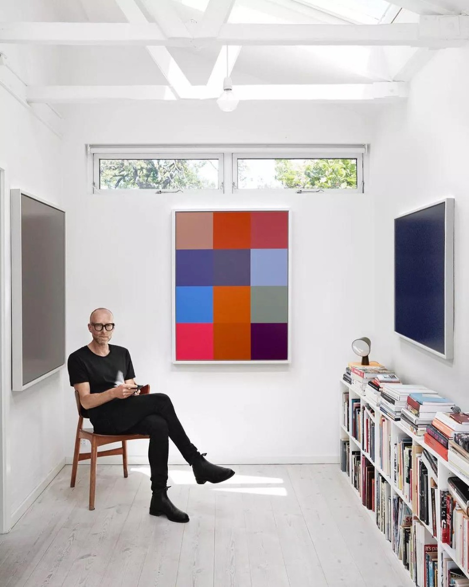
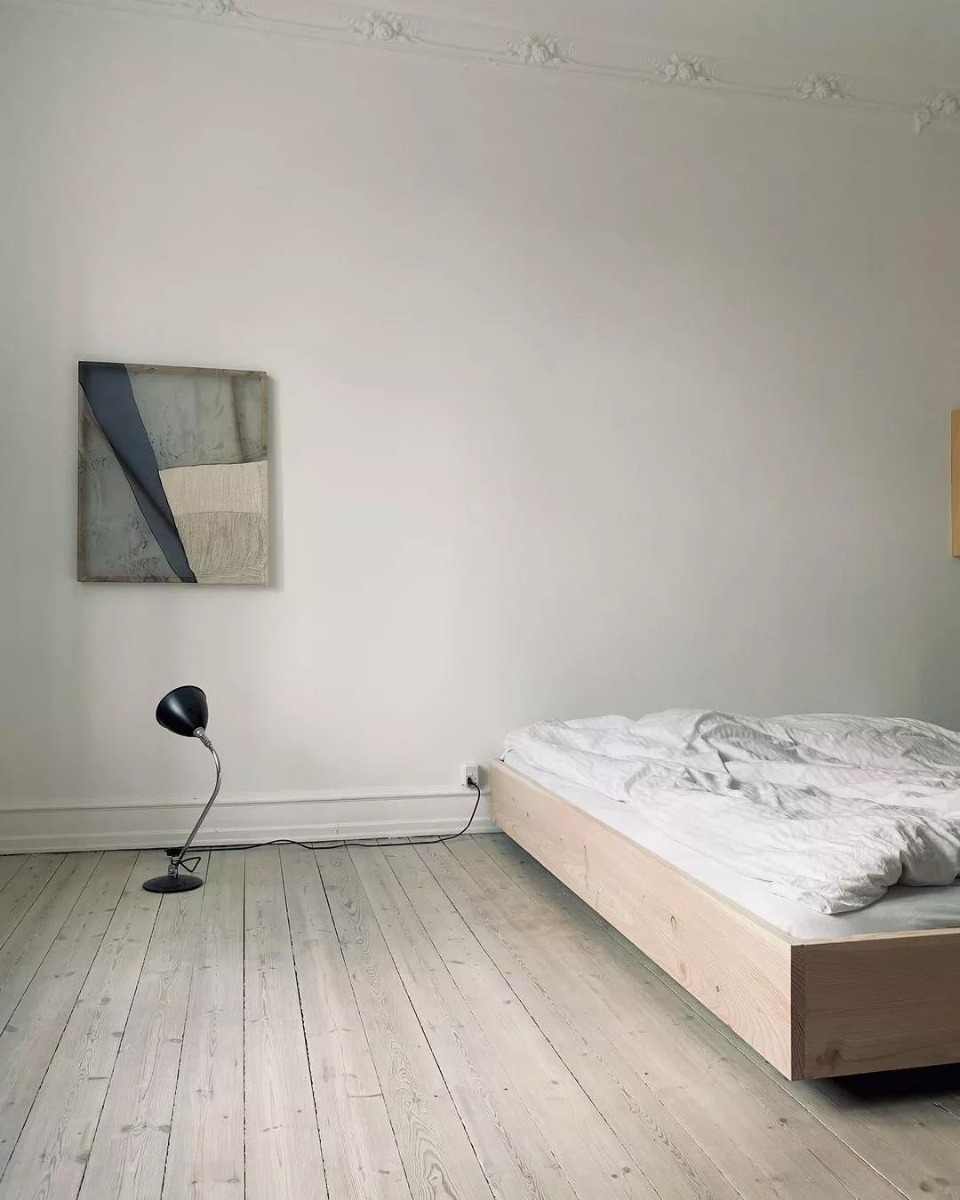
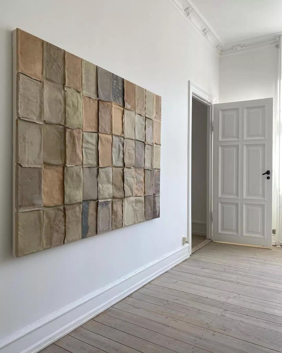
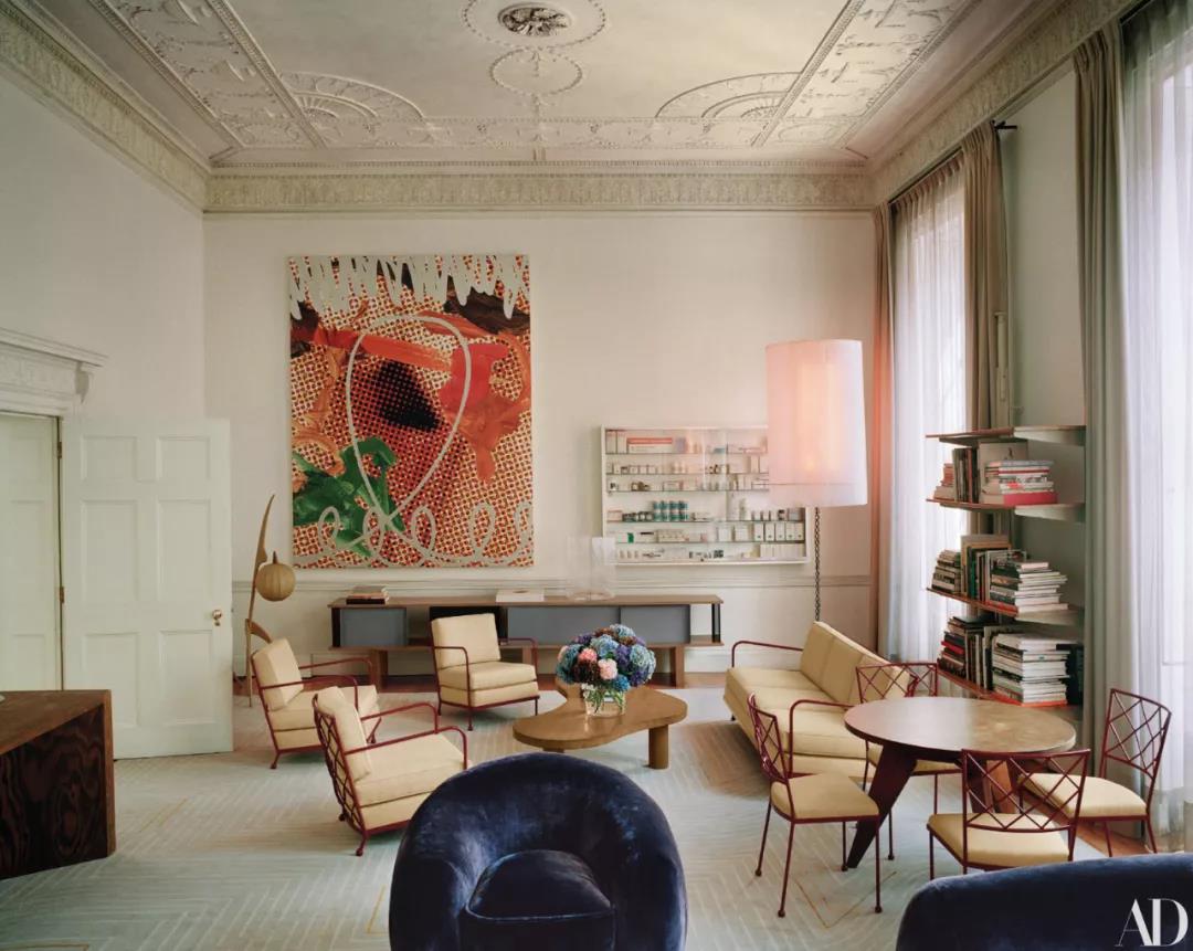
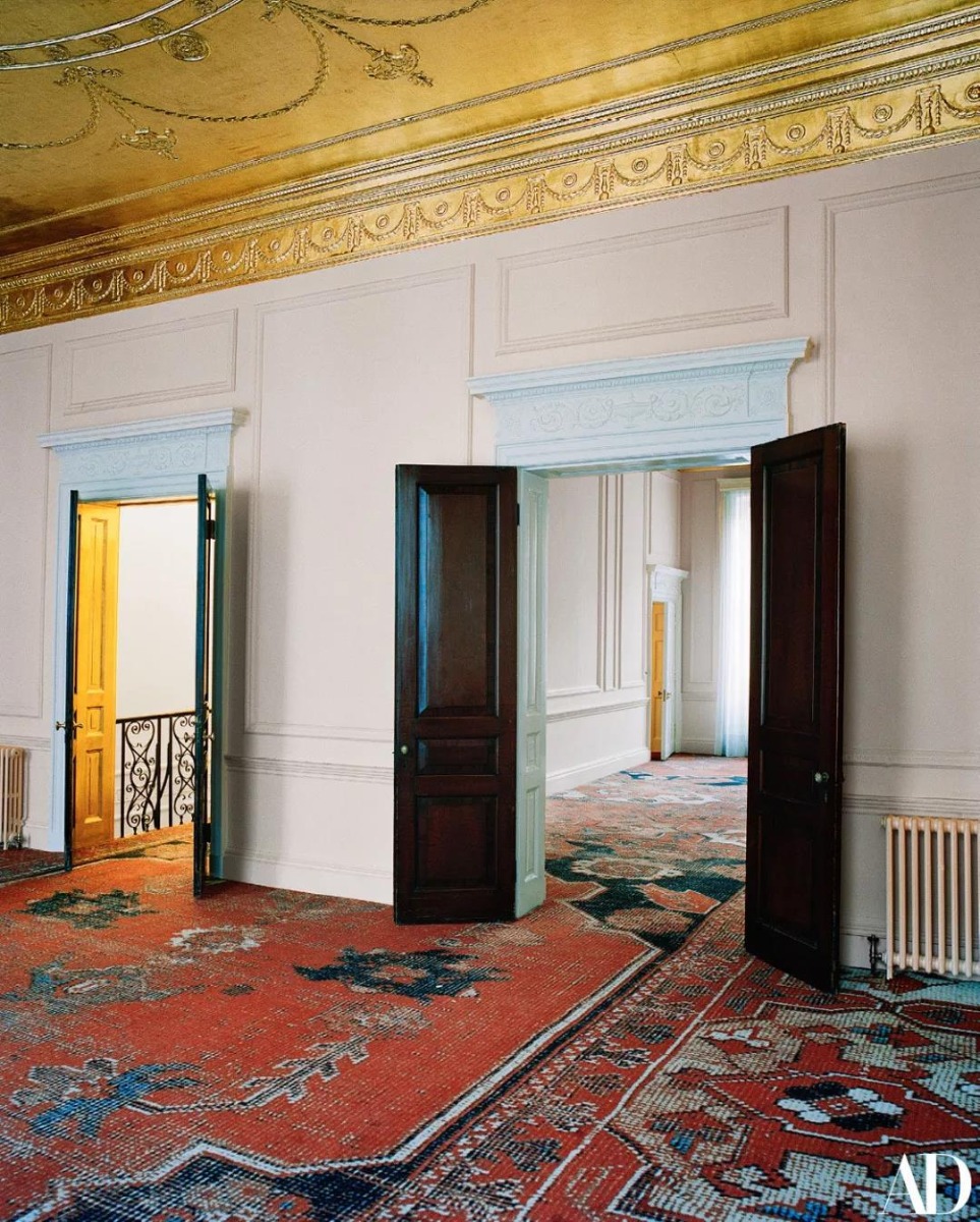
1. The Monochrome Private Home of Curator Peter Ibsen, Copenhagen
Peter Ibsen, founder of The Museum of Contemporary Art in Copenhagen, has a collection of works he has loved for a decade in his private home.
When Peter Ibsen came across a black, checkerboard-like work by Gregor Hildebrandt, he decided to sell his entire collection and set himself a strict collection target. It is impossible to rule out the artwork because it runs counter to his explanatory powers.
Since then, he has concentrated on collecting monochrome and minimalist works made up of the many artists he shows in his private residence, including Sergej Jensen, Andre Butzer, Sam Moyer and Ethan Cook, among others, in addition to Hildebrandt. Peter Ibsen: "I love the fact that you have to work harder as you see something less."
© Peter Ibsen
2. Two Art Collectors' Penthouses, Chicago.
Designed by Wheeler Kearns Architects for two art collectors, this Chicago penthouse features an extensive art collection complemented by industrial details, walnut floors and earthy pastel colors.
Images via Google
3. Artist's Family Room, Melbourne.

What looks like an elegant Santorini Contemporary gallery is actually the family home of artists and interior decorators Phoebe and George Rolleston, located in the Melbourne suburb of Glen Iris!
Architect Lucy Bowen has completely refurbished the quirky building from the '80s, constantly updating the artwork.
© Phoebe and George Rolleston
4. Artist and Potter's Cottage, Australia.
Nicolette and her husband, Web designer Tom Dawson, have rented the house in Bardon, Brisbane, for four years. Thanks to their incredible attention to artwork, like antique furniture and handmade items, this Queensland lodge has a distinctly 'them' feel.
© Nicolette and Tom Dawson
5. Home of Renowned Collector Maja Hoffmann, London

Mahdavi combines two adjacent houses on a picturesque London street to make a unique statement for renowned collector Maja Hoffmann.
© Mahdavi
Are you ready to make your home a new look? Add several art pieces to it then.
-End-
-
Hotels may be meant for temporary stays, but that doesn’t mean that they don’t have to feel like home. The best ones have luxurious yet comfortable furnishings that instantly give off a warm and welcoming vibe, making guests instantly want to extend their booking the minute they step inside.
Nowadays, there are so many interior design trends for hotels. From dynamic, show-stopping lobbies to greenery and spa-like bathroom features, it’s clear that the new focus is transforming these temporary stays into homes away from home.
In addition to these trends, incorporating art into a hotel’s design scheme is increasingly becoming one of the most popular ways to make these spaces appear more welcoming. Some have chosen to place small sculptures and large-scale installations in the common areas, while others have opted for simple paintings in the guest rooms.
No matter which strategy you pick, adding art will definitely take your hotel to greater heights of success! But how exactly do you choose the most appropriate pieces for your space?
Well, here’s a short guide to help you out.
For the Hotel Lobby: Powerful and Eye-Catching
The lobby is every guest’s first contact with a hotel, which is why you have to make it as stunning and as impressive as possible. However, it also needs to feature both private and public areas that people can use for relaxing, waiting, or even working.For example, the Banyan Tree Mayakoba in River Maya, Mexico is known for its open-air lobby that provides sweeping views of the beach. On the other hand, people flock to the Four Seasons Hotel George V in Paris, France for a glimpse of its Florence chandelier and spectacular floral displays.
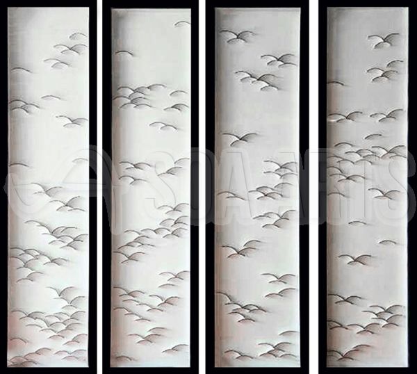
Our Pick: Four-Panelled Flying Birds 3D Wall Art ($140.80)
Opt for powerful and eye-catching artworks to set your lobby apart, such as this Four-Panelled Flying Birds 3D Wall Art. Made with a combination of wood, stone, metal, and acrylic, this stunning piece exudes an impressive yet calming vibe, making it the perfect thing to welcome guests to your hotel.
For the Hotel Room: Warm and Sweet
Guest rooms are arguably the most important part of a hotel, so don’t be afraid to invest in them. These spaces must ooze warmth and coziness since these are where customers will relax and sleep.For example, The Fullerton Bay Hotel in Singapore has bath products from Bottega Veneta, as well as floor-to-ceiling windows, giving guests a phenomenal view of the city. Meanwhile, COMO The Treasury in Perth, Australia, features Scandinavian-style furniture, with low-slung furniture, blonde wood, and an airy floor plan.
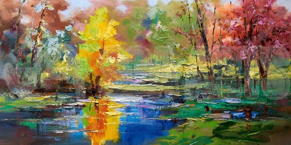
Our Pick: Lake View in Autumn ($62.00)
There’s nothing warmer and more comforting than a landscape painting so go for something like this Lake View in Autumn, a breathtaking hand-painted oil on canvas piece that will leave guests wanting to extend their stay. Its vibrant colors and textured look will undoubtedly make any room feel like home sweet home.
For the Hotel Bathroom: Simple and Cohesive
Hotel bathrooms tend to contain luxurious features, such as expensive bath products and high-tech showers that can do practically anything. Its design shouldn’t draw attention away from its amenities, so make sure to opt for something that’s simple and meshes well with the rest of the room’s theme.For example, the bathrooms Time+Tide Miavana in Nosy Ankao Island, Madagascar, feature an open-air shower and a sunken tub facing the sea. The rest of its design is relatively subdued to ensure that guests remain focused on the phenomenal view before them. Meanwhile, those in the Romance Suites at The Reverie Saigon in Ho Chi Minh City, Vietnam, boast tasteful over-the-top elements, like hand-laid mosaic floor tiling and sparkling chandeliers.
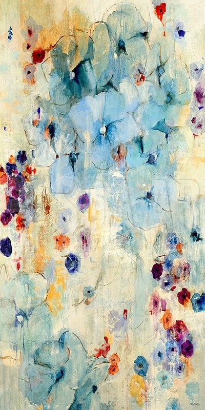
Our Pick: Lotus Leaves ($20.00)
Colorful abstract art is perfect for hotel bathrooms, so this Lotus Leaves print is definitely your best option. Its six beautiful shades, combined with the fascinating placement of the flowers, will mesh well with all kinds of design themes.* * * * *
When it comes to hotels, interior design should be both aesthetically pleasing and functional. This means that the various elements must enhance the customer experience without compromising the operational services that the staff is responsible for carrying out.
More importantly, though, interior design for hotels should be localized to the region’s specific tastes and culture. In the end, guests must be able to leave with an excellent and personalized experience, as well as with a deeper insight into the place that they’re currently exploring.
Don’t know where to look for fantastic art interior design pieces for your hotel? Then, check out SOA Arts, a one-stop shop for all your decorating needs. The platform will deliver art pieces localized to your region and fit your hotel’s brand.
-End-
-

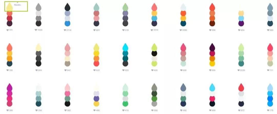
As a designer, do you often feel a headache when facing all kinds of complicated color collocation? Maybe you have a butch of questions about it. Don't know how to extract color values, have a keen sense of color, and have no color matching skills. How to solve these problems quickly and efficiently? Here, you come to the right place.
SOA Arts shares your top 10 gorgeous color design matching websites,
help you improve the efficiency of color matching in the work to Be More with less.
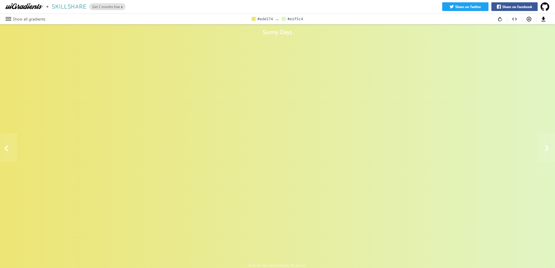
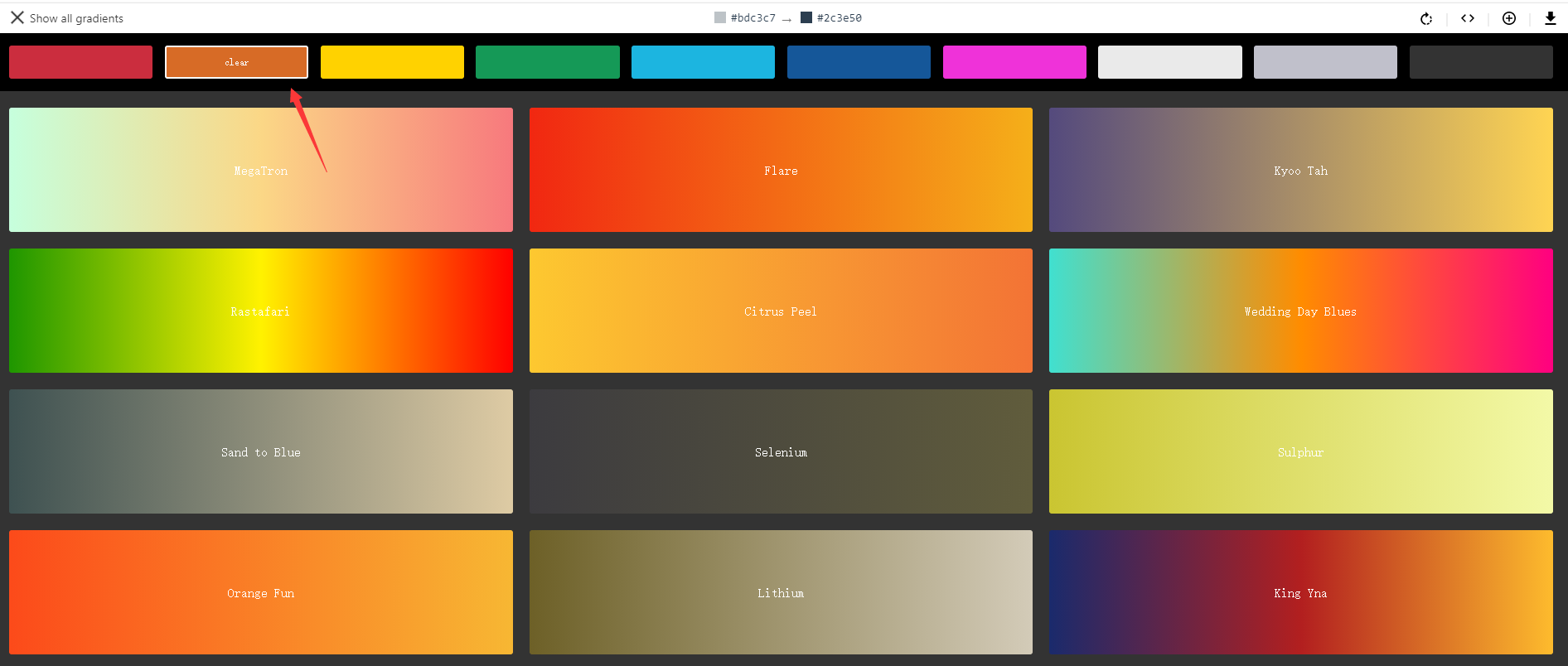
01.uiGradients
Design Tool Based on Gradient Color
uiGradients is a gradient-based sharing site
Close to hundreds of gradient color schemes
Designers can choose their own style to match.
Each one has an excellent look at and is ready to use
Save a lot of time to try colors!
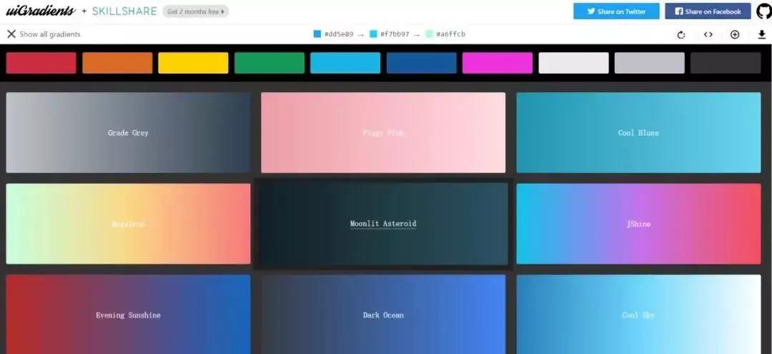
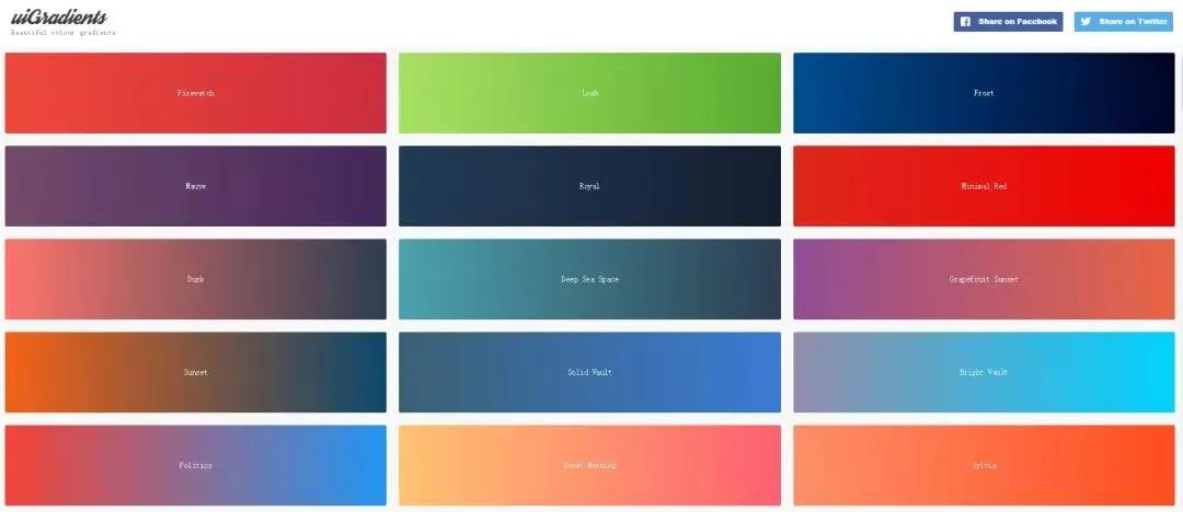
△ Screenshot via uiGradients official website
Next, we will guide you how to use this amazing matching website.
1. online tour, pictures free downloadYou can browse all the color schemes online.
Click on an image you like to see a larger version.
There's a free download button in the upper right corner.
Choose the color you like and you can play directly.
You can also share it on your social media accounts.
2. one key copy color valueAnd it's super easy to pick up colors.
Each color has a configured color value.
Click on it and copy it!
3. Operation-friendly selection of color system
It can be screened according to the required color system!
Select a color from the navigation bar above
And then, it will display all the matching colors under that color system.
For designers who often need to be targeted to find a color
It's a very nice feature.
02.
Adobe color
Online Color Wheel Design Website
Adobe Color is an online color wheel extraction site.Strong compatibility with the use
Provide RGB, CMYK, LAB, SHB, HEX
A total of 5 color modes, very humanized
Users can match colors in real-time according to their own color matching requirements.
It is a necessary tool for matching colors.


Screenshot via Adobe Color official website
03.
Zhongguose
Chinese Traditional Color Matching Website
Chinese color sites are derived from Nipponcolors of Japan.
Is a Chinese literature and art website
Each color scheme has a nice name.
A red dye, falling persimmon, swallow fat, sparrow tea, yellow Dan, hemerocallis, red incense......
Click on each color
The background color of the site will change accordingly.
The background color changes throughout the site.
The visuals are amazing.
Each color has CMYK and RGB color values.
Helps to accurately identify colors

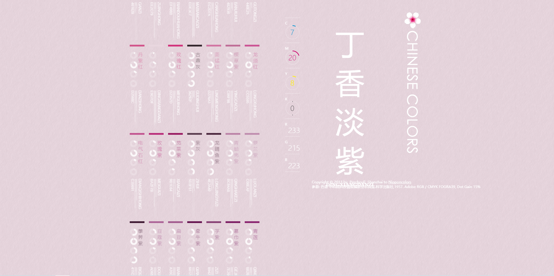
△screenshot via zhongguose
04.
Material PaletteAutomatic Color Matching Online Tool
Material Palette provides Material Design online color matching.
Simple and efficient use
You just need to figure out the two colors you want to match.
It shows a preview of the two colors together.
Offers you the option of darker or lighter colors
It automatically generates any color code you want
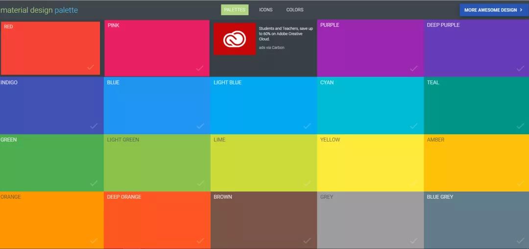
△screenshot via Material Palette
05.
CoolorsOnline Fast Color Scheme Generator
Coolors provides Generate and Explore2 services.
A set of five color schemes is randomly generated.
And display their color parameters and codes.
We can do either of these colors separately.
Hue saturation, brightness and other options adjustment
You can also modify its parameters directly.
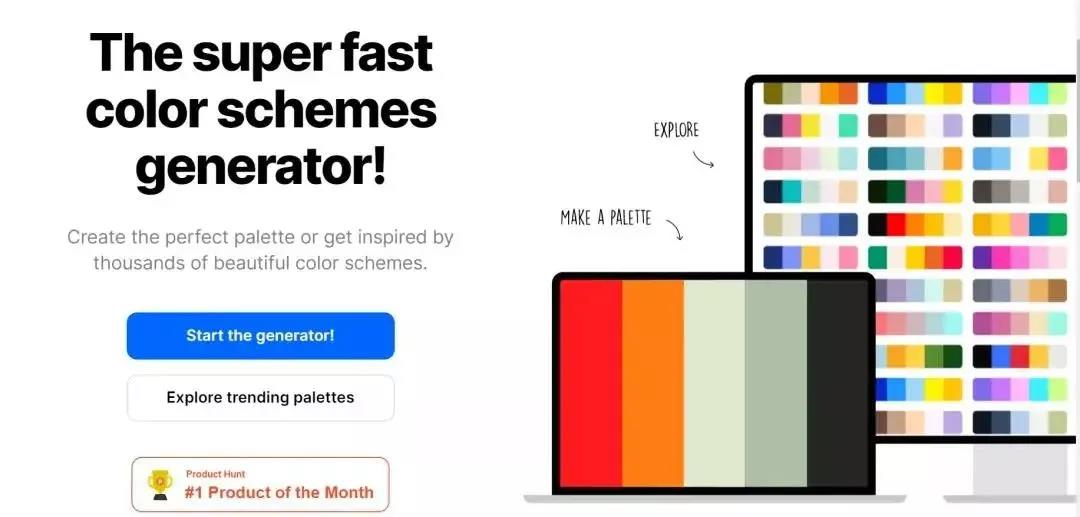
△screenshot via Coolors
06.
Colordrop
Four Grid Colors MatchColordrop is an online color combination debugging tool.
Also known as four-grid color matching
Click on one to display four color codes.
Copy directly to PHOTOSHOP or AI
It's very convenient and efficient.
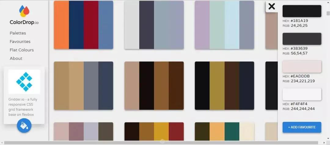
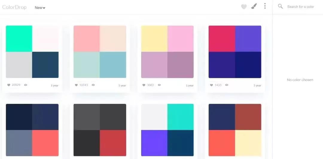
△screenshot via Colordrop
07.
Colrd
A Website for Finding Color InspirationThis website can be based on
Colors, gradients, palettes, etc
Search for image data
When you don't have ideas for colors
You can visit this website.
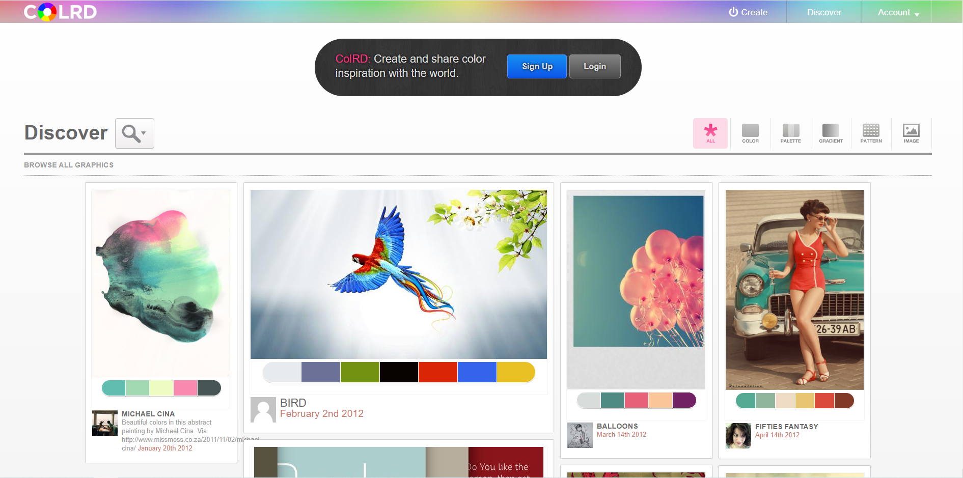
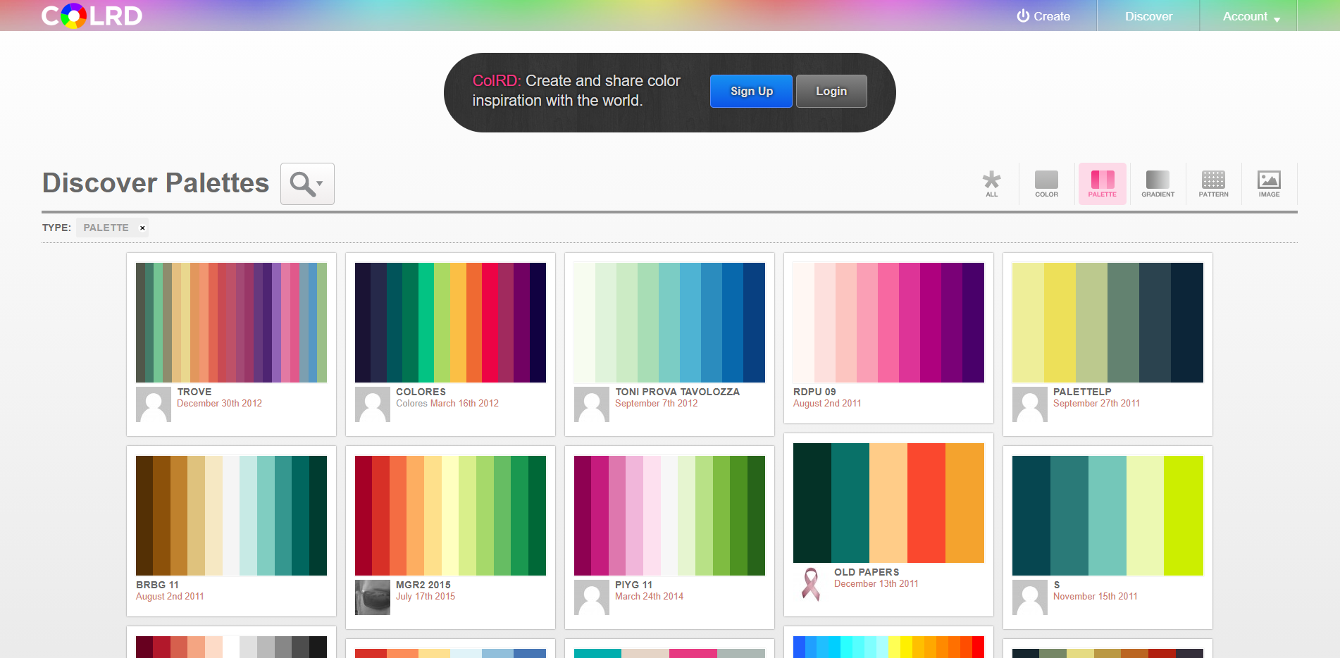
△screenshot via Colrd
08.
Color Scheme DesignerOnline Color Scheme Design Website
As a free web color palette tool
No registration is required to use
Let the user choose the color mainly by way of the color ring.
You can add 6 fool-proof color schemes.
A novice that does not have color matching knowledge also can easily start.
Set the brightness arbitrarily in the hue ring
Solid color, gray, contrast color and other color styles
Can export color list
It can be adjusted arbitrarily.
Allows users to easily mix up pleasing color schemes
6 Matching Ways in Color Scheme Designer:
1. Monochromatic
Use a single color as the base color.
Then matching other colors with saturation and brightness change.
Because they belong to the same color system
So this kind of matching colorway can allocate a comfortable color experience more.
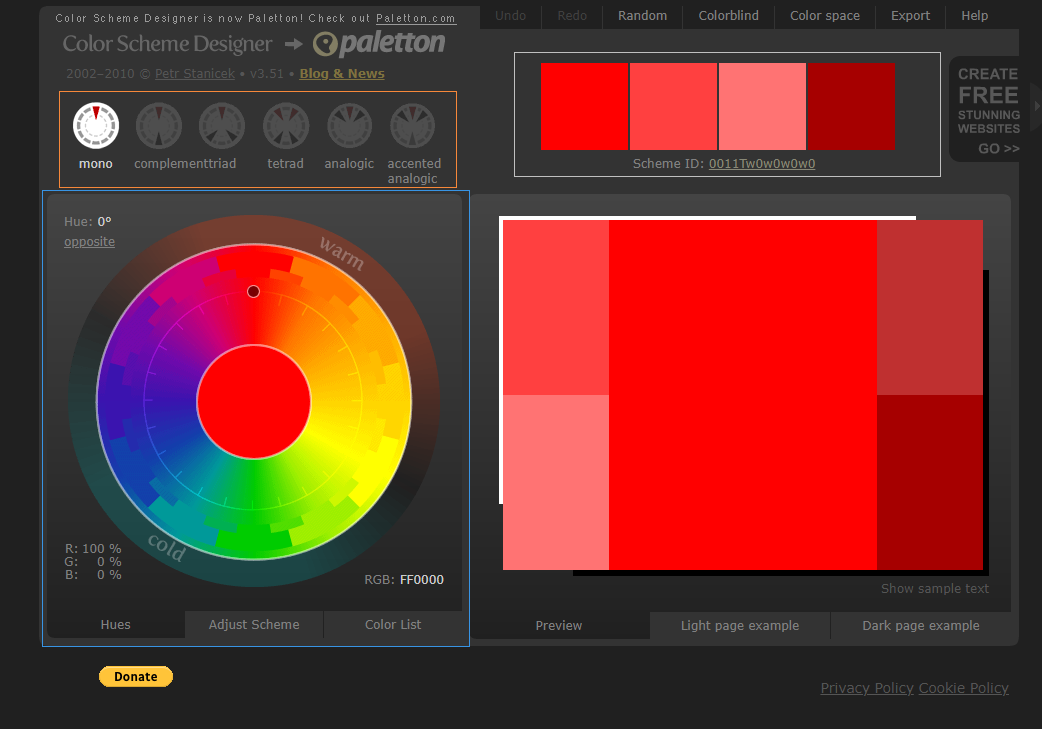
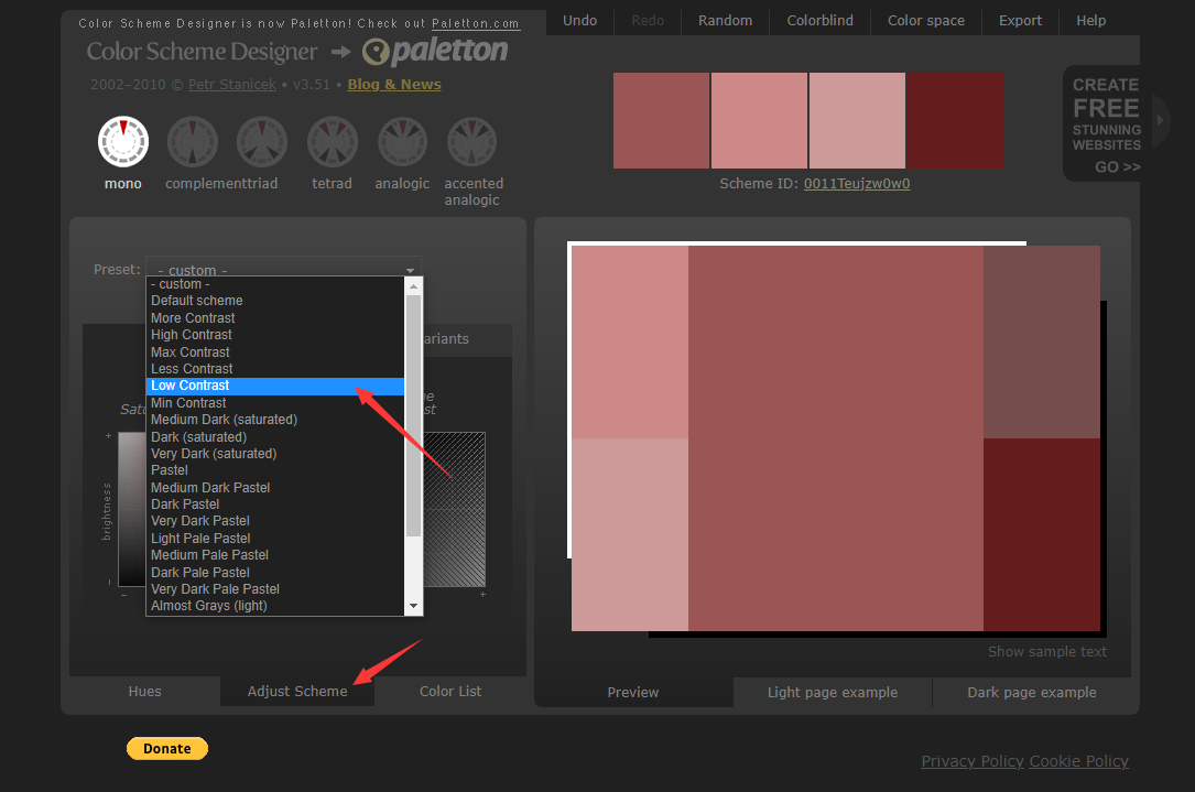
△ Operation of single tone Color Scheme in Color Scheme Designer
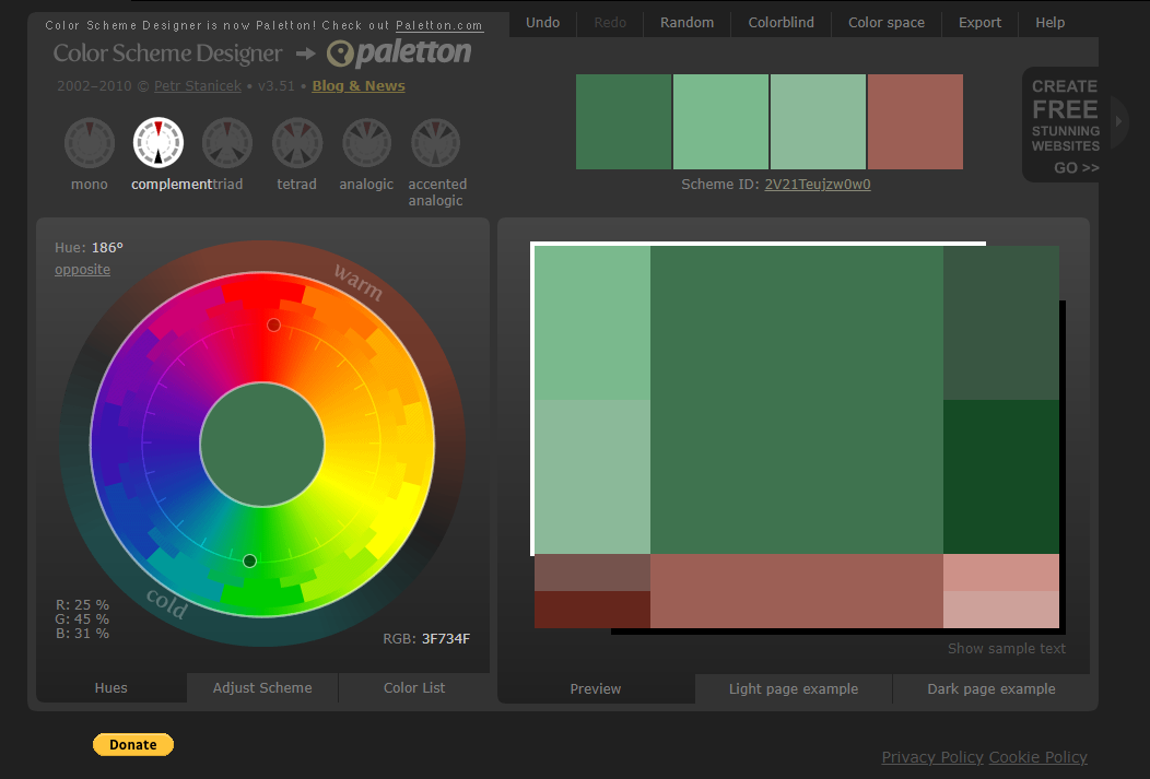
2. Complementary
The primary color and the complementary color on the opposite side of the color ringCall up a color scheme that contrasts well.
3. Triad
Take one primary color and two complementary colors on the opposite side of the color ring.Compose relatively soft contrast effect
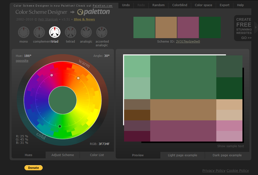
△assign three colors in Color Scheme Designer
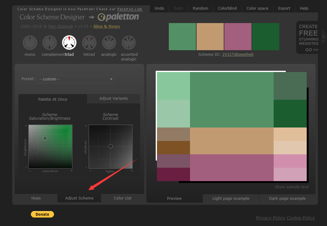
△Scheme after reducing saturation of three colors
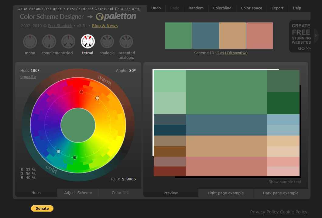
4. TetradWith two primary colors and two complementary colors on the opposite side of the color ring
Create a strong visual effect
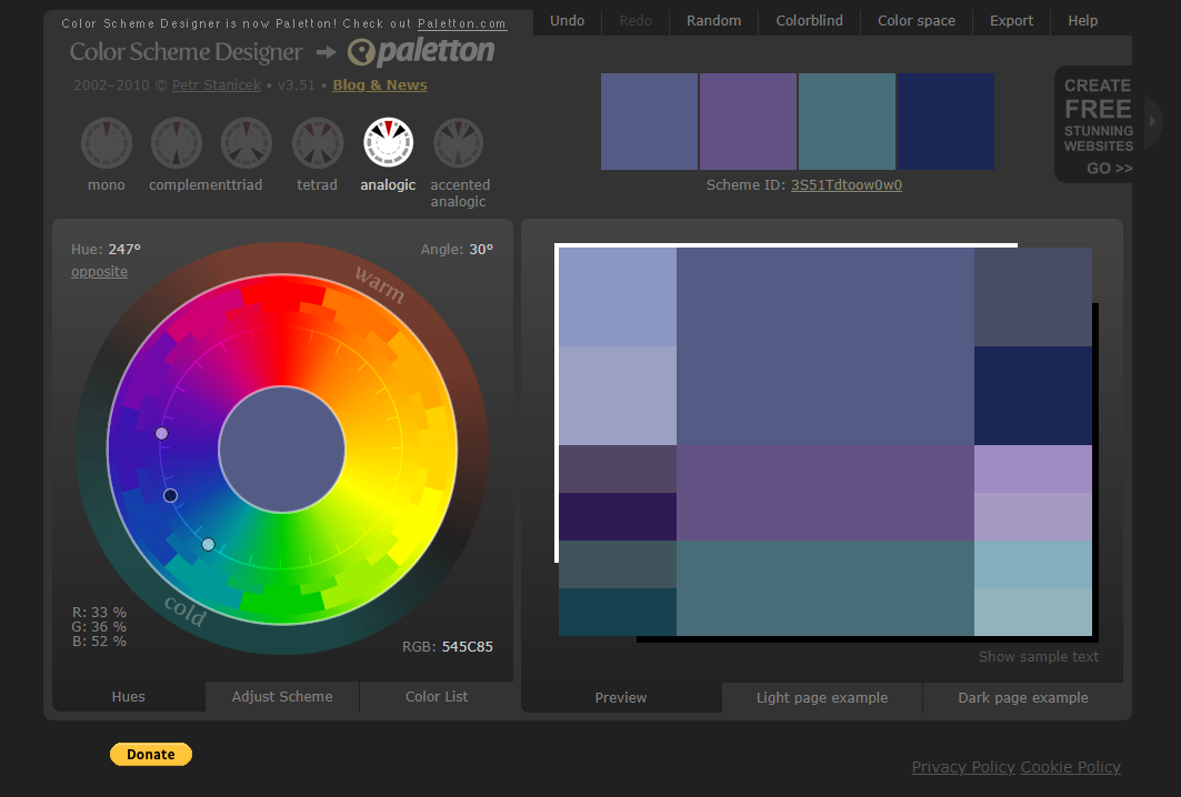
5. Analogic
With a primary color and two complementary colors equally spaced on both sides
Match color with an elegant, concise color feeling for you
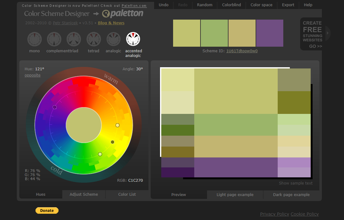
6. Accented AnalogicBased on 3 similar colors
Plus a contrasting color on the opposite side of the color ring
Constitute an effective color scheme that is elegant and emphasizes the point
09.
LOL ColorsThe Appearance of A Higher Level of Color Schemes Website
LOL Colors is very simple
Art and lively color scheme collocation tool
Move the mouse over the water droplets of different colors.The Hex Code is prompted for the color value.
Designers can find a lot of different color combinations here.

△screenshot via LOL Colors
10.
SeedArt and Fresh Appearance Level Color Website
Seed is based on a fresh artistic style of color collocation web page.
Color matching can be automatically generated according to the selected picture.
It can be applied to color inspired design collocation.
The official website: www.design-seeds.com

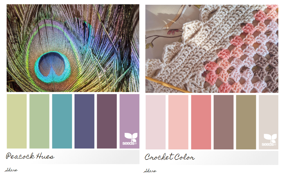
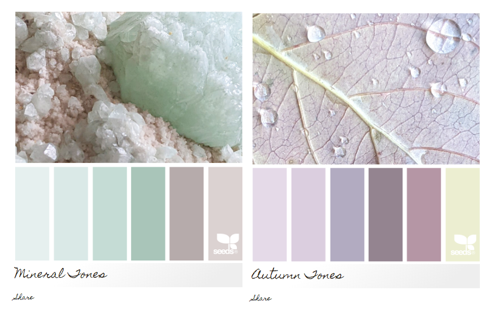
△screenshot via Seed official matching scheme
Summary
1. uiGradients
A designed tool based on gradient color2. Adobe Color
An online color wheel design tool3. Zhongguose
A Chinese traditional color matching website
4. Material Palette
An online tool that will automatically match colors5. Coolors
An online fast color scheme generator6. Colordrop
Four grid colors match7. Colrd
A website for color inspiration8. Color Scheme Designer
An online Color Scheme design tool9. LOL Colors
a high level of appearance Color Scheme tool
10. Seed
An art and fresh appearance level color matching tool
Color is highly emotional and symbolicBrilliant collocation makes people feel good.
For the same reason, a bad color scheme can ruin a design.
If you have any questions about color schemes in interior design for art, feel free to contact SOA Arts, we will help you.
-End-
-
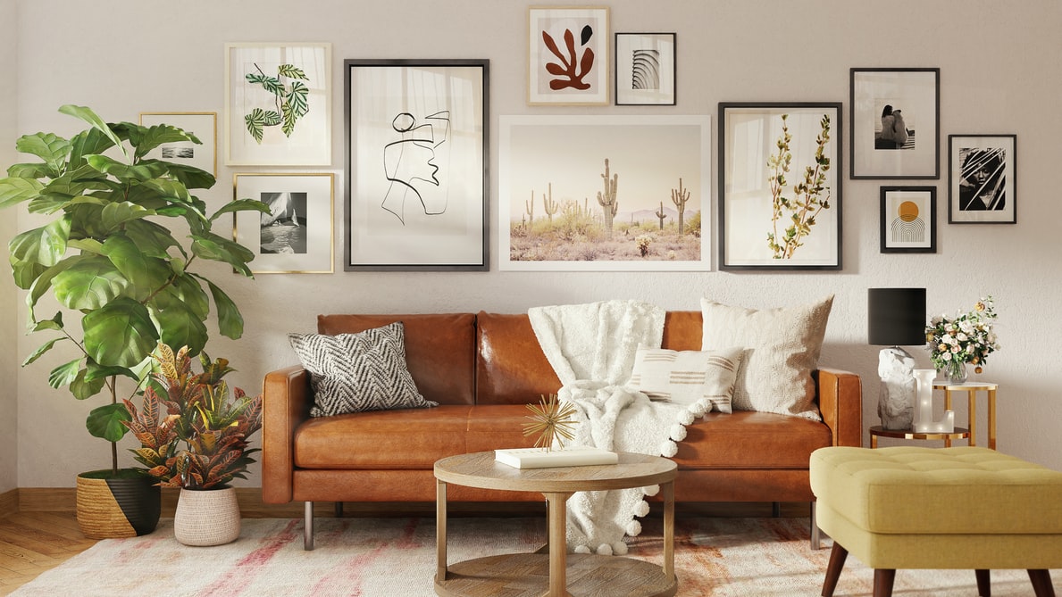
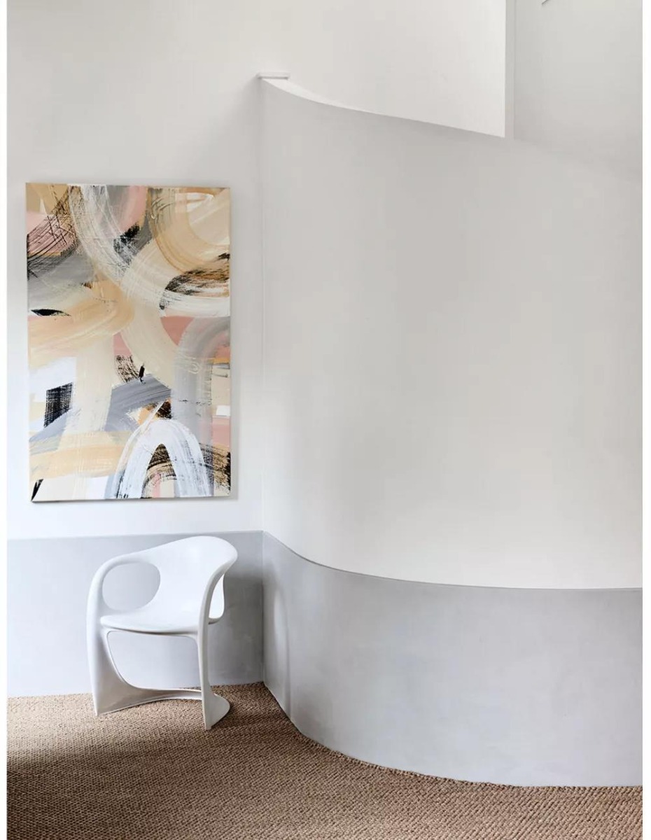
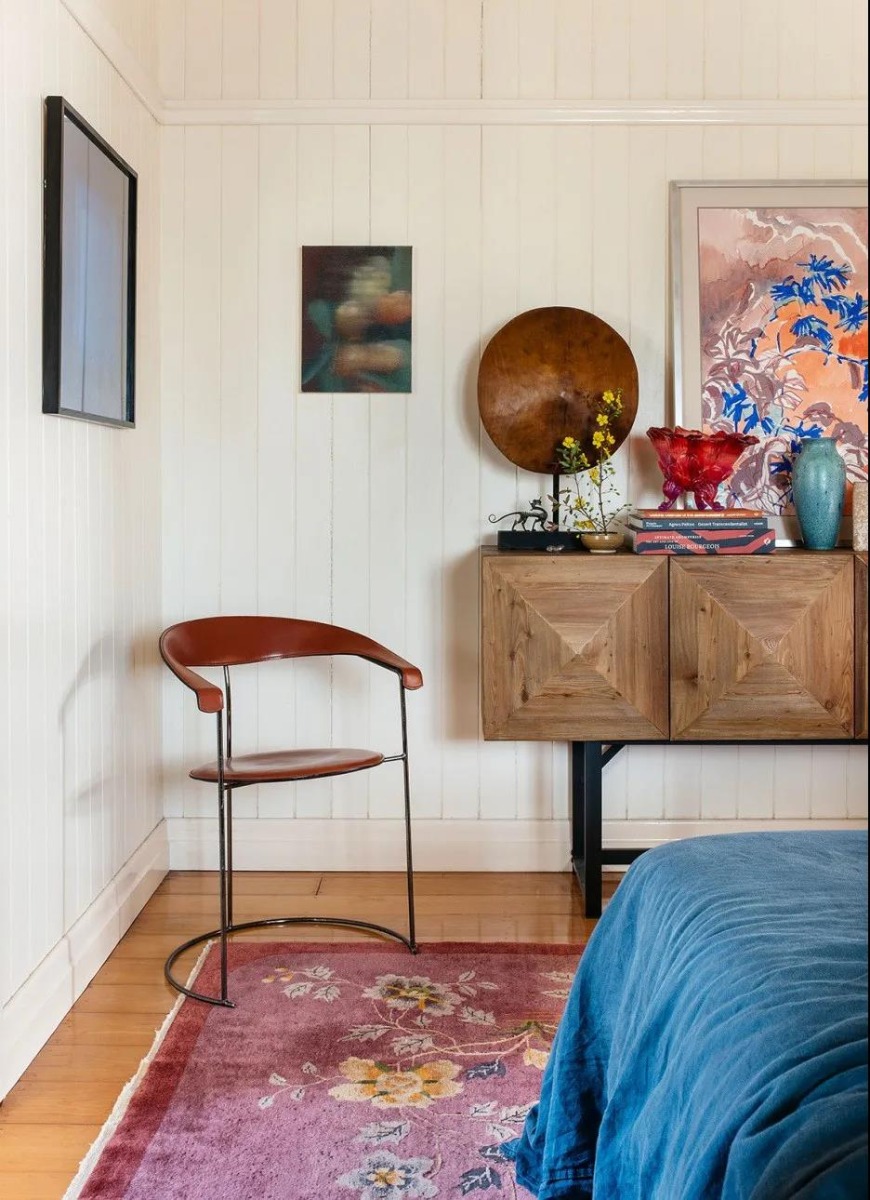
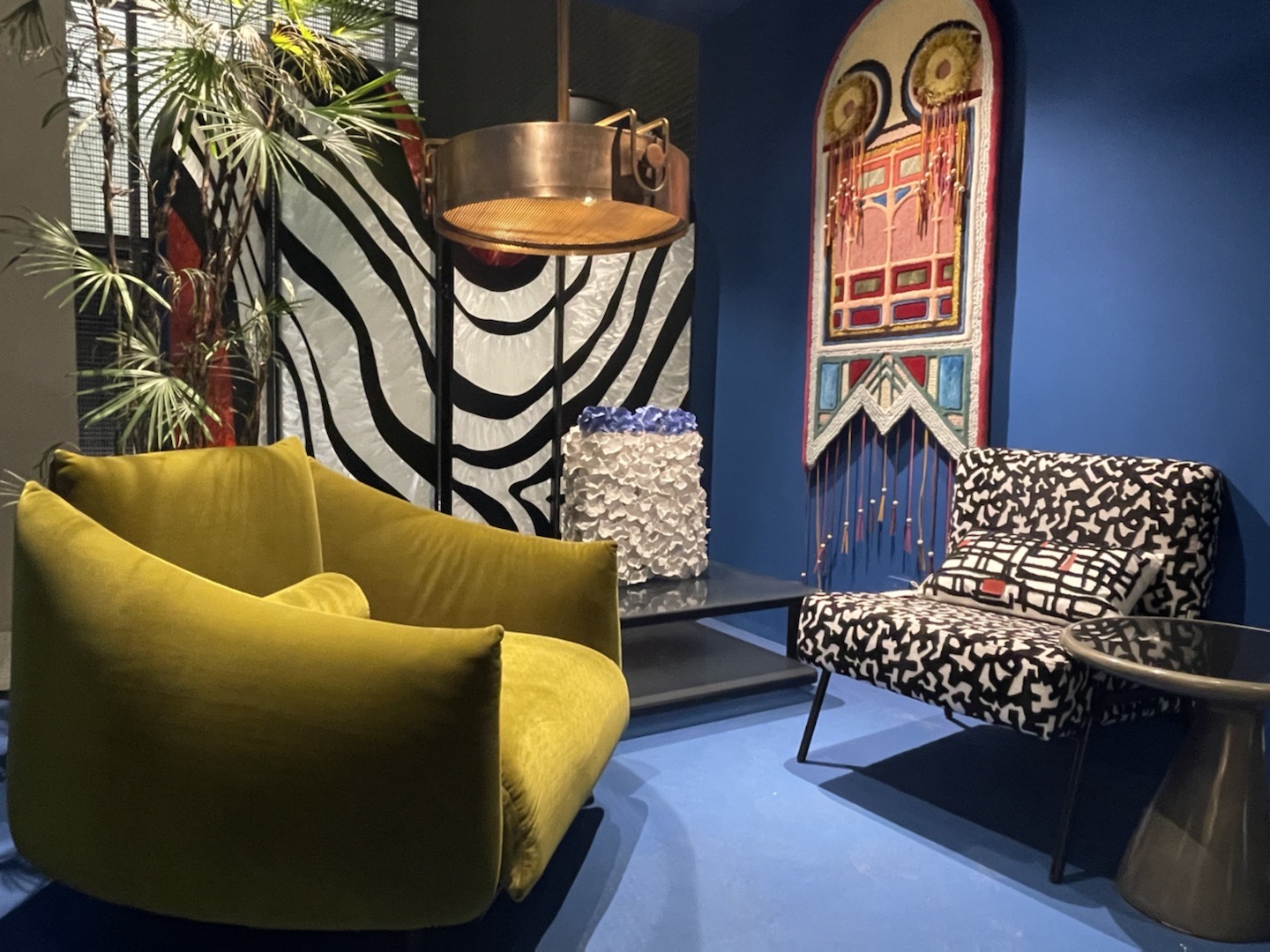
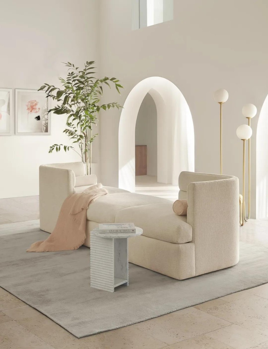
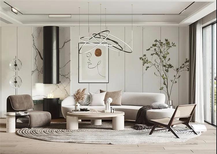
Looking for interior design ideas for living room spaces? You’ve come to the right place. Creating a living space that is stylish, comfortable, and affordable is easier than you might think. You just need a little know-how.
On this page, we’ll explore some simple home design ideas that will help you get started on your interior styling journey. Read on to build the home of your dreams!
Interior Design Ideas for Living Room Styles
The interior design tips below are intended as a ‘jumping-off’ point. They’re here to give you the inspiration you need to start crafting spaces with impact.
Remember Your Lighting
Any interior designer worth their salt takes advantage of natural lighting in their creations. It’s perhaps the most important aspect of designing spaces. No matter what aesthetic, design cues, and color palettes you’re going for, you’ll need to make sure that your room is lit effectively.
If you’re lucky, this means taking advantage of your large windows that can do a lot of the heavy lifting for you. If you’re working with a smaller room, you’ll have to think creatively about lamps and furniture placement to make sure the rest of your design can shine.
Use your available light to highlight your design choices.
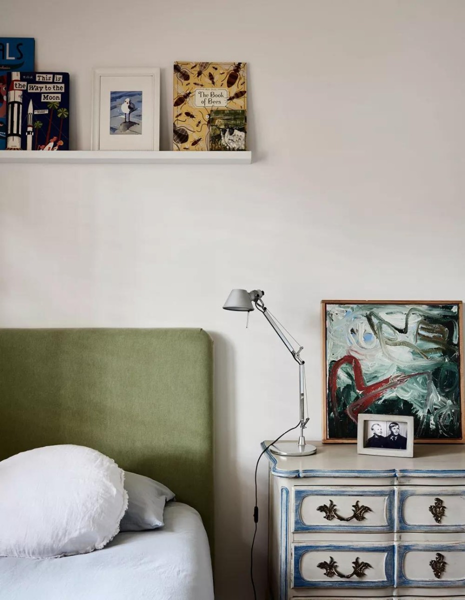
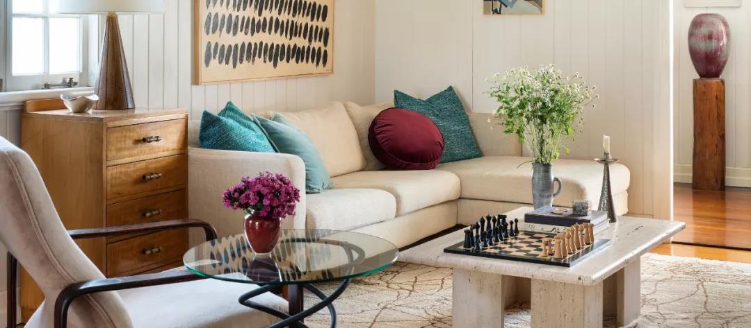
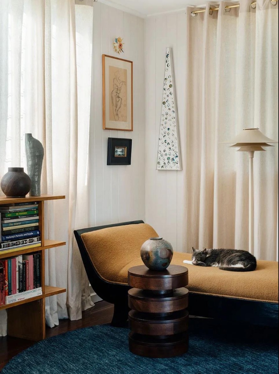
Art for Living Room Design
Finding good art for living room spaces can be tricky if you don’t know where to look, but it’s worth the effort – trust us. A few well-placed statement pieces can lift a design up from ‘okay’ all the way to ‘spectacular’.
It’s all about finding pieces that work for your space. Consider color palettes, textures, periods, and the context of your building. When was your property built? Can you find an era-specific artist that can add some much-needed flair to your living room?
How can you match the style of your chosen paintings with the rest of your room? Feel free to get creative here!
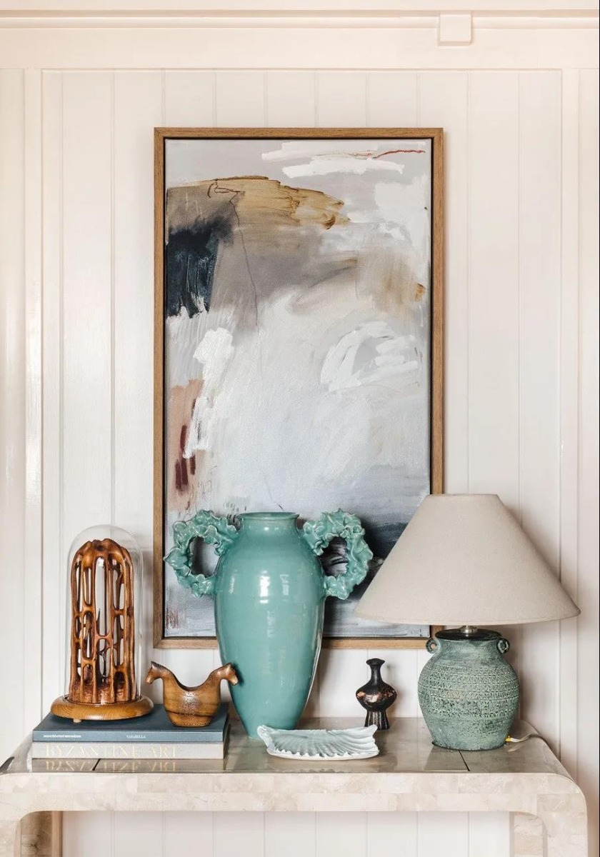
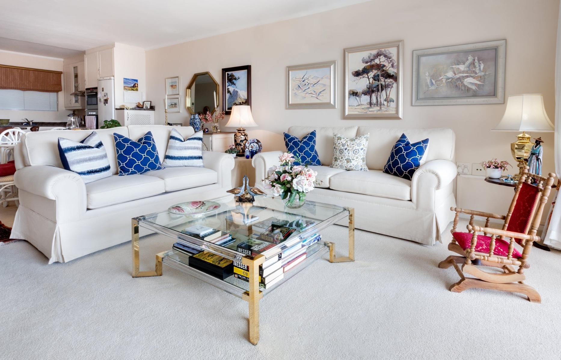
Coordinate Your Colors
Color is another hugely important aspect of good interior design. The best interior design ideas for living room spaces use colors that complement and elevate each other. If you’re new to designing interiors, it’s probably best to err on the side of caution here.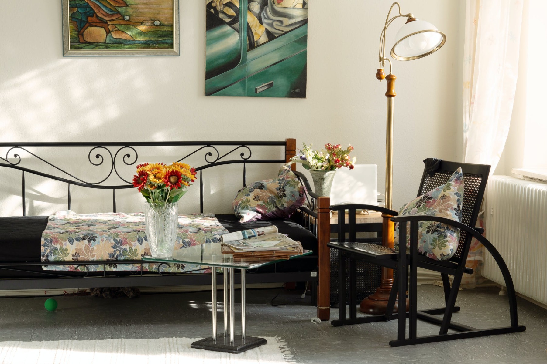
Don’t go crazy with tonnes of different colors unless you’re confident that’s what you want for your room. Choosing 2-3 stylish tones and implementing them effectively is usually a good way to go.
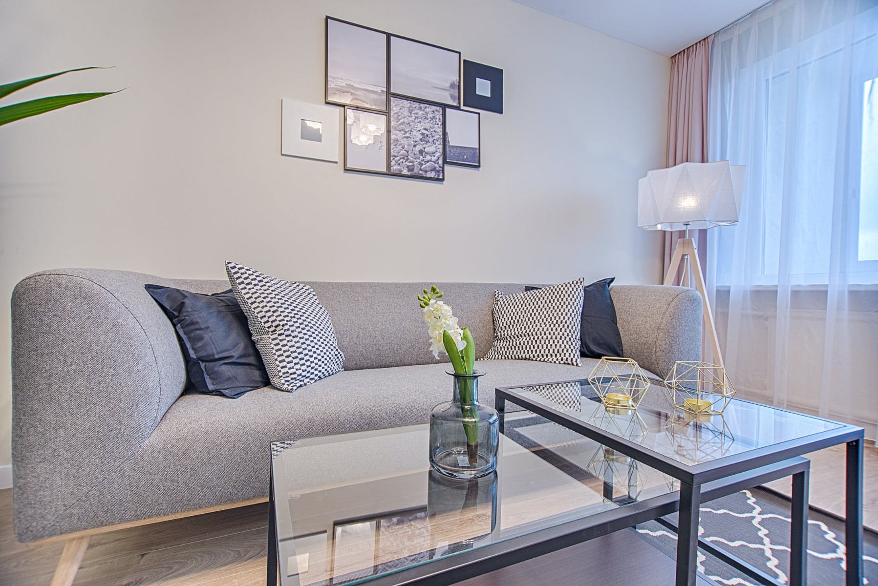
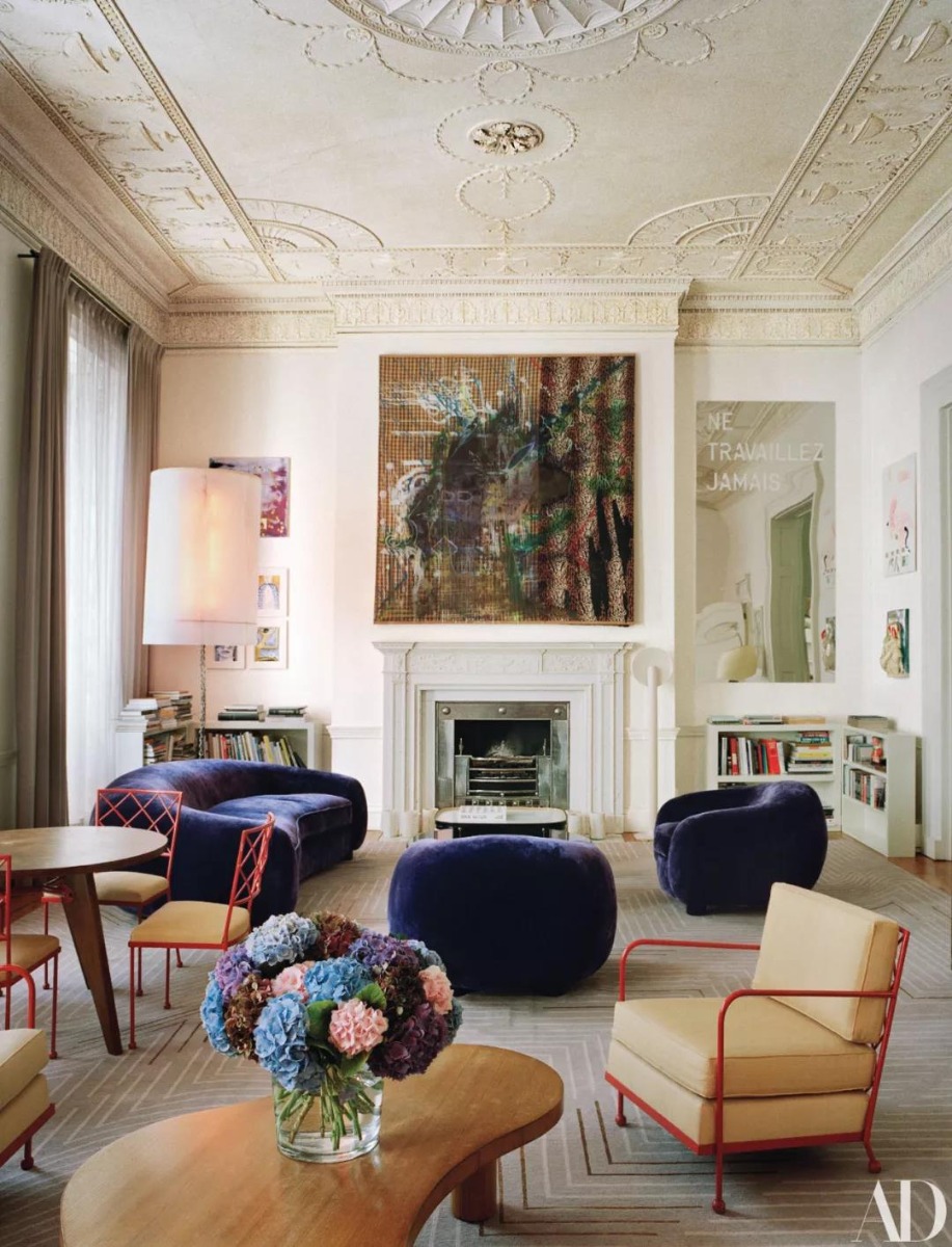
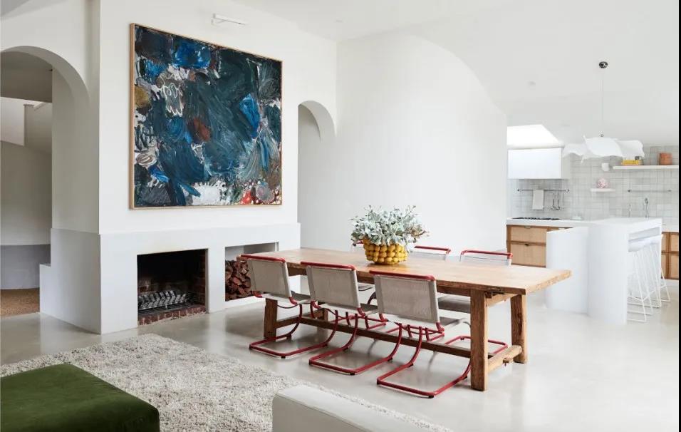
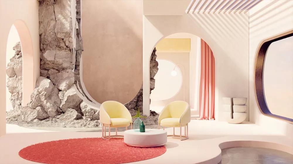
For example, note how the living room in the picture above makes use of blues, whites, and greys to bring the space together.
Remember Comfort Matters Too!
You can curate the most beautiful space in the world, but it will have been for nothing if you can’t spend time comfortably in the room. It’s called a living room after all! Good interior design makes rooms that look nice.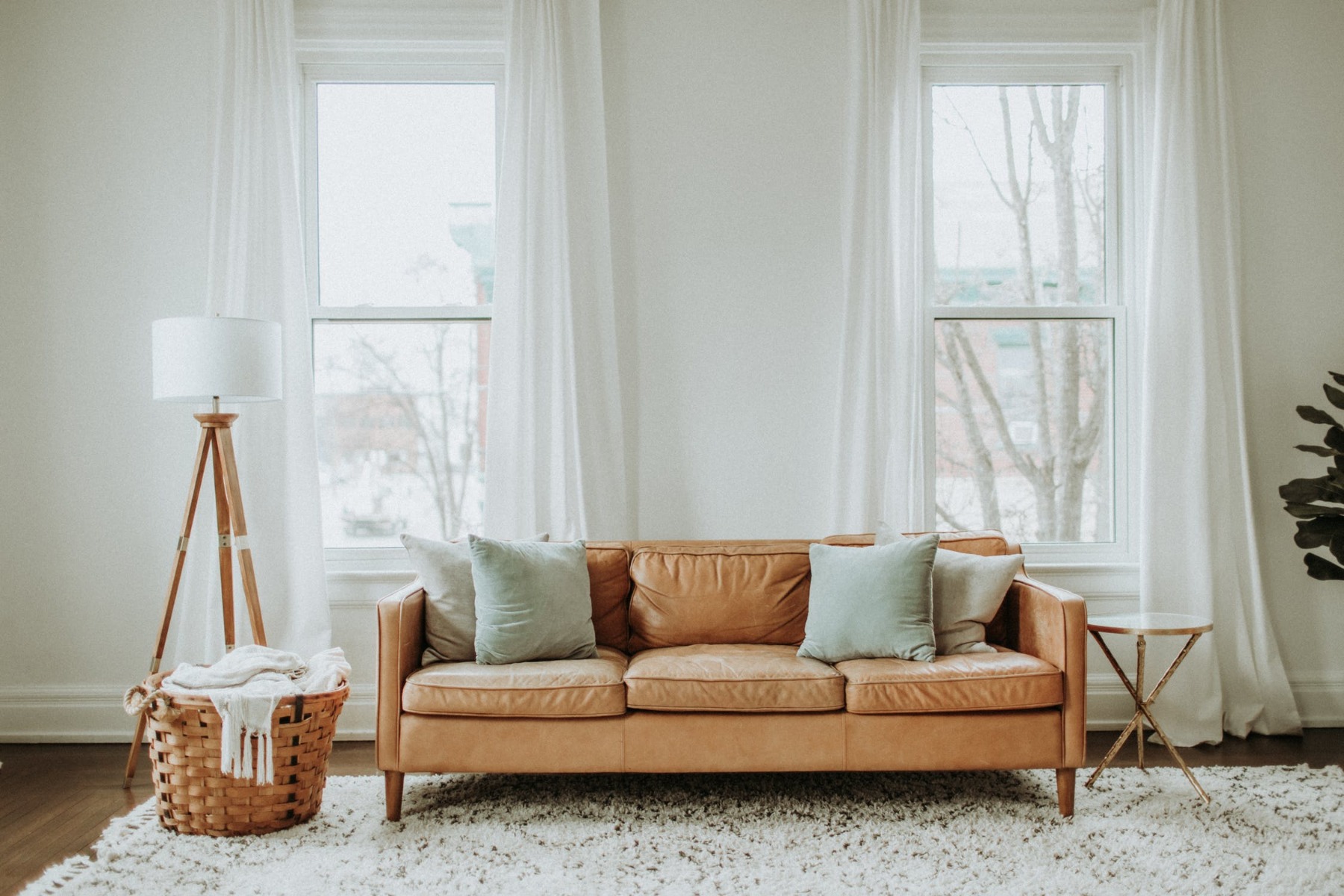
All images via pexels
Great interior design produces beautiful spaces that are made for human beings to use. Your living room should be welcoming, easy to navigate, and elegant. While experimenting with ideas for your room, try to test them out in the real world whenever possible.
Try not to commit to changes until you’re sure you’ll want to live with them for months and years to come.
SOA Arts – Your Home for Incredible Art
At SOA Arts, we have more than 12 year’s experience in the curation, production, and design of artworks from around the world. As a premium Chinese art factory, we have everything you need to source incredible pieces for your interior spaces.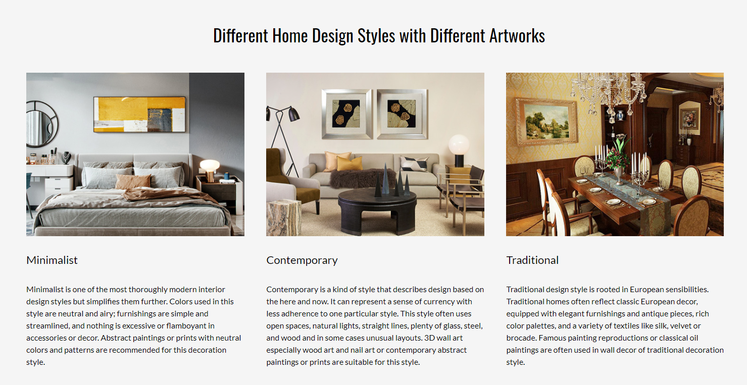
Wondering how to start? Looking for something specific? Get in touch today, and we’ll be more than happy to help!
-End-
-
Color is a vital part of interior design but also the first feeling after people enter the space. Therefore, as a designer, it becomes a necessary ability to choose and match colors in interior design.
Color schemes are based on science, not feeling. Many of you in doing color matching for interior design and do not know why it should be matched like that, and just by your own feeling or copy from the website. It turns out to be indescribable for the result of the visual effect.
Therefore, to help you solve this problem, we will share 5 popular color matching in interior design.
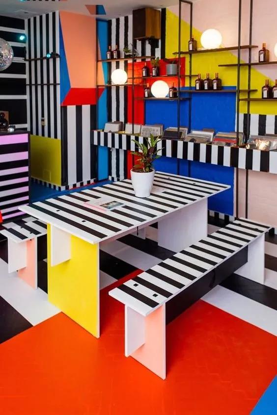
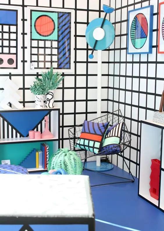
ONE. Memphis Color Scheme
Why do we call Memphis color so advanced? The secret lies in using bright, lively, high contrast hues. The personality in overall color tone is more evident after using a variety of complex, colorful surface patterns.
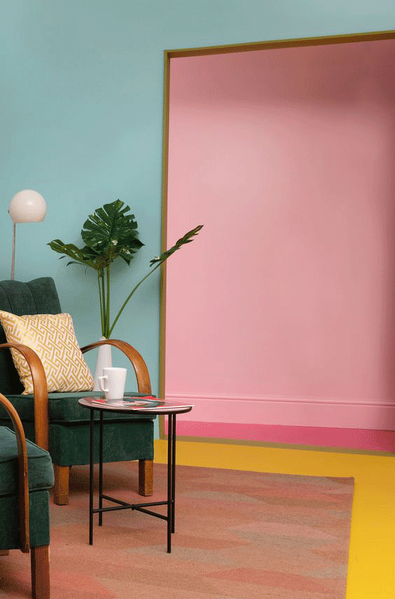
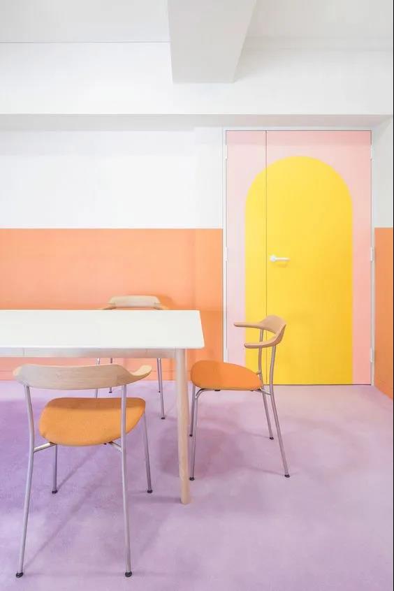
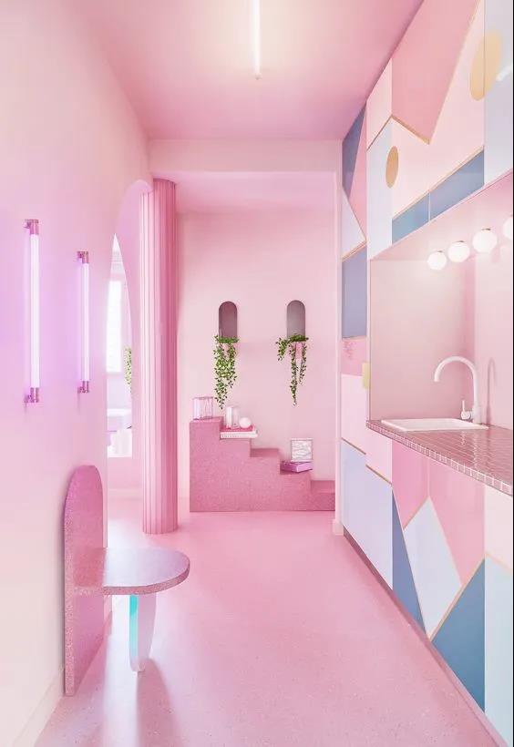
TWO. Macaron Color Scheme
As a dessert, the color of macaron can make us feel sweet, clean and dreamy. It also can be used in interior design to create a warm, girly, and fresh vibe.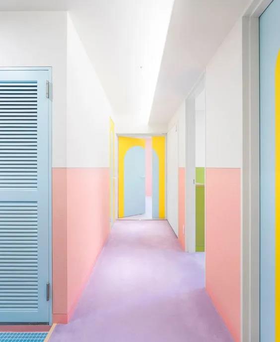
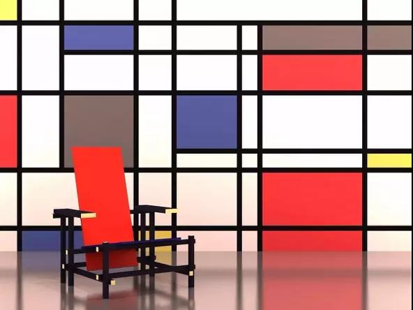
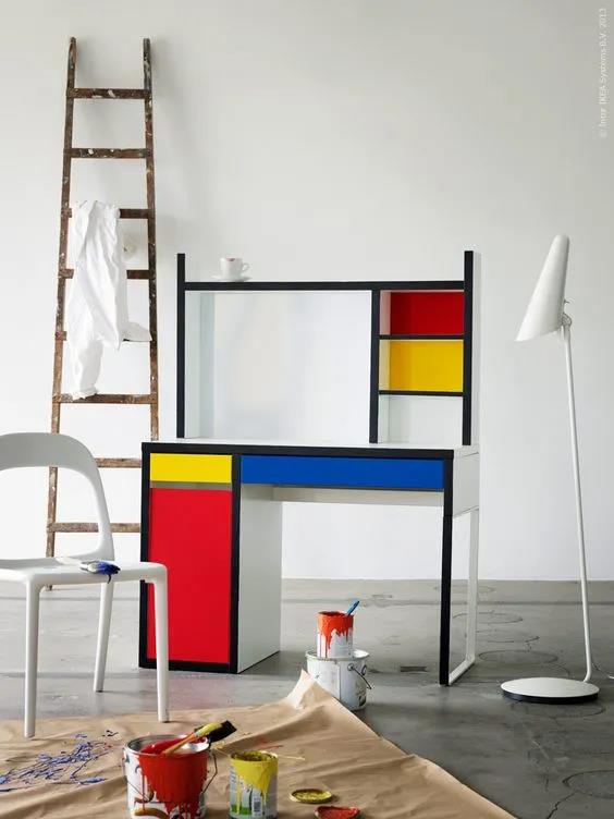
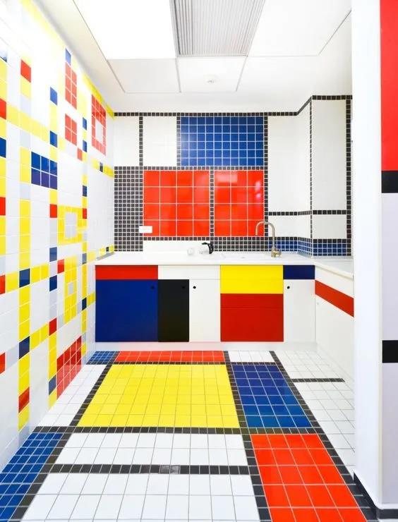
THREE. Mondrian's Color Scheme
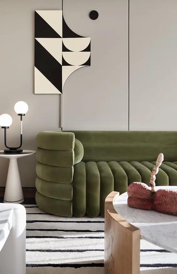
The space is dominated by the highly saturated red, which has a relatively wide area and more vivid color, while the other colors with a little blue, yellow and white.
FOUR. Morandi Color Scheme
Morandi color is a low saturation color series, not as bright as other colors, as if covered with a layer of gray. But "gray" is not a simple color but the representative of a group of colors, so it will always be called "advanced gray".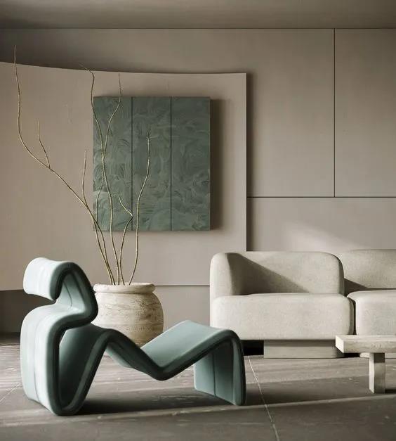
FIVE. Traditional Chinese Style Color Scheme
Speaking of color, Chinese people tend to have deep implicit feelings and vigorous waiting for release, not directly expressing the sense, but combining emotion with the scenery. The expression "depict three points, leave seven points" is Oriental unique amorous feelings.
Deep Black Color
It vividly conveyed Chinese architecture's exquisite tenon and mortise and restored the simple, quiet and neat beauty.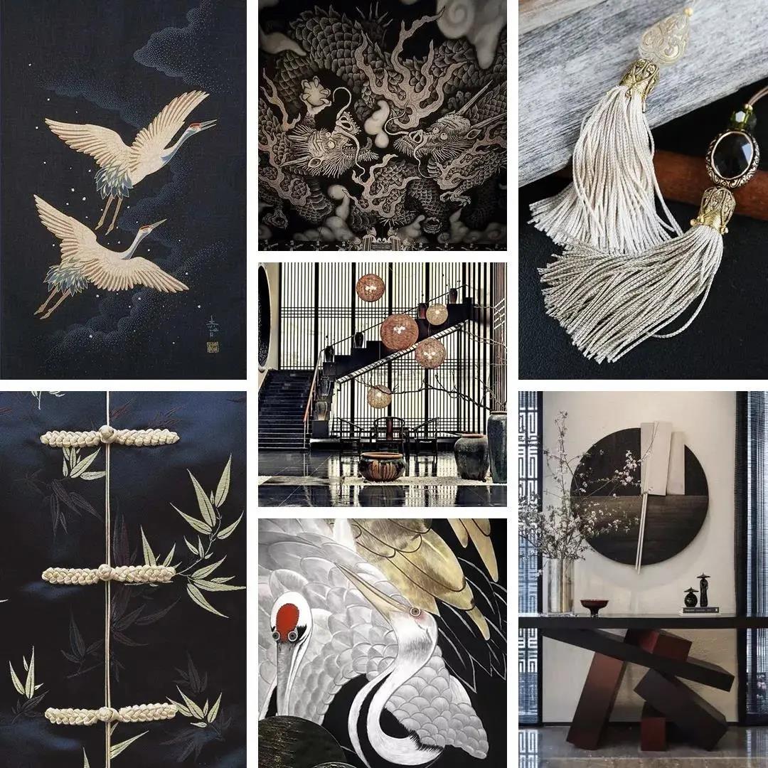

Color card: Bright white/Storm grey/Pure black/Honey
Chinese Red
Highlight cultural deposits have always been a good way for the Chinese style to output the world's most advanced taste performance with national characteristics. French romance adds more delicate elegance to Chinese red.
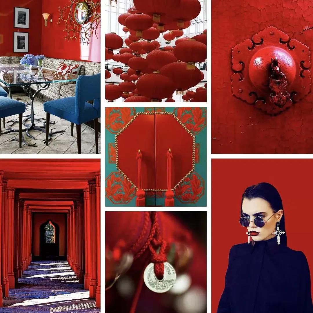

Color card: China red/Serenity blue/Victoria blue/Beige/Light turquoise
Songbird Green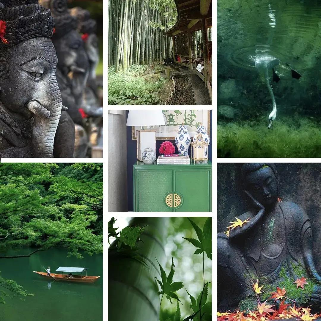
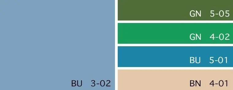
Color card: Dusk blue/Treetop green/Kelly green/Bluebird/Wheat
Coral
Bright and dynamic Hermes orange, gathering new Chinese style can also deduce the gorgeous color of Chinese style.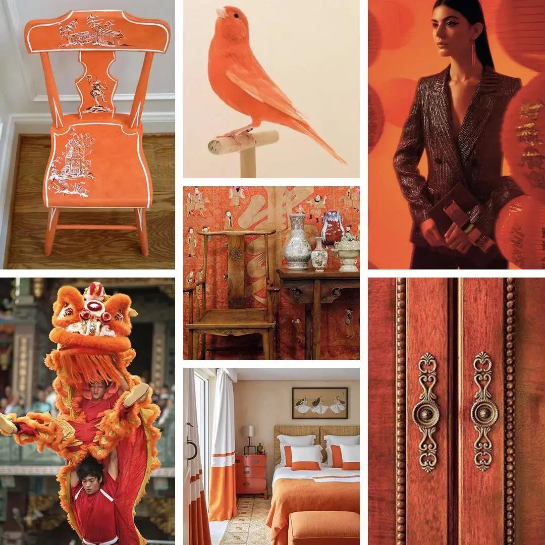
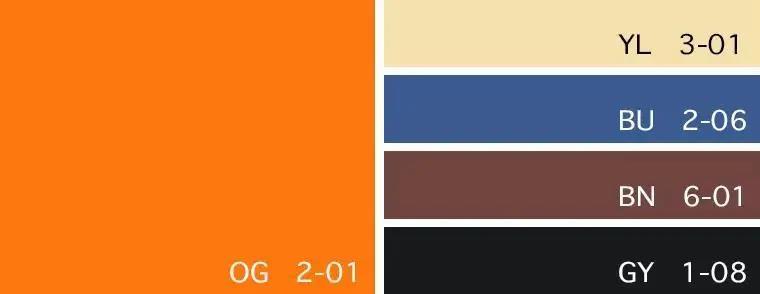
Color card: Hermes Orange/Sunshine/Delft blue/Sable/Pure black
MACLURA AURANTICA
The fashion collision between senior grey and imperial yellow makes the new Chinese style modern and full of western-style publicity and individuality.
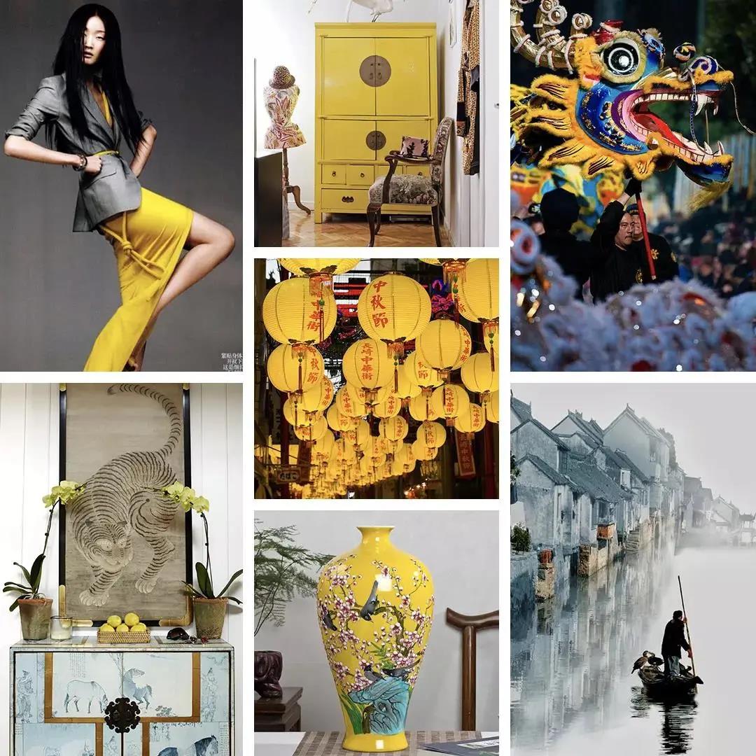

Color card: Bright white/Imperial yellow/Gold/Tortoiseshell/Phantom black
The above are 5 popular color schemes for interior design. If you have any questions about color matching and art recommendations for home, feel free to contact SOA Arts, and we will help you!
-
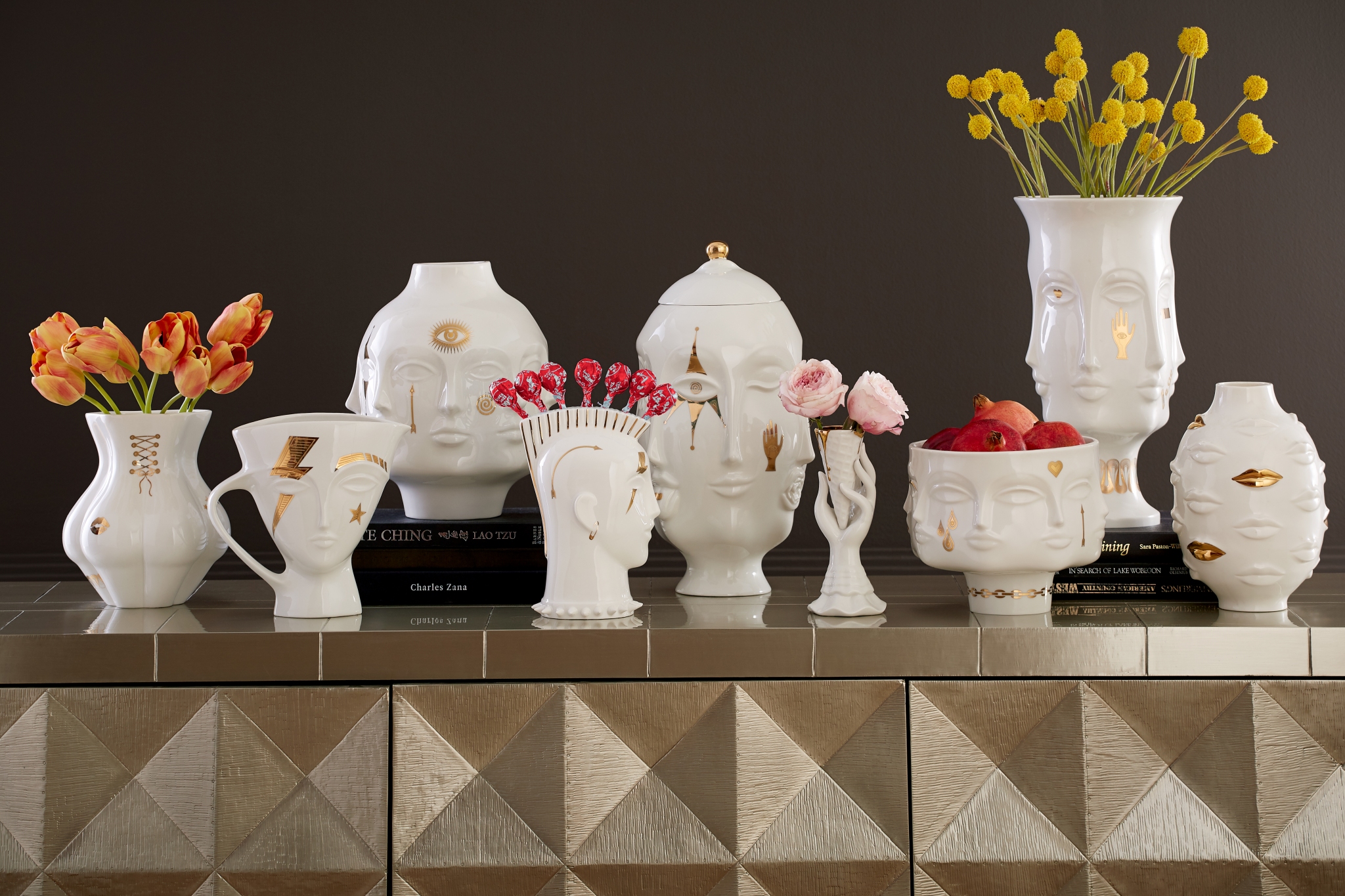
 Mr. Adler with his design works: (from top) Adler's Bacharach sofa; Adler's Alexander T-Arm sofa and a vintage chair.COMPOSITE: JONATHAN ADLER
Image via mansionglobal.com
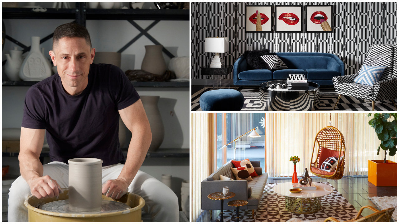
“Your home should make you feel like the most eccentric, glamorous version of yourself”, Jonathan Adler says. This interior designer has an interesting philosophy with creativity in the home. Adler is an American potter, author, and of course, interior decorator out of New York. After opening a pottery store in SoHo back in 2003, Adler went on to symbolize modern interior design.
Jonathan Adler hardly follows rules when it comes to interior design. He believes in fresh, yet chaotic projects that represent modern design. He uses the freedom that we have in America to express how he feels about his creations. Even his corporate office is glowing with freedom and creativity. It’s bright and sprinkled with his own items, including pottery and ceramics. As unorthodox as it sounds, employees are allowed to bring their pets if they wish!
If you’re looking for a way to add more personality and boldness to your home, Jonathan Adler may provide some inspiration. Here’s how you can craft your interior design the way Adler would do it!
Personality in Interior Design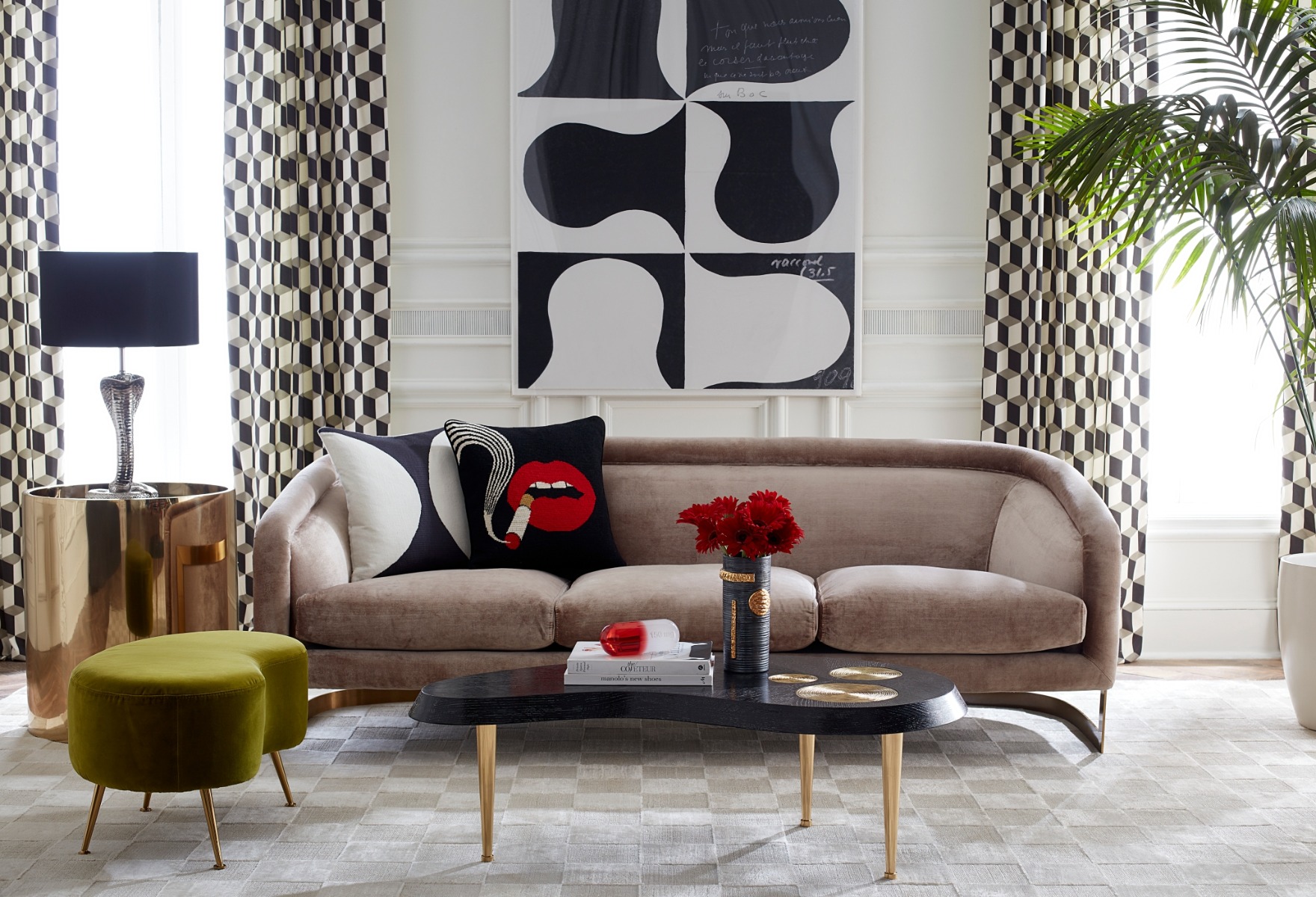
Adler’s work has a light and cheerful tone.
Image via wwd.com
One of the core themes with the interior design style of Adler is really making it a personal space. By traveling the world and seeking inspiration, he learned that it’s beneficial to create your own style. For instance, he found one of the best craftsmen in the world, a person who works with beads. After seeing the dimensions that beads alone add, he collaborated with him and sprinkled in his own personal touch with his artwork.Making your space personable is about finding your eccentric side and being bold with what you truly want. Whether it’s colors, objects, or unusual shapes, make your own rules where other people follow the trends.
Layers in Interior Design
Pieces from the collection can be used for many purposes.
Image via wwd.com
Based on his pottery background, Adler knows how to bring even the simplest design elements to life. Starting with just clay, he turned his creations into world-class works of art. He reaches peak creativity by layering as much as possible. When it comes to layering your home, start with your base color. Don’t be afraid to use something other than just white. Any color works great from the start. However, if you have a plain color, consider using patterns on your walls and floors to really spice up your interior.You can bring depth into rooms by mixing patterns with related colors, while your base color ties the place together. When you decorate walls, add some intriguing artwork. Even mismatched frames create loads of character with your layers. Finally, use similar colors with rugs, curtains, and cushions. These extra layers create a combination of colors that play off your base color.
Not Being Afraid to Take Risk
His upbeat design aesthetic lifted spirits during the pandemic.
Image via wwd.com
Adler believes that, “not everything in your home needs to function.” What does this mean exactly? Whether you place objects in your room that isn’t meaningful or add contrasting colors. For example, adding a nice sculpture doesn’t have to have meaning, but it could certainly make a statement. It could even be a hanging decoration if you really want to add drama!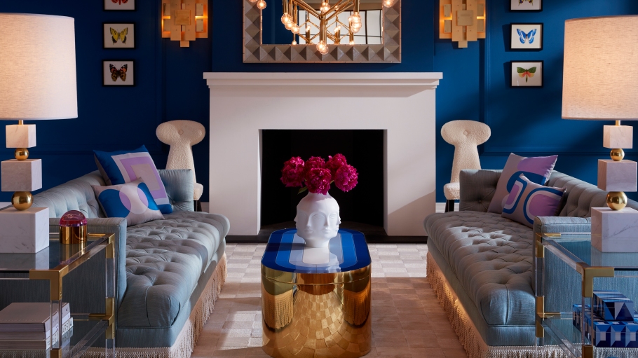
Jonathan Adler designs a variety of items for the home.
Image via wwd.com
When you’re choosing fabrics, being bold is about style first instead of material. You can mix silk and linen together, just like the way marble and tile may go together. It’s just like picking out your outfit. If you’re really looking for a statement, you could paint the ceilings. Not to mention, some bold designers paint the ceiling even darker than the paint on the walls. It’s all about being dynamic!
So the next time you’re thinking about giving your home a new look, find your inspiration. Jonathan Adler is a great place to start if you’re looking for boldness and more freedom. Your creativity is always limitless.
If you want to explore more art for interior design, SOA Arts is get ready.
-
“In traditional Japanese aesthetics, wabi-sabi (わび さび/侘寂) is a world view centered on the acceptance of transience and imperfection. The aesthetic is sometimes described as one of appreciating beauty that is “imperfect, impermanent, and incomplete” in nature.” It become more prevalent in recent times.
If you are a big fan of simple, go on and get inspired.01
What is Wabi-Sabi?
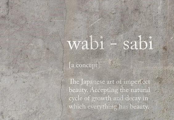
In Japanese, Wabi-sabi (わび さび) means to get rid of the unnecessary and to pursue the essence of nature. However, it doesn’t mean to change its origin, make it pure, and insert vitality.
It is the quintessential Japanese aesthetic, a beauty of things imperfect, impermanent, and incomplete. A beauty of things modest and humble. Accepting the natural cycle of growth and decay in which everything has beauty.Wabi(侘び)means simplicity, which is a low-key decoration and appearance. While Sabi(寂び) means “lonely” or “withering”, its reference to an old style.
In brief, wabi-sabi is an aesthetic idea: the appreciation and acceptance of imperfect beauty and the ability to create beauty from the plain.
02The Origin of Wabi-Sabi
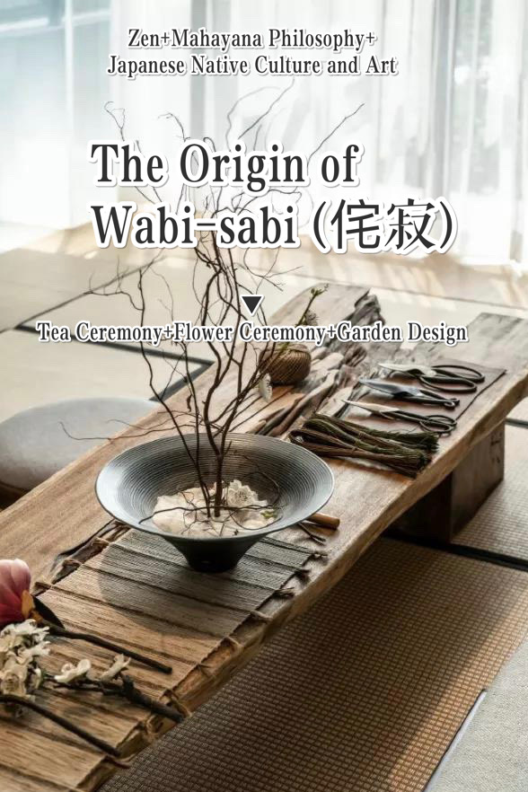
In 1191, a monk named Ming’ An, who brought Zen Buddhism from China, established Japan’s first zen temple, Seokfuji, and brought the tea ceremony of the Great Song Dynasty. Wabi-sabi was accepted and meditated by Zen and Mahayana Buddhism philosophy and, combined with Japanese art and culture, finally formed aesthetic philosophy thought of wabi-sabi. Later, this aesthetic was integrated into Japanese tea ceremonies, flower ceremonies, garden design, etc.
03The Conception of Wabi-Sabi
Asymmetry
Wabi-Sabi is one of the three Japanese aesthetics.
Unlike the ideal proportion of perfect symmetry in western aesthetics, wabi-sabi is the appreciation and affirmation of the beauty of imperfection, impermanence and incomplete things.
Incomplete/The pursuit of truth
Imperfection is the soul of wabi-sabi
All the elements are filled with a sense of incompleteness
The shape, the texture, the color, the luster of the object itself
Are absolutely imperfect, full of incompleteness
Blend in the simple and quiet beauty
Switch to your comfort zone.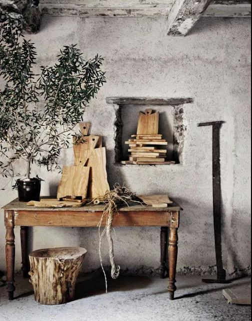
Old things/Time goes by
Wabi-sabi has been filled with years of vicissitudes
So everything in wabi-sabi was worn out
Like the nicks, the mottled marks on the walls
Or moss and so on
Old as it was, tattered as it was
But there is also a natural beauty that comes with age.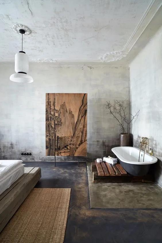
04
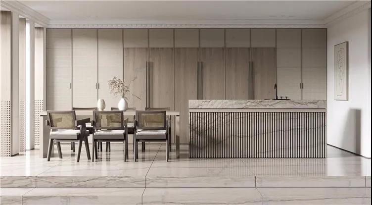
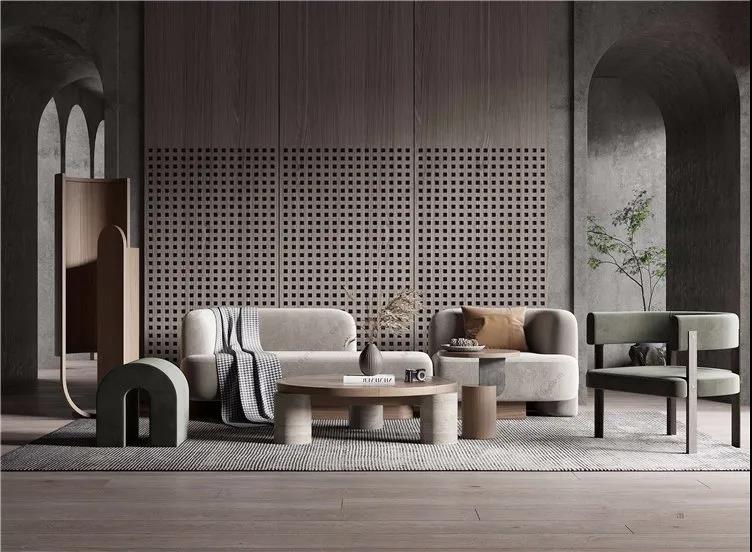
Design Elements Commonly Used in Wabi-SabiMottled Wall
The main characteristic of mottled metope
Is a very uneven surface texture
The walls are of different shades of color
Primitive natural, rough style
Give a person a kind of pure plain visual experience.
Handmade Products
The key ornament of wabi-sabi is the handiwork, which is the element that can best express the local culture.
Like hand-woven fabrics, or ceramics, or Zen wood,
The finely textured handmade products are unique and delicate.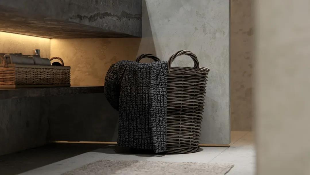
Original Wooden Furniture
Wabi-sabi itself is intended to express the original nature
So old wood has been tempered by nature
Despite rain and wind, the baptism of time
Already filled with the vicissitudes of texture
There is no need for secondary processing, adding too much decoration
Itself can be made into a unique texture, natural wood furniture
Simple and Elegant Flower Art
Wabi-sabi flower design, more can reflect wither, lonely visual experience
Simple but elegant, reserved, clear branches and grains
It has the deep charm of Oriental Zen
Plain Cement
Plain cement itself rugged, dry texture
It is in line with the tonality and atmosphere of wabi-sabi
Pure texture, extreme simplicity
It is also a key material element to create the atmosphere of wabi-sabi.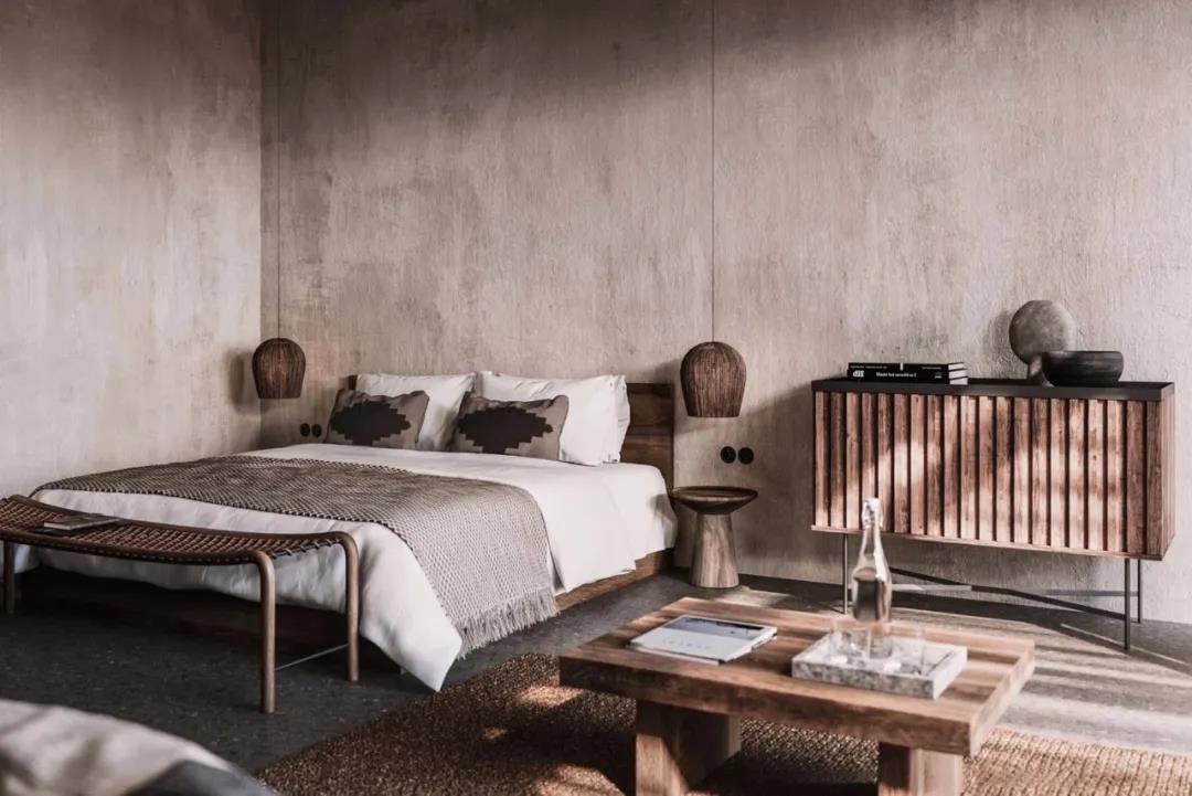
Plain Tone and Withering Rough Texture
Wabi-sabi as a whole does not have many bright colors
Most of them are dark gray and light gray
There are no overly complicated line elements
Indirect interspersed with milky white, earth color, light brown
Emphasis on the expression of wabi-sabi itself rough, dry, tattered
The emptiness of wither and silence
Minimalistic Abstract Painting
Wabi-sabi is mainly based on black, white, and gray
Fresh, minimalistic abstract painting and style of wabi-sabi complement each otherAnd add a cozy, warm vibe to the room, giving you the sense of returning to nature.
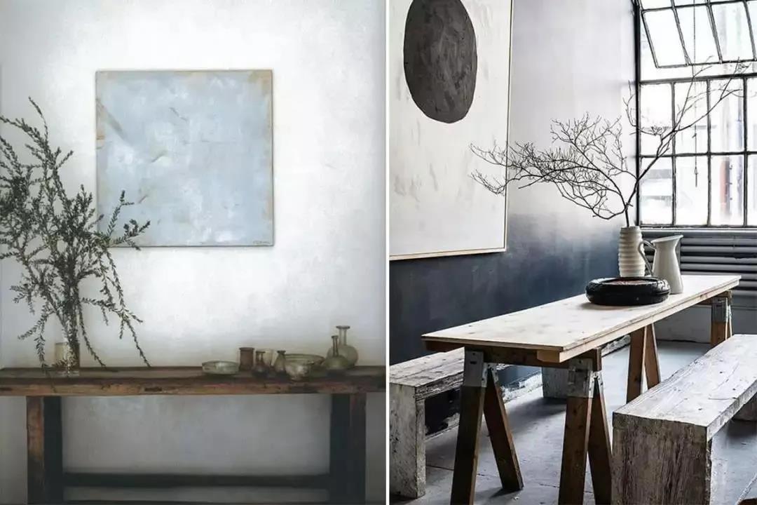
All images via google
-
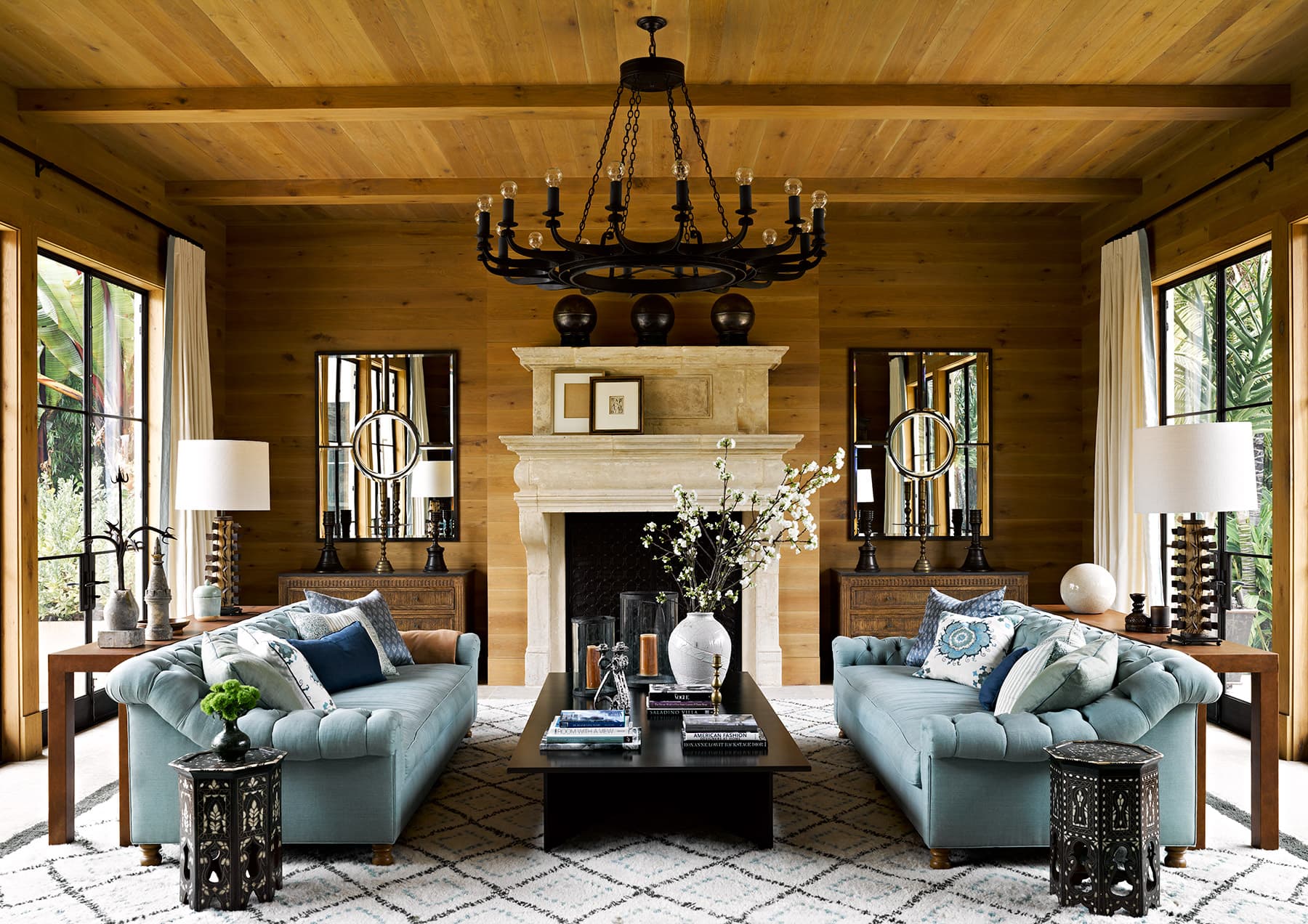
Image via Unsplash
There’s a plethora of different interior design styles out there. Finding approaches that work best for you and your business involves taking the time to consider your options. At SOA Arts, we find it’s often valuable to learn from the big names on the scene.
Martyn Lawrence Bullard is a phenomenal example. This interior design titan has been transforming spaces for many years and has been featured in television and award shows in over 60 different countries.
In this overview, we’ll explore the styles and approaches of this artist’s work to uncover valuable inspiration for those looking to improve their own properties. Whether you’re looking for interior design ideas for living room spaces, or just want general interior design tips, you’ve come to the right place.
Read on to learn more.
Martyn Lawrence Bullard (MLB)
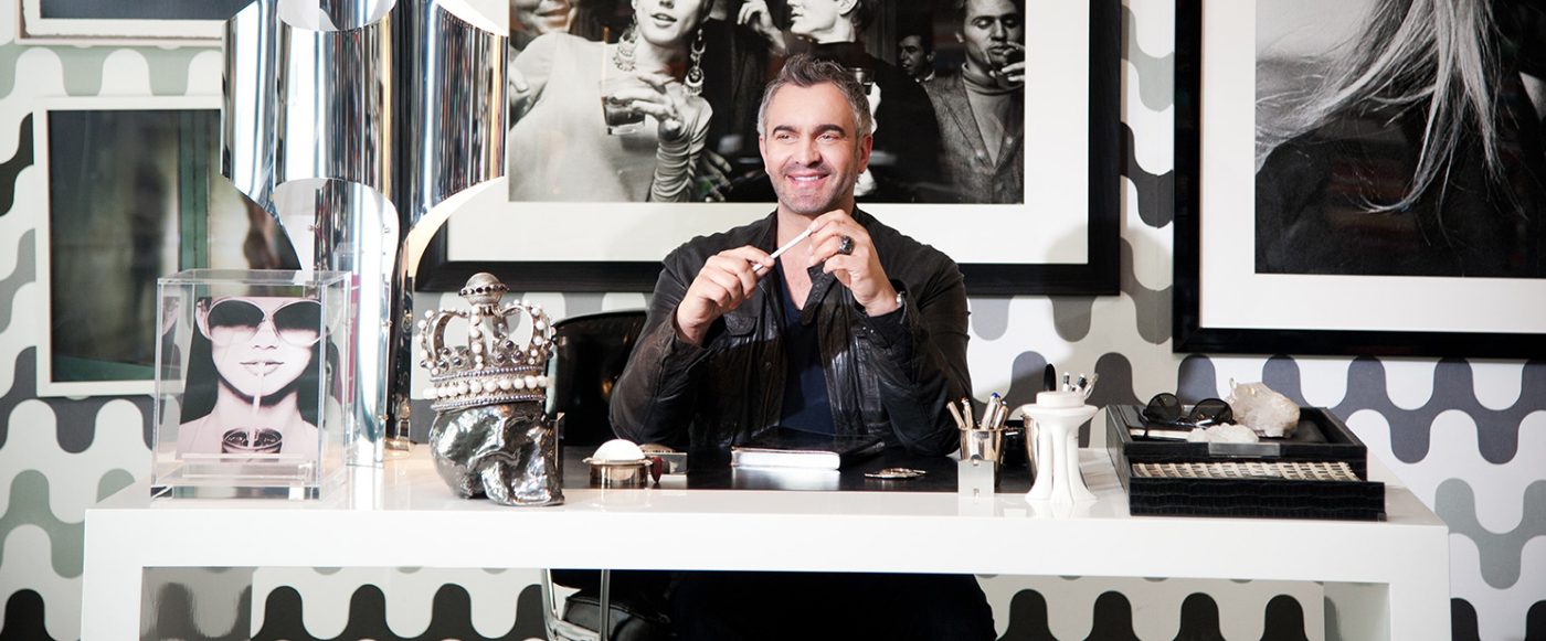
Image via martynlawrencebullard.com
Working from his base in LA, Martyn Lawrence Bullard has reached legendary status in the world of property design. His interior design styles are trusted by the likes of Kylie Jenner, Khloe Kardashian, Kourtney Kardashian, Tommy Hilfiger, and many more. The good news is that there’s plenty to learn from this artist’s approach. We explore a few key interior design tips below. Check them out.
Interior Design Styles – MLB
A comprehensive exploration of MLB is beyond the scope of this post. We’ve picked out a few headline styles below that should prove helpful in your own designs.
Fabrics and Patterns
Image via martynlawrencebullard.com
One thing that really stands out with this designer’s work is his dazzling array of fabrics and interior patterns. From sumptuous wallpapers to statement cushion cases, fabric material is showcased in full force here.
When designing your own interior, see if you can find a statement fabric pattern that you love. How can you implement this in your space? A furniture fabric? Spread across the walls? The world really is your oyster if you think creatively.
Open, Natural Light

Image via martynlawrencebullard.com
Another feature that crops up again and again in MLB’s work is an abundance of natural lighting. Floor-to-ceiling windows and the floods of sunlight they bring are never far away. The result of this approach is that every other aspect of this artist’s designs is able to shine in all their glory.
As an interior designer, you’ll always be limited by the layout of your rooms. That said, it’s best to allow for as much natural light as possible for your interior spaces. Can you upgrade your windows to allow for more light?
Are you placing your furniture and statement pieces strategically to avoid blocking your available sunlight?
Statement Colors
Image via Unsplash
MLB’s use of color can teach us valuable lessons about how to design interiors. In general, neutral tones are used throughout, with the exception of one intentional accent color.
This more vibrant, striking tone is often used intelligently to highlight a few iconic pieces. When creating your own spaces, think about how you can use color intelligently to draw focus to where you’d like it to be.
Interior Design Styles SOA Arts
At SOA Arts, we have over a decade’s experience in creating, sourcing, and curating spectacular art for businesses around the world. We’re intimately familiar with current interior design trends and have everything you need to transform your property.
Whether you’re looking for something specific or need help getting started, feel free to get in touch today and a member of our team will be more than happy to get the ball rolling.
For incredible interiors with impact, think SOA Arts.